
Playful Events Pricing Layout: Divi 5 Party Package Tiers
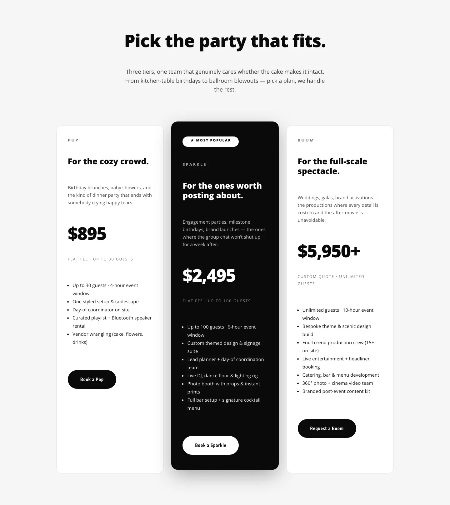
Colorful Divi 5 pricing layout for event planners, featuring three flat-rate party packages with playful gradients, confetti accents, and clear CTAs.
Rate this element
Download this section, free
- Divi 5 JSON, imports in seconds
- Commercial license included
- No account needed
Click to view the full page
Overview
The section sits on a warm cream #FFF8F0 canvas with 110–120px of vertical padding on desktop (6vw of horizontal breathing room), so the pricing cards feel invited in rather than compressed. A centered header block, capped at 780px, leads with a coral eyebrow (Confetti-included packages set 14px uppercase with 3px letter-spacing) then an 800-weight 56px display heading in deep plum #1B1140, and an 18px supporting paragraph in muted #4A4568. That intro carries the playful tone before the pricing math starts.
Underneath, three equal 1_3 columns share a 28px gap inside a 1200px max-width row. The outer cards use white backgrounds, 1px hairline borders, 28px corner radii and a soft #1B1140 8% drop shadow. The middle Signature tier deliberately breaks the pattern: a #FF4D6D → #7A3CFF gradient at 160°, a heavier purple-tinted shadow, and a 16px upward translate so it visibly lifts above its neighbors. Each card follows the same rhythm: colored eyebrow, 64px price, meta line (guests + event length), short pitch paragraph, bullet list at 2em line-height, and a full-width pill button with a 999px radius. Buttons alternate visually: outline coral on the Starter, cream fill on the Signature, and outline ink on the Grand Finale.
On phone, the section relaxes to 80/90px vertical padding and the 56px headline scales down to 36px. Both the header row and the pricing row switch to flexDirection column, so each card becomes a full-width 24_24 block that stacks vertically: no horizontal scroll, no cramped columns. Below the tiers, a 720px contact row keeps the concierge phone number and mailto link on-brand: 15px body copy with 700-weight coral link styling.
What’s inside
- Three-tier pricing row (1_3 × 1_3 × 1_3) with 28px column gap and a 1200px max width, centered inside the section
- Middle *Signature* card lifted via a 16px Y-translate, coral-to-purple 160° gradient background and a stronger purple-tinted drop shadow
- Consistent card anatomy: uppercase eyebrow, 64px price heading, meta line, paragraph pitch, feature bullet list, pill CTA
- Bulleted feature lists per plan (5–6 items) rendered with native Divi text at 2em line-height for readable scanning
- Fully rounded pill buttons (999px radius) with distinct hover swaps: outline coral, cream-fill dark text, and outline ink
- Centered intro block capped at 780px with coral uppercase eyebrow, 56px 800-weight headline and 18px supporting paragraph
- Footer contact row (720px max width) with phone number and mailto link styled in 700-weight coral #FF4D6D
- Mobile stack behavior: both rows flip to flexDirection column, columns collapse to 24_24, headline scales 56 → 36px
Who it’s for
This layout is built for event and hospitality brands that price by package rather than by hour. Wedding and party planners, catering studios, venue-management teams, corporate event agencies, gala fundraisers, kids' party companies and destination-wedding outfits all fit the three-tier structure: an entry flat-fee starter, a lifted signature tier, and a full-service headliner. The playful coral-plum palette and rounded pill buttons skew warm and celebratory, so it suits studios that want to feel personable rather than boutique-minimal. Anywhere a visitor needs a clear guest count + event length + price summary before booking a discovery call (private chefs, bar mitzvah planners, popup dinner series, retreat organizers, birthday-party concierges), this section slots in cleanly. Swap the copy and it works equally well for photography, DJ or florist packages.
Customization tips
To shift the palette, edit the section background (#FFF8F0), the accent coral (#FF4D6D), the deep ink (#1B1140), and the two gradient stops (#FF4D6D → #7A3CFF) on the middle card. Every other element inherits from those four values. Keep price headings at three-to-five characters ($1,450 / $3,850 / $7,900) so the 64px display type doesn't wrap; drop it to 52px if you need a fourth digit or a currency prefix. Feature bullets read best at 4–6 items per card, beyond that the middle tier's Y-translate starts crowding its neighbors visually. Meta lines (Flat fee · guests · duration) work up to about 40 characters; longer and they wrap awkwardly under the price. There are no images to swap out, so most edits are text-only. If you do want to add a photo backdrop or icon per tier, target a 1:1 or 4:3 crop at ~320px wide and place it above the price. On mobile the cards stack full-width and the middle tier loses its lift, so consider adding a Most popular text badge if you want to preserve the hierarchy signal on small screens.
How to install this layout
- Download the layout JSON file from this page.
- Open the target page in the Divi 5 builder.
- Open the portability panel (up/down arrows icon) and choose the Import tab.
- Upload the JSON. Tick “replace existing content” only for full-page imports.
- Check the page at desktop and mobile widths, then swap in your copy and images.
Full walkthrough with troubleshooting: How to Import a Divi 5 Layout.
Questions about Playful Events Pricing Layout: Divi 5 Party Package Tiers
Is the middle *Signature* card meant to be the visual focus?
Yes. It uses a coral-to-purple 160° gradient, a heavier purple-tinted drop shadow (rgba 122,60,255,0.35), and a 16px upward translate so it sits above the two neutral cards. If you'd rather a flat lineup, remove the translate and swap the gradient for the same white background the outer cards use.
How do the three cards behave on mobile?
Both rows switch to flexDirection column on phone, so the header block, the three tiers and the contact row all stack vertically. Each card becomes a full-width 24_24 column and retains its 48–56px internal padding. The 56px display headline scales down to 36px so it stays inside the viewport.
Which Divi modules make up the section?
Only Divi 5 native modules: Section → Row → Column → Text, Heading and Button. No third-party dependencies, no code blocks and no images. The polish comes from background colors and gradients, 28px card radii, box shadows and 999px pill buttons. All inside standard module settings.
What should I edit first after importing?
The three prices, the three meta lines (guests + duration), the tier names inside each eyebrow, the feature bullets per card and the three button labels. Then update the footer phone number and email: the mailto link points to hello@sparklerevents.co out of the box, which you'll want to replace.
Can I add a fourth tier without breaking the layout?
You can, but the row is currently a 1_3 × 1_3 × 1_3 structure. Either reset the column set to 1_4 × 1_4 × 1_4 × 1_4, or let a fourth card wrap onto a second row using the existing flexWrap setting. If you keep everything on one row, drop the 64px price down to about 52px and tighten the 38px side padding so the cards don't run out of room.
Which Divi version does this layout need?
Divi 5. The layout is generated natively for Divi 5 and validated against its real module structure before publication, so it imports clean into the current builder.
Can I use this layout on client websites?
Yes. Every download includes a commercial license covering unlimited sites you own or build for clients. Only reselling or redistributing the layout file itself is prohibited.
More pricing tables
Browse all pricing tables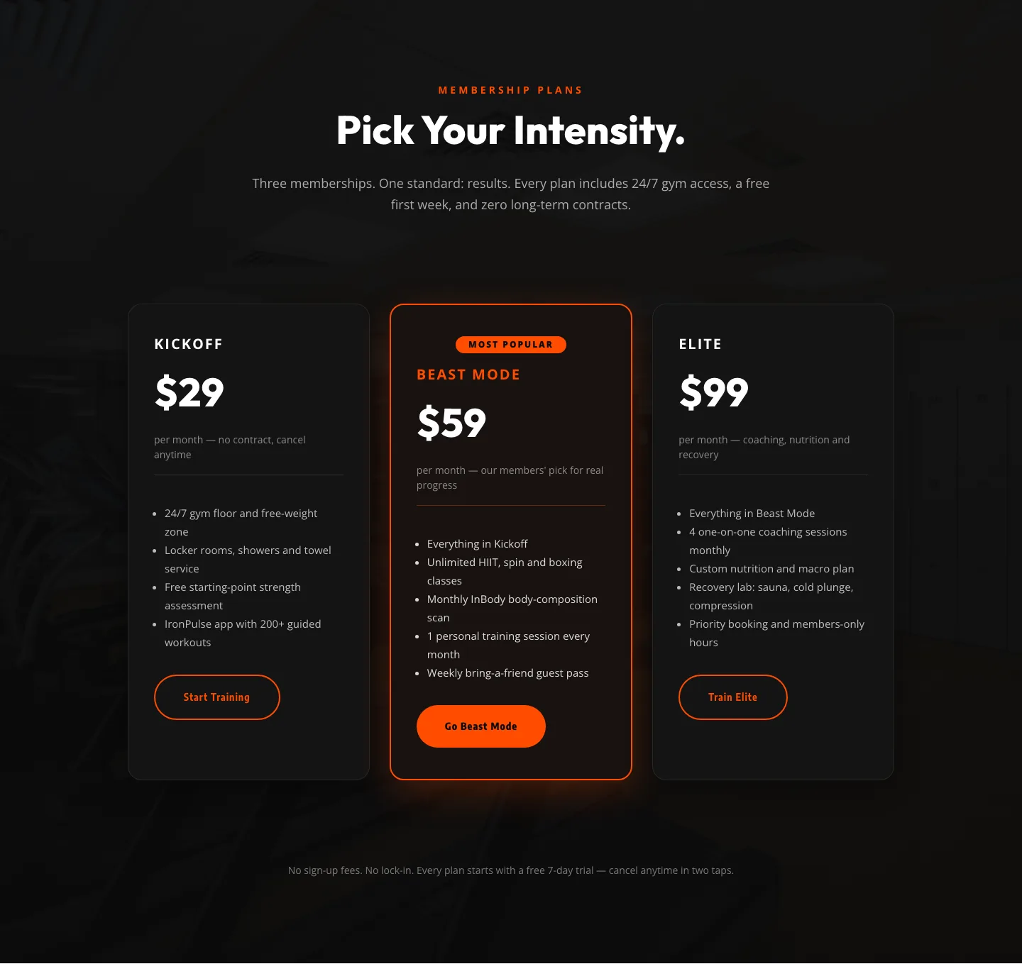
Bold Fitness Pricing Table: Dark Gym Membership Plans Divi 5 Layout
pricing · fitness · bold
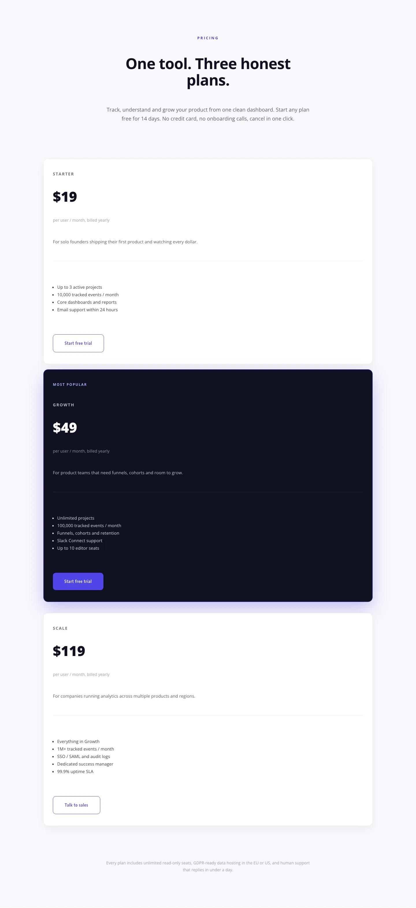
Minimal SaaS Pricing Section: 3-Tier Plan Cards with Featured Dark Tier | Divi 5 Layout
pricing · saas · minimal
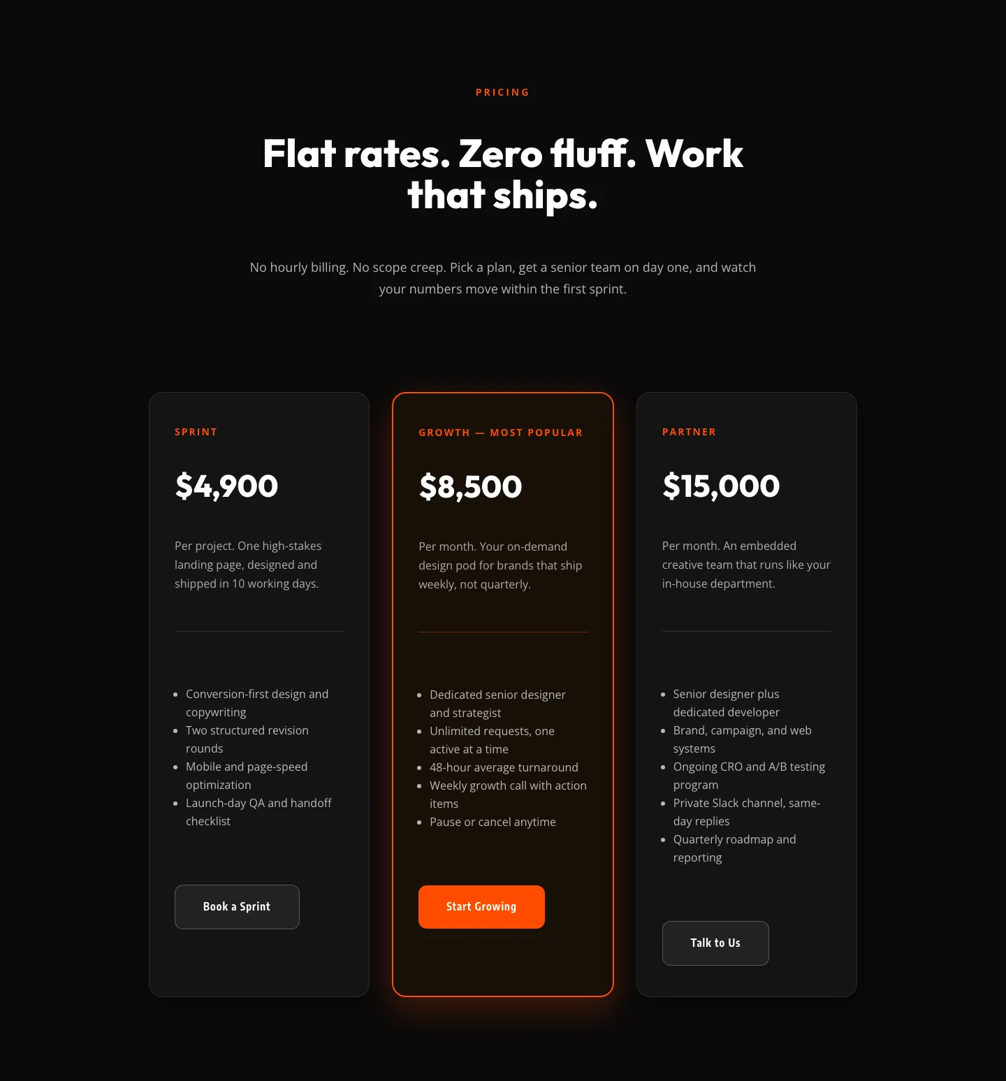
Bold Agency Pricing Section: Dark 3-Tier Divi 5 Layout
pricing · agency · bold
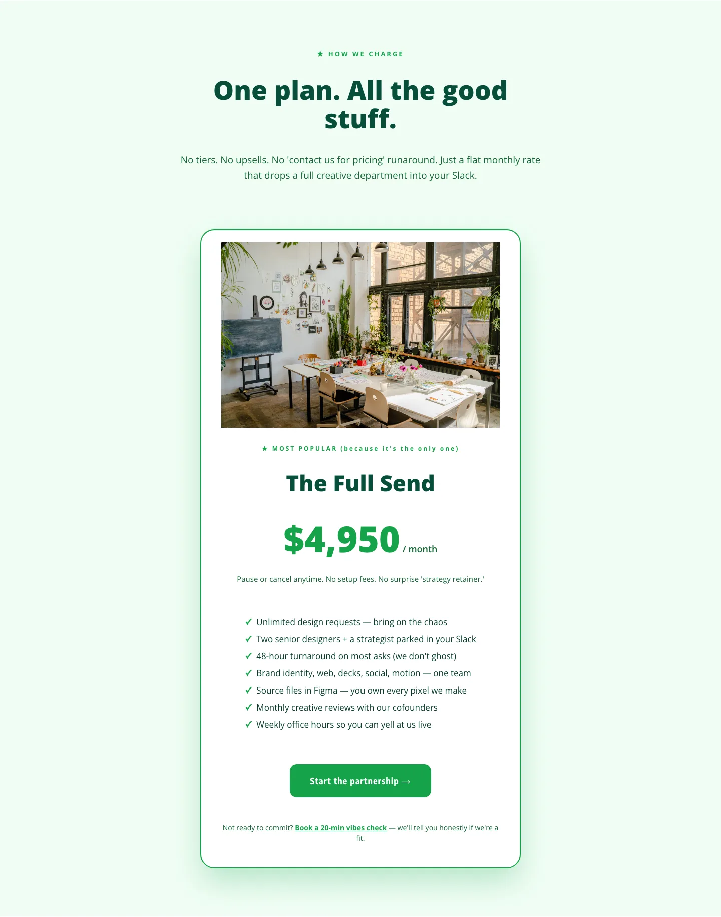
Playful Agency Pricing Section: Flat-Rate Divi 5 Layout
pricing · agency · playful
Playful Three-Tier Event Pricing Section for Divi 5
pricing · events · playful
Elegant Coaching Pricing Section: 3-Tier Divi 5 Layout
pricing · coaching · elegant