
Minimal SaaS 3-Up Feature Cards Layout for Divi 5
Clean, minimal Divi 5 cards section with three feature columns for SaaS sites. Soft shadows, lift-on-hover, centered icons, and responsive 1-3 column flex.
Variations
Rate this element
Download this section, free
- Divi 5 JSON, imports in seconds
- Commercial license included
- No account needed
Click to view the full page
Overview
The layout opens on a soft slate canvas (#F8FAFC) with 100px of vertical breathing room above and below, so it drops into a page without fighting neighboring sections. A single centered introduction row sets the frame: a 42px, weight-700 headline in slate-900 tightened to a -0.5px letter-spacing and 1.15em line-height, followed by an 18px slate-600 paragraph capped at 680px so the lede stays two lines on desktop and never crowds the cards below.
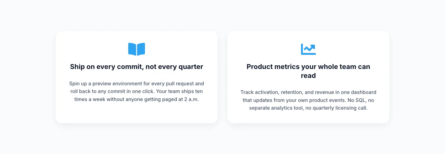
Beneath the intro sits the actual feature grid: three equal 1_3 columns with a 32px column gap, 32px row gap, and alignItems: stretch so every card matches its tallest neighbor. Each card is a white surface with 36px of even padding, a 20px border radius, a barely-there 1px border (rgba(15,23,42,0.06)) to catch the light, and a soft preset3 shadow that lifts on hover: the column translates -6px on Y with a deeper shadow, giving the section a quiet interactive rhythm without any animation code.
Card contents follow the same top-down cadence: a 44px centered icon (two Font Awesome glyphs and one Divi glyph in this build), a 22px weight-700 heading, and a 15px slate-600 body paragraph at 1.65em leading, three to four lines each, tuned so the shortest and longest cards read at the same visual weight.
On tablet the row is set to flexWrap: wrap, so cards break to a two-then-one arrangement instead of squeezing at a narrow width; on phone the row flips to flexDirection: column and every card expands to full width, with the 36px inner padding and 18px inner row-gap preserved end to end.
What’s inside
- Two-row structure: centered intro (42px heading + 18px lede) stacked above a three-card feature grid, all inside one Divi 5 section with 100px top/bottom padding
- Intro copy constrained to a 680px max-width and horizontally auto-margined so the measure stays tight on ultrawide viewports
- Three equal 1_3 columns with a 32px column gap, 32px row gap, and stretch alignment. Card heights always match their tallest neighbor
- Card decoration preset: 20px border radius, 36px inner padding on all sides, 1px hairline border at 6% slate, and a preset3 box shadow with hover intensification
- Interactive hover state on every card: -6px Y translate plus a stronger 18px/42px shadow, no custom CSS, pure Divi 5 transform + boxShadow states
- 44px centered icon on each card via the native Icon module (two Font Awesome glyphs, one Divi glyph. Trivially swappable)
- Locked slate palette baked in: #F8FAFC section background, #FFFFFF cards, #0F172A headings, #475569 body copy
- Responsive plumbing: `flex-nowrap` desktop → `flex-wrap` tablet → `flexDirection: column` phone, with an 18px column row-gap inside each card
Who it’s for
Built for SaaS founders, dev-tool startups, API and infrastructure products, analytics dashboards, security and compliance tooling, and developer platforms. Anywhere three tight benefits need to sit mid-page without competing with a hero. The three-card cadence is deliberately generic, so it also drops cleanly into fintech feature blocks, B2B service triads, agency "what we do" rows, and product-marketing landing pages that need a value moment between the hero and the pricing. It works as a standalone feature section on a homepage, a values block on an About page, or a differentiator strip above a plan grid on Pricing.
Customization tips
The palette is effectively a preset: swap the #F8FAFC section background for any pale tone (sand, mist, cream) and the white cards keep their contrast. For a dark variant, invert: use near-black cards (#0F172A) with slate-100 headings and slate-400 body; the hairline border and preset3 shadow still read.
Copy limits worth respecting: keep card headings to 3–5 words so they stay one line at 22px on tablet, and card body paragraphs to 35–55 words (three to four lines) so all three cards balance visually. The intro headline reads best under eight words and the intro paragraph under thirty, which preserves the 680px measure.
There are no images to swap, the layout is icon-driven. Change any of the three icons via the Icon module (Font Awesome or the built-in Divi icon library). If you need photography instead, replace the Icon module with a square (1:1) Image at ~120px wide and it will sit cleanly in the icon's 44px slot.
How to install this layout
- Download the layout JSON file from this page.
- Open the target page in the Divi 5 builder.
- Open the portability panel (up/down arrows icon) and choose the Import tab.
- Upload the JSON. Tick “replace existing content” only for full-page imports.
- Check the page at desktop and mobile widths, then swap in your copy and images.
Full walkthrough with troubleshooting: How to Import a Divi 5 Layout.
Questions about Minimal SaaS 3-Up Feature Cards Layout for Divi 5
What modules make up each card?
Every card is a Column containing three stacked modules: an Icon (44px, centered), a Heading, and a Text module. That's it (no Blurbs, no nested rows) so restyling any one element is a single click away.
How does the layout behave on tablet and phone?
On tablet the row switches to `flex-wrap`, so cards break to a two-plus-one arrangement instead of shrinking below their comfortable width. On phone the row flips to `flexDirection: column` and every card expands to full width, keeping the 36px inner padding and 18px row-gap intact.
What should I edit first?
The three card headings and body paragraphs. They're the tone-setters. After that, swap the three icons via the Icon module to match your product's language (a chart, a code glyph, a shield, etc.), then rewrite the 42px intro headline and its 680px paragraph.
Can I turn this into a 4-card or 2-card grid?
Yes. Duplicate a column and change the row's column structure to 1_4,1_4,1_4,1_4 (or 1_2,1_2). The card decoration (border, radius, shadow, hover-lift) lives at the column level, so any column you duplicate inherits the treatment automatically.
Does the hover-lift work on touch devices?
The hover state fires on tap in most mobile browsers, so cards briefly lift when a finger lands. If you'd rather freeze the resting state on phone, remove the hover shadow and transform from the phone tab of each column.
Are there any images in this layout?
No. It's entirely icon and typography driven. That keeps rendered page weight tiny and skips the need to source three matching feature photos. If you want to add imagery later, drop an Image module into any column above the Icon.
Which Divi version does this layout need?
Divi 5. The layout is generated natively for Divi 5 and validated against its real module structure before publication, so it imports clean into the current builder.
Can I use this layout on client websites?
Yes. Every download includes a commercial license covering unlimited sites you own or build for clients. Only reselling or redistributing the layout file itself is prohibited.
More cards
Browse all cards
Elegant Coaching Services Cards: Divi 5 Layout
cards · coaching · elegant

Elegant Coaching Cards Layout for Divi 5: Four-Pillar Framework
cards · coaching · elegant

Minimal SaaS Feature Cards Layout: 4-Column Divi 5 Section
cards · saas · minimal

Minimal SaaS Feature Cards Layout for Divi 5
cards · saas · minimal

Minimal SaaS Features Cards Layout for Divi 5
cards · saas · minimal
Minimal SaaS Two-Column Feature Cards
cards · saas · minimal