
Three-Step SaaS Onboarding Cards: Minimal Divi 5 Layout
Minimal three-column SaaS cards layout for Divi 5. Numbered step cards with hover lift, clean Inter type, and indigo accents. Perfect for product onboarding sections.
Variations
Rate this element
Download this section, free
- Divi 5 JSON, imports in seconds
- Commercial license included
- No account needed
Click to view the full page
Overview
This section opens with a centered intro block (a 40px Inter headline in near-black (#0B0F19) with tight -0.5px tracking, plus a 640px-capped subhead in a softer #4B5563 gray) that anchors the eye before the three cards begin. The section sits on a warm off-white canvas (#FAFAFA) with 100px of vertical breathing room top and bottom, so the white cards feel like they lift off the page rather than fight it. Nothing shouts; the hierarchy is doing the work.
Below the intro, three equal 1/3 columns sit in a flex row with a 32px column and row gap, align-items: stretch, and flex-wrap: nowrap on desktop so all three cards match height even when the middle copy runs long. Each card is a self-contained flex column: a 56px circular step badge in indigo (#4F46E5) with a white numeral, a 22px card title, a 16px description in the same muted gray as the intro, and (pinned to the bottom via margin-top: auto), a small 14px indigo link that acts as the secondary CTA. Cards use 36px of padding on all sides, a 20px radius, and a soft preset3 shadow (rgba(15,23,42,0.06)) that deepens on hover while the whole card lifts 6px: a restrained interaction that reads as premium, not gimmicky.
On tablet the row switches to flex-wrap: wrap so cards can break to a second line if needed, and on phone the row and columns both collapse to a single stacked column at full width. The stacked order preserves the 1 → 2 → 3 numbering, so the narrative (Connect, Configure, Ship) never breaks. Because every card shares identical padding, radius, shadow, and internal row-gap (18px), the section stays visually calm no matter how much copy each step carries.
What’s inside
- Three-column feature/steps row (1_3, 1_3, 1_3) built on native Divi 5 sections, rows, columns, headings, and text modules. No third-party addons
- Centered intro block with a 40px Inter headline and a 640px max-width subhead, auto-margined for perfect centering
- 56px circular numbered step badges (indigo #4F46E5, white numerals) built from a Heading module + free-form CSS. No icon library required
- Uniform card styling: 36px padding, 20px border-radius, soft preset3 shadow, and a 6px hover lift with a deeper shadow
- `align-items: stretch` + `flex-wrap: nowrap` on desktop so all three cards match height, with `margin-top: auto` pinning the CTA link to the card bottom
- Secondary text-link CTA per card in indigo with a darker hover state (#3730A3), ready to point at integrations, docs, or a demo
- Full responsive stack: cards wrap on tablet and collapse to a single column on phone, preserving the 1 → 2 → 3 reading order
- Cohesive Inter type system across headline, card titles, body copy, and links: one font family, three sizes, tuned line-heights
Who it’s for
Built for SaaS marketing pages that need to explain a product in three quick beats: onboarding flows, how-it-works sections, developer-tool landing pages, and pricing-page primers. It reads especially well for infrastructure, DevOps, observability, and API products where the story is connect → configure → deploy, but the copy structure (title + short paragraph + link) is generic enough for AI tools, fintech onboarding, HR platforms, or agency service breakdowns. The muted off-white background and restrained indigo accent make it easy to drop into an existing brand system without a full redesign, and the stretched card heights keep it looking tidy even when one step needs more explanation than the others.
Customization tips
Swap the indigo (#4F46E5) for your brand color by editing the step-badge background and the link/hover colors: six values total, all in the module settings, no CSS needed. Keep step titles to about 3–5 words so the card heads don't wrap awkwardly on tablet; body copy sits comfortably at 20–35 words per card before the row starts to look unbalanced. If you need more than three steps, duplicate a column and change the row column structure from 1_3,1_3,1_3 to 1_4 × 4. The stretch alignment and hover behavior carry over. To turn this into an icon-based feature row instead of numbered steps, replace the numeral heading with an Icon module inside the same 56px circular container. The 640px cap on the subhead is deliberate, raising it starts to fight the card grid below.
How to install this layout
- Download the layout JSON file from this page.
- Open the target page in the Divi 5 builder.
- Open the portability panel (up/down arrows icon) and choose the Import tab.
- Upload the JSON. Tick “replace existing content” only for full-page imports.
- Check the page at desktop and mobile widths, then swap in your copy and images.
Full walkthrough with troubleshooting: How to Import a Divi 5 Layout.
Questions about Three-Step SaaS Onboarding Cards: Minimal Divi 5 Layout
How does this section behave on tablet and mobile?
On tablet the three cards can wrap to a second line (`flex-wrap: wrap`), and on phone the row collapses into a single stacked column, keeping the 1 → 2 → 3 order intact. Padding and radius stay constant across breakpoints.
What Divi 5 modules is this actually built from?
Only native Divi 5 primitives: one Section, two Rows (intro + cards), Columns, Heading modules (for both the section title and the numbered badges), and Text modules for the descriptions and link CTAs. No child themes or plugins required.
Are the numbered circles real icons or something else?
They're Heading modules styled with a solid indigo background, a 100px border-radius, and a small free-form CSS block that forces a 56×56px flex-centered container. You can swap the numeral for an icon module inside the same container if you prefer icons over numbers.
Why do all three cards stay the same height even when the copy differs?
The row uses `align-items: stretch` and each card is a flex column with `margin-top: auto` on the bottom link. Longer descriptions push the middle down, but the CTA link stays pinned to the bottom edge so the three cards visually align.
What should I edit first after importing?
Start with the section headline and subhead, then the three card titles and paragraphs, then the CTA link URLs (they point at `#integrations`, `#rules`, and `#demo` placeholders). Finally, if you're rebranding, change the indigo accent in the step badges and the two link color values.
Can I use this for something other than a three-step process?
Yes: the same structure works as a three-feature grid, a three-tier plan teaser, or a three-benefit block. Replace the numeral with an icon or a small image, and the card layout keeps its stretch behavior and hover lift.
Which Divi version does this layout need?
Divi 5. The layout is generated natively for Divi 5 and validated against its real module structure before publication, so it imports clean into the current builder.
Can I use this layout on client websites?
Yes. Every download includes a commercial license covering unlimited sites you own or build for clients. Only reselling or redistributing the layout file itself is prohibited.
More cards
Browse all cards
Elegant Coaching Services Cards: Divi 5 Layout
cards · coaching · elegant
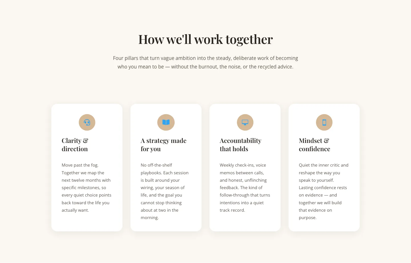
Elegant Coaching Cards Layout for Divi 5: Four-Pillar Framework
cards · coaching · elegant

Minimal SaaS Feature Cards Layout: 4-Column Divi 5 Section
cards · saas · minimal

Minimal SaaS Feature Cards Layout for Divi 5
cards · saas · minimal

Minimal SaaS Features Cards Layout for Divi 5
cards · saas · minimal

Minimal SaaS 3-Up Feature Cards Layout for Divi 5
cards · saas · minimal