
Four-Step How It Works Cards: Minimal SaaS Divi 5 Layout
Minimal SaaS how-it-works section with four numbered process cards. Clean white tiles on soft gray, hover lift, Inter type. Drop into any Divi 5 page.
Variations
Rate this element
Download this section, free
- Divi 5 JSON, imports in seconds
- Commercial license included
- No account needed
Click to view the full page
Overview
This is a two-row "how it works" section built entirely from native Divi 5 modules: an intro row with a centered H2 plus supporting paragraph, and a four-column row of numbered step cards. The heading sets a tight visual anchor (Inter 700 at 42px on desktop, letter-spacing tuned to -0.5px, deep slate #0F172A) with a 640px max-width subhead in slate #475569 beneath it, so the eye lands on the promise before scanning the steps.
The cards row uses an equal 1_4,1_4,1_4,1_4 structure with a 24px column gap and alignItems: stretch, so every card rises to the same height regardless of copy length. Each card is a white surface on the #F7F8FA section background, wrapped in a 20px radius, a hairline rgba(15,23,42,0.06) border and a soft preset3 shadow. Inside, a 56×56 circular number badge in the same near-black as the heading sits above an Inter 600 20px step title and a 15px slate body paragraph. The whole card breathes on 36px inner padding with a 16px row gap between elements.
Subtle motion carries the interaction: on hover, each card translates up 6px and its shadow deepens (preset3, 18px vertical, 44px blur), giving the section a quiet, product-marketing feel without any external CSS. Vertical rhythm is generous (110px section padding top and bottom, 56px between the intro block and the cards) so the layout reads as calm and premium at real-world screen sizes.
On tablet the row wraps to a 2×2 grid with 20px gaps, and on phone the four cards stack in a single column with an 18px row gap; the H2 also scales down (34px tablet, 28px phone) so the hierarchy stays intact instead of dwarfing the first card.
What’s inside
- Two-row layout: centered H2 + supporting paragraph on top, four-column step cards below
- Equal `1_4` cards with `alignItems: stretch`, copy of any length keeps card heights aligned
- Circular number badges (56×56, near-black `#0F172A`, white Inter 700 numeral) built with a Text module + freeform CSS. No icon module or image required
- White cards on a `#F7F8FA` section, 20px radius, hairline border, and `preset3` shadow for a premium SaaS surface
- Hover interaction wired in the JSON: each card lifts 6px with a deeper shadow, no custom code
- Responsive breakpoints already tuned: 4-across desktop → 2×2 tablet (`flexWrap: wrap`) → single column phone, with H2 scaling 42 → 34 → 28px
- Inter font stack throughout, with weight, size, color and line-height tokens set on every module for consistent typography
Who it’s for
Purpose-built for SaaS marketing pages that need to explain a product or onboarding flow in four clear beats: think analytics tools, dev platforms, AI assistants, workflow apps, or fintech dashboards. It slots naturally into a homepage below the hero, an "About" or "How it works" landing page, or a feature deep-dive that needs a scannable process summary. The clean palette and generous whitespace also make it a fit for agencies, consultancies, and productized service businesses that want to show a four-step engagement model without leaning on illustration or video. If your process has three or five steps instead of four, the card structure adapts by duplicating or removing a single column. The styling stays consistent.
Customization tips
For a brand refresh, swap the two accent colors in preset: change #0F172A (H2, H3, number badge fill) to your primary and update the body slate #475569 to your secondary neutral in the two Text modules per card and the intro subhead. The #F7F8FA section background pairs with any near-white; for a dark variant, flip section to a deep neutral, cards to #111827, and invert text colors. Keep step titles under about 30 characters so they stay on one or two lines at 20px, and cap card body copy around 180 characters: beyond that, the equal-height cards start to feel unbalanced. If you want to add an icon above each number badge, drop a Divi Icon module into the column and set a small bottom margin. There are no images in the section, so no aspect ratios to manage; adding a screenshot at the bottom is as simple as appending a third row.
How to install this layout
- Download the layout JSON file from this page.
- Open the target page in the Divi 5 builder.
- Open the portability panel (up/down arrows icon) and choose the Import tab.
- Upload the JSON. Tick “replace existing content” only for full-page imports.
- Check the page at desktop and mobile widths, then swap in your copy and images.
Full walkthrough with troubleshooting: How to Import a Divi 5 Layout.
Questions about Four-Step How It Works Cards: Minimal SaaS Divi 5 Layout
How does the four-column row behave on smaller screens?
The row is already configured with responsive flex settings: it stays 4-across on desktop with a 24px column gap, wraps to a 2×2 grid on tablet with 20px gaps, and stacks into a single column on phone with an 18px row gap. The H2 also steps down from 42px to 34px on tablet and 28px on phone.
Are the numbered circles icons or images?
Neither: each badge is a Divi Text module containing a single digit, styled via a small freeform CSS block (`width:56px;height:56px;display:flex;align-items:center;justify-content:center;`) with a 50% border radius and `#0F172A` background. That means no icon font or image assets to swap; you edit the number by editing the text.
What Divi 5 modules does this section actually use?
Only four: Section, Row, Column, Heading, and Text. There are no third-party modules, no image modules, and no icon modules. Which keeps the layout light and easy to restyle from the Divi preset system.
Can I use three steps or five instead of four?
Yes. Because every card is an identical `1_4` column, you can duplicate a column for a fifth step (Divi will re-flow the row) or delete one for a three-step version. For three steps, consider changing the column structure to `1_3,1_3,1_3` so the cards spread evenly on desktop.
What should I edit first when dropping this into a page?
Start with the intro H2 and the four step titles, those set the hierarchy and are what visitors read first. Then rewrite the four body paragraphs (they're short on purpose, around one to two sentences). The palette values (`#0F172A`, `#475569`, `#F7F8FA`) can be swapped last as a single sweep across the section.
Does the hover lift work on touch devices?
The card `translateY(-6px)` and deeper shadow are keyed to the hover state, which mobile browsers only trigger transiently on tap. Visitors on desktop get the interaction; on mobile the cards render in their resting state, which is the intended behavior.
Which Divi version does this layout need?
Divi 5. The layout is generated natively for Divi 5 and validated against its real module structure before publication, so it imports clean into the current builder.
Can I use this layout on client websites?
Yes. Every download includes a commercial license covering unlimited sites you own or build for clients. Only reselling or redistributing the layout file itself is prohibited.
More cards
Browse all cards
Elegant Coaching Services Cards: Divi 5 Layout
cards · coaching · elegant
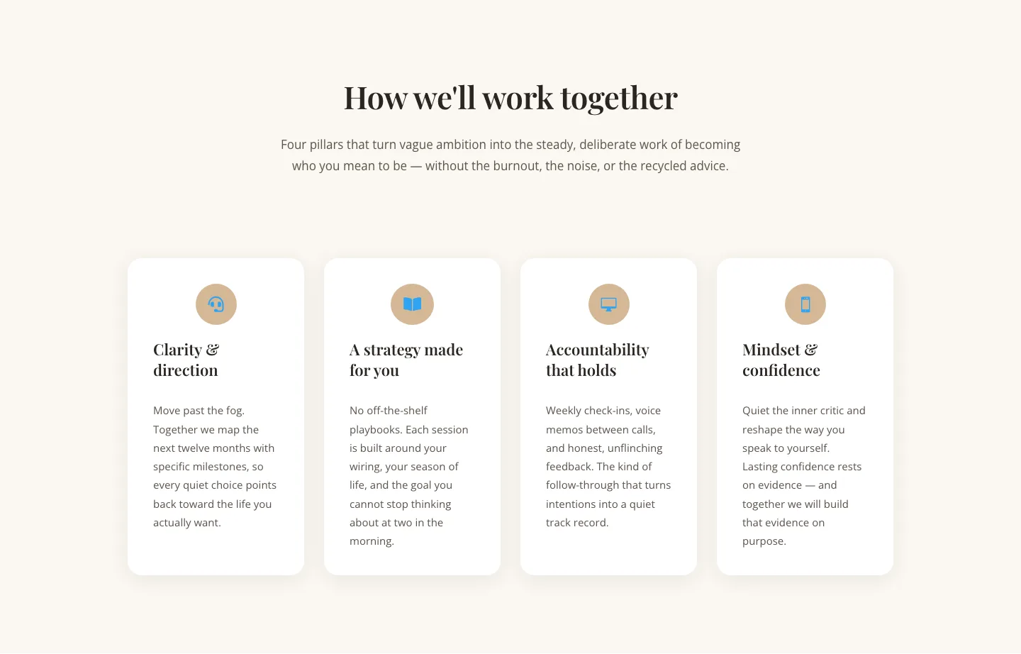
Elegant Coaching Cards Layout for Divi 5: Four-Pillar Framework
cards · coaching · elegant

Minimal SaaS Feature Cards Layout: 4-Column Divi 5 Section
cards · saas · minimal

Minimal SaaS Feature Cards Layout for Divi 5
cards · saas · minimal

Minimal SaaS Features Cards Layout for Divi 5
cards · saas · minimal

Minimal SaaS 3-Up Feature Cards Layout for Divi 5
cards · saas · minimal