
SaaS Feature Highlights: 4-Card Grid Layout for Divi 5
Minimal 4-card feature grid for SaaS landing pages. Clean white cards, indigo icons, and hover lift effects. Built in Divi 5 and ready to drop into your site.
Variations
Rate this element
Download this section, free
- Divi 5 JSON, imports in seconds
- Commercial license included
- No account needed
Click to view the full page
Overview
The section leads with a centered H2 sized 42px on desktop, stepping down to 34px on tablet and 28px on phone, followed by a supporting intro paragraph capped at 640px wide. That width limit keeps the header readable as a single glance rather than a wall of copy, and a 56px bottom margin on the header row cleanly separates the narrative from the grid below.
The card row uses a strict four-column layout at desktop widths: four equal 1_4 columns, flexWrap: nowrap, and a 28px gap in both directions. On tablet it flips to flex-wrap: wrap so the columns settle into a balanced 2×2 grid; on phone the row switches to flex-direction: column and every card stacks full-width. Each card sits on a pure white surface at 20px corner radius, padded 36px on all sides, with a soft slate shadow (0 6px 24px, rgba(15,23,42,0.08)) that deepens and translates the card up 6px on hover.
Inside every card, a circular light-indigo #eef2ff badge holds an indigo #4f46e5 icon, centered via width: fit-content custom CSS, followed by a 20px Inter H3 and a 15px Inter body paragraph. Everything inside the cards is center-aligned, so the badges, headings, and copy line up on a vertical spine.
The palette is deliberately quiet: a near-white #fafafa section background lets the white cards read as raised objects, while slate-900 headings (#0f172a) and slate-600 body copy (#475569) keep hierarchy legible without shouting. The only saturated hue in the section is the indigo, which doubles as the visual anchor for each pillar: analytics, API, integrations, and SOC 2.
What’s inside
- Single `divi/section` with a `#fafafa` background and 100px top/bottom padding (24px left/right), no full-bleed imagery to compete with the cards
- Header row: centered H2 (`Inter 700`, 42/34/28px responsive) plus a 640px-max intro paragraph, separated from the grid by a 56px bottom margin
- Card row of four equal `1_4` Divi columns with a 28px column and row gap; `flex-wrap: nowrap` on desktop, `wrap` on tablet (2×2), and `flex-direction: column` on phone
- Each card is a Divi Column at 20px border-radius, 36px padding on all sides, white background, and a `preset3` box shadow that intensifies from 24px blur to 44px blur on hover
- Hover transform on every card: a 6px upward translate paired with the deeper shadow, no JavaScript, all handled through Divi's Column settings
- Circular icon badges built from a `divi/icon` with `#eef2ff` fill, 22px padding, and 50% border-radius, centered via `selector { width: fit-content; margin: 0 auto; }` custom CSS
- Three Font Awesome icons (chart-line, code, wrench) plus one native Divi icon on the SOC 2 card. Swap any of them from the standard Icon module picker
- Native `divi/section`, `divi/row`, `divi/column`, `divi/heading`, `divi/icon`, and `divi/text` modules only: no shortcodes, no third-party plugins, no custom HTML
Who it’s for
Best suited for SaaS marketing pages, developer tools, and B2B product sites that need to summarize four core capabilities right after the hero. The restrained palette and disciplined typography also translate cleanly to fintech, cybersecurity, and enterprise software brands where minimalism reads as trustworthy. Freelancers and agencies building startup landing pages can drop it in as a "why us" or "product pillars" block, and product marketers spinning up feature or comparison microsites can use it almost as-is. The four-column structure specifically fits stories that break into four pillars (features, differentiators, benefits, or stack layers) so it's less ideal for two- or three-item narratives where the extra column would leave a visible gap.
Customization tips
Recolor the entire section by swapping four hex values: the #fafafa section background, the #4f46e5 icon color, the #eef2ff badge fill, and the slate tint inside the shadow's rgba(15,23,42, …). Keep the badge about 8–12% lighter than the icon color so the icon still reads at a glance. Card headings hold their shape up to about 26 characters; body paragraphs sit tightest between 100 and 160 characters, pushing past that will unbalance neighboring cards because the row uses alignItems: stretch and tall cards drag their siblings with them. If you swap the Font Awesome icons, stick to the same weight (fa 900) so stroke thickness stays consistent, or replace all four with native Divi icons if you'd rather ship without FA. There are no photos in the layout, so no image aspect ratios to manage; if you want to introduce imagery, replace a card's Icon module with an Image module and re-apply the circular badge styling manually. On landing pages that already feel dense, drop the section padding from 100px to about 72px.
How to install this layout
- Download the layout JSON file from this page.
- Open the target page in the Divi 5 builder.
- Open the portability panel (up/down arrows icon) and choose the Import tab.
- Upload the JSON. Tick “replace existing content” only for full-page imports.
- Check the page at desktop and mobile widths, then swap in your copy and images.
Full walkthrough with troubleshooting: How to Import a Divi 5 Layout.
Questions about SaaS Feature Highlights: 4-Card Grid Layout for Divi 5
How does the card row behave across breakpoints?
On desktop, the four cards sit in a single `flex-wrap: nowrap` row with a 28px gap in both directions. On tablet, the row is set to `flex-wrap: wrap` and each column shifts to a `12_24` sizing so you get a 2×2 grid. On phone, the row switches to `flex-direction: column` and every card stacks full-width, with the icon badge staying centered.
Which modules make up each card?
Every card is a Divi Column containing a `divi/icon`, a `divi/heading` (H3), and a `divi/text` module: no Blurb, no Icon Blurb combo, no custom HTML. That means every color, size, and font is editable through the standard module UI, and you can duplicate or reorder cards without unpacking a compound module.
What should I edit first after importing?
The four headings and their descriptions, then the icons. The order in the file is deliberate (analytics, API, integrations, SOC 2) so if your pillars are different, rewrite the copy before you touch colors so the visual weight stays balanced. Icons are the last edit because you'll want to pick them against your finalized headings.
Are there any images or photos in this layout?
No, the section is icon-driven only. Three cards use Font Awesome icons and one uses a native Divi icon inside a circular light-indigo badge, so there's no imagery to source and no aspect ratios to manage. That's also why the section imports and renders quickly out of the box.
How does the hover effect work, and can I disable it?
Each card has a hover transform that translates it 6px up on the Y axis, paired with a shadow that grows from a 24px blur at `rgba(15,23,42,0.08)` to a 44px blur at `rgba(15,23,42,0.18)`. Both states live on the Column, so you can turn them off from the Column → Transform and Box Shadow tabs if you'd rather keep the cards static.
Which Divi version does this layout need?
Divi 5. The layout is generated natively for Divi 5 and validated against its real module structure before publication, so it imports clean into the current builder.
Can I use this layout on client websites?
Yes. Every download includes a commercial license covering unlimited sites you own or build for clients. Only reselling or redistributing the layout file itself is prohibited.
More cards
Browse all cards
Elegant Coaching Services Cards: Divi 5 Layout
cards · coaching · elegant
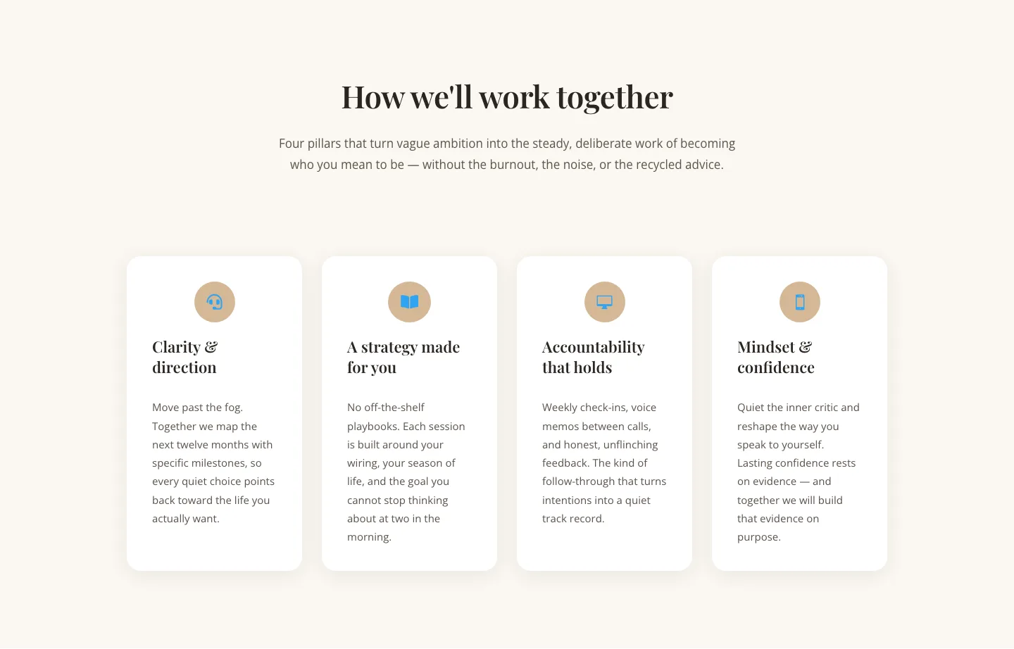
Elegant Coaching Cards Layout for Divi 5: Four-Pillar Framework
cards · coaching · elegant

Minimal SaaS Feature Cards Layout: 4-Column Divi 5 Section
cards · saas · minimal

Minimal SaaS Feature Cards Layout for Divi 5
cards · saas · minimal

Minimal SaaS Features Cards Layout for Divi 5
cards · saas · minimal

Minimal SaaS 3-Up Feature Cards Layout for Divi 5
cards · saas · minimal