
Minimal SaaS Feature Cards Layout: 4-Column Divi 5 Section
A clean, minimal Divi 5 feature cards layout for SaaS sites. Four equal columns with circular icons, hover lift, and crisp Inter typography on a soft gray backdrop.
Variations
Rate this element
Download this section, free
- Divi 5 JSON, imports in seconds
- Commercial license included
- No account needed
Click to view the full page
Overview
The section sets a 100px top/bottom rhythm on a soft #FAFAFA canvas, then leads with a centered intro row capped at 720px (a 44px Inter heading over an 18px subtitle in mid-slate) before a 60px gap opens onto four equal-width feature cards. On desktop the cards ride a nowrap row with a 24px column gap and alignItems: stretch, so they always match height even when one description runs a line longer than another.
Each card is a self-contained unit: 36px padding, 20px corner radius, a nearly invisible 1px slate border, and a soft preset3 box shadow. Hover lifts the card −6px on the Y axis and deepens the shadow over a 300ms transition, giving the section a quiet tactile response without any custom CSS. Inside each card, a rounded (999px) pastel icon chip anchors the top, followed by a 20px bold Inter heading and a 15px body paragraph at 1.65 line-height. A 16px row gap keeps the vertical rhythm consistent from card to card.
The palette does the heavy lifting: an almost-white background, deep slate #0F172A titles, mid-slate #475569 body copy, and four tint pairs (indigo #EEF2FF/#4F46E5, emerald #ECFDF5/#059669, rose #FFF1F2/#E11D48, cyan #ECFEFF/#0891B2) that color-code each benefit without shouting. On tablet the row wraps to a 2×2 grid (each column switches to 12_24); on phone flexDirection: column collapses the cards into a single stack and the intro heading scales 44px → 34px → 30px while body sizes hold, so nothing feels cramped on small screens.
What’s inside
- Section wrapper with 100px vertical padding on a #FAFAFA background: no horizontal padding, so it inherits your theme's content width
- Centered intro row (heading + one-sentence subhead) capped at a 720px column with a 60px bottom margin before the card row
- Second row of four equal 1/4 columns with a 24px column gap and `alignItems: stretch` so every card matches the tallest
- Card × 4 built from native Divi modules: white fill, 20px radius, 1px slate border, soft preset3 shadow, 36px padding, 16px row gap
- Hover interaction on every card, −6px Y translate plus a deeper shadow over a 300ms transition
- Rounded (999px) pastel icon chip per card in indigo, emerald, rose, and cyan. One Divi icon-set glyph and three Font Awesome
- Icon → Heading (20px Inter 700) → Text (15px Inter, 1.65 line-height) stack inside each card, all left-aligned
- Responsive breakpoints wired in: 2×2 grid on tablet, single-column stack on phone, heading scales down to 30px
Who it’s for
SaaS and B2B tech marketing pages that need to communicate four differentiators at a glance: analytics platforms, workflow automation tools, developer platforms, integration/API companies, and security or compliance products. The "icon chip + short headline + one-sentence proof" pattern is compact enough for a homepage benefits row and structured enough to sit mid-page below a hero. It also fits productivity apps, fintech dashboards, and early-stage startup landing pages where whitespace and clarity matter more than illustration. Because each card holds only a headline and roughly twenty words of body copy, it suits founders writing their own launch copy who don't want to source photography or commission custom illustrations.
Customization tips
Repalette in minutes by swapping the four icon tint pairs (background + icon fill) for your brand's supporting colors, the pastel-background-plus-saturated-icon pattern is the thing to preserve so the chips stay legible against white. Copy limits: card headings read best at 3–6 words (the 20px/1.3em line-height starts wrapping past that at desktop widths), and body sentences hold together at 15–25 words each; treat one to two short sentences per card as the ceiling. There are no images to worry about: every card uses the native Divi Icon module, so swap glyphs from Divi's icon picker rather than uploading SVGs. Want three cards instead of four? Change the row's column structure from 1_4,1_4,1_4,1_4 to 1_3,1_3,1_3: all card styling (padding, radius, shadow, hover lift) carries over unchanged. For a dark variant, invert to a #0F172A section background with #1E293B cards and keep the icon chips as accent glows.
How to install this layout
- Download the layout JSON file from this page.
- Open the target page in the Divi 5 builder.
- Open the portability panel (up/down arrows icon) and choose the Import tab.
- Upload the JSON. Tick “replace existing content” only for full-page imports.
- Check the page at desktop and mobile widths, then swap in your copy and images.
Full walkthrough with troubleshooting: How to Import a Divi 5 Layout.
Questions about Minimal SaaS Feature Cards Layout: 4-Column Divi 5 Section
How does this section behave on tablet and mobile?
On tablet the row wraps to a 2×2 grid (each column switches to a `12_24` flex type). On phone, `flexDirection: column` collapses the four cards into a single vertical stack. The intro heading scales 44px → 34px → 30px across breakpoints; the 15px body copy stays put so it never gets uncomfortably small.
Are the icons images, SVGs, or a Divi module?
They're Divi's native Icon module, no image uploads and no external SVGs to manage. Three cards use Font Awesome glyphs (chart-line, magic wand, shield) and one uses a Divi icon-set glyph. Color, size, and background chip are all editable inline from each icon's module settings.
Will all four cards stay the same height if my copy is uneven?
Yes. The row is set to `alignItems: stretch`, so every column matches the tallest card in the row. Even if one benefit description runs a line or two longer than the others. Backgrounds, borders, shadows, and the hover lift all stay perfectly aligned.
What's the first thing I should edit?
The four card headlines and their one-sentence subcopy, those decide whether the section reads as your value proposition or as a placeholder. The icon glyphs and their tint colors are the natural second pass; the intro heading and subtitle are the third.
Can I drop this to three cards or expand it to more?
Three works cleanly: delete a column and change the row's column structure from `1_4,1_4,1_4,1_4` to `1_3,1_3,1_3`. Six also works by duplicating the row (four across, two centered below): the card styling itself, including the hover animation, survives either change.
Which Divi version does this layout need?
Divi 5. The layout is generated natively for Divi 5 and validated against its real module structure before publication, so it imports clean into the current builder.
Can I use this layout on client websites?
Yes. Every download includes a commercial license covering unlimited sites you own or build for clients. Only reselling or redistributing the layout file itself is prohibited.
More cards
Browse all cards
Elegant Coaching Services Cards: Divi 5 Layout
cards · coaching · elegant

Minimal SaaS 3-Up Feature Cards Layout for Divi 5
cards · saas · minimal

Minimal SaaS Feature Cards Layout for Divi 5
cards · saas · minimal

Minimal SaaS Features Cards Layout for Divi 5
cards · saas · minimal

Elegant Coaching Cards Layout for Divi 5: Four-Pillar Framework
cards · coaching · elegant
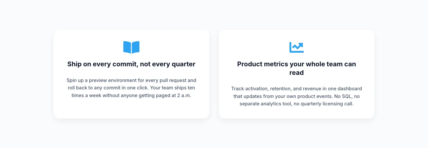
Minimal SaaS Two-Column Feature Cards
cards · saas · minimal