
Minimal SaaS How-It-Works Cards: 4 Numbered Steps | Divi 5 Layout
A clean 4-step "How it works" cards section for SaaS landing pages. Numbered indigo badges, soft shadows, hover lift: minimal Divi 5 layout, drop-in ready.
Variations
Rate this element
Download this section, free
- Divi 5 JSON, imports in seconds
- Commercial license included
- No account needed
Click to view the full page
Overview
This section opens with a stacked eyebrow-heading-subhead intro, then drops into a single row of four equal-width cards: a 4/4 intro row above a 1_4,1_4,1_4,1_4 grid, both wrapped in a #f8fafc section with 100px vertical padding so the cards float on a soft neutral instead of pure white. The eyebrow is a 13px #4f46e5 uppercase micro-label with 2px letter-spacing, followed by a 40px Inter heading in #0f172a and a 640px-capped 18px #475569 subhead that stays centered via auto side margins. The palette is deliberately restrained: one indigo accent (#4f46e5) does all the semantic work (eyebrow, step-number badges, and hover lift) while everything else sits on a slate scale (#0f172a for titles, #475569 for body, #ffffff cards on #f8fafc).
Each step card is built from two Text modules inside a padded column (36px on all sides, 20px radius, preset3 shadow at 8px/24px/-8px). The first Text renders the card title as an inline flex <h3> with a 40px circular indigo badge holding the step number and the label sitting to its right. That's why the numerals stay perfectly aligned with the title baseline instead of drifting above it. The second Text is a 15px #475569 body line with 1.6em leading, giving each card a two-line breathing room. On hover, the whole card translates -6px on Y and the shadow deepens to 18px/36px/-10px, which is the only motion in the section.
Responsive behavior is explicit in the JSON, not implied. The step row is flexWrap: nowrap on desktop with a 24px column gap; at tablet and tablet-wide it switches to flexWrap: wrap so cards break into a 2×2; on phone the row flips to flexDirection: column and each card takes the full 24_24 width. The heading also drops from 40px to 30px on phone so the intro doesn't dominate a small screen. Nothing here relies on images, icons libraries, or third-party assets. It's pure type, color, and layout, which is why it drops cleanly into any Divi 5 page without extra setup.
What’s inside
- Divi 5 Section → Row (4/4 intro) → Row (1_4,1_4,1_4,1_4 steps) → 4 Columns, each holding two native Text modules
- Numbered step badges rendered as inline `<h3>` with a 40px circular indigo pill: no icon plugin, no images, no external font files beyond Inter
- Section background `#f8fafc` with 100px top/bottom padding; each card is white with 36px padding, 20px corner radius, and a soft slate shadow (`preset3`, 8px/24px/-8px)
- Two-tier hover: `-6px` Y translate on the card plus a deeper 18px/36px/-10px shadow, configured on each column's decoration, no custom CSS
- Explicit responsive rules baked in: `flexWrap: nowrap` desktop, `wrap` on tablet + tablet-wide (2×2), `flexDirection: column` on phone (stack)
- Type system already wired: 13px uppercase indigo eyebrow with 2px tracking, 40px Inter heading (30px on phone), 18px `#475569` subhead capped at 640px, 15px 1.6em card body
- One-color accent system: `#4f46e5` is the only non-neutral, so recoloring the whole section to your brand is a single swatch swap
- Zero image dependencies: nothing to source, license, or replace before you ship the section live
Who it’s for
Built for SaaS marketing pages that need a clean, un-fussy "how it works": early-stage startup homepages, product tour landers, feature launches, and onboarding explainers where the conversation is about workflow, not visuals. It fits API companies, dashboard and analytics tools, developer platforms, no-code builders, fintech onboarding, and B2B automation products, where a four-step story (connect → configure → build → share) maps naturally onto four cards. Because the palette is monochrome-plus-one-indigo and there are no photos, it also works as a process section for agencies, consultancies, and productized services that want to look modern without shooting custom imagery. Avoid it for heavy visual brands, e-commerce category pages, or any story that genuinely needs more than four numbered steps.
Customization tips
To rebrand, change the single accent #4f46e5: it lives in the eyebrow color, the four step-badge backgrounds inside each <h3>, and nowhere else. Swap #0f172a (titles) and #475569 (body/subhead) as a pair if you want a warmer neutral scale; the section background #f8fafc and card #ffffff should stay light or invert together to keep the shadow readable. Copy limits from the JSON: step titles read best at 2–3 words ("Connect your stack"), card body at ~15–20 words / one to two lines so all four cards stay the same height; the intro heading works up to about 60 characters before wrapping past two lines. To add a fifth or sixth step, duplicate a column and change the row's columnStructure to 1_5,1_5,... or 1_6,.... The tablet 2×2 wrap will just become 2×3 automatically. If you want icons instead of numerals, replace the <span>1</span> inside each <h3> with an inline SVG at the same 40×40 dimensions and the alignment stays intact. No image aspect ratios apply, this section is image-free.
How to install this layout
- Download the layout JSON file from this page.
- Open the target page in the Divi 5 builder.
- Open the portability panel (up/down arrows icon) and choose the Import tab.
- Upload the JSON. Tick “replace existing content” only for full-page imports.
- Check the page at desktop and mobile widths, then swap in your copy and images.
Full walkthrough with troubleshooting: How to Import a Divi 5 Layout.
Questions about Minimal SaaS How-It-Works Cards: 4 Numbered Steps | Divi 5 Layout
How does it stack on tablet and phone?
The step row is set to `flexWrap: nowrap` on desktop, `wrap` on tablet and tablet-wide (so it breaks into a 2×2 grid), and `flexDirection: column` on phone so the four cards stack full-width. The intro heading also drops from 40px to 30px on phone.
What Divi 5 modules is this built from?
Only two: Section/Row/Column for the frame, and native Divi Text and Heading modules for content. The numbered badges are inline `<span>` elements inside the card `<h3>`, not a separate icon module. Nothing to install.
Are there any images to swap out?
No. The section is entirely type, color, and shape. That's why it renders identically on any site and why the free download has no photo licensing to worry about.
What should I edit first?
Edit the eyebrow ("HOW IT WORKS"), the 40px headline, and the four step titles + descriptions. If your brand color isn't indigo, do a find-and-replace on `#4f46e5` across the section. It's the only accent.
Can I use fewer than four steps?
Yes. Delete one or two columns and update the row's `columnStructure`: for three steps use `1_3,1_3,1_3`, for two use `1_2,1_2`. The card padding, shadow, and hover behavior are set per-column, so nothing else needs to change.
Does the hover animation work on touch devices?
The `-6px` translate and deeper shadow are wired to the desktop hover state, so they animate on mouse-in. On touch devices there's no persistent hover, so the cards render in their resting state. Which is intentional and doesn't break the layout.
Which Divi version does this layout need?
Divi 5. The layout is generated natively for Divi 5 and validated against its real module structure before publication, so it imports clean into the current builder.
Can I use this layout on client websites?
Yes. Every download includes a commercial license covering unlimited sites you own or build for clients. Only reselling or redistributing the layout file itself is prohibited.
More cards
Browse all cards
Elegant Coaching Services Cards: Divi 5 Layout
cards · coaching · elegant
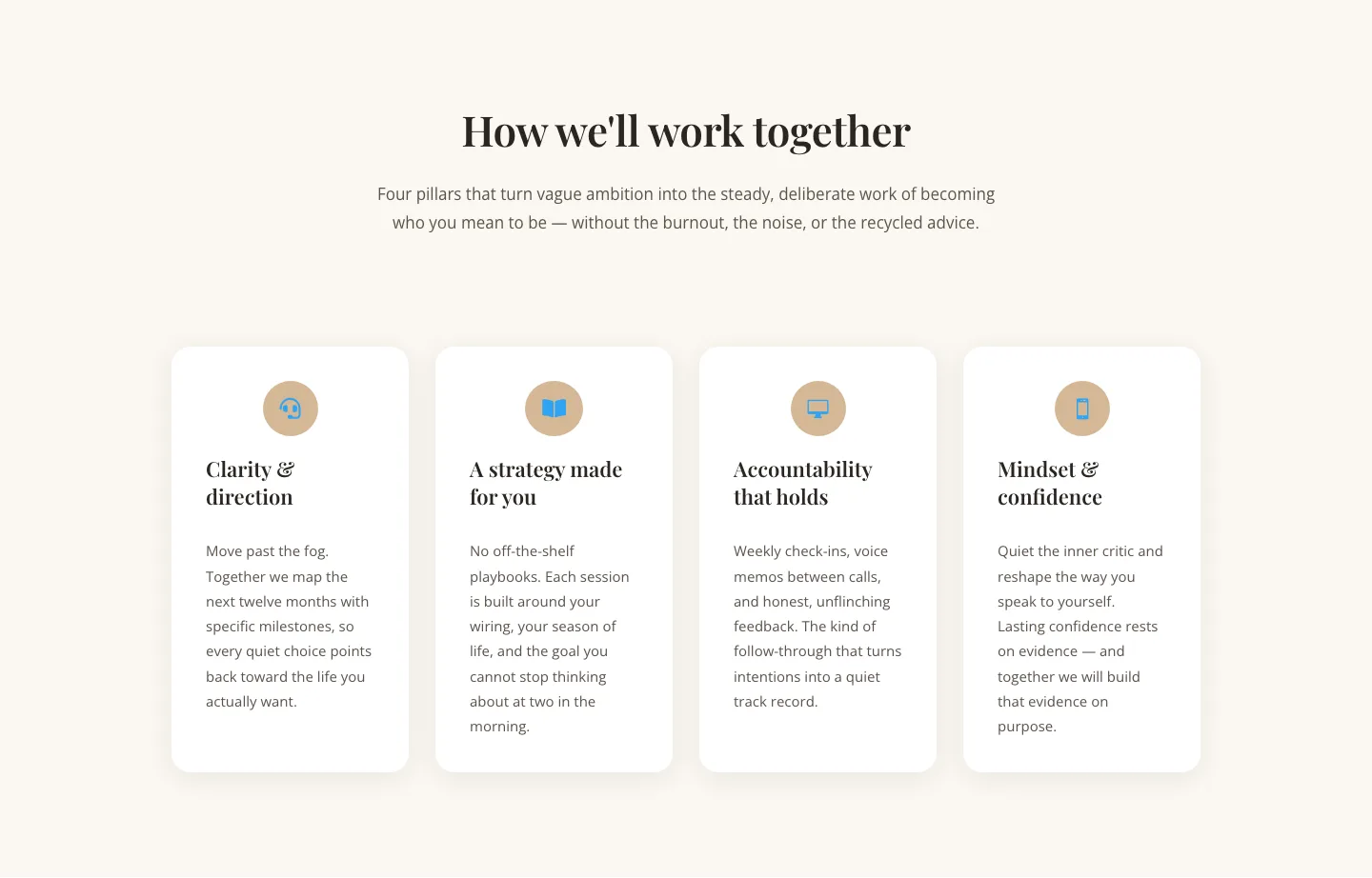
Elegant Coaching Cards Layout for Divi 5: Four-Pillar Framework
cards · coaching · elegant

Minimal SaaS Feature Cards Layout: 4-Column Divi 5 Section
cards · saas · minimal

Minimal SaaS Feature Cards Layout for Divi 5
cards · saas · minimal

Minimal SaaS Features Cards Layout for Divi 5
cards · saas · minimal

Minimal SaaS 3-Up Feature Cards Layout for Divi 5
cards · saas · minimal