
Minimal SaaS Four-Step Setup Cards Layout for Divi 5
Clean numbered four-step onboarding cards layout for SaaS sites. Built for Divi 5 with minimal styling, indigo accents, and hover lift effects.
Variations
Rate this element
Download this section, free
- Divi 5 JSON, imports in seconds
- Commercial license included
- No account needed
Click to view the full page
Overview
The section rests on a soft slate background (#F8FAFC) with generous 110px vertical padding, so the four cards feel like a quiet dashboard rather than a sales pitch. A centered intro anchors the top: a 44px Inter heading ("Set up Mesa in four focused steps.") capped at 720px, with a supporting paragraph in slate-600 (#475569) below it, capped at 620px so the eye never has to travel more than a comfortable measure.
Below the intro, four white cards sit in a 2×2 grid with a 32px column and row gap and alignItems: stretch, so cards in the same row match height even when copy runs longer on one side. Each card carries 20px rounded corners, 36px interior padding on all sides, and a soft rgba(15,23,42,0.06) box shadow. On hover, the card translates up by 6px and the shadow deepens. A small motion that reads as tactile without being noisy.
Inside every card the composition is identical: a 48px circular indigo badge (#4F46E5) holds the step number in bold white 18px Inter, sitting to the left of the step's H3 title (22px, weight 700, slate-900, tight -0.2px tracking). A short 16px paragraph in slate-600 with 1.65em line-height sits directly beneath, giving each step room to breathe.
On phone, the outer row switches to flexDirection: column, so the four cards stack full-width in numeric order. The badge-plus-heading strip keeps its inline layout inside each card, which preserves the numbered rhythm as you scroll: no reflow surprises, no cropped padding.
What’s inside
- Four numbered onboarding cards laid out as a 2×2 grid on desktop that stacks to a single column on phone
- Nested `1_5, 4_5` inner row per card that pairs a circular numbered badge with an H3 title on a single baseline
- Circular 48px indigo badges (`#4F46E5`) built from a Divi 5 text module: no icon dependencies, no external font
- Two-tier hierarchy: 44px centered section heading with 720px cap, plus 22px card headings and 16px body copy in Inter
- Card hover interaction: 6px upward translate paired with a `preset2` shadow that expands from 24px to 42px blur
- Stretch alignment across each 1_2 row so paired cards match height even when one description runs longer
- Slate-500 (`#F8FAFC`) section background with pure white cards, 20px synced corner radius, and 36px padding on all sides
- Native Divi 5 modules only (section, row, column, heading, and text) no third-party libraries or shortcodes
Who it’s for
Built for SaaS product pages that need to explain a setup, onboarding, or activation flow without slowing the scroll. It fits well on landing pages for developer tools, integrations, workflow automation, analytics dashboards, and any B2B product where the hook is "you're live before lunch." Because the badges are just text and the palette is neutral, it also works on help-center intros, launch-week pages, and pricing-adjacent "how it works" sections. Agencies can reuse it for any client whose story is a short, ordered sequence: think fintech onboarding, HR platform setup, or a course platform's first-week roadmap. If the story is longer than four beats or needs illustrations per step, this is the wrong section.
Customization tips
Palette changes are one-stop: swap the indigo (#4F46E5) badge color to your brand accent across all four cards, and adjust the section background (#F8FAFC) if you need warmer neutrals. The white card fill and slate-900 heading color rarely need touching. Keep card H3s to 2–5 words ("Connect your stack," "Retro in fifteen minutes"). Anything longer starts wrapping under the badge and breaks the grid rhythm. Body descriptions read best at 25–40 words, one to two sentences; the card padding was tuned for that range. There are no image slots, so you don't need to worry about aspect ratios. The entire section is type and geometry. To scale up or down, duplicate a card column for a 6-step version or delete one for 3; the intro paragraph copy caps at 620px, so keep it to one tight sentence.
How to install this layout
- Download the layout JSON file from this page.
- Open the target page in the Divi 5 builder.
- Open the portability panel (up/down arrows icon) and choose the Import tab.
- Upload the JSON. Tick “replace existing content” only for full-page imports.
- Check the page at desktop and mobile widths, then swap in your copy and images.
Full walkthrough with troubleshooting: How to Import a Divi 5 Layout.
Questions about Minimal SaaS Four-Step Setup Cards Layout for Divi 5
Which Divi 5 modules is each card built from?
Just three: a heading module for the H3 title, a text module for the badge number, and a text module for the description. The circular badge is a styled text module (50% radius, indigo background), not an icon or SVG. That keeps it dependency-free and easy to recolor.
Are there any images in this layout?
No. It is entirely type and geometry: cards, badges, headings, and paragraphs. That's part of the appeal: nothing to license, nothing to resize, and it renders instantly on slow connections.
How does it behave on phones?
The outer row flips to `flexDirection: column`, so the four cards stack full-width in numeric order. Inside each card the badge and heading still sit side-by-side on the same baseline, so the numbered rhythm survives the stack.
Can I change the number of steps?
Yes. Duplicate a card column to add a fifth or sixth step, or delete one for a 3-step version. If you drop below 4 or go above 6, consider adjusting the outer row's column structure (currently two 1_2 rows) so the grid stays balanced.
What should I edit first after import?
Rewrite the top H2 and its supporting paragraph to match your product, then replace the four card H3s with your actual step names. Descriptions come last, keep them to one or two sentences so the 2×2 grid stays even and cards in the same row match height.
Is the hover lift distracting?
It's a 6px translate with a slightly deeper shadow, which reads as tactile on desktop. On touch devices the transform doesn't fire on scroll, so mobile visitors see the resting state only. If you want it fully static, remove the `transform` and `boxShadow.hover` values from each card column.
Which Divi version does this layout need?
Divi 5. The layout is generated natively for Divi 5 and validated against its real module structure before publication, so it imports clean into the current builder.
Can I use this layout on client websites?
Yes. Every download includes a commercial license covering unlimited sites you own or build for clients. Only reselling or redistributing the layout file itself is prohibited.
More cards
Browse all cards
Elegant Coaching Services Cards: Divi 5 Layout
cards · coaching · elegant
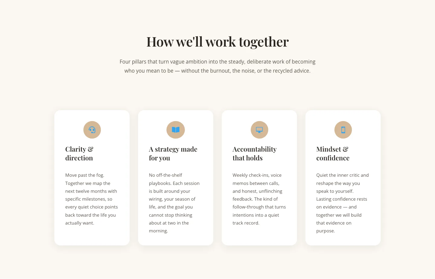
Elegant Coaching Cards Layout for Divi 5: Four-Pillar Framework
cards · coaching · elegant

Minimal SaaS Feature Cards Layout: 4-Column Divi 5 Section
cards · saas · minimal

Minimal SaaS Feature Cards Layout for Divi 5
cards · saas · minimal

Minimal SaaS Features Cards Layout for Divi 5
cards · saas · minimal

Minimal SaaS 3-Up Feature Cards Layout for Divi 5
cards · saas · minimal