
Minimal SaaS Feature Cards: Divi 5 Layout
Clean, minimal Divi 5 feature cards section for SaaS sites. Four icon cards highlight dashboards, integrations, SOC 2 compliance, and developer API.
Variations
Rate this element
Download this section, free
- Divi 5 JSON, imports in seconds
- Commercial license included
- No account needed
Click to view the full page
Overview
This is a features section built around a centered eyebrow headline and a 2×2 grid of four cards, framed by generous 100px vertical section padding on a soft #FAFBFC off-white canvas so the white cards visibly lift off the page. The intro block caps at a 640px max-width and is centered with margin: auto, giving the 40px/700 headline and the 18px supporting paragraph a comfortable reading measure before the grid begins 56px below.
Each card is a standalone column with 36px of interior padding on all sides, a 20px border radius, and a subtle preset shadow (0 8px 24px -6px rgba(15,23,42,0.08)) that deepens on hover into a taller 0 18px 40px -8px rgba(15,23,42,0.18) while the card lifts 6px via a Y-axis transform. Inside every card is a nested two-column row (1/4 + 3/4) that pairs a circular tinted icon badge with a right-hand stack of a 20px/700 heading and a 15px body paragraph at 1.65em line-height, a rhythm that keeps four different feature stories reading as one system.
The palette is deliberately restrained: near-black #0F172A for headings, slate #475569 for body copy, and four accent pairings on the icons, indigo (#4F46E5 on #EEF2FF), emerald (#059669 on #ECFDF5), amber (#B45309 on #FEF3C7), and rose (#BE123C on #FFE4E6). Because the color only lives inside the icon chips, swapping one feature's accent doesn't affect the others.
On phone, both outer rows switch to flexDirection: column, so the 2×2 grid stacks into a single vertical column of full-width cards. The inner icon+text row also collapses vertically at the phone breakpoint, moving each icon above its heading rather than beside it. Which keeps the 15px body copy readable without shrinking type.
What’s inside
- Centered intro block: 40px/700 headline plus a 640px-max-width, 18px slate supporting paragraph
- 2×2 responsive grid of four feature cards with a 32px column and row gap, wrapping to a single column on phone
- White cards on `#FAFBFC` canvas with 20px radius, 36px interior padding, and a preset shadow that deepens on hover
- Hover interaction: each card translates up 6px while the shadow expands, no color change needed
- Per-card inner layout: circular tinted icon badge (`1/4`) beside a heading + text stack (`3/4`), collapsing to a stacked column on phone
- Four pre-styled icon accent pairings (indigo, emerald, amber, rose) using the Divi Icon module. No external image assets required
- Native Divi 5 blocks only: Section, Row, Column, Heading, Text, and Icon, no third-party modules, no shortcodes
- 100px top and bottom section padding for clean drop-in between adjacent sections
Who it’s for
Built for SaaS marketing pages that need to explain four product pillars quickly: think a 'Why us' or 'What you get' section on a homepage, a pricing-page reassurance block, or a feature landing page for a specific persona. The restrained palette and card-based rhythm suit B2B analytics, dev tools, fintech infrastructure, HR platforms, and any product where trust matters more than personality. It also works for agencies presenting service pillars, consultants outlining a methodology in four steps, or MSPs listing coverage areas. If your brand is playful, illustrated, or photography-heavy, this will read too corporate; if it's clean, technical, and product-led, it will feel native.
Customization tips
Change accent colors at the icon module level only: each of the four cards has its own icon color and background color, so recoloring one card takes two clicks and leaves the others untouched. If you want the whole section on a single accent, set all four icon backgrounds to one tint (e.g., #EEF2FF) and match the icon fills. Copy fits best at short lengths: headings work up to about 32 characters before wrapping onto three lines, and body paragraphs read cleanest between 20 and 45 words, the card height is driven by content, so mismatched copy lengths will produce uneven card heights unless you equalize wording. To swap icons, edit each Icon module and pick from Divi's built-in FontAwesome or Divi icon sets. No images needed. To add a fifth or sixth card, duplicate a column inside one of the two rows and let the flexWrap: wrap handle overflow, or add a third row.
How to install this layout
- Download the layout JSON file from this page.
- Open the target page in the Divi 5 builder.
- Open the portability panel (up/down arrows icon) and choose the Import tab.
- Upload the JSON. Tick “replace existing content” only for full-page imports.
- Check the page at desktop and mobile widths, then swap in your copy and images.
Full walkthrough with troubleshooting: How to Import a Divi 5 Layout.
Questions about Minimal SaaS Feature Cards: Divi 5 Layout
How does the 2×2 grid behave on tablet and phone?
The two outer rows use `flexWrap: wrap` with a 32px gap, so on narrower screens the cards wrap naturally. On phone specifically, both rows are forced to `flexDirection: column`, which stacks all four cards into a single full-width column.
What Divi 5 modules does this section actually use?
Just five: Section, Row, Column, Heading, Text, and Icon. No third-party plugins, no custom shortcodes, no Code modules. Everything renders with native Divi 5 blocks at builder version 5.8.0.
Does the layout need any images?
No. The four icon badges use Divi's built-in FontAwesome and Divi icon sets, colored via the Icon module's color setting. You can ship this section without uploading a single image.
What should I edit first after importing?
Start with the four card headings and body paragraphs, then the intro headline and subheading. After the copy is locked, decide whether to keep the four-color icon palette or unify to a single brand accent by editing each Icon module's color and background fields.
How does the hover effect work, is it CSS I'll need to maintain?
No custom CSS. The lift is a Divi transform on the column (translate Y -6px on hover) and the shadow change is a hover state on the column's box shadow preset. Both are edited from the Divi visual builder, not from a stylesheet.
Can I add a fifth or sixth feature card?
Yes. Duplicate one of the existing card columns inside either row (the row's `flexWrap: wrap` will push extras to a new line) or add a third `1/2 + 1/2` row below the second one and copy two cards into it.
Which Divi version does this layout need?
Divi 5. The layout is generated natively for Divi 5 and validated against its real module structure before publication, so it imports clean into the current builder.
Can I use this layout on client websites?
Yes. Every download includes a commercial license covering unlimited sites you own or build for clients. Only reselling or redistributing the layout file itself is prohibited.
More cards
Browse all cards
Elegant Coaching Services Cards: Divi 5 Layout
cards · coaching · elegant
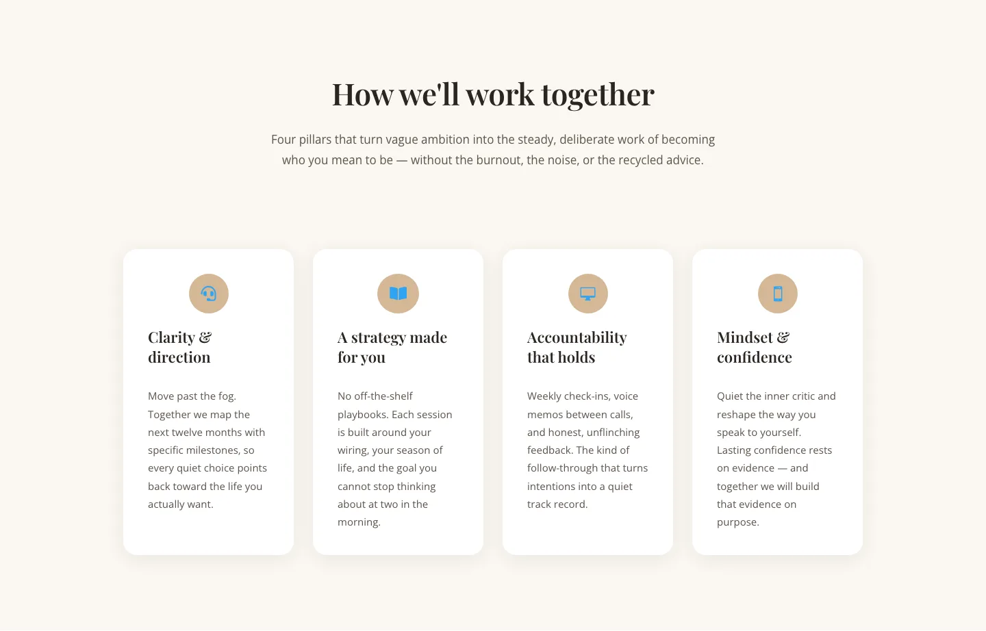
Elegant Coaching Cards Layout for Divi 5: Four-Pillar Framework
cards · coaching · elegant

Minimal SaaS Feature Cards Layout: 4-Column Divi 5 Section
cards · saas · minimal

Minimal SaaS Feature Cards Layout for Divi 5
cards · saas · minimal

Minimal SaaS Features Cards Layout for Divi 5
cards · saas · minimal

Minimal SaaS 3-Up Feature Cards Layout for Divi 5
cards · saas · minimal