
Minimal SaaS 2-Up Cards with Circular Icon Badges: Divi 5 Layout
Clean two-column Divi 5 cards section for SaaS sites. Circular icon badges, soft shadows, hover lift, and centered copy on a light gray background.
Variations
Rate this element
Download this section, free
- Divi 5 JSON, imports in seconds
- Commercial license included
- No account needed
Click to view the full page
Overview
This section opens with a centered eyebrow block: an H2 headline in Inter 700 at 44px with a tight -0.5px letter-spacing, sitting above a 640px-capped intro paragraph in slate-gray (#475569). That capped width keeps the supporting sentence from stretching across the full container, which is what makes minimal SaaS layouts feel intentional instead of empty. Below it, two equal 1/2 columns hold the value-prop cards, separated by a 32px column gap and stretched to matching heights via alignItems: stretch. So uneven copy never leaves one card looking taller than the other.
Each card is built as a white column on the section's #F7F8FA canvas, wrapped with a 20px radius, a hairline rgba(15,23,42,0.06) border, and a soft preset-3 shadow that deepens on hover while the whole card lifts 6px on the Y axis. Inside, a circular icon badge (18px padding, 50% radius) sits centered (tinted indigo #EEF2FF/#4F46E5 on the first card and mint #ECFDF5/#059669 on the second) followed by a 22px H3, a 16px body paragraph, and a bold inline text link colored to match each badge. The card interior uses display: flex with flexDirection: column and an 18px rowGap, so vertical rhythm stays consistent regardless of copy length.
On tablet, the row switches to flexWrap: wrap with a 24px rowGap; on phone, the row flips to flexDirection: column and every column reflows to full 24/24 width. Heading sizes also drop (44 → 34 → 30px) so the hierarchy holds without horizontal scroll. The palette leans on a near-black #0F172A for headings, #475569 for body copy, and the two accent hues reserved for icon badges and links, which is the entire reason the section reads as calm and product-focused rather than decorative.
What’s inside
- Divi Section with a soft #F7F8FA background, 100px vertical padding, and a 48px rowGap that separates the intro row from the cards row
- Centered intro row with an H2 heading (Inter 700, 44px desktop / 34px tablet / 30px phone, -0.5px letter-spacing) and a 640px max-width subheading
- Two-column cards row (1_2, 1_2) with 32px column gap, `alignItems: stretch` for equal heights, and `flexWrap` set to wrap on tablet
- Card columns built as Divi Columns with white background, 20px border-radius, 1px hairline border, 36px inner padding, and preset-3 box shadow
- Hover state that swaps to a deeper shadow and translates the card -6px on the Y axis for a subtle lift
- Divi Icon module rendered as a circular badge (50% radius, 18px padding) with distinct tint pairs per card: indigo `#EEF2FF/#4F46E5` and mint `#ECFDF5/#059669`
- Per-card stack of H3 (22px Inter 700), 16px body Text, and a bold inline link Text that inherits the badge accent color
- Mobile behavior handled at the row level: `flexDirection: column` on phone and 24/24 flexType on every column for full-width stacking
Who it’s for
This section is built for SaaS marketing pages that need to communicate two flagship benefits (usually a speed/ease pillar paired with a trust/security pillar) without dominating the page. It fits developer tools, API platforms, fintech dashboards, cybersecurity products, HR and payroll apps, analytics tools, and B2B workflow software where the buyer expects a calm, product-forward aesthetic. It also translates cleanly to professional services (agencies, consultancies, legal-tech) that pitch two headline capabilities, and to any post-hero section that needs to reinforce a positioning statement before the visitor scrolls into pricing or a longer feature grid.
Customization tips
Swap the two badge accents first: the indigo #4F46E5 and mint #059669 are wired into both the icon color and the inline link color per card, so change them together to keep each card's story visually unified. To match your brand, restyle at the preset level: adjust the section background (#F7F8FA) and card background (#FFFFFF) for a dark variant, and pick two accent hues with similar tonal contrast. Copy limits are strict: keep card H3s to 3–6 words and body paragraphs to roughly 20–35 words so the two cards stay balanced under alignItems: stretch. The intro paragraph is capped at 640px, so aim for 15–25 words there. This section is icon-only (no imagery to size) but if you swap the FontAwesome glyphs, stay in the same visual weight (solid, 900) so the badges read consistently. Duplicate a column to move from 2-up to 3-up; the row's flex settings will accommodate it.
How to install this layout
- Download the layout JSON file from this page.
- Open the target page in the Divi 5 builder.
- Open the portability panel (up/down arrows icon) and choose the Import tab.
- Upload the JSON. Tick “replace existing content” only for full-page imports.
- Check the page at desktop and mobile widths, then swap in your copy and images.
Full walkthrough with troubleshooting: How to Import a Divi 5 Layout.
Questions about Minimal SaaS 2-Up Cards with Circular Icon Badges: Divi 5 Layout
Is this section responsive out of the box?
Yes. The cards row uses `flexWrap: wrap` with a 24px rowGap on tablet, and switches to `flexDirection: column` on phone so each card takes full width. The intro heading also steps down from 44px to 34px on tablet and 30px on phone.
Which Divi 5 modules make up this section?
Native Divi 5 only: one Section, two Rows, four Columns, two Heading modules (H2 and two H3s), five Text modules for the intro, card body copy, and inline links, and two Icon modules used as circular badges. No third-party modules or custom HTML.
How do I change the icons in the badges?
Open each Icon module and pick a new FontAwesome glyph. The badges rely on 50% border-radius plus 18px padding on a tinted background, so as long as you keep the icon size around 28px, any solid-weight icon will sit correctly inside the circle.
Can I turn this into a 3-up or 4-up card grid?
Yes. Duplicate one of the 1/2 columns and change the row's column structure, 1_3 for three cards or 1_4 for four. The card styling (padding, radius, shadow, hover lift) lives on the column itself, so duplicates carry it automatically.
What should I edit first after importing?
Start with the H2 and intro paragraph in the top row, those set the section's promise. Then swap each card's H3, body copy, badge icon, badge tint, and the inline link URL and label. The 640px intro width and per-card copy lengths are the guardrails to respect.
Are the inline links required?
No. Each card ends with a bold Text module that acts as an inline CTA link. If you don't want a secondary action, delete that Text module: the card's rowGap will re-space the remaining heading, body, and badge cleanly.
Which Divi version does this layout need?
Divi 5. The layout is generated natively for Divi 5 and validated against its real module structure before publication, so it imports clean into the current builder.
Can I use this layout on client websites?
Yes. Every download includes a commercial license covering unlimited sites you own or build for clients. Only reselling or redistributing the layout file itself is prohibited.
More cards
Browse all cards
Elegant Coaching Services Cards: Divi 5 Layout
cards · coaching · elegant
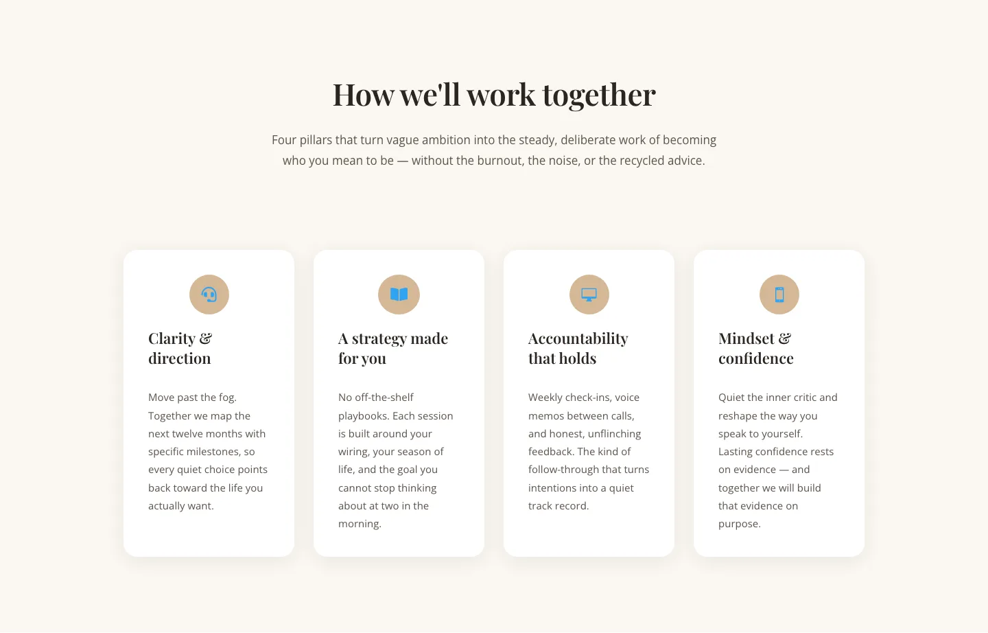
Elegant Coaching Cards Layout for Divi 5: Four-Pillar Framework
cards · coaching · elegant

Minimal SaaS Feature Cards Layout: 4-Column Divi 5 Section
cards · saas · minimal

Minimal SaaS Feature Cards Layout for Divi 5
cards · saas · minimal

Minimal SaaS Features Cards Layout for Divi 5
cards · saas · minimal

Minimal SaaS 3-Up Feature Cards Layout for Divi 5
cards · saas · minimal