
Minimal SaaS Two-Step Onboarding Cards for Divi 5
A clean two-card Divi 5 layout that walks SaaS visitors through a numbered onboarding flow (connect your stack, then ship dashboards) in a minimal style.
Variations
Rate this element
Download this section, free
- Divi 5 JSON, imports in seconds
- Commercial license included
- No account needed
Click to view the full page
Overview
This is a two-step onboarding section that keeps the eye on a single job: showing that the product goes from zero to value in exactly two moves. The section sits on a warm off-white #FAFAFA canvas with 96px of vertical breathing room, so the cards float rather than crash into the surrounding content. Above the cards, an intro row centers an H2 in Inter 700 at 42px with tight -0.02em letter-spacing, capped by a 640px-wide supporting paragraph in muted slate (#475569). A classic minimal SaaS hierarchy that reads confident without shouting.
Below the intro, a 1080px 1_2, 1_2 row holds two equal white cards separated by a 32px gap. Each card is padded 36px on all sides, rounded to 20px, ringed with a hairline rgba(15,23,42,0.06) border, and lifted by a soft preset3 shadow. On hover, a 300ms transition slides each card up by 6px and deepens the shadow. A subtle interaction that signals "click me" without animation clutter. Inside every card you get a 56px circular step badge (solid #0F172A for step 1, indigo #4F46E5 for step 2, both with white numerals), an H3 title, a plain-language paragraph, and an indigo inline link that anchors to a deeper section (#integrations, #templates).
The palette is disciplined: near-black ink, slate body copy, off-white background, white cards, and one accent (indigo) used for the second step, the links, and the link hover state (#3730A3). That single-accent discipline is what makes the section feel like modern SaaS rather than a generic template. On phones, the row switches to flexDirection: column so the two cards stack full-width, the H2 drops to 30px, and the internal centering keeps the badges, headings, and CTAs vertically aligned end-to-end. Nothing overflows, nothing needs a horizontal scroll: the section was built with the mobile stack in mind, not retrofitted.
What’s inside
- Two-column `1_2, 1_2` row of onboarding cards, capped at 1080px and centered with a 32px column gap that collapses to a stack on phones
- 56px circular numbered step badges built from a styled Divi Text module (one dark (`#0F172A`), one indigo (`#4F46E5`)) no icon fonts or images required
- Centered intro row with an H2 headline and a 640px-max supporting paragraph, so the copy reads as a single confident statement above the cards
- Per-card structure: badge → H3 title → body copy → inline anchor link, with a 16px row gap keeping the internal rhythm consistent
- Hover interaction on each card: 6px lift and deepened shadow via a 300ms transition, defined once in free-form CSS on the column
- Rounded 20px card corners with a 1px hairline border and preset3 box-shadow, giving the cards subtle depth against the `#FAFAFA` background
- Fully typed Inter font stack across headings, body, and badges, with tight `-0.02em` / `-0.01em` letter-spacing on titles
- Mobile behavior baked in: row flex direction switches to column, H2 scales from 42px to 30px, and column flexType shifts to full width
Who it’s for
This section was designed for product-led SaaS companies whose onboarding really can be told in two moves: connect a data source, then ship the output. It fits analytics tools, dashboarding platforms, no-code builders, integration hubs, and any B2B product where the pitch is "skip the engineering ticket." It also works well for developer tools with a two-step "install → deploy" story, workflow automation apps, and internal-tools platforms. Because the copy is generic enough to swap but structured enough to feel intentional, it's a good drop-in for a homepage "how it works" strip, a pricing-page reassurance section, or the middle of a landing page where prospects need one more nudge before hitting the CTA.
Customization tips
Palette-wise, the section is driven by four colors: background #FAFAFA, ink #0F172A, body slate #475569, and indigo accent #4F46E5 (with #3730A3 on link hover). Swap the accent globally to rebrand: change both step-2 badge fill and the two link colors to your brand hue. For headlines, keep the H2 at roughly 8–12 words so the tight -0.02em letter-spacing still reads clean; card H3s work best at 3–6 words. Card body paragraphs should land around 25–40 words, much more and the two cards will drift in height and break the alignItems: stretch symmetry. If you add a third step, duplicate a column and change the row structure to 1_3, 1_3, 1_3; reduce card padding to 28px so the row still fits inside 1080px comfortably. No images are used, so there are no aspect ratios to worry about: but if you drop a screenshot into a card, keep it 16:9 and place it above the badge.
How to install this layout
- Download the layout JSON file from this page.
- Open the target page in the Divi 5 builder.
- Open the portability panel (up/down arrows icon) and choose the Import tab.
- Upload the JSON. Tick “replace existing content” only for full-page imports.
- Check the page at desktop and mobile widths, then swap in your copy and images.
Full walkthrough with troubleshooting: How to Import a Divi 5 Layout.
Questions about Minimal SaaS Two-Step Onboarding Cards for Divi 5
How does this two-card layout behave on mobile?
The parent row's `flexDirection` flips to `column` on the phone breakpoint, so the two cards stack full-width with the same 32px vertical gap. The H2 also scales from 42px to 30px, and each column's `flexType` becomes `24_24` so the cards stretch edge to edge inside the section's 24px side padding.
Are the numbered badges icons or something I can edit?
They're styled Divi Text modules, a `<p>1</p>` and `<p>2</p>` wrapped in a 56px circle via free-form CSS. To change the numeral, just edit the text; to change the color, edit the module's background. No icon library, no image upload, no font-awesome dependency.
What's the hover animation on the cards, and can I turn it off?
Each card lifts 6px on hover and its shadow deepens, driven by a `transition: transform 300ms ease, box-shadow 300ms ease` rule in the column's free-form CSS plus a hover transform. Remove the CSS block and the hover shadow preset to make the cards static.
Can I add a third step without breaking the layout?
Yes: duplicate one of the `1_2` columns and change the row's `columnStructure` to `1_3, 1_3, 1_3`. Because the row is capped at 1080px with a 32px gap, three cards fit comfortably; you may want to drop card padding from 36px to about 28px to keep the numbered badge, heading, and paragraph from feeling cramped.
What should I edit first after importing?
Start with the H2 and the intro paragraph, they set the tone. Then rewrite each card's H3 and the paragraph beneath it to match your actual two-step flow. Finally, point the two inline anchor links (`#integrations` and `#templates`) at real destinations on your site.
Does this section use any images or stock photos?
No. The entire section is type, color, and shape: one background color, two white cards, two colored circles, and Inter throughout. That's why it loads instantly and why the free download is a single JSON file with no asset dependencies.
Which Divi version does this layout need?
Divi 5. The layout is generated natively for Divi 5 and validated against its real module structure before publication, so it imports clean into the current builder.
Can I use this layout on client websites?
Yes. Every download includes a commercial license covering unlimited sites you own or build for clients. Only reselling or redistributing the layout file itself is prohibited.
More cards
Browse all cards
Elegant Coaching Services Cards: Divi 5 Layout
cards · coaching · elegant
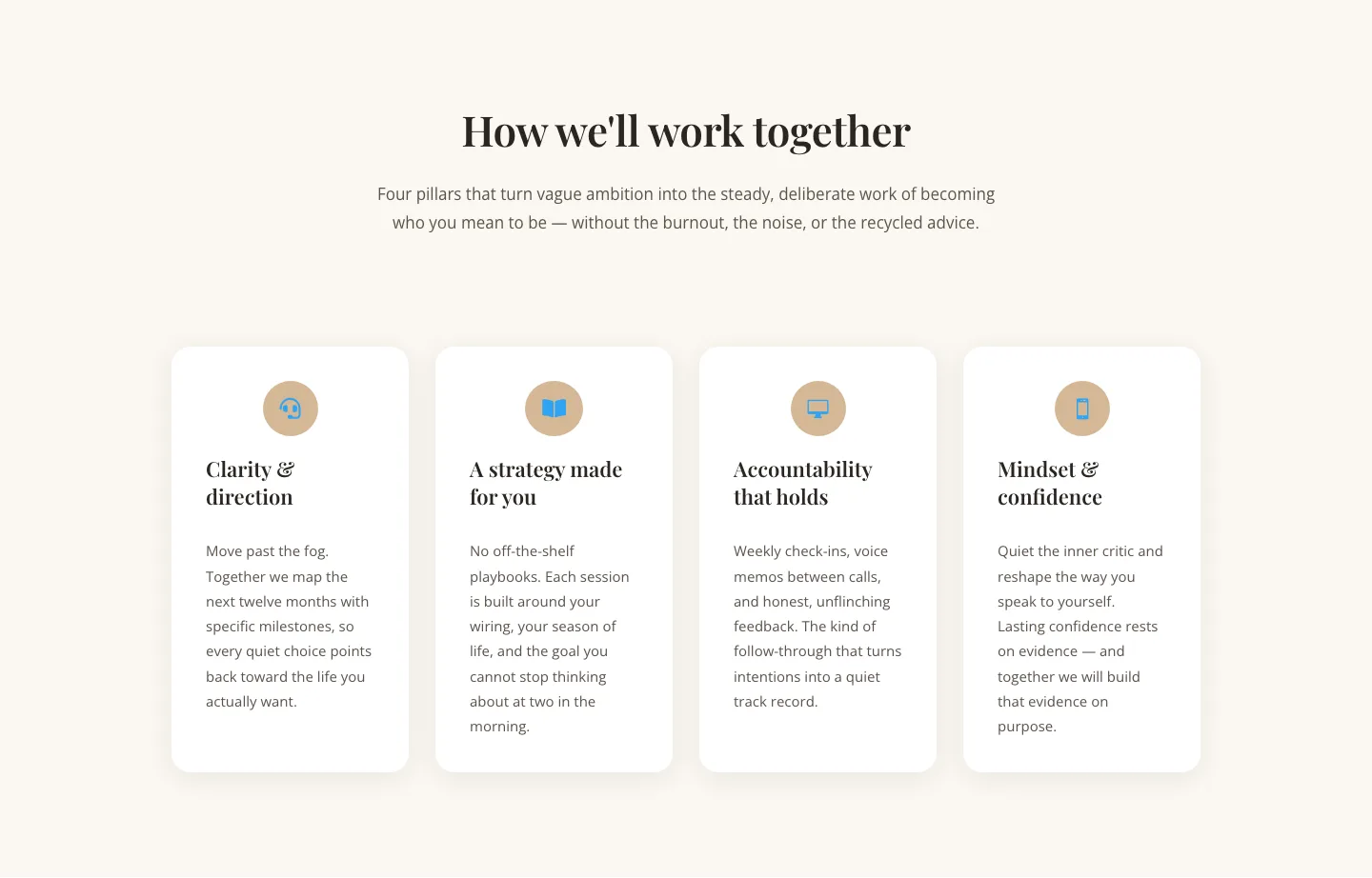
Elegant Coaching Cards Layout for Divi 5: Four-Pillar Framework
cards · coaching · elegant

Minimal SaaS Feature Cards Layout: 4-Column Divi 5 Section
cards · saas · minimal

Minimal SaaS Feature Cards Layout for Divi 5
cards · saas · minimal

Minimal SaaS Features Cards Layout for Divi 5
cards · saas · minimal

Minimal SaaS 3-Up Feature Cards Layout for Divi 5
cards · saas · minimal