
Minimal SaaS Two-Column Feature Cards
A minimal two-column SaaS feature cards layout for Divi 5 with centered icons, hover lift, and soft shadows on a light slate background.
Variations
Rate this element
Download this section, free
- Divi 5 JSON, imports in seconds
- Commercial license included
- No account needed
Click to view the full page
Overview
This is a single-section, two-column feature layout built on a soft slate canvas (#F8FAFC) with 100px of vertical breathing room top and bottom. The two cards sit side by side in an equal 1/2 + 1/2 row with a 32px column gap and align-items: stretch, so both cards match height even when one paragraph runs longer than the other. Each card is a self-contained white surface with 20px rounded corners, 36px of padding on all four sides, and a soft slate shadow (rgba(15,23,42,0.08)) that deepens on hover while the card lifts 6px. A subtle interaction that signals clickability without shouting.
Inside each card the hierarchy is deliberately quiet and centered: a 48px Font Awesome icon on top, an Inter 22px/1.3 h3 in near-black (#0F172A), and a 16px/1.6 body paragraph in muted slate (#475569). The 18px row gap between those three elements keeps the rhythm consistent card-to-card, and the shared Inter family means the section reads as one voice rather than two competing tiles. Because the copy is centered and the icons anchor the top, the eye lands on the icon, drops to the headline, then settles on the supporting sentence. The exact scan pattern you want in a feature grid.
Mobile behavior is handled at the row level rather than by duplicating styles. On tablet the row switches to flex-wrap: wrap, and on phone it goes flex-direction: column with each column forced to full width (flexType: 24_24). That means the cards stack cleanly without the 32px gap collapsing awkwardly, and the padding, radii, and shadows carry over untouched: so the phone view still looks like a considered card, not a squeezed desktop.
What’s inside
- Full-width Divi 5 Section with a `#F8FAFC` slate background and 100px top/bottom padding for a calm, uncluttered feel
- Two-column row (`1_2, 1_2`) with equal columns, 32px column gap, and `align-items: stretch` so both cards match height regardless of copy length
- Two identical white feature cards with 20px rounded corners, 36px all-around padding, and an 18px internal row gap
- Preset-3 box shadow with a hover state that deepens the shadow and lifts each card 6px on the Y axis
- One 48px centered Font Awesome icon per card (rocket / chart), swap-ready via the icon picker
- Two Inter h3 headings at 22px/1.3, weight 700, in `#0F172A` for a strong but restrained hierarchy
- Two Inter body paragraphs at 16px/1.6 in `#475569`, center-aligned to match the icon and heading
- Explicit tablet wrap and phone stack behavior so the cards reflow to a single column without extra breakpoint work
Who it’s for
Built for SaaS marketing pages where two capabilities deserve equal billing: think a landing page pairing "shipping" with "analytics," or a homepage feature block that contrasts two flagship product pillars. It also works cleanly for developer tools, dev-ops platforms, product analytics companies, and API-first startups where the audience expects a quiet, engineering-friendly aesthetic rather than gradients and illustrations. Because the cards are icon-led and copy-light, it slots in equally well on B2B agency sites, internal tool marketing pages, and pricing-page "why us" sections. It is not the right pick when you need three or four features in a single row, or when the story requires imagery. This layout is deliberately restrained to two focused points.
Customization tips
The palette lives in three places: the section background (#F8FAFC), the card background (#FFFFFF), and the two text colors (#0F172A heading, #475569 body). Change those four values in Divi's color pickers and the whole section rethemes in under a minute: a warmer off-white plus a charcoal heading, for example, will give you a totally different mood without touching structure. Headings read best around 4–7 words; go longer and the centered h3 wraps to three lines and breaks the visual rhythm between cards. Body paragraphs are tuned for 2–3 sentences (roughly 25–40 words), that keeps both cards close in height so the stretch alignment still looks intentional. Icons are Font Awesome unicode entries, so pick a matching pair from the same weight (both 900 here) to preserve visual balance. There are no images to swap, so you never need to worry about aspect ratios; if you do add one, keep it inside the card padding and consider bumping the border-radius to 24px to match.
How to install this layout
- Download the layout JSON file from this page.
- Open the target page in the Divi 5 builder.
- Open the portability panel (up/down arrows icon) and choose the Import tab.
- Upload the JSON. Tick “replace existing content” only for full-page imports.
- Check the page at desktop and mobile widths, then swap in your copy and images.
Full walkthrough with troubleshooting: How to Import a Divi 5 Layout.
Questions about Minimal SaaS Two-Column Feature Cards
How does this section behave on mobile?
On tablet the row switches to `flex-wrap: wrap`, and on phone it goes to `flex-direction: column` with each card forced to 24/24 width. The cards stack in order (card one on top, card two below) and keep their 36px padding, 20px radius, and shadow intact.
What Divi 5 modules are actually used?
Just three module types, six modules total: a Section, a Row with two Columns, and inside each column an Icon module, a Heading module, and a Text module. No blurbs, no counters, no third-party dependencies.
Are there any images to replace?
No, the layout is entirely icon and type. Each card uses a 48px Font Awesome icon (rocket and chart-line in the shipped version). You can swap them via Divi's icon picker without touching the media library.
What should I edit first to make this my own?
Start with the two headings and body paragraphs, then swap the two icons to match your feature pair. If your brand isn't slate-and-white, change the section background, card background, and the two text colors. Those four values retheme the entire section.
Why do both cards stay the same height even when one has more text?
The row uses `align-items: stretch` and both columns are set to equal 1/2 widths, so Divi 5 grows the shorter card to match the taller one. This is why keeping body copy within 2–3 sentences per card looks best, the stretch stays subtle.
Does the hover lift work on touch devices?
The `translateY(-6px)` and deeper shadow are triggered by the `:hover` state, which touch devices generally don't fire until tapped. On desktop you get the full lift-and-shadow interaction; on mobile the cards sit statically, which is the right behavior for a touch interface.
Which Divi version does this layout need?
Divi 5. The layout is generated natively for Divi 5 and validated against its real module structure before publication, so it imports clean into the current builder.
Can I use this layout on client websites?
Yes. Every download includes a commercial license covering unlimited sites you own or build for clients. Only reselling or redistributing the layout file itself is prohibited.
More cards
Browse all cards
Elegant Coaching Services Cards: Divi 5 Layout
cards · coaching · elegant
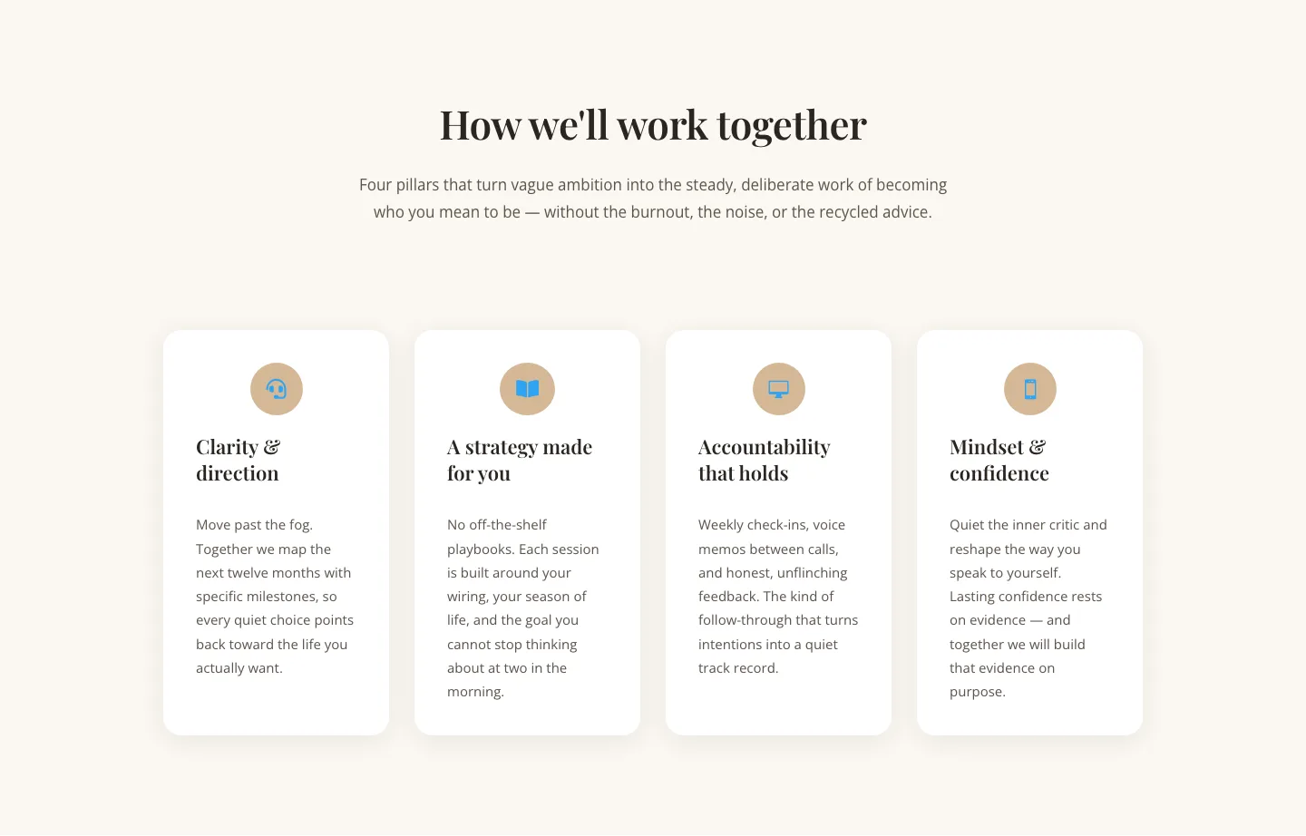
Elegant Coaching Cards Layout for Divi 5: Four-Pillar Framework
cards · coaching · elegant

Minimal SaaS Feature Cards Layout: 4-Column Divi 5 Section
cards · saas · minimal

Minimal SaaS Feature Cards Layout for Divi 5
cards · saas · minimal

Minimal SaaS Features Cards Layout for Divi 5
cards · saas · minimal

Minimal SaaS 3-Up Feature Cards Layout for Divi 5
cards · saas · minimal