
Cards: Minimal SaaS
A clean, minimal Divi 5 four-card feature section for SaaS sites: soft shadows, rounded corners, FontAwesome icons, and conversion-focused capability copy.
Variations
Rate this element
Download this section, free
- Divi 5 JSON, imports in seconds
- Commercial license included
- No account needed
Click to view the full page
Overview
The section opens with a centered intro block: a 44px display heading (weight 700, tight -0.02em tracking on #0F172A) sitting above an 18px muted subhead in #475569. The whole intro is capped at a 720px max-width column and pushed to the horizontal center, so it reads as a single tight lockup instead of stretching edge-to-edge. Below it, a four-column row (1_4,1_4,1_4,1_4) presents the feature cards with a 24px column gap and stretched vertical alignment, meaning every card ends at the same baseline regardless of copy length.
Each card is an all-white column on the section's near-white #FAFBFC canvas, a deliberately quiet contrast that lets the color come from the icons rather than the containers. Cards use 36px of internal padding on every side, a 20px border-radius, and a soft preset3 shadow (0/8/28/-10 at ~8% slate). On hover the card lifts 6px and the shadow deepens to 0/20/44/-12 at ~18%, giving a controlled interaction instead of a flashy one. Inside, a 40px centered icon sits on its own row, followed by a 20px bold title and a 15px body paragraph at 1.65 line-height. Icon accents rotate through indigo #4F46E5, sky #0EA5E9, green #16A34A, and pink #DB2777: one card uses a Divi glyph, the other three pull from Font Awesome.
Responsive behavior is baked in: at tablet the row wraps to a 2-up grid with a 24px row gap, and on phone it collapses to a single stacked column with a 20px row gap. Padding, radii, and shadows stay the same across breakpoints, so the cards feel like the same component whether you're seeing four across or one at a time.
What’s inside
- Centered intro lockup: 44px H2 with -0.02em tracking + 18px subhead, capped at a 720px column
- Four-column feature row (`1_4,1_4,1_4,1_4`) with stretched heights so every card ends level
- White cards on a `#FAFBFC` canvas: 36px padding, 20px radius, no visible border
- Soft slate shadow (`preset3`, 0/8/28/-10 at 8% opacity) that deepens on hover
- Hover interaction: -6px Y translate with a heavier 0/20/44/-12 shadow
- 40px centered icons in four accent colors (indigo, sky, green, pink): one Divi glyph, three Font Awesome
- 20px bold titles over 15px body copy at 1.65 line-height for scannable card content
- Built-in breakpoints: 4-up desktop, 2-up tablet, single-column stack on phone
Who it’s for
Built for SaaS marketing pages that need a clean "what you get" moment without the noise of gradients, screenshots, or animated illustrations. It fits developer-tool and infrastructure companies (analytics, integrations, security posture) especially well. The four sample cards already speak that vocabulary. It also works for productivity apps, B2B platforms selling to procurement-heavy buyers, agencies presenting service pillars, and consultants listing capability areas. If your brand leans quiet and confident (dark ink on off-white, one accent per idea), this section will slot into a landing page, a features sub-page, or a pricing-adjacent "why us" block without fighting the surrounding design. Skip it if you need imagery-heavy cards or long-form descriptions per tile.
Customization tips
To rebrand quickly: change each icon color to your palette accents (there are four independent color values on the icon modules), and swap the section background #FAFBFC if you want a stronger contrast between canvas and cards. The card body #FFFFFF can go to a subtle tint (e.g. a 2% brand shade) without breaking the shadow legibility. Keep card titles to 3–5 words, the 20px size with the fixed 36px padding starts to wrap awkwardly beyond about 28 characters. Body copy is comfortable at roughly 90–140 characters per card; longer copy will still render because heights are stretched, but shorter cards will grow to match. To swap icons, edit the unicode value on each icon module: the row supports mixing Font Awesome and Divi icons, as the sample already does. No images are used, so there's nothing to resize, but if you replace an icon with a small illustration, target roughly 48×48 to match the current 40px optical weight.
How to install this layout
- Download the layout JSON file from this page.
- Open the target page in the Divi 5 builder.
- Open the portability panel (up/down arrows icon) and choose the Import tab.
- Upload the JSON. Tick “replace existing content” only for full-page imports.
- Check the page at desktop and mobile widths, then swap in your copy and images.
Full walkthrough with troubleshooting: How to Import a Divi 5 Layout.
Questions about Cards: Minimal SaaS
How does the four-card row behave on tablets and phones?
The row is set to wrap at tablet, so cards drop into a 2-by-2 grid with a 24px row gap. On phone the column direction is forced to `column` with a 20px row gap, so cards stack full-width one after another. Padding and radii stay the same at every breakpoint.
What modules make up each card?
Every card is a Divi column containing three native modules stacked with a 14px row gap: an Icon module (40px, centered), a Heading module (20px, weight 700), and a Text module (15px body copy). No blurbs, no custom code.
Are there any images to replace?
No, the layout is entirely typography and icons. That's why it stays fast and light, and why swapping brand colors on the four icon modules is enough to fully rebrand the section.
What should I edit first after importing?
Start with the intro heading and subhead in the top row, then replace each card's title and body copy. After the words are yours, tune the four icon colors to your accent palette and, if needed, pick different icon glyphs on each Icon module.
Can I turn this into a 3-card or 6-card layout?
Yes. To go to 3 cards, delete one column and change the row's `columnStructure` to `1_3,1_3,1_3`. For 6 cards you can either duplicate the row or switch to `1_6` columns: because the row already uses `flexWrap` at tablet/phone, extra cards will wrap correctly.
Does the hover lift work on touch devices?
The -6px translate and deeper shadow are hover states, so they only fire on devices with a hover pointer (desktop). On phones and tablets the cards render in their resting state, which is intentional. No accidental sticky-hover artifacts.
Which Divi version does this layout need?
Divi 5. The layout is generated natively for Divi 5 and validated against its real module structure before publication, so it imports clean into the current builder.
Can I use this layout on client websites?
Yes. Every download includes a commercial license covering unlimited sites you own or build for clients. Only reselling or redistributing the layout file itself is prohibited.
More cards
Browse all cards
Elegant Coaching Services Cards: Divi 5 Layout
cards · coaching · elegant
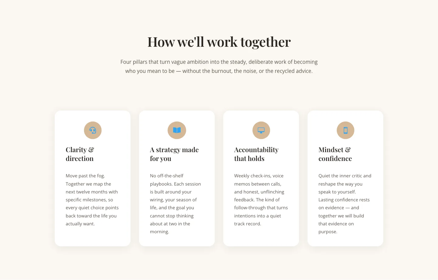
Elegant Coaching Cards Layout for Divi 5: Four-Pillar Framework
cards · coaching · elegant

Minimal SaaS Feature Cards Layout: 4-Column Divi 5 Section
cards · saas · minimal

Minimal SaaS Feature Cards Layout for Divi 5
cards · saas · minimal

Minimal SaaS Features Cards Layout for Divi 5
cards · saas · minimal

Minimal SaaS 3-Up Feature Cards Layout for Divi 5
cards · saas · minimal