
Minimal SaaS Feature Cards Layout for Divi 5
Clean four-column feature cards section for SaaS landing pages. Minimal Divi 5 layout with icon blurbs, hover lift, and Inter typography on a soft gray canvas.
Variations
Rate this element
Download this section, free
- Divi 5 JSON, imports in seconds
- Commercial license included
- No account needed
Click to view the full page
Overview
A quiet, four-up feature grid built for SaaS product pages that want to explain themselves without shouting. The section opens with a centered eyebrow block (an H2 in Inter 700 at 40px with a tight -0.02em letter-spacing over a 640px-wide subhead in soft grey (#6B7280)) then drops into a single row of four equal columns separated by a 24px gap. The whole section sits on a #FAFAFA canvas with 110px of vertical padding on desktop, so the white cards read as objects floating just above the page rather than blocks stamped into it.
Each card is a Divi Blurb module inside its own column: a 30px indigo icon (#4F46E5), an H3 title at 19px, and a short paragraph in #4B5563 at 15px with 1.6em line-height for comfortable scanning. The card container itself does the heavy lifting: 36px of internal padding, a 20px radius, a 1px hairline border in rgba(15,23,42,0.06), and a preset2 shadow that lifts on hover with a 6px upward translate over a 300ms ease transition. Nothing about the styling is decorative; every value earns its place in the hierarchy.
Responsive behavior is handled at the row level rather than through custom breakpoints. Desktop keeps the four columns in a single nowrap line. Tablet drops padding to 80px, wraps the row into a 2×2 grid with a matching 24px row gap, and shrinks the H2 to 32px. Phone collapses to a single stacked column with 20px between cards, 64px section padding, and a 28px heading: the cards keep their full 36px inner padding, so they never feel cramped on a narrow screen.
What’s inside
- Four Divi 5 Blurb modules in a 1/4 + 1/4 + 1/4 + 1/4 row with equal column widths and a 24px gap
- Centered intro block (H2 heading plus a 640px max-width subheading paragraph) sitting 56px above the cards
- White cards on a #FAFAFA section canvas with 20px radius, 1px hairline border, and preset2 box shadow
- Hover state that lifts each card 6px and deepens the shadow over a 300ms ease transition
- Icon-led layout: 30px accent icons at #4F46E5 (two Font Awesome, two native Divi glyphs)
- Typography set entirely in Inter: 40/32/28px H2, 19px H3s, 17px lead copy, 15px card body
- Three-tier responsive row: 4-across desktop, 2×2 tablet wrap, single-column stack on phone
- Vertical rhythm baked in: 110/80/64px section padding and 36px padding inside every card
Who it’s for
Built for early- and growth-stage SaaS marketing sites that need a clean, four-benefit section without bolting on an illustration budget. It slots naturally into product tours, feature overviews, homepage 'why us' blocks, integration pages, and pricing-page reassurance strips. The neutral canvas and Inter type stack fit dashboard-style brands, developer tools, B2B analytics platforms, project-management apps, and API companies. Anywhere the reader is technical enough to reward restraint. It also transplants cleanly onto agency case-study pages, SaaS-adjacent internal tools, workspace and productivity apps, or a design-forward portfolio landing page. If your brand voice is closer to Linear or Notion than to a lifestyle DTC shop, this is the section pattern that gets out of the copy's way.
Customization tips
Swap the four icons through the Blurb module: the layout uses a mix of Font Awesome and native Divi glyphs, so anything from either library drops in without breaking the grid. To rebrand quickly, change the accent color (#4F46E5) on each icon and reuse the same hex anywhere else you want a highlight; the rest of the palette (#FAFAFA canvas, white cards, #0F172A headings, #4B5563/#6B7280 body copy) is intentionally neutral and rarely needs touching. Card titles read best at 3–5 words; keep body copy to two short sentences (about 20–30 words) so all four cards stay the same height on desktop. If you need to drop the 24px column gap, do it on the row rather than the columns to keep tablet wrap behavior intact. To add a card, duplicate any column, keep it at 1/4 width, and the tablet 2×2 wrap continues to work. No images are used, so there's nothing to resize.
How to install this layout
- Download the layout JSON file from this page.
- Open the target page in the Divi 5 builder.
- Open the portability panel (up/down arrows icon) and choose the Import tab.
- Upload the JSON. Tick “replace existing content” only for full-page imports.
- Check the page at desktop and mobile widths, then swap in your copy and images.
Full walkthrough with troubleshooting: How to Import a Divi 5 Layout.
Questions about Minimal SaaS Feature Cards Layout for Divi 5
How does the four-column layout behave on tablet and mobile?
At tablet width the row switches from nowrap to wrap and the four cards reflow into a 2×2 grid with a 24px row gap. On phone it collapses to a single stacked column with 20px between cards. Section padding steps down at each breakpoint (110px → 80px → 64px) and the H2 shrinks from 40px to 32px to 28px.
Which Divi 5 modules does this section actually use?
One Section, two Rows, five Columns, a Heading, a Text module for the subhead, and four Blurb modules. One per card. Everything is native Divi 5; there's no code module, no third-party dependency, and no images to manage.
Can I add a fifth or sixth feature card?
Yes. Duplicate one of the four columns inside the second row and leave its width at 1/4. On desktop you'll get a 5- or 6-across line; on tablet the row will continue wrapping in pairs; on phone it stays a single stack. If you'd rather keep four across desktop but add a second row, drop a new row underneath with the same 1_4,1_4,1_4,1_4 structure.
Where should I start editing?
Rewrite the H2 and lead paragraph first so the section frames your product, then the four Blurb titles and body copy. Swap the four icons to match your feature set, and finally change the icon color (#4F46E5) if you're rebranding to a non-indigo accent.
Is the hover lift effect optional?
Yes. It's applied at the column level via a preset2 box shadow, a -6px Y transform, and a 300ms CSS transition on the main element. Turn off the hover state on each column and delete the transition line in the custom CSS to ship a fully static version.
How long can each card's copy be before the grid breaks?
Cards use stretch alignment, so the tallest card sets the height and the others fill to match: the grid won't visually break, but very uneven copy makes short cards look empty. Aim for roughly two sentences (about 25 words) per card so all four stay balanced on desktop and in the 2×2 tablet wrap.
Which Divi version does this layout need?
Divi 5. The layout is generated natively for Divi 5 and validated against its real module structure before publication, so it imports clean into the current builder.
Can I use this layout on client websites?
Yes. Every download includes a commercial license covering unlimited sites you own or build for clients. Only reselling or redistributing the layout file itself is prohibited.
More cards
Browse all cards
Elegant Coaching Services Cards: Divi 5 Layout
cards · coaching · elegant

Minimal SaaS 3-Up Feature Cards Layout for Divi 5
cards · saas · minimal

Minimal SaaS Feature Cards Layout: 4-Column Divi 5 Section
cards · saas · minimal

Minimal SaaS Features Cards Layout for Divi 5
cards · saas · minimal

Elegant Coaching Cards Layout for Divi 5: Four-Pillar Framework
cards · coaching · elegant
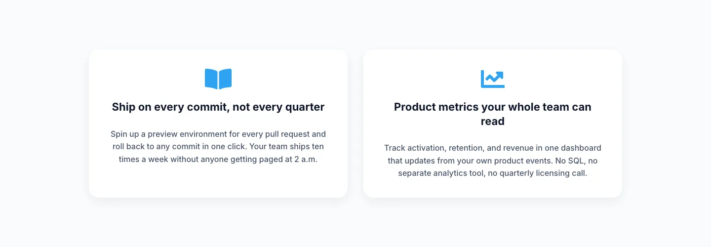
Minimal SaaS Two-Column Feature Cards
cards · saas · minimal