
Minimal SaaS Features Cards Layout for Divi 5
Clean three-column SaaS feature cards for Divi 5. Minimal white cards with pastel icon badges, hover lift, and benefit-led copy for product teams.
Variations
Rate this element
Download this section, free
- Divi 5 JSON, imports in seconds
- Commercial license included
- No account needed
Click to view the full page
Overview
This is a compact three-card features section built on a single Divi 5 section with two rows: an intro row (heading + supporting paragraph) and a three-column card row below. The section sits on a soft neutral background (#F7F8FA) with 100px top and bottom padding, which frames the cards without competing with them. A deliberate minimal SaaS choice where whitespace does the work of decoration.
The intro heading is centered, 40px, weight 700, in near-black (#0F172A), paired with an 18px slate-grey lead paragraph (#475569) capped at 640px so the line length stays readable. Beneath it, three equal 1/3 columns hold identical card shells: white background, 20px radius, 36px all-around padding, and a soft shadow (rgba(15,23,42,0.08), 24px blur). Each card lifts 6px on hover with a deeper shadow, so the whole grid feels tactile without needing borders or dividers.
Each card follows the same rhythm: a circular icon chip, a 20px bold title, then a 16px body paragraph at 1.6 line-height. The chip colors rotate through a muted trio (indigo (#EEF2FF), mint (#ECFDF5), amber (#FEF3C7)) so the row reads as a set while each card stays distinct. Two icons are Font Awesome, one is a native Divi glyph, all sized at 22px.
Responsive behavior is explicit in the JSON: the three-card row wraps on tablet (flexWrap: wrap) and stacks vertically on phone (flexDirection: column), and each card column switches to full width (24_24) below desktop. A 32px column gap on desktop keeps the cards from touching, and the 20px row gap inside each card evenly spaces icon, title, and body.
What’s inside
- Three equal-width feature cards in a 1/3, 1/3, 1/3 row, each with icon chip, headline, and supporting paragraph
- Centered intro block above the cards: 40px heading + 18px lead paragraph capped at 640px max-width
- Card shells: white background, 20px border radius, 36px padding, soft `rgba(15,23,42,0.08)` outer shadow
- Hover interaction on each card: 6px upward translate plus a deeper shadow, defined at the column level
- Circular icon chips in three rotating pastels (indigo `#EEF2FF`, mint `#ECFDF5`, amber `#FEF3C7`) at 22px
- Mixed icon set: two Font Awesome glyphs (chart, tools) plus one native Divi icon, all left-aligned
- Explicit responsive rules: cards wrap on tablet, stack vertically on phone, each expanding to full width
- Muted slate palette: `#0F172A` headings, `#475569` body copy, `#F7F8FA` section background. No bright accents
Who it’s for
Purpose-built for SaaS marketing pages that need a clean, credible "why this product" moment without visual noise. It fits product landing pages, feature index pages, and pricing-page supporting rows where you need to explain three core capabilities side-by-side. The muted palette and understated shadows suit B2B tools (analytics platforms, workflow automation, integration hubs, developer tooling, internal ops software) where founders want to look serious and technical rather than playful. It also works well for AI startups, fintech dashboards, and productivity apps aiming for a Linear/Stripe/Notion aesthetic. If your brand leans neon, illustrated, or heavily gradient, this section will feel too restrained and you'll want a bolder alternative.
Customization tips
The palette lives in a few predictable places: the section background (#F7F8FA), the card backgrounds (#FFFFFF), the three icon chip fills, and the text colors (#0F172A for headings, #475569 for body). Swap chip colors first (they carry the only accent) and keep them in the same low-saturation register or the minimal feel breaks. Card titles read best at 3–6 words (e.g. "Analytics without the spreadsheet"); the JSON's longest example runs about 30 characters. Body copy sits comfortably at 20–35 words per card, much more and the three columns start to look unbalanced on desktop. Icons are set at 22px inside a 14px-padded chip, so any Font Awesome or native Divi glyph will swap cleanly without rework. To convert to four cards, change the row column structure from 1_3,1_3,1_3 to 1_4,1_4,1_4,1_4 and tighten the column gap from 32px to about 24px. No images are used, so there are no aspect ratios to manage.
How to install this layout
- Download the layout JSON file from this page.
- Open the target page in the Divi 5 builder.
- Open the portability panel (up/down arrows icon) and choose the Import tab.
- Upload the JSON. Tick “replace existing content” only for full-page imports.
- Check the page at desktop and mobile widths, then swap in your copy and images.
Full walkthrough with troubleshooting: How to Import a Divi 5 Layout.
Questions about Minimal SaaS Features Cards Layout for Divi 5
How does this section handle tablet and phone widths?
The card row is set to wrap on tablet (`flexWrap: wrap`), so cards flow to a second line as space runs out, and stacks fully vertical on phone (`flexDirection: column`). Each card column switches to `24_24` (full width) below desktop, so cards become full-width blocks on mobile instead of shrinking.
Which Divi modules make up each card?
Every card is a single column containing three modules: an Icon module (with a circular colored chip), a Text module for the title (20px, weight 700), and a Text module for the body copy (16px, 1.6 line-height). No blurb module is used, this keeps typography controls independent for title vs. body.
Are there any images I need to replace?
No. The section is icon-driven, not image-driven. You'll be swapping three icons (two Font Awesome, one native Divi) rather than photography, which makes replacement fast and keeps the section lightweight.
What should I edit first after importing?
Rewrite the three card titles and body paragraphs to match your product's features, then swap the three icons and their chip background colors. The section heading and 640px-capped lead paragraph come next. The card shells, shadows, and hover behavior can stay as-is.
Do the cards animate on hover?
Yes. Each card column is configured to translate 6px upward on hover and swap to a deeper shadow (`rgba(15,23,42,0.16)`, 40px blur, -8px spread). The animation is defined via Divi's transform and box-shadow hover states, so it works without custom CSS.
Can I add a fourth card or reduce to two?
Yes: change the row's `columnStructure` from `1_3,1_3,1_3` to `1_4,1_4,1_4,1_4` for four, or `1_2,1_2` for two, and duplicate or delete one card column. Because every card uses the same padding, radius, shadow, and hover preset, added cards inherit the exact style automatically.
Which Divi version does this layout need?
Divi 5. The layout is generated natively for Divi 5 and validated against its real module structure before publication, so it imports clean into the current builder.
Can I use this layout on client websites?
Yes. Every download includes a commercial license covering unlimited sites you own or build for clients. Only reselling or redistributing the layout file itself is prohibited.
More cards
Browse all cards
Elegant Coaching Services Cards: Divi 5 Layout
cards · coaching · elegant

Minimal SaaS 3-Up Feature Cards Layout for Divi 5
cards · saas · minimal

Minimal SaaS Feature Cards Layout: 4-Column Divi 5 Section
cards · saas · minimal

Minimal SaaS Feature Cards Layout for Divi 5
cards · saas · minimal

Elegant Coaching Cards Layout for Divi 5: Four-Pillar Framework
cards · coaching · elegant
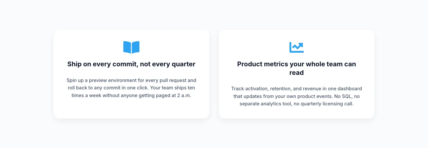
Minimal SaaS Two-Column Feature Cards
cards · saas · minimal