
Three-Step How It Works Cards for SaaS Onboarding
Minimal Divi 5 cards layout featuring a numbered three-step process (connect your stack, define metrics, ship insights) built for SaaS onboarding pages.
Variations
Rate this element
Download this section, free
- Divi 5 JSON, imports in seconds
- Commercial license included
- No account needed
Click to view the full page
Overview
This is a two-row section built on a soft slate background (#f8fafc) with a generous 100px top and bottom padding, so it drops into a longer landing page without crowding its neighbors. The top row holds a single centered column with a 40px Inter heading in slate-900 (#0f172a) and an 18px Inter subhead in slate-600 (#475569), capped at a 680px max width so the intro reads as one clean typographic block rather than a stretched banner.
Below that, three equal 1/3 columns sit in a nowrap flex row with a 28px column gap and alignItems: stretch, so every card ends up the same height regardless of copy length. Each card is a white panel with 36px padding on every side, a 20px border radius, and a soft preset-3 shadow (10px blur, slate at 10% opacity) that deepens on hover while the whole card lifts 6px. A small motion cue that reads as tactile without feeling gimmicky. Inside each card, a single Text module carries an h3 that pairs a 40px dark circle badge (numbered 1, 2, 3 in white) with the step title, followed by a supporting paragraph and a blue (#2563eb) inline link CTA.
Mobile behavior is handled explicitly in the JSON: at the tablet breakpoint the row switches to flex-wrap: wrap with a 24px row gap, and on phone the columns move to flex-direction: column and each column re-sizes to 24_24 (full width). The result stacks cleanly, keeps the numbered badges intact, and preserves the vertical rhythm without any manual CSS.
What’s inside
- Two-row Divi 5 section: centered intro (heading + subhead) above a 3-column card row
- Three equal 1/3 columns using a flex row with 28px column gap and stretch alignment so cards match heights
- White cards with 36px padding, 20px border radius, and a preset-3 soft shadow tuned to slate-900 at 10% opacity
- Hover interaction on every card: -6px translate plus a deeper shadow (18% opacity, 22px vertical offset)
- Numbered circle badges (40×40, slate-900 background, white numerals) rendered inline inside each card heading
- Blue (#2563eb) inline anchor link at the bottom of every card for a per-step CTA (integrations, metric library, sample digest)
- Explicit responsive rules baked into the JSON: tablet wraps with a 24px row gap, phone stacks into a single column
- Native Inter typography stack (40px display heading, 20px card titles, 18px intro body, 16px card body) all set on the modules, not via custom CSS injections
Who it’s for
Built for SaaS product marketers who need a clean, three-step "how it works" moment on a homepage, product tour, or feature page. The copy pattern (connect a stack, configure something, distribute an output) maps cleanly onto data platforms, analytics tools, integration marketplaces, workflow automation, developer tools, and API-first products. It also travels well outside pure SaaS: fintech onboarding, HR platforms explaining an implementation flow, agencies packaging a 3-step service, and B2B consultancies walking a prospect through discovery → build → launch. Because the cards are purely typographic and shape-based (no photography), it works especially well for brands that want to stay minimal and let the numbered steps carry the visual weight.
Customization tips
The palette is a straight slate-and-blue system, so it swaps easily: replace #0f172a with any dark neutral, #f8fafc with a matching tint, and #2563eb with your brand accent, five color fields per card, plus the section background. Copy budgets that fit the current spacing: step titles read best at 3–5 words, body paragraphs at 25–40 words, link labels at 3–6 words with the trailing arrow. Each card's badge, title, paragraph, and link all live inside a single Divi Text module as inline HTML: edit that block to renumber steps, change the badge shape to a square, or add a small icon before the title. To add a fourth step, duplicate one card column and change the row's flex structure to 1_4,1_4,1_4,1_4; the shadow, radius, and stretch behavior come along automatically. No imagery is required, so there are no aspect ratios to worry about.
How to install this layout
- Download the layout JSON file from this page.
- Open the target page in the Divi 5 builder.
- Open the portability panel (up/down arrows icon) and choose the Import tab.
- Upload the JSON. Tick “replace existing content” only for full-page imports.
- Check the page at desktop and mobile widths, then swap in your copy and images.
Full walkthrough with troubleshooting: How to Import a Divi 5 Layout.
Questions about Three-Step How It Works Cards for SaaS Onboarding
How does the section behave on mobile?
The JSON sets tablet to wrap with a 24px row gap, and phone switches the row to a column direction while every card column re-sizes to full width (24_24). The numbered badges and card padding stay identical, only the layout stacks.
Which Divi 5 modules is this actually built from?
One Section, two Rows, four Columns, one Heading module for the intro title, and four Text modules. One for the intro paragraph and one per card. The numbered badges and per-card link CTAs are inline HTML inside those Text modules, not separate Button or Blurb modules.
Do I need to supply any images?
No. The design is entirely typographic and shape-based: numbered circle badges, rounded cards, a soft shadow. That also means it stays fast and the layout won't shift while images load.
Can I add a fourth or fifth step?
Yes. Duplicate one of the 1_3 columns, update the badge number and copy in the Text module's HTML, then change the row's column structure to 1_4,1_4,1_4,1_4 (or 1_5s). The stretch alignment and hover lift carry over from the row and column settings.
How do I retarget the inline link CTAs?
Each card's link points to a placeholder anchor (#integrations, #metric-library, #sample-digest). Open the card's Text module, edit the href in the anchor tag, and swap the label: the blue color, weight, and arrow are inline styles you can also adjust there.
What should I edit first after importing?
Start with the intro headline and subhead, then rewrite the three step titles and paragraphs to your product's actual flow. Once the copy is in, adjust the accent color on the inline links and the badge background if your brand isn't slate-and-blue.
Which Divi version does this layout need?
Divi 5. The layout is generated natively for Divi 5 and validated against its real module structure before publication, so it imports clean into the current builder.
Can I use this layout on client websites?
Yes. Every download includes a commercial license covering unlimited sites you own or build for clients. Only reselling or redistributing the layout file itself is prohibited.
More cards
Browse all cards
Elegant Coaching Services Cards: Divi 5 Layout
cards · coaching · elegant
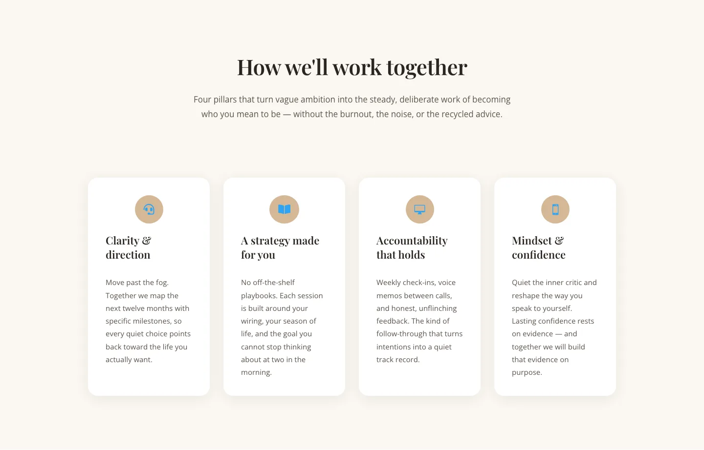
Elegant Coaching Cards Layout for Divi 5: Four-Pillar Framework
cards · coaching · elegant

Minimal SaaS Feature Cards Layout: 4-Column Divi 5 Section
cards · saas · minimal

Minimal SaaS Feature Cards Layout for Divi 5
cards · saas · minimal

Minimal SaaS Features Cards Layout for Divi 5
cards · saas · minimal

Minimal SaaS 3-Up Feature Cards Layout for Divi 5
cards · saas · minimal