
Monochrome Divi 5 Layouts
Monochrome layouts strip a page down to a single hue and let typography, spacing, and photography do the talking. The result is calm, editorial, and quietly confident. The aesthetic you reach for when the product or portfolio needs to feel considered rather than shouted. Every section below is a validated Divi 5 export with real desktop and mobile renders, ready to drop into your own build.
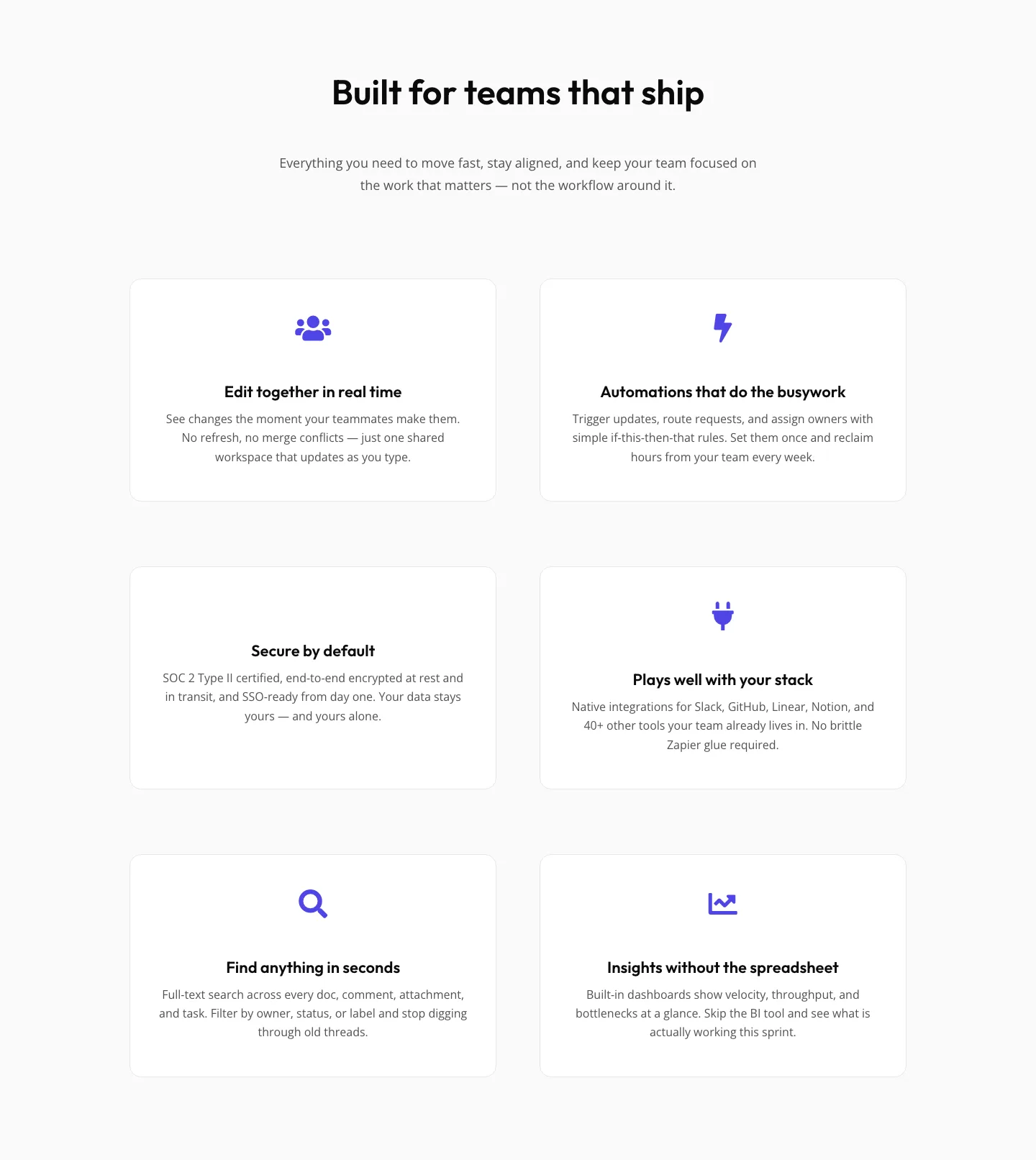
SaaS Features Section: Minimal Divi 5 Layout for Product Teams
features · saas · minimal
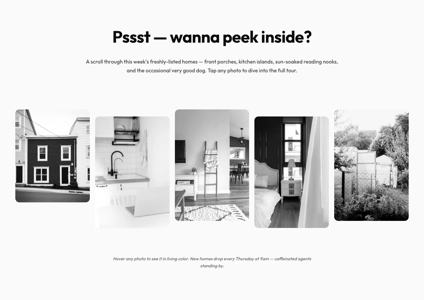
Playful Real Estate Listings Gallery: Divi 5 Layout
gallery · real_estate · playful
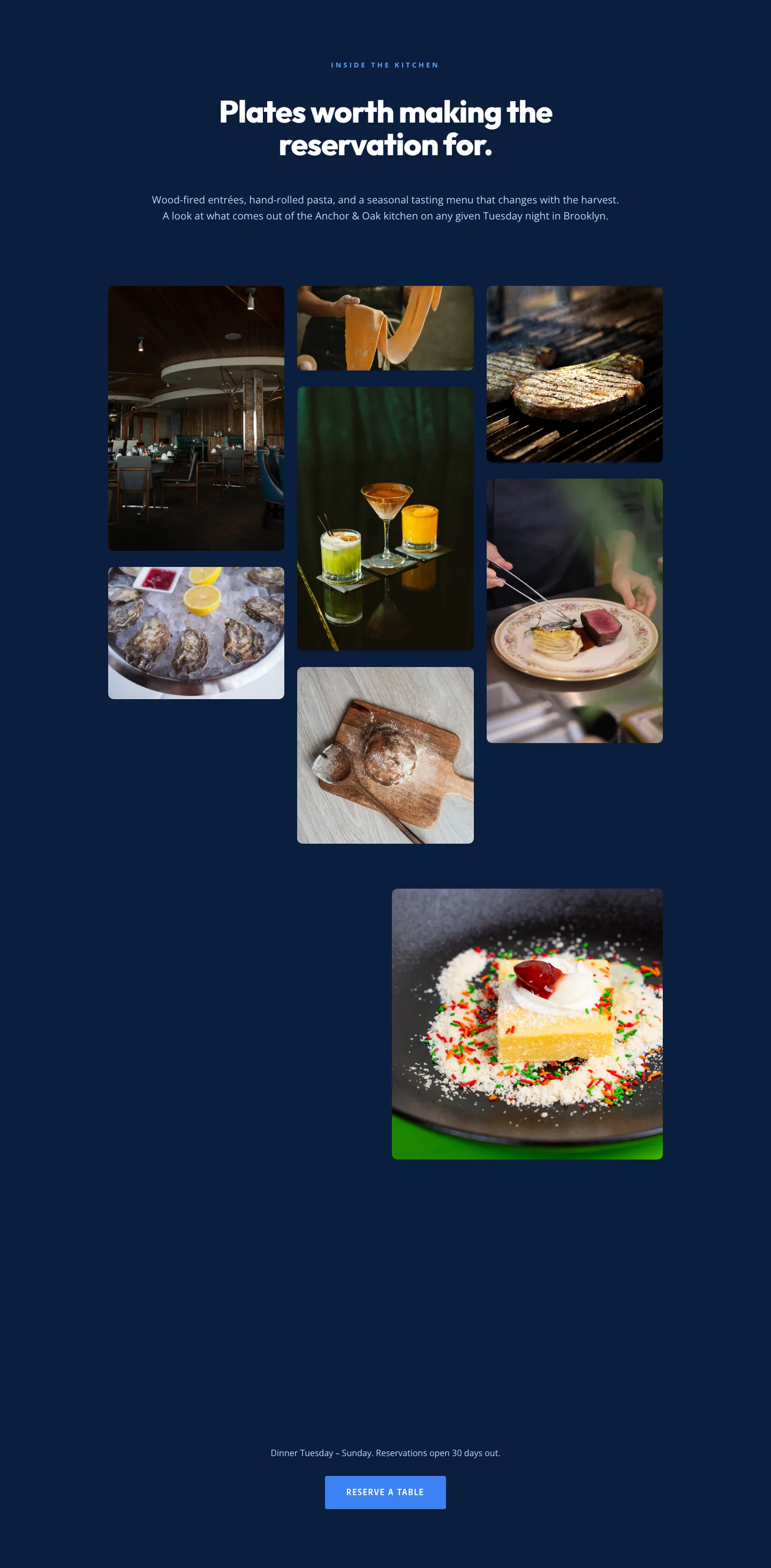
Restaurant Gallery: Bold Blue (Anchor & Oak) | Divi 5 Layout
gallery · restaurant · bold
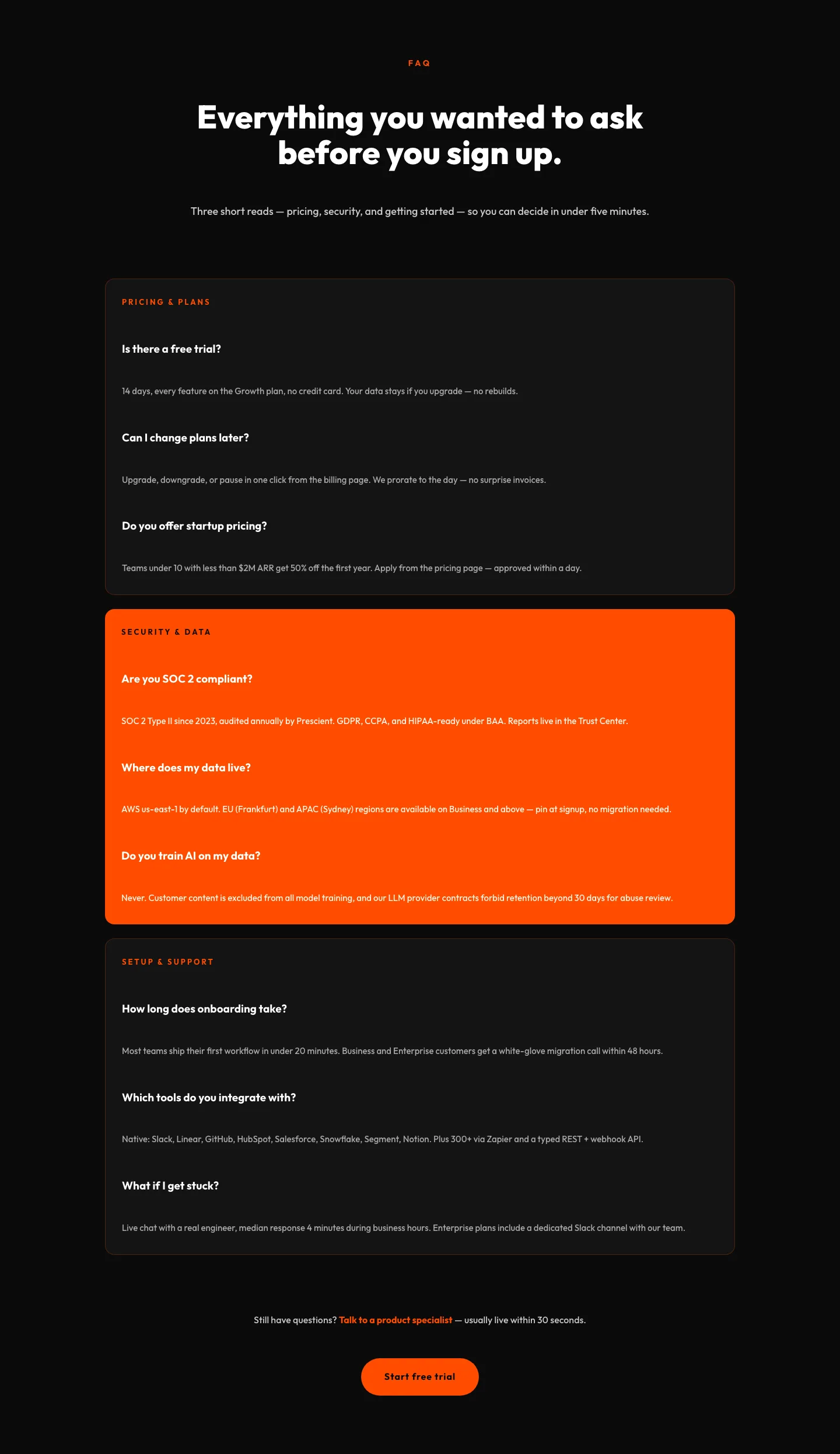
Bold SaaS FAQ Section: Divi 5 Layout
faq · saas · bold
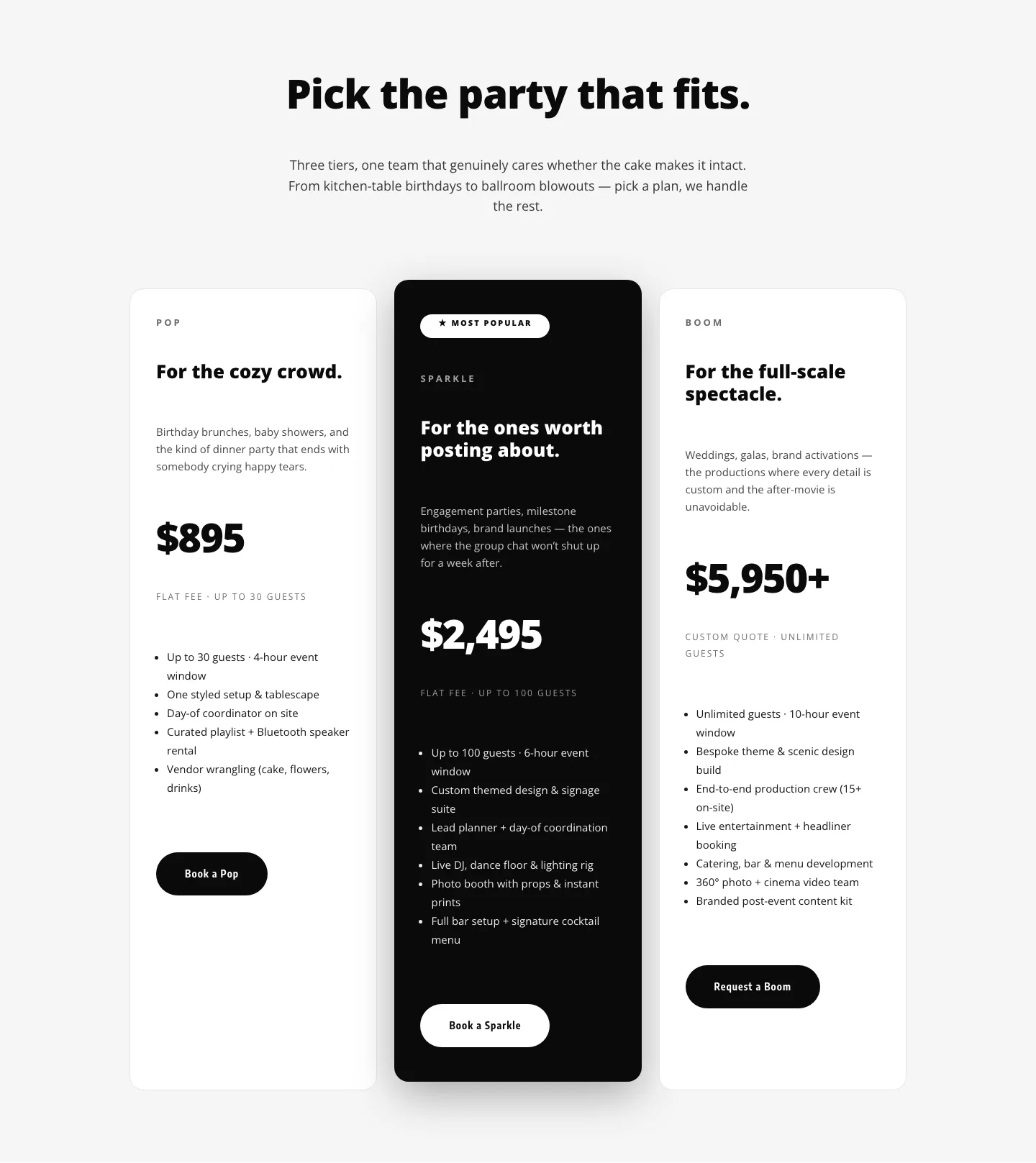
Playful Three-Tier Event Pricing Section for Divi 5
pricing · events · playful
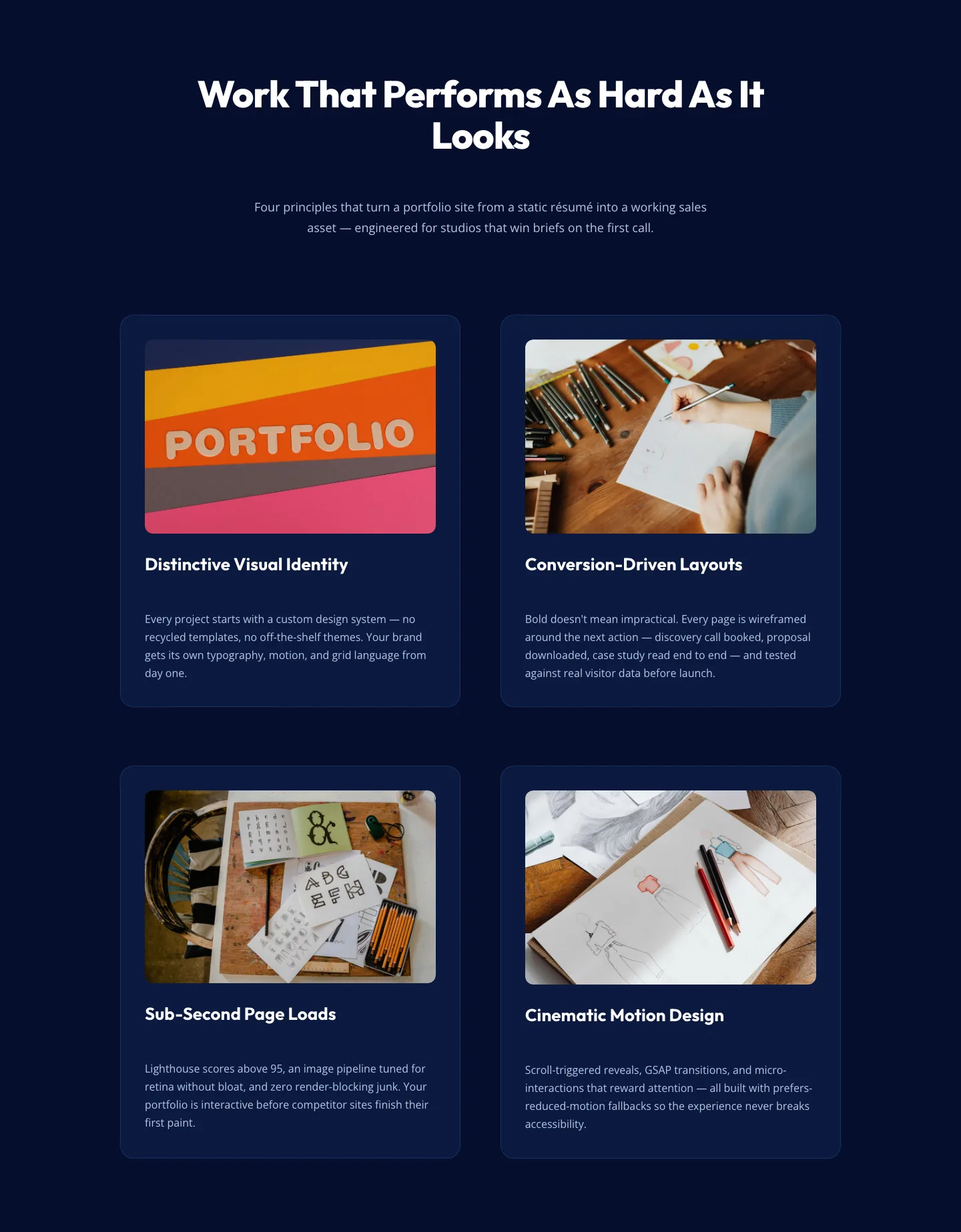
Bold Portfolio Features Section: 2×2 Grid for Divi 5
features · portfolio · bold
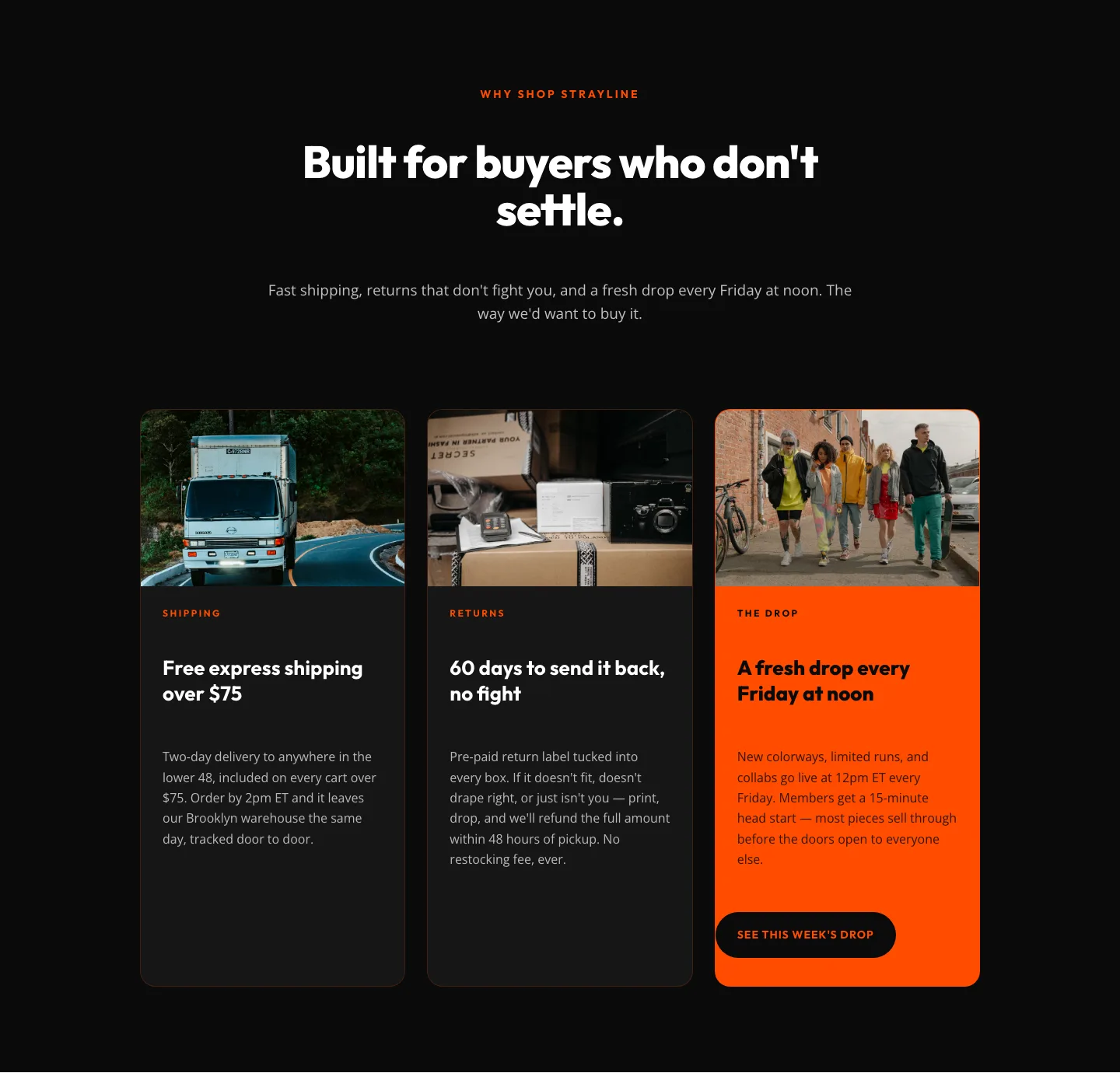
Bold Ecommerce Features Section: Free Shipping, Returns & Weekly Drops
features · ecommerce · bold

CTA: Portfolio Bold Blue
cta · portfolio · bold
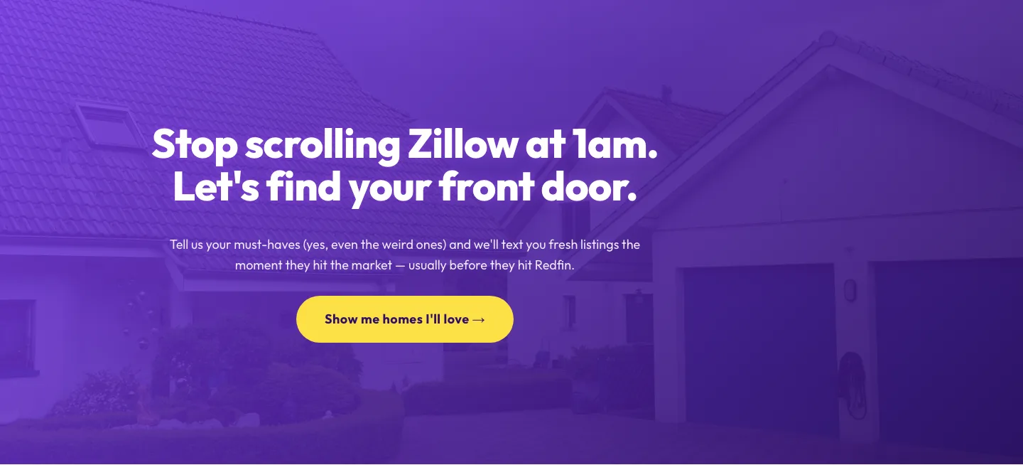
Playful Real Estate CTA: Purple Gradient Listing Alert Signup
cta · real_estate · playful
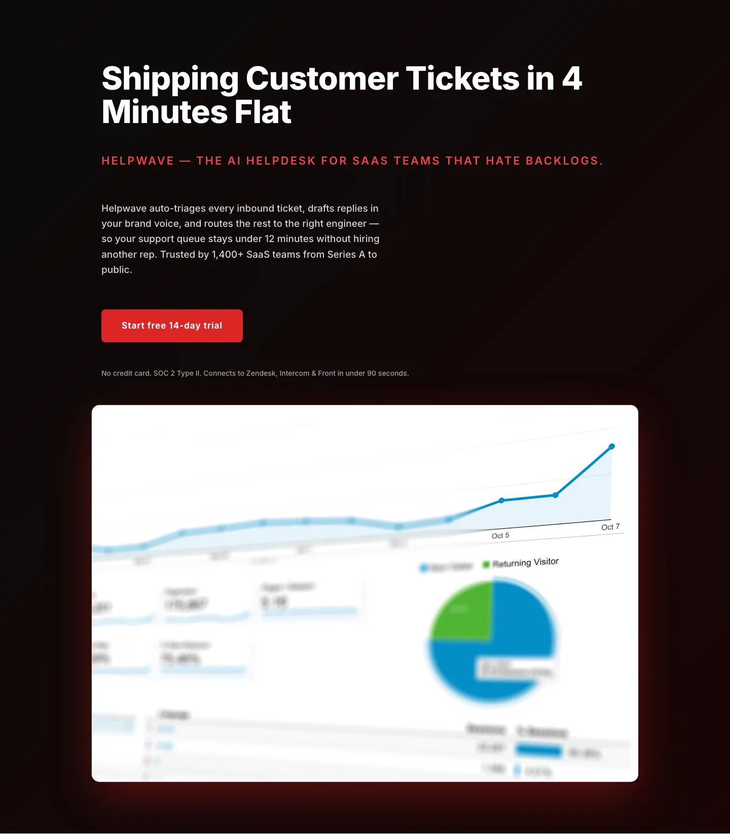
Bold SaaS Hero Section: Red Gradient Helpdesk Template for Divi 5
hero · saas · bold
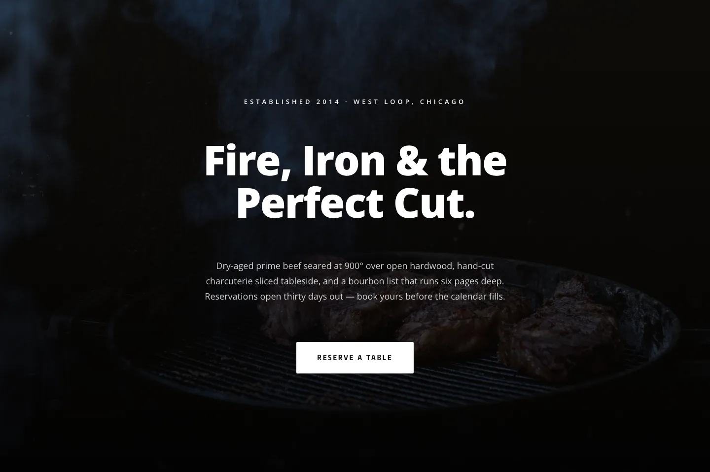
Blackline Chophouse Hero: Bold Steakhouse Divi 5 Layout
hero · restaurant · bold

Bold Fitness App Hero Layout for Divi 5: IronPulse Adaptive Training
hero · fitness · bold

Wood-Fired Steakhouse Hero Layout for Divi 5: Bold Restaurant Template
hero · restaurant · bold
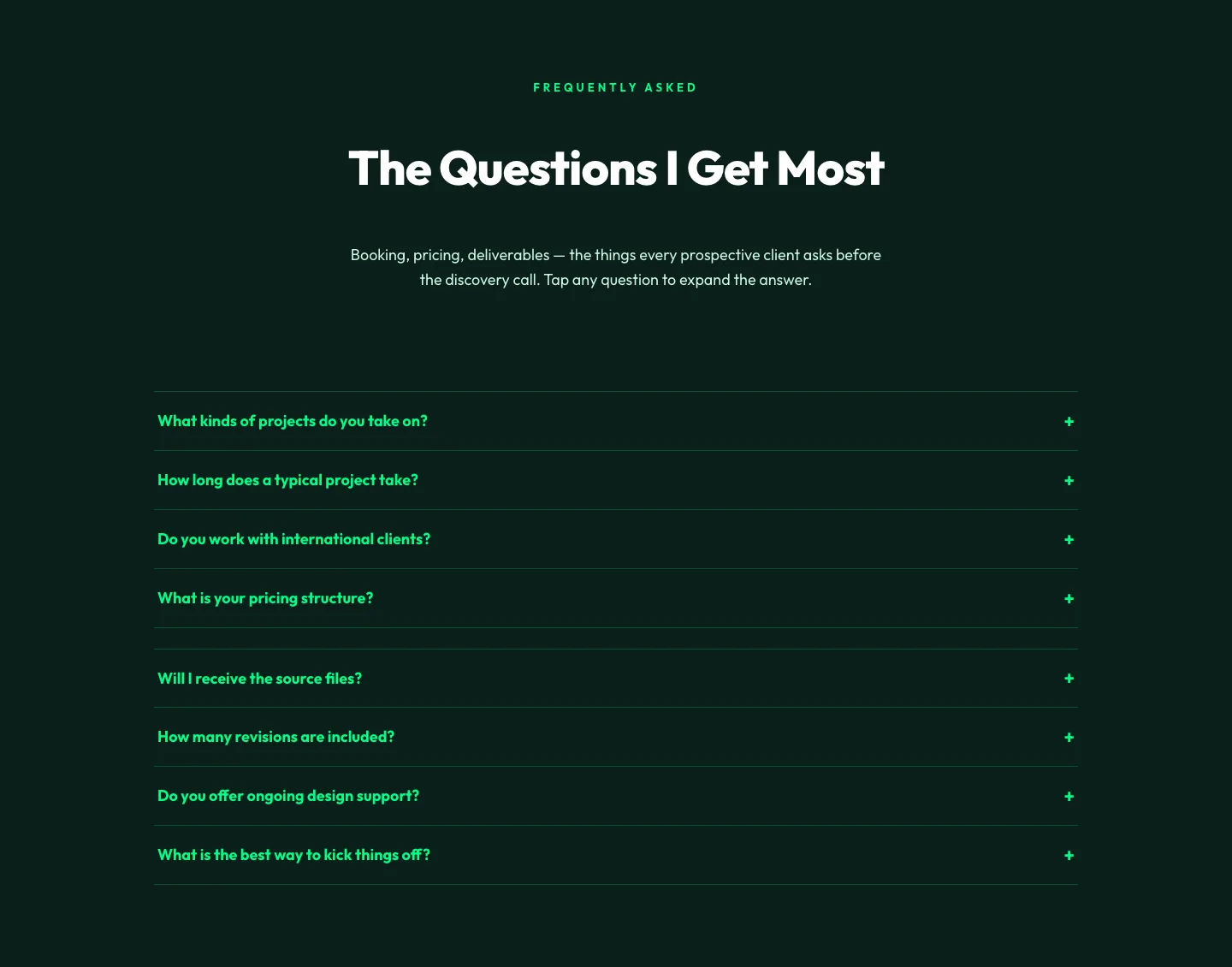
Bold Portfolio FAQ Section: Divi 5 Layout
faq · portfolio · bold
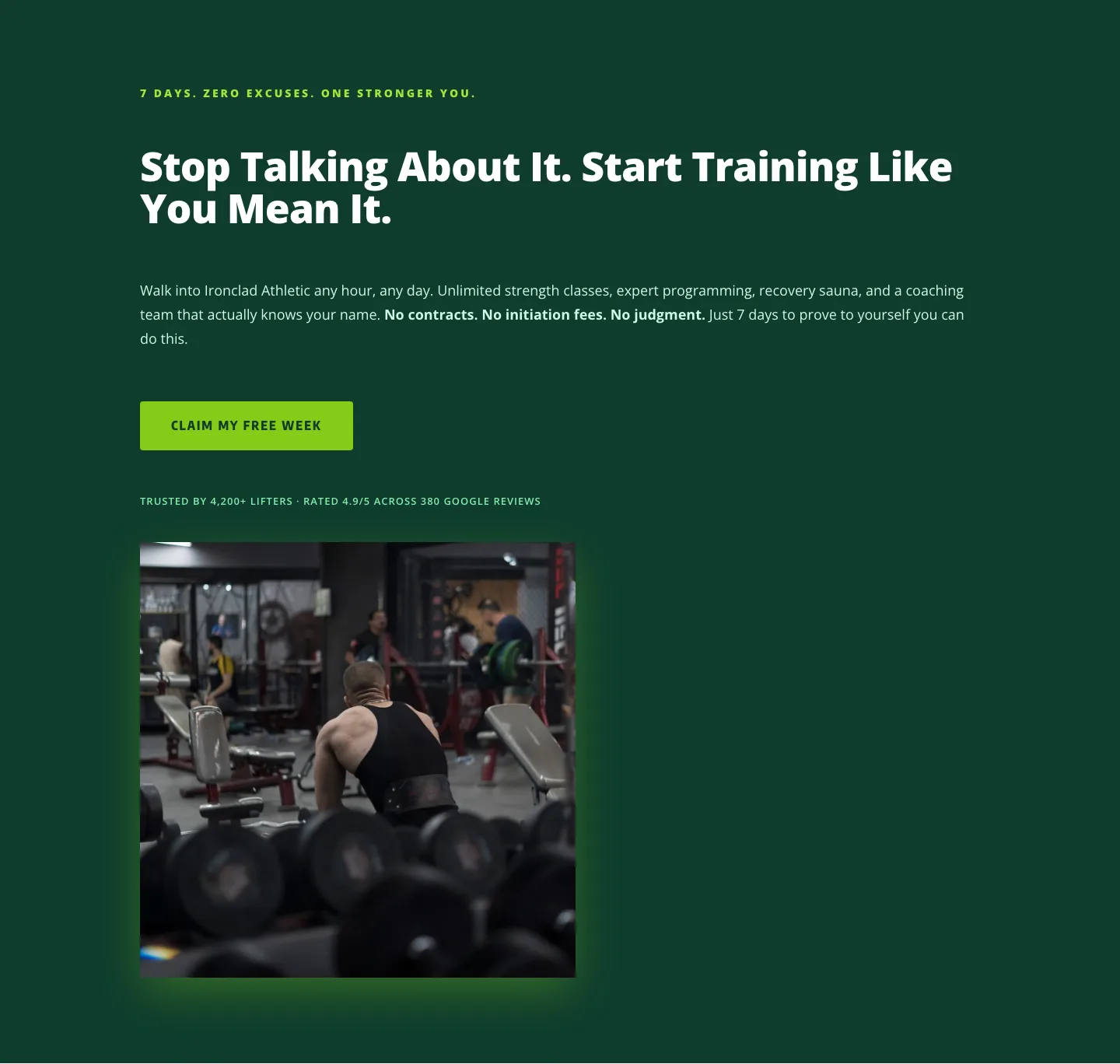
Bold Fitness CTA: Free Week Trial Divi 5 Layout
cta · fitness · bold
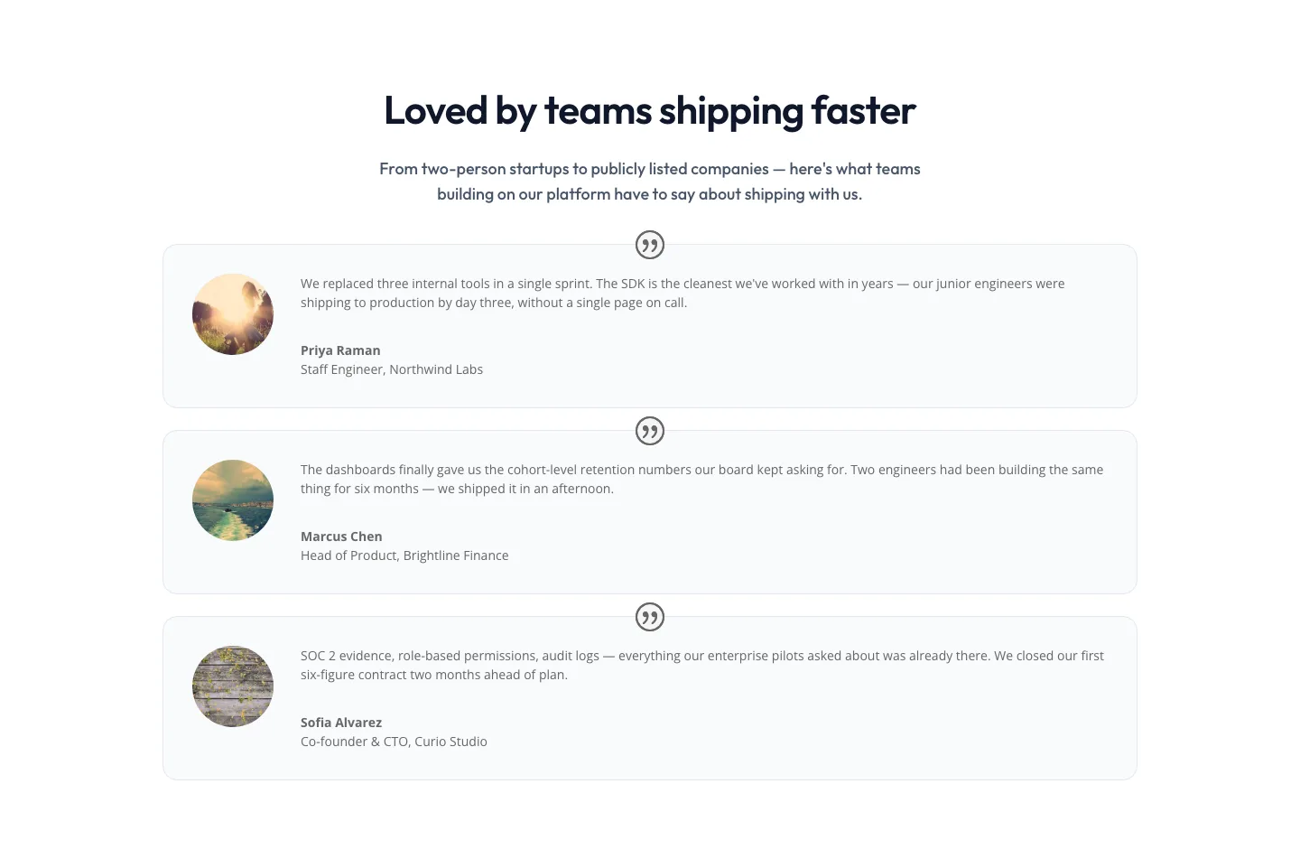
Minimal SaaS Testimonials Section: Three-Column Customer Quotes
testimonials · saas · minimal
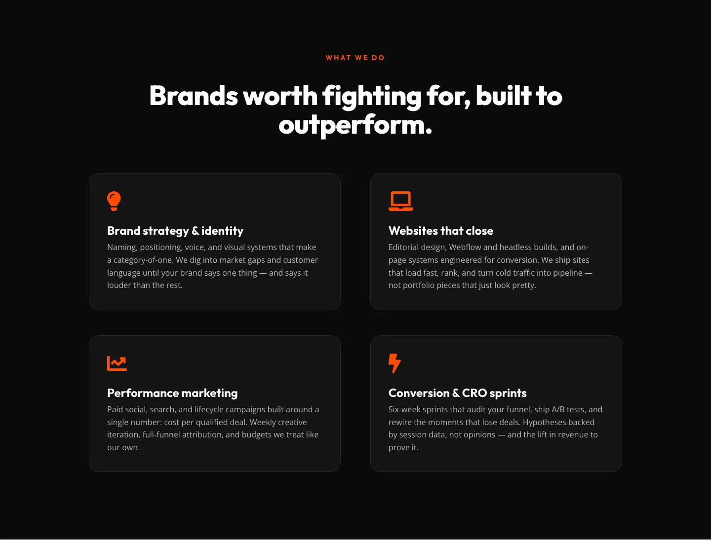
Bold Agency Features Section: Divi 5 Services Grid Layout
features · agency · bold
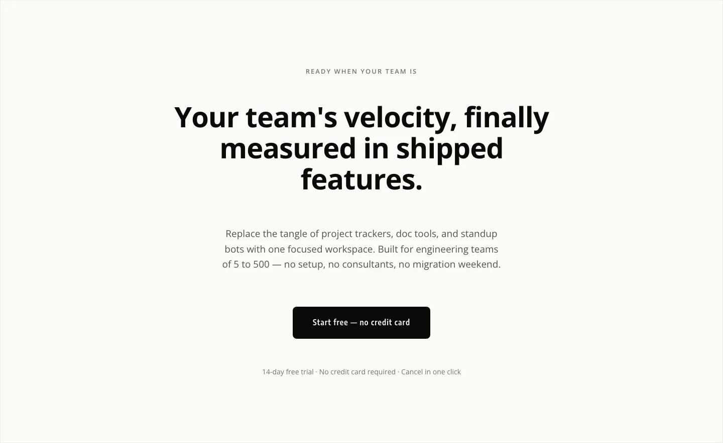
Minimal SaaS CTA: Ship Features Faster
cta · saas · minimal
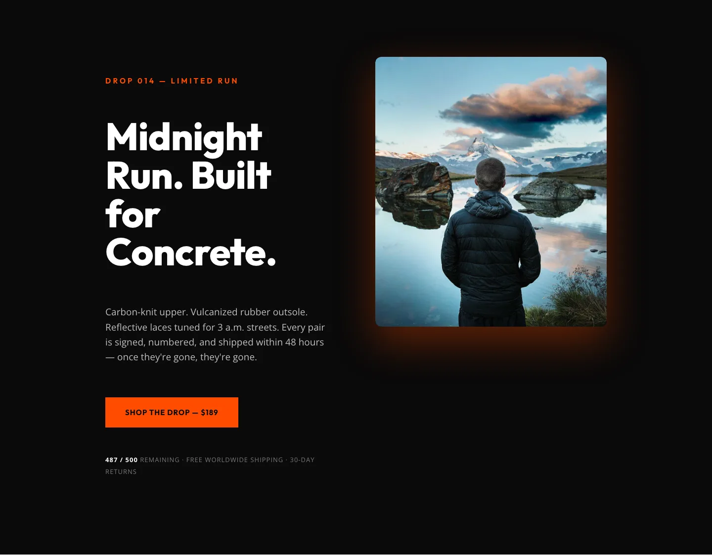
Midnight Run Drop 014: Bold Ecommerce Product Hero
hero · ecommerce · bold
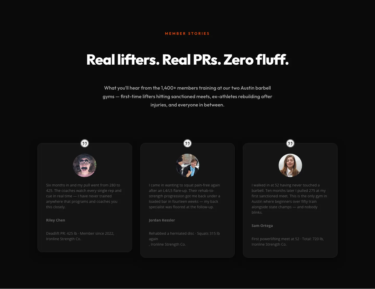
Bold Fitness Testimonials Section for Divi 5: Gym & Barbell Club
testimonials · fitness · bold

Ember & Steel: Bold Steakhouse Landing Page for Divi 5
full_landing · steakhouse · bold
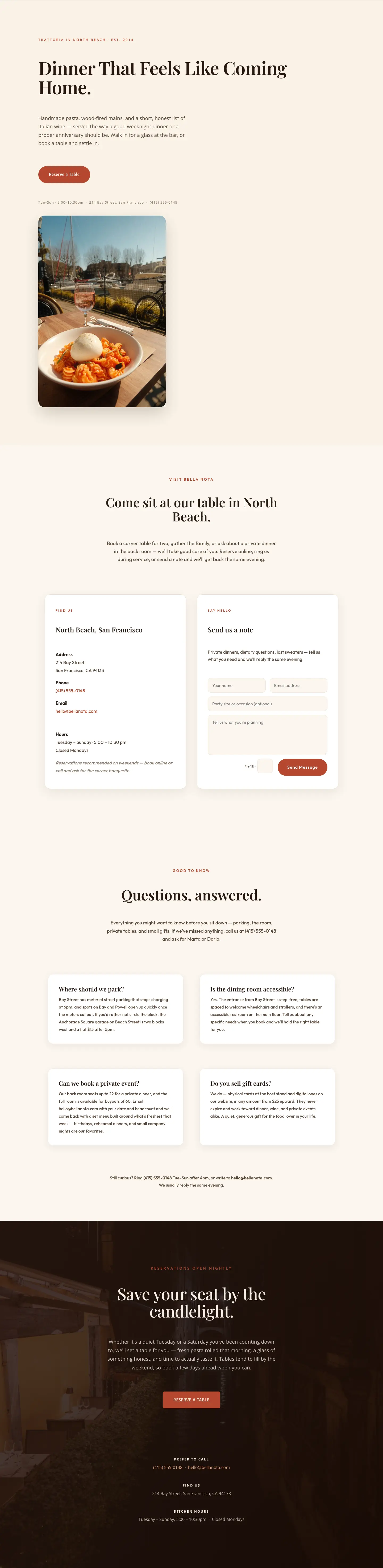
Bella Nota: Elegant Restaurant Contact Page for Divi 5
full_landing · restaurant · elegant
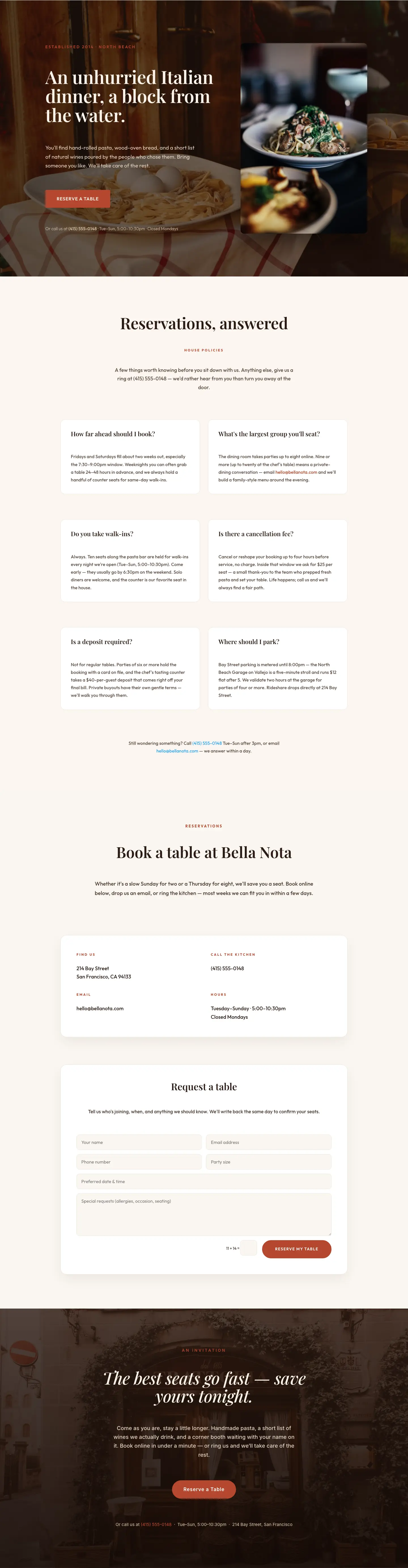
Bella Nota: Elegant Restaurant Reservations Page for Divi 5
full_landing · restaurant · elegant
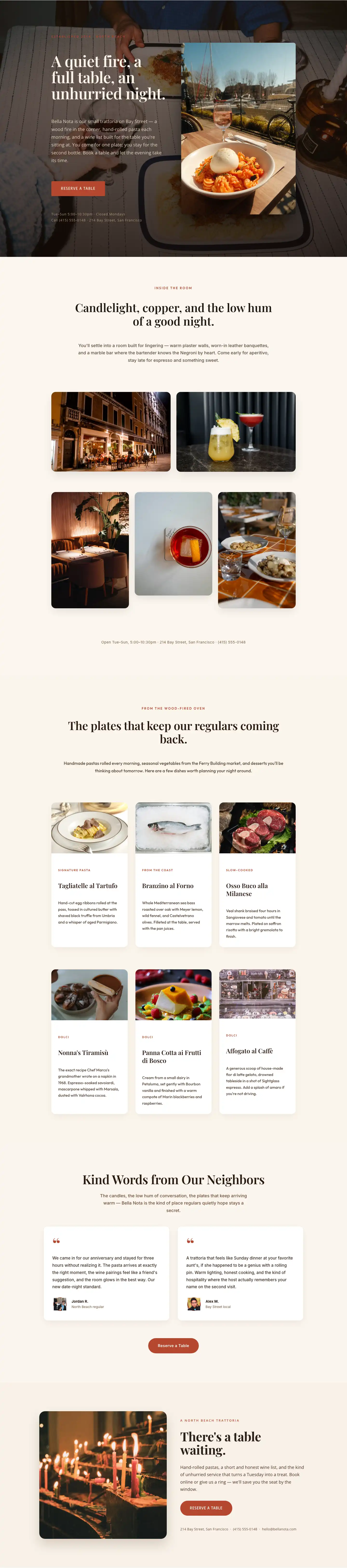
Bella Nota: Elegant Restaurant Gallery Page for Divi 5
full_landing · restaurant · elegant
What makes a monochrome layout work
A monochrome page isn't the absence of color. It's the disciplined use of one. The best examples lean on a full tonal range: near-black for headlines, mid-grays for supporting copy, a soft off-white for the canvas, and a single accent tone reserved for the moments that matter (a hover state, a price, a keyline under a nav item). Contrast comes from type weight, scale, and negative space rather than hue, so the hierarchy has to be sharper than it would on a color-rich page. Photography is treated as another tonal layer: black-and-white portraits, desaturated product shots, or high-contrast still lifes that read as texture rather than decoration.
Who reaches for this palette
Editorial studios, architectural practices, luxury fashion labels, coaches and consultants, wedding photographers, and B2B software brands that want to feel grown-up. If your positioning is quiet authority (or your product is visually loud on its own and needs a stage that doesn't compete) monochrome is the safest and most timeless call. It also ages exceptionally well, which matters if you're building a site that shouldn't need a rebrand in eighteen months.
Customizing a monochrome layout in Divi 5
Divi 5's global presets are what make this palette practical to maintain. A few moves before you touch individual sections:
- Set your grayscale ramp in the color palette: pick five swatches from your darkest ink to your paper tone, plus one accent. Every module pulls from these, so a future adjustment is one edit.
- Anchor type presets first. Define a display, heading, and body preset with clear size and weight jumps. Monochrome pages fall apart when the type scale is timid.
- Reserve the accent. Assign it only to primary buttons, active links, and a single hover treatment. If it appears everywhere, the effect collapses.
- Swap copy inline, not the structure. These layouts are composed for rhythm: replace headlines and paragraphs, but leave the section spacing and grid ratios alone until you've seen them live.
How the files ship
Every section on this page is a free download behind a quick email: one Divi 5 JSON file, a commercial license included, and screenshots that show the actual desktop and mobile output rather than a mockup. Import, restyle to your ramp, and publish.