
Green Divi 5 Layouts
Green is the color you reach for when the story is growth, health, money, or the outdoors. Anything that needs to feel calm and confident at the same time. This collection pulls together Divi 5 layouts built around green as the load-bearing hue, from soft sage editorials to deep forest tech pages. Every layout is validated against Divi 5 structure before publication and ships with real desktop and mobile renders so you can see exactly how the palette behaves.

Brightwell Family Dental: Minimal Medical Landing Page for Divi 5
full_landing · medical · minimal

Meridian Imaging: Minimal Medical Landing Page for Divi 5
full_landing · medical · minimal
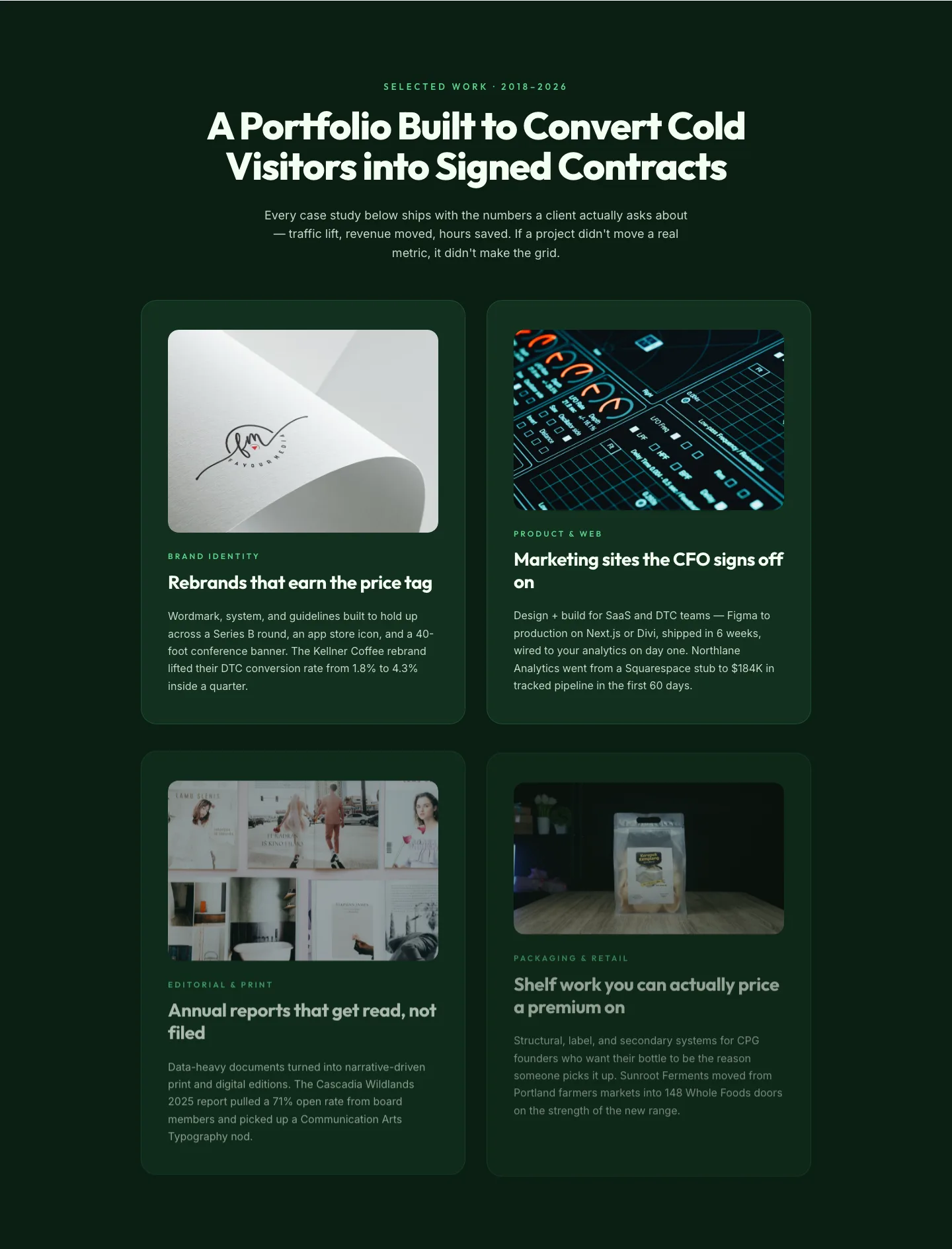
Bold Portfolio Features Grid: Divi 5 Case Study Layout
features · portfolio · bold
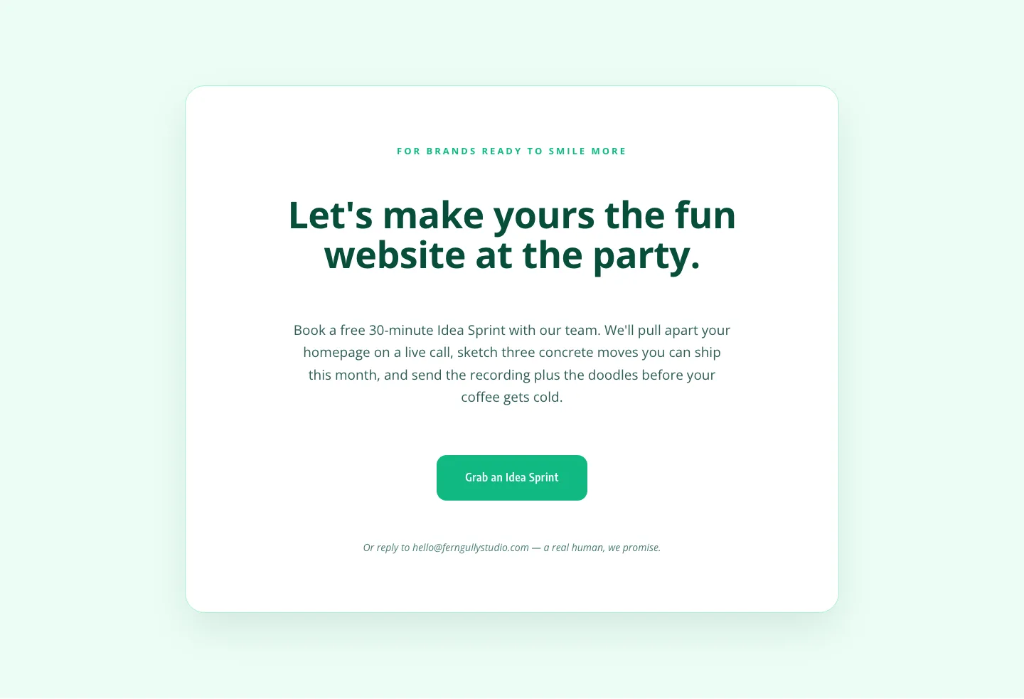
Playful Agency CTA: Idea Sprint Booking Card
cta · agency · playful
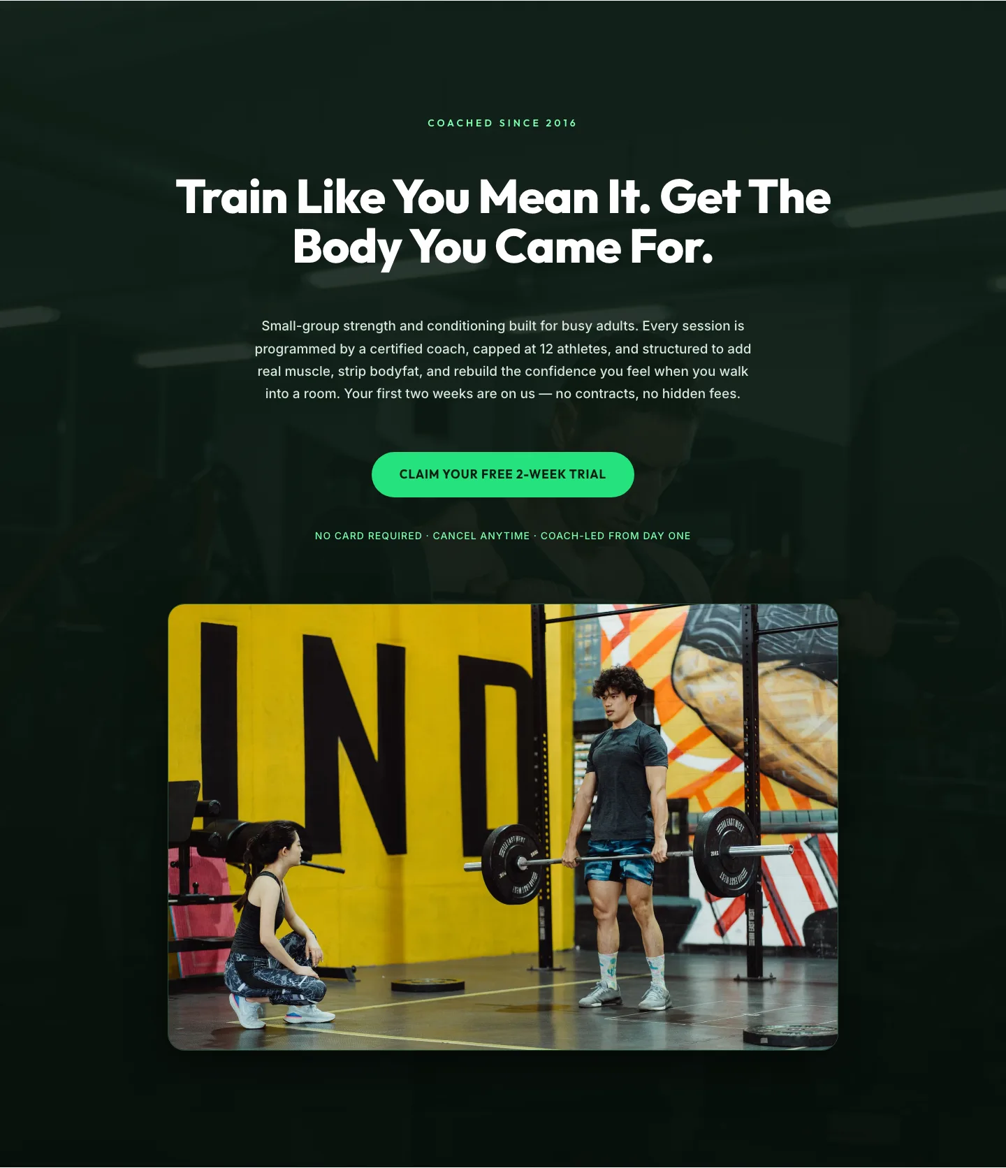
Bold Fitness Hero Section for Divi 5: Free Trial CTA
hero · fitness · bold
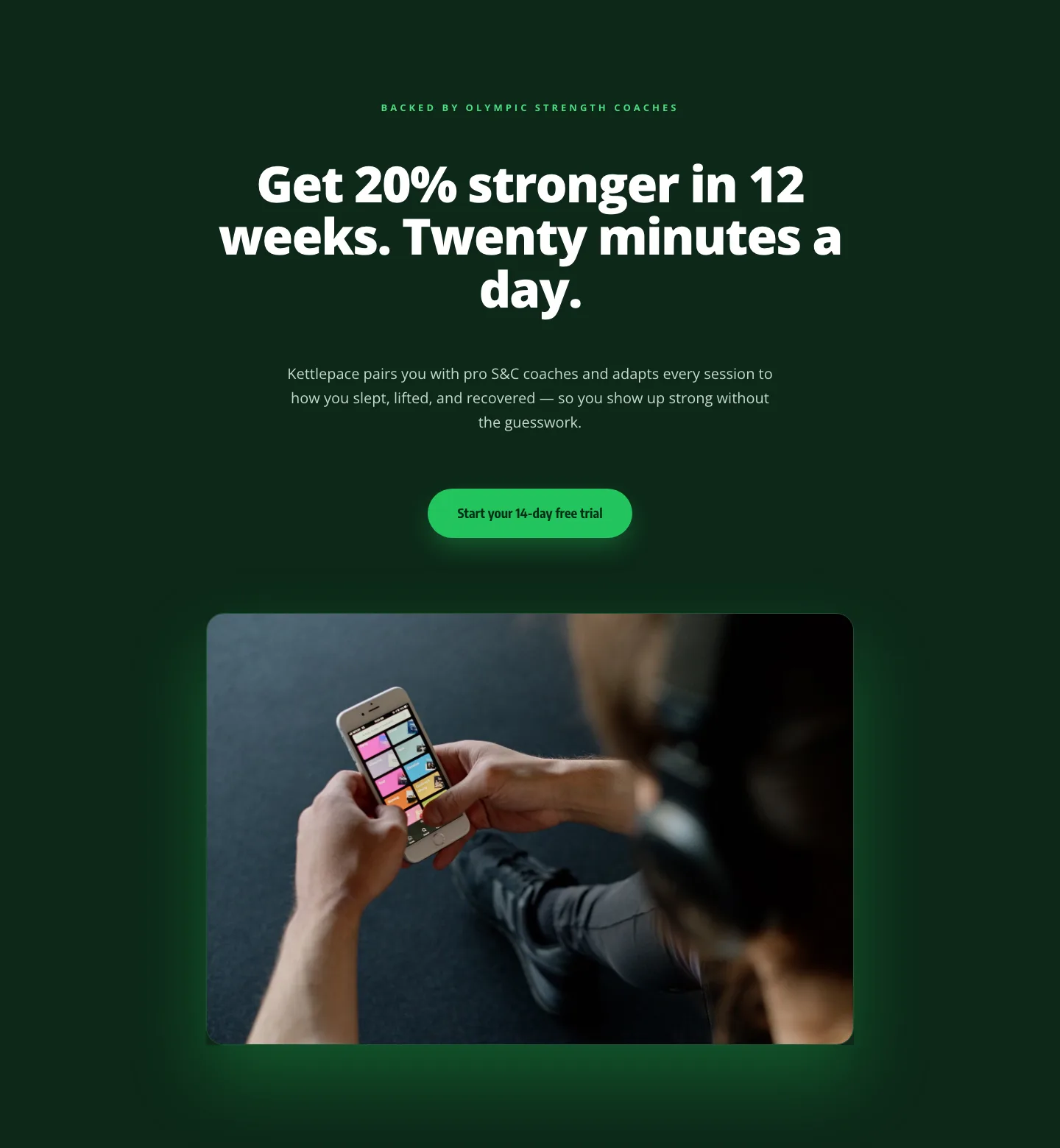
Kettlepace Hero: Bold Fitness App Landing Section for Divi 5
hero · fitness · bold
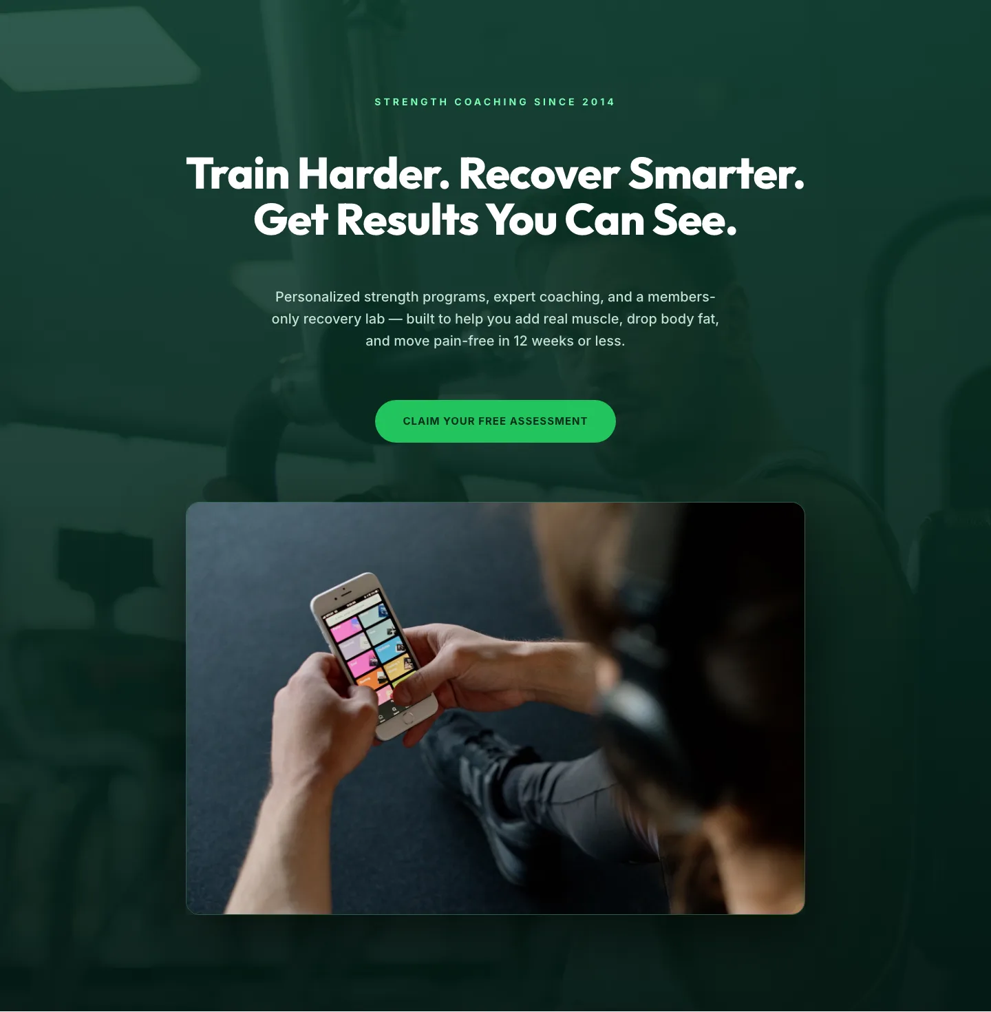
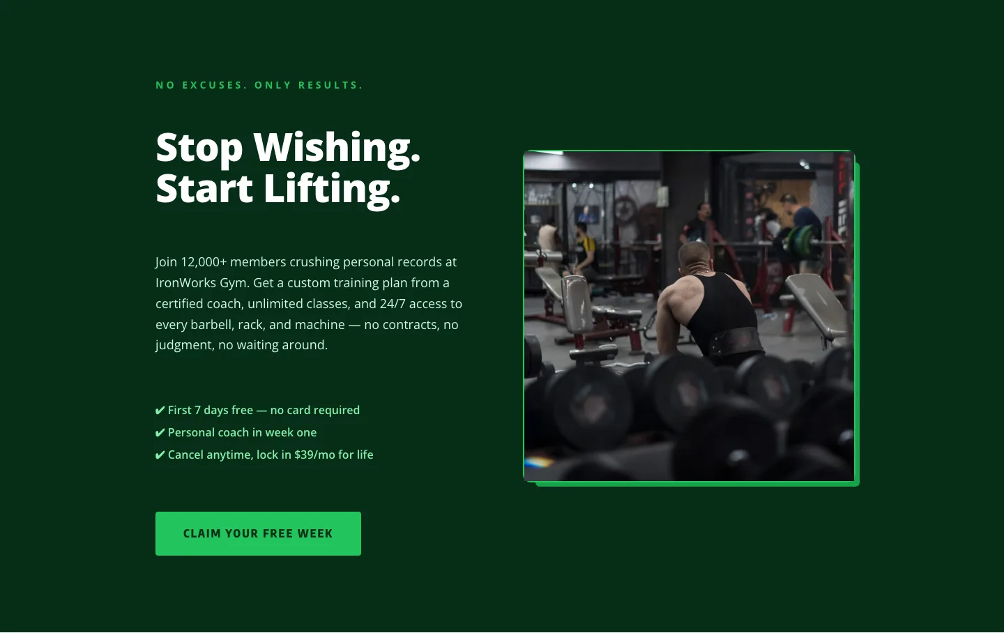
Bold Green Fitness Hero Section for Divi 5: Strength Coaching Landing
hero · fitness · bold
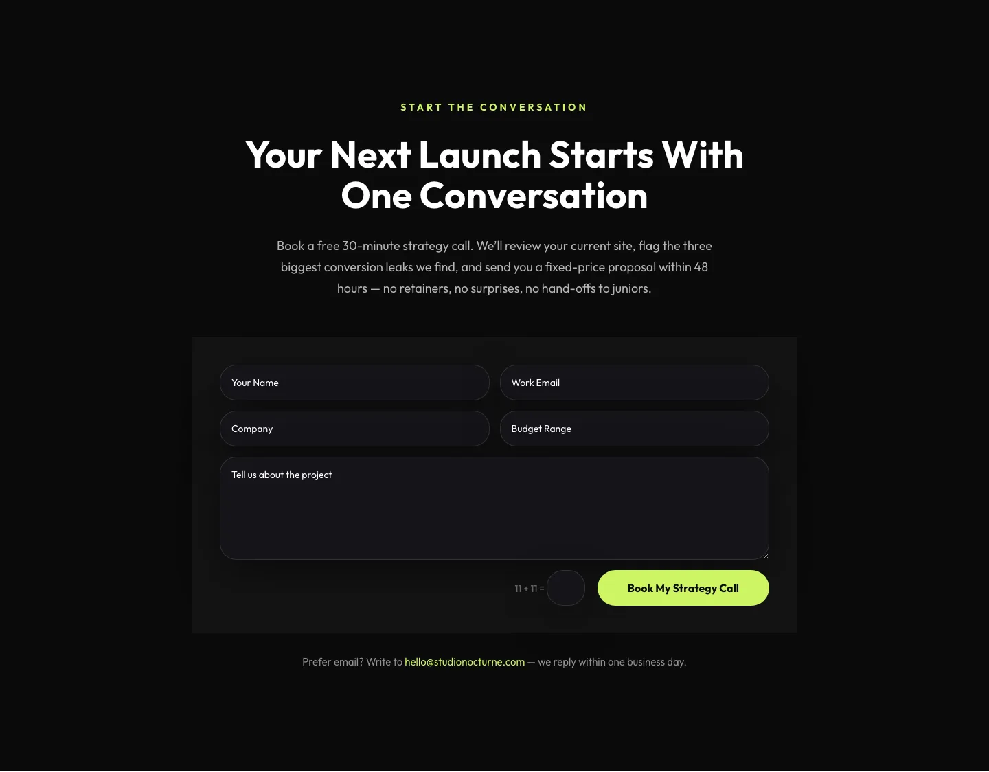
Dark Agency Contact Form: Book a Strategy Call Divi 5 Layout
contact · agency · dark
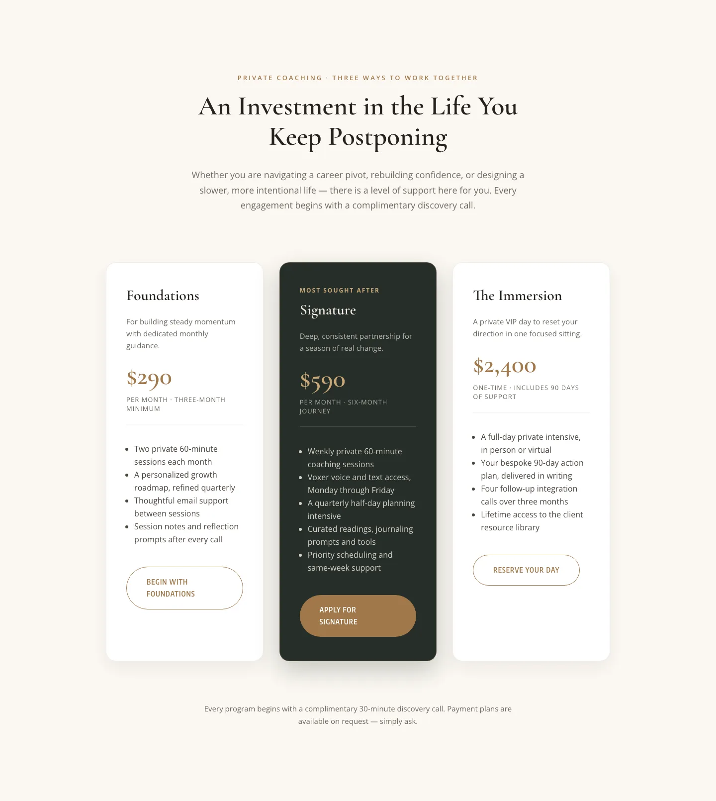
Elegant Coaching Pricing Section: 3-Tier Divi 5 Layout
pricing · coaching · elegant
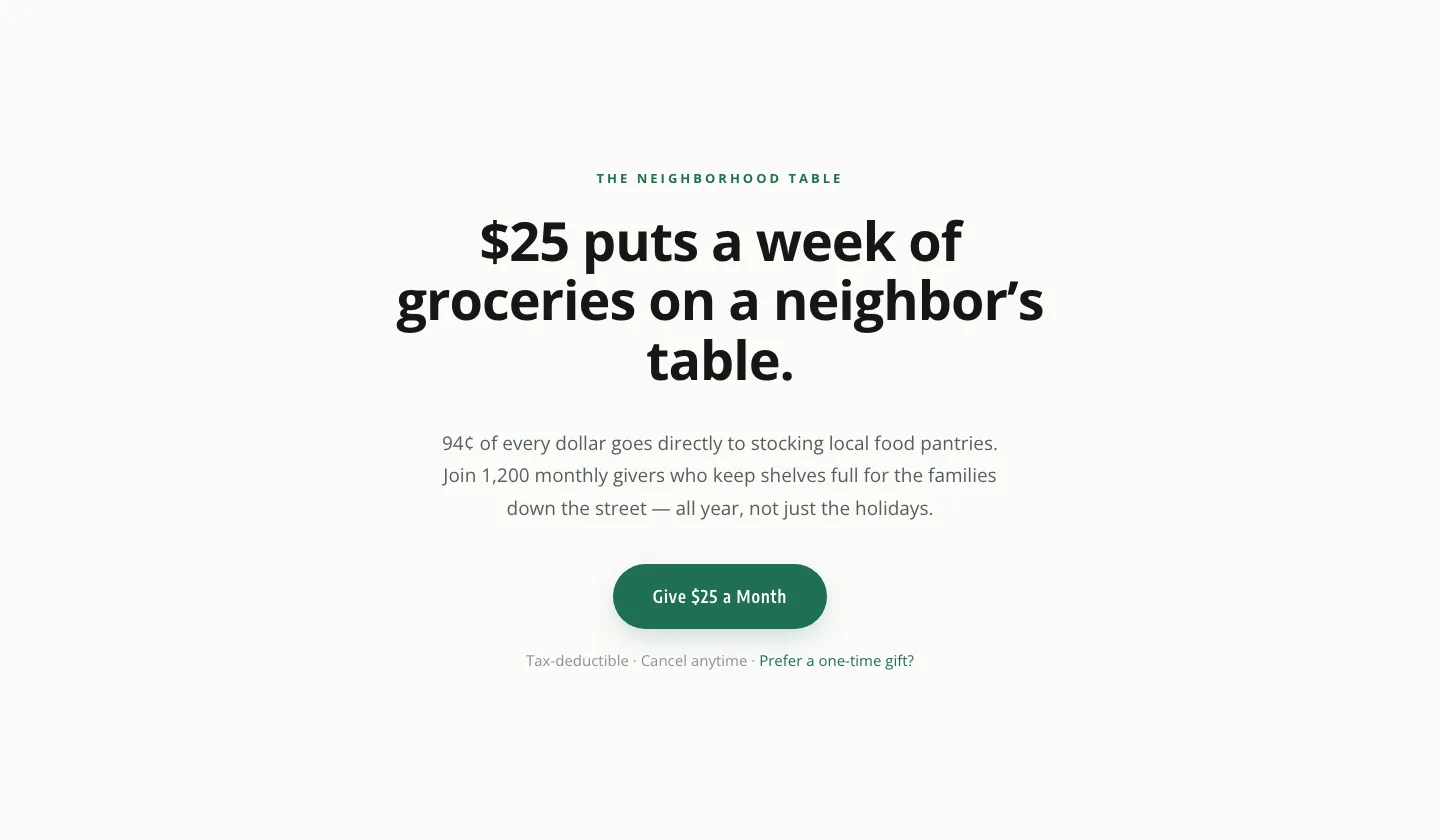
Minimal Nonprofit Donation CTA: Divi 5 Layout
cta · nonprofit · minimal
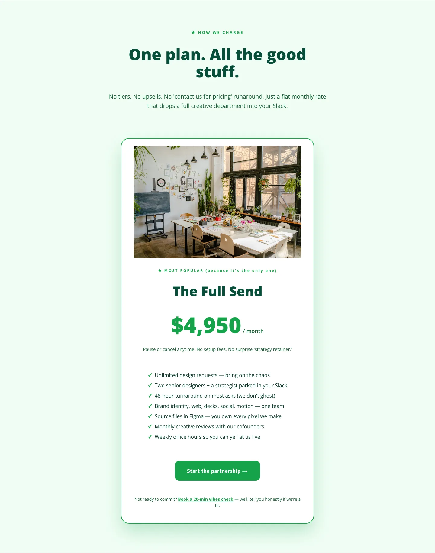
Playful Agency Pricing Section: Flat-Rate Divi 5 Layout
pricing · agency · playful

Bold Fitness App Hero Layout for Divi 5: IronPulse Adaptive Training
hero · fitness · bold
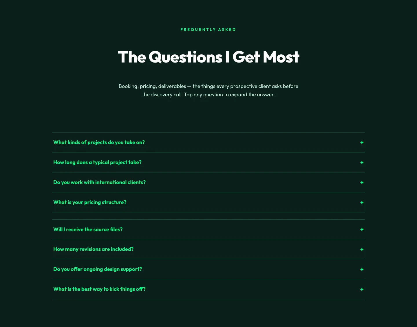
Bold Portfolio FAQ Section: Divi 5 Layout
faq · portfolio · bold
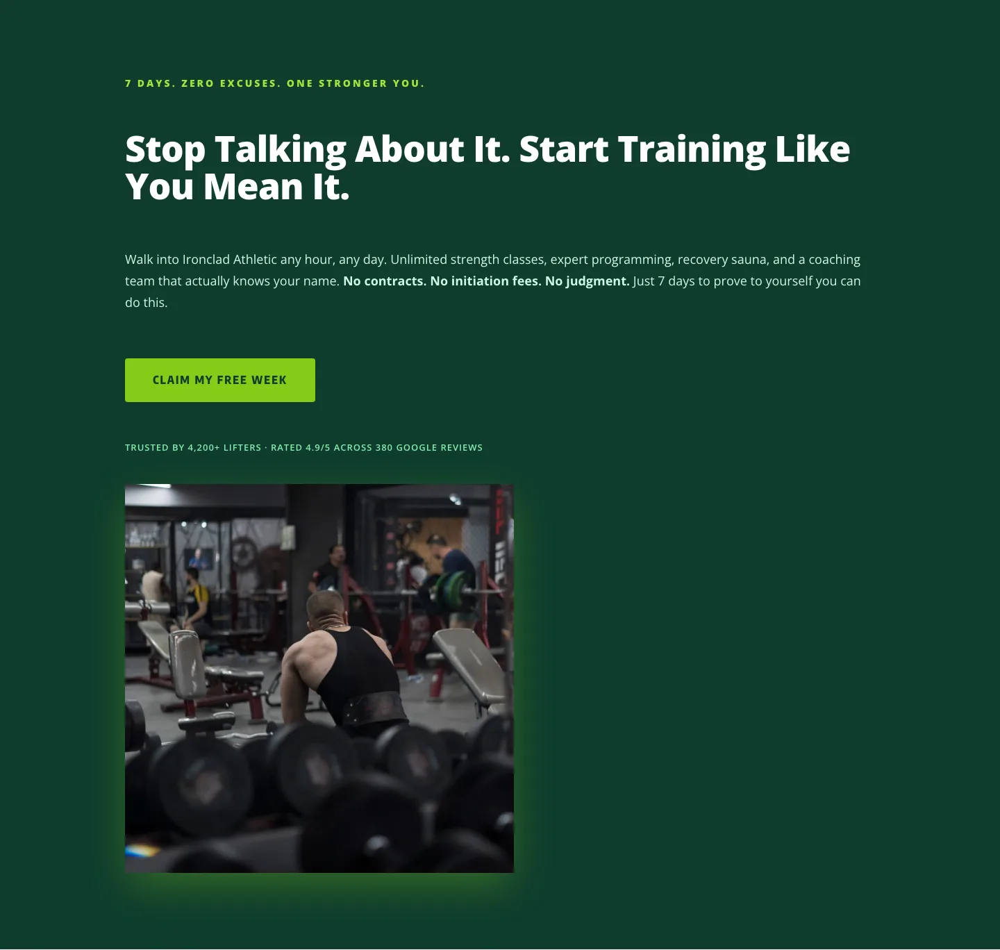
Bold Fitness CTA: Free Week Trial Divi 5 Layout
cta · fitness · bold

Meridian & Co.: Elegant Executive Coaching Landing Page for Divi 5
full_landing · coaching · elegant
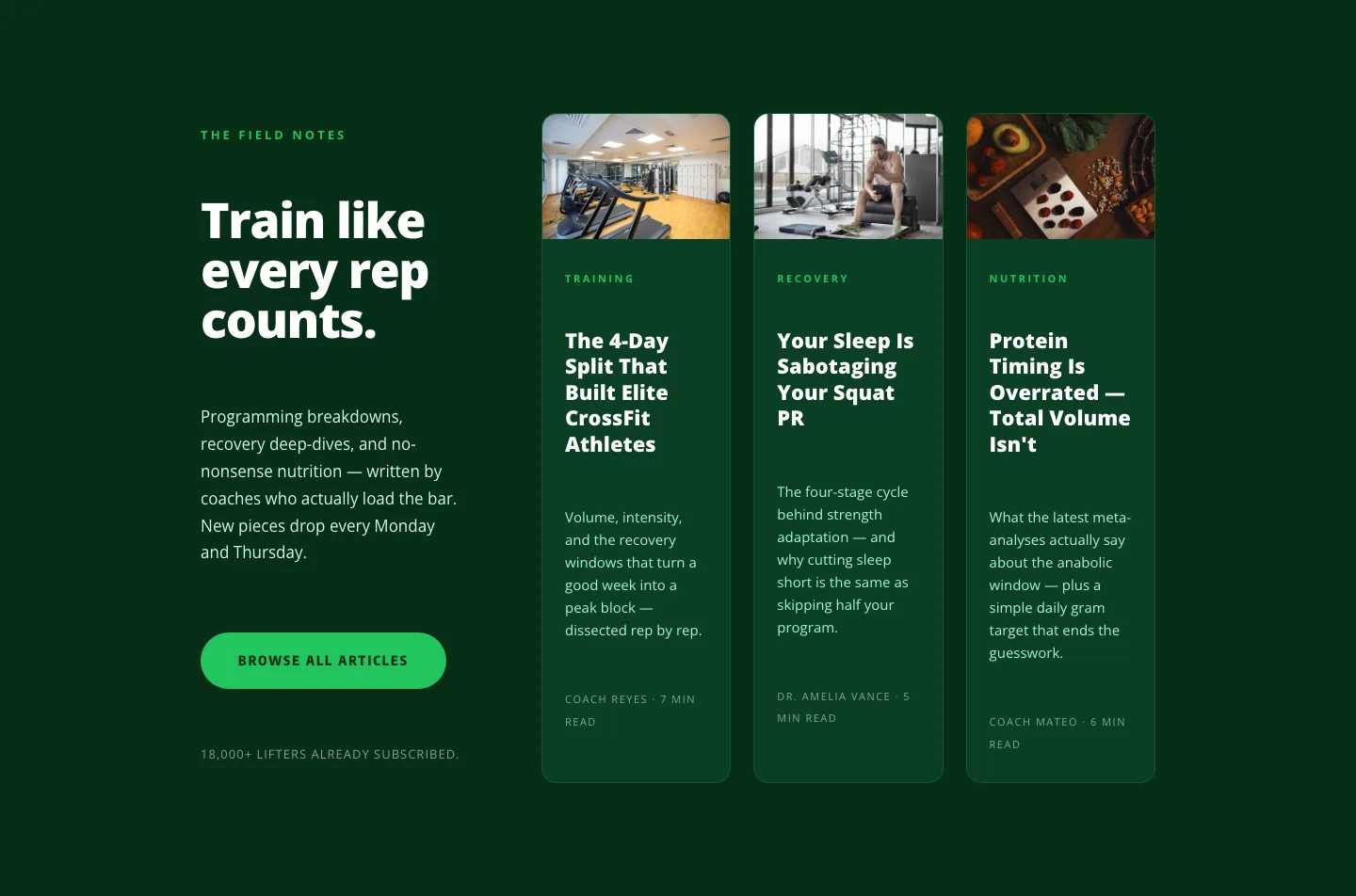
Bold Fitness Blog Layout for Divi 5: Green Asymmetric Split
blog · fitness · bold
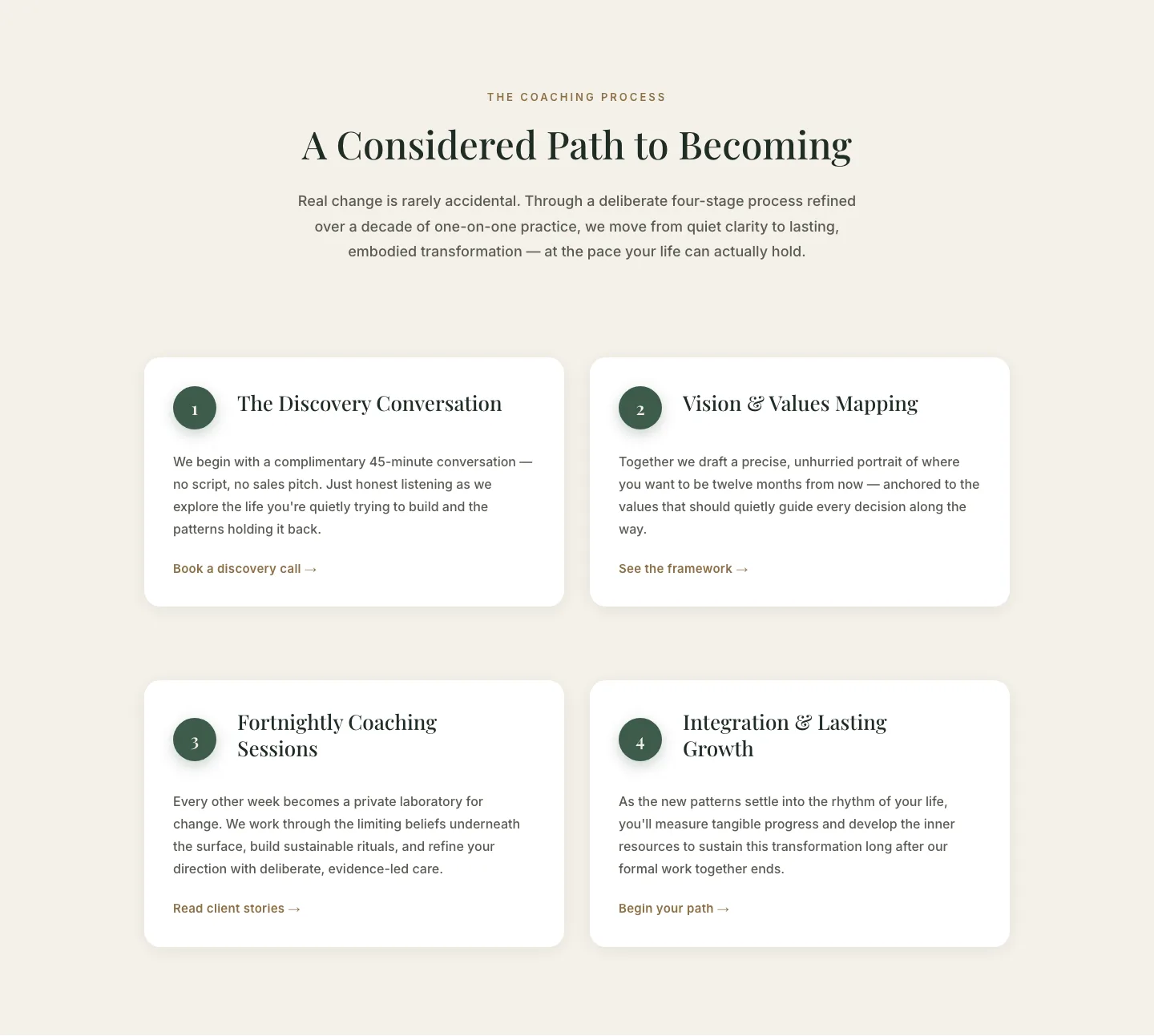
Elegant 4-Step Coaching Process Cards: Divi 5 Layout
cards · coaching · elegant
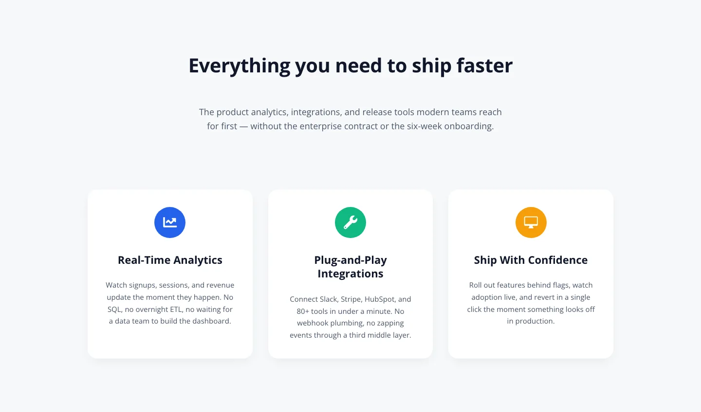
3-Column SaaS Feature Cards: Minimal Divi 5 Layout
cards · saas · minimal
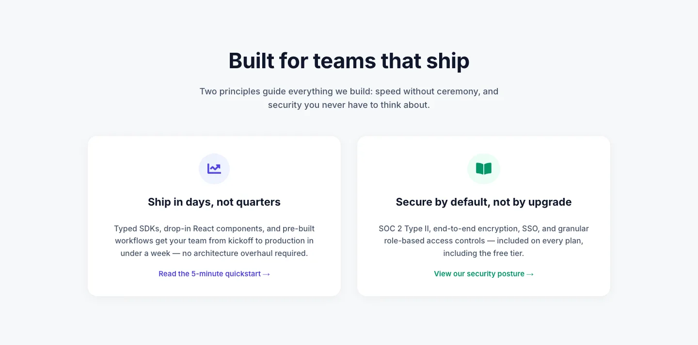
Minimal SaaS 2-Up Cards with Circular Icon Badges: Divi 5 Layout
cards · saas · minimal
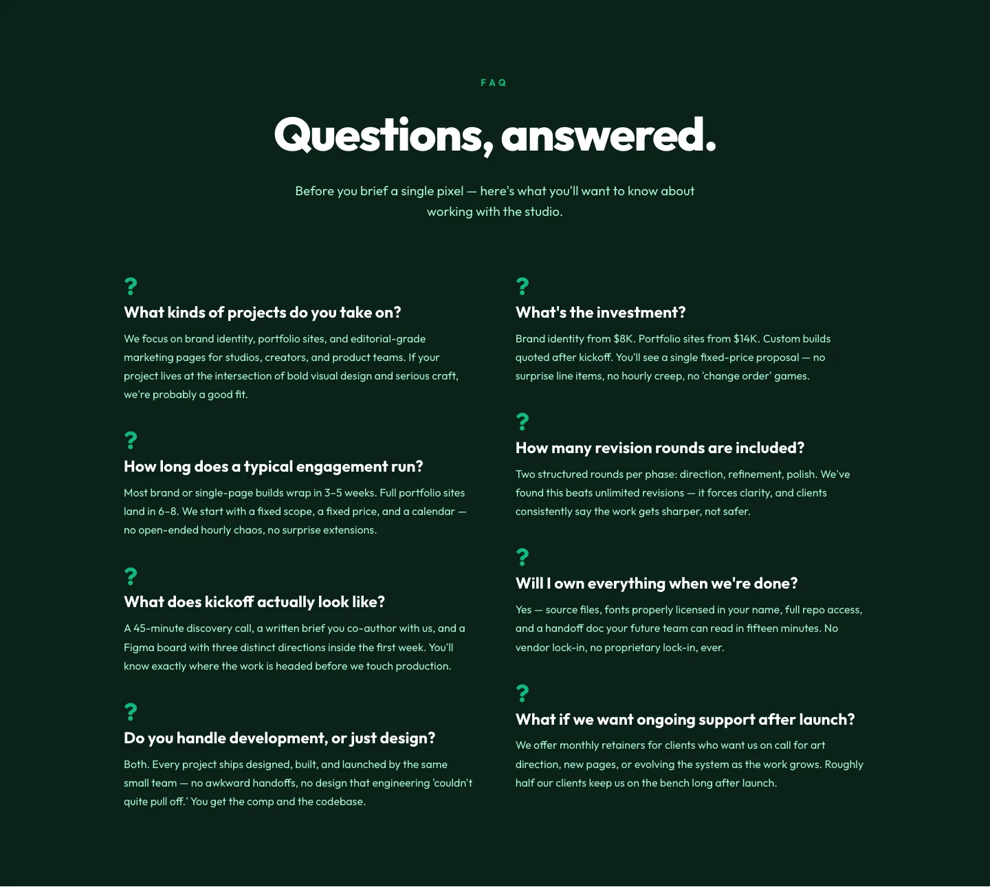
Bold Portfolio FAQ Section: Free Divi 5 Layout
faq · portfolio · bold
Bold Fitness CTA Layout for Divi 5: Start Training Today
cta · fitness · bold
What makes a strong green layout
Green is one of the trickier colors to design around because the wrong shade tips a page instantly: mint reads playful, olive reads editorial, emerald reads premium, forest reads institutional. A good green layout picks a single anchor shade and lets everything else (neutrals, type, imagery) get out of its way. Look for pages where green is doing a job: signaling a primary CTA, tying a hero to a testimonial, warming a photograph, or grounding a stat block. If green is decorating instead of directing, the page will feel like a smoothie brand no matter what you put on it.
Contrast is the other tell. Green sits mid-luminance, which makes it easy to accidentally build a page where the CTA disappears into the background. The layouts here pair green with a deliberate partner (cream, bone, charcoal, off-black, or the occasional terracotta) so the eye always has somewhere to land.
Who these layouts are for
Wellness studios, plant and garden brands, sustainability-minded SaaS, fintech and money apps, outdoor and adventure companies, food and beverage, agriculture, healthcare, and any B2B brand that wants to feel modern without going full corporate blue. Designers building for coaches, therapists, and consultants also lean on green when the goal is trust without stiffness.
Customizing a green layout in Divi 5
- Swap the palette globally. Open Divi 5's global colors and replace the anchor green with your brand's exact hex. Because every module in these layouts references global tokens, one edit reflows the whole page: buttons, dividers, icon backgrounds, section overlays.
- Use presets for tone. Each layout ships with typography and button presets. Duplicate a preset before editing it so you can A/B a softer vs. bolder green without rebuilding sections.
- Mind the neutral. If you shift from a warm green (sage, olive) to a cool one (emerald, teal-green), also shift the paired neutral. Warm greens want cream or bone; cool greens want true white or off-black. Keep the neutral aligned or the page will feel muddy.
- Rewrite the copy in place. The headline and subhead slots are sized for realistic word counts, don't stretch them past the built-in max-widths or the rhythm breaks. Keep CTAs to two or three words.
- Replace imagery last. Green layouts are unusually sensitive to photo choice. Swap in your own imagery before you sign off, and check the mobile render. A hero photo that works at 1440px can crop badly at 390px.
Every section is a free download behind an email, and paid packs ship under a single commercial license so you can use them on client work without a second thought.