
Blue Divi 5 Layouts
Blue is the workhorse of digital design: trustworthy enough for banks, fresh enough for SaaS, calm enough to make dense content feel readable. This collection gathers Divi 5 layouts built around blue palettes, from deep navy corporate frames to airy sky and cyan gradients. Every section is validated against Divi 5 structure before it ships, so what you see in the desktop and mobile screenshots is what imports into your builder.

Caldwell & Pierce: Corporate Legal Landing Page for Divi 5
full_landing · legal · corporate
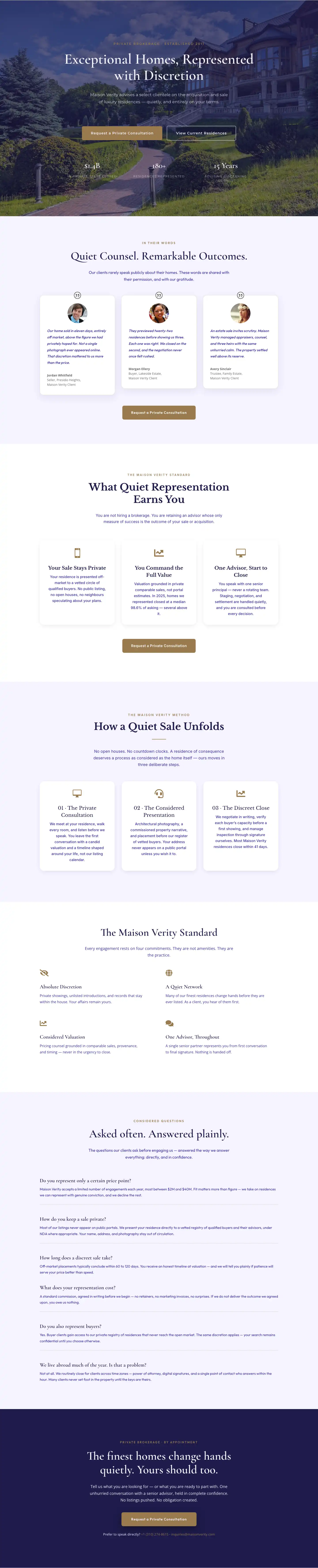
Elegant Luxury Real Estate Landing Page: Divi 5 Layout
full_landing · real_estate · elegant
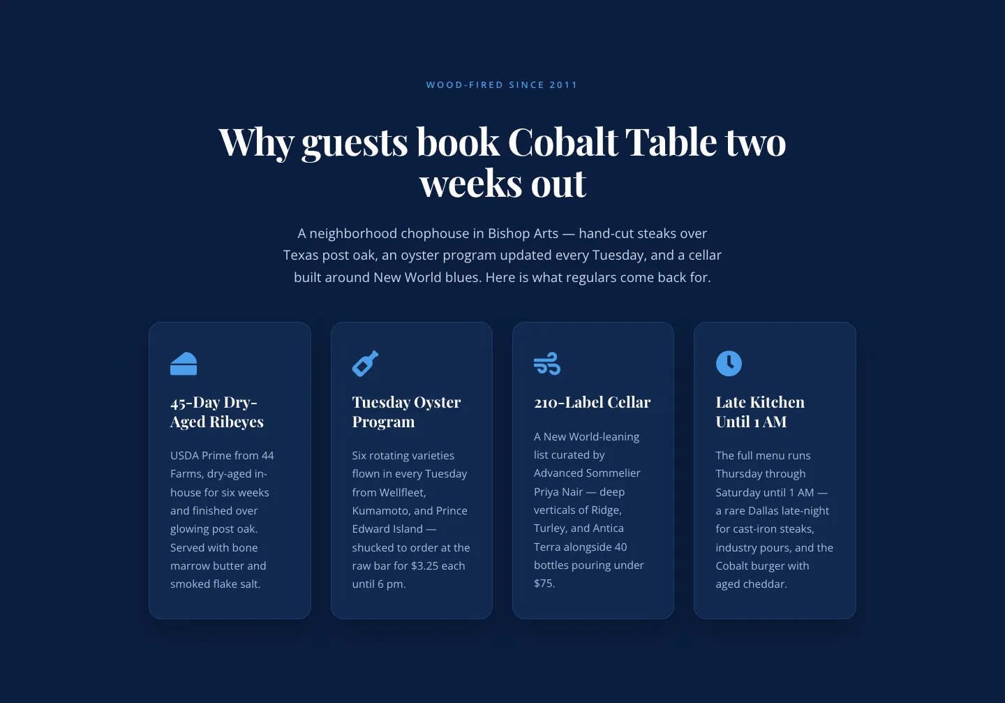
Bold Blue Restaurant Features Section: 4 Icon Columns | Divi 5
features · restaurant · bold
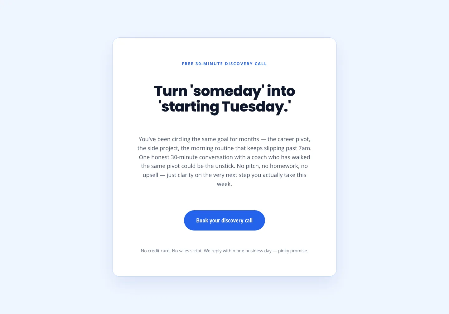
Coaching Discovery Call CTA: Playful Divi 5 Layout
cta · coaching · playful
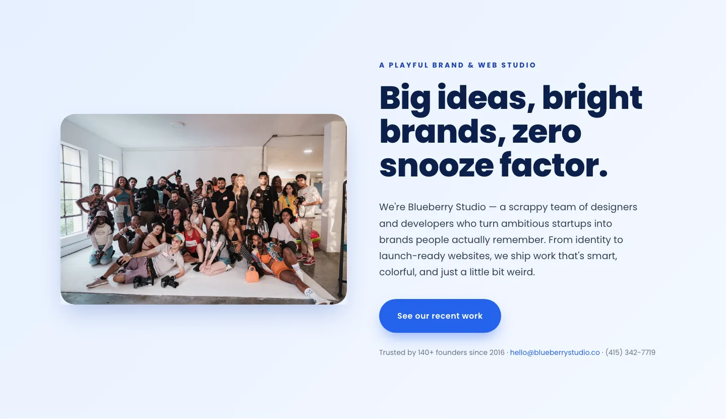
Playful Agency Hero Section: Bright Image-Left Divi 5 Layout
hero · agency · playful
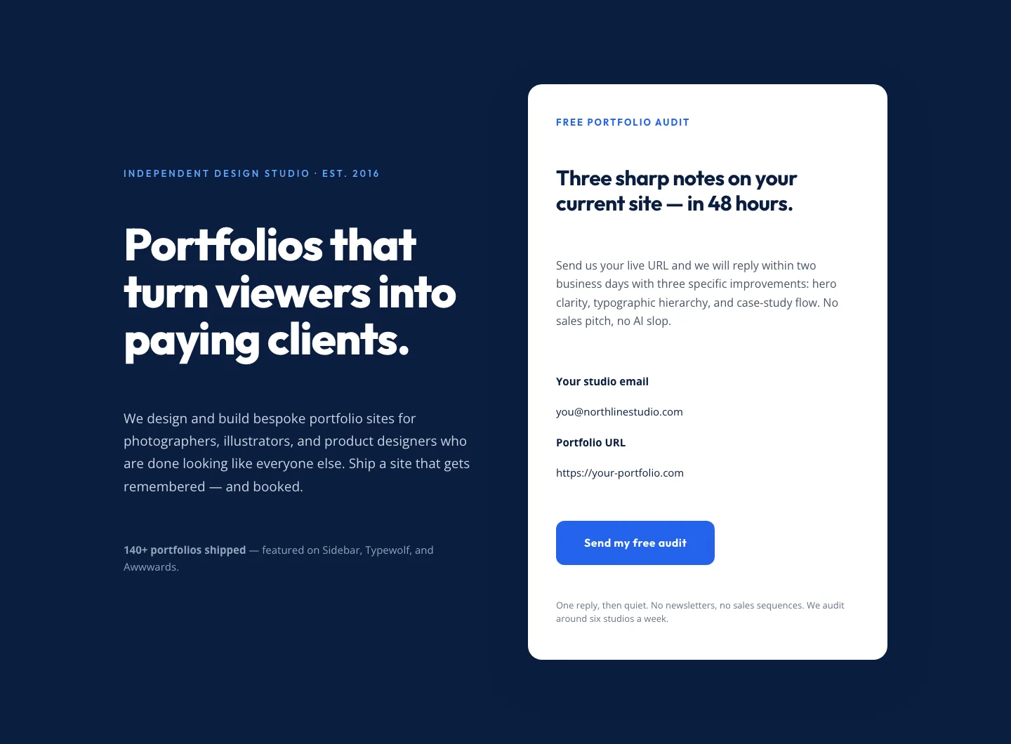
Bold Portfolio Hero with Free Audit Sign-up: Divi 5 Layout
hero · portfolio · bold
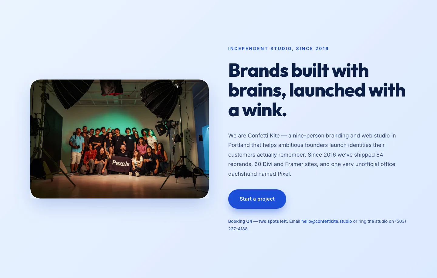
Playful Agency Hero Section for Divi 5: Ideas With A Wink
hero · agency · playful
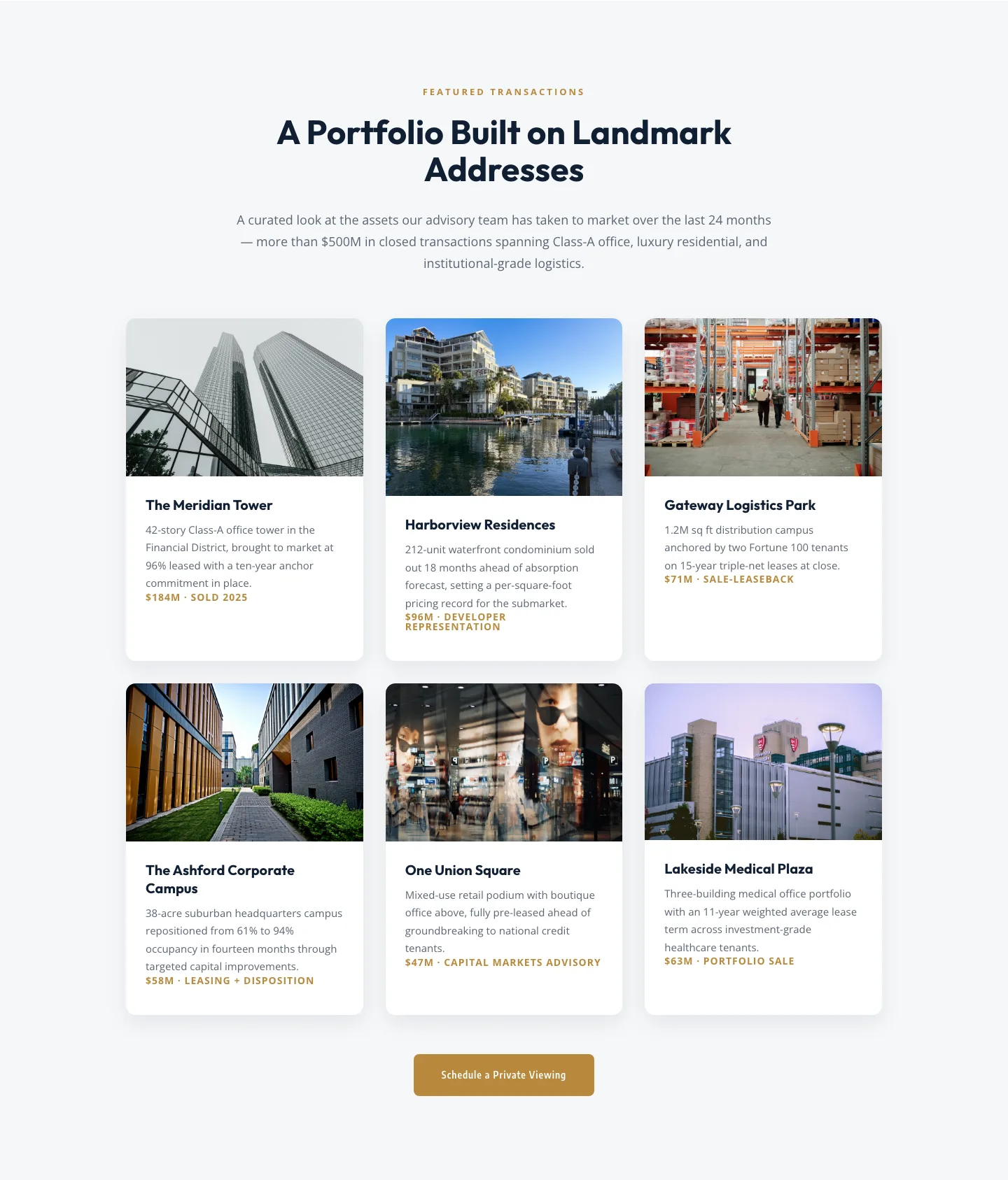
Corporate Real Estate Featured Listings Gallery: Divi 5 Layout
gallery · real_estate · corporate
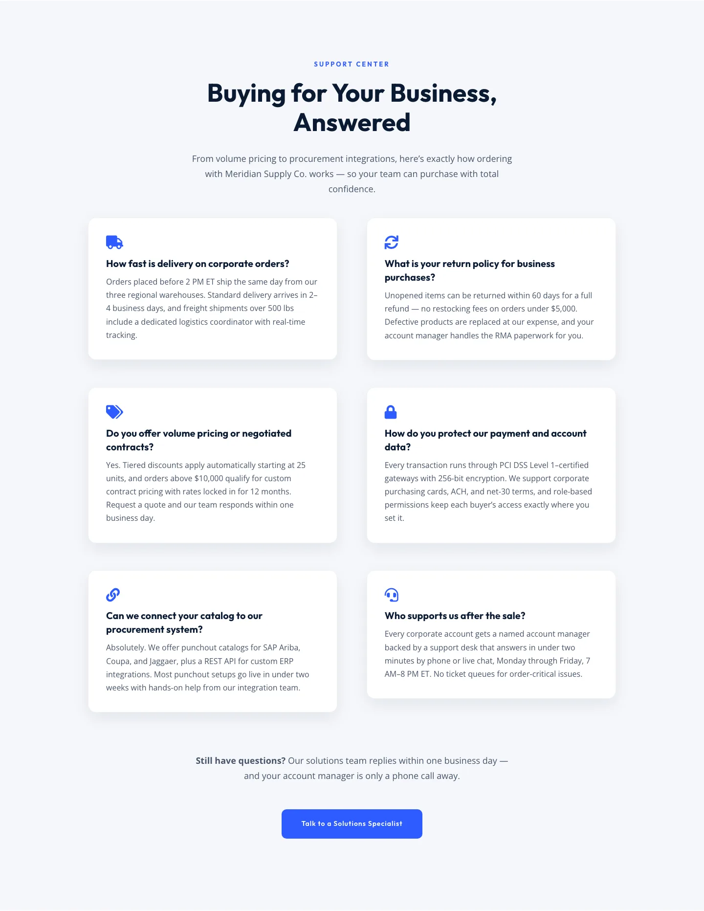
Corporate Ecommerce FAQ Section: Divi 5 Layout
faq · ecommerce · corporate
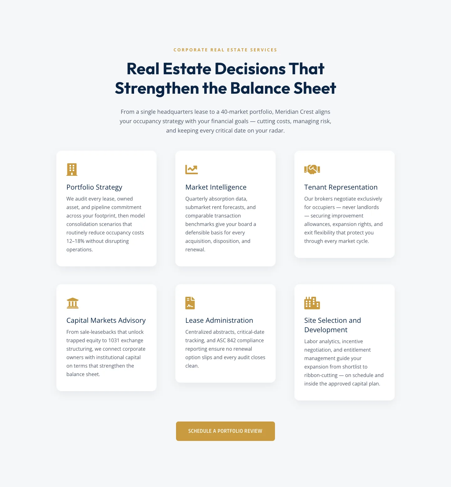
Corporate Real Estate Features Section: Six-Pillar Service Grid for Divi 5
features · real_estate · corporate

Playful Agency Hero Section for Divi 5: Bold Studio Landing
hero · agency · playful
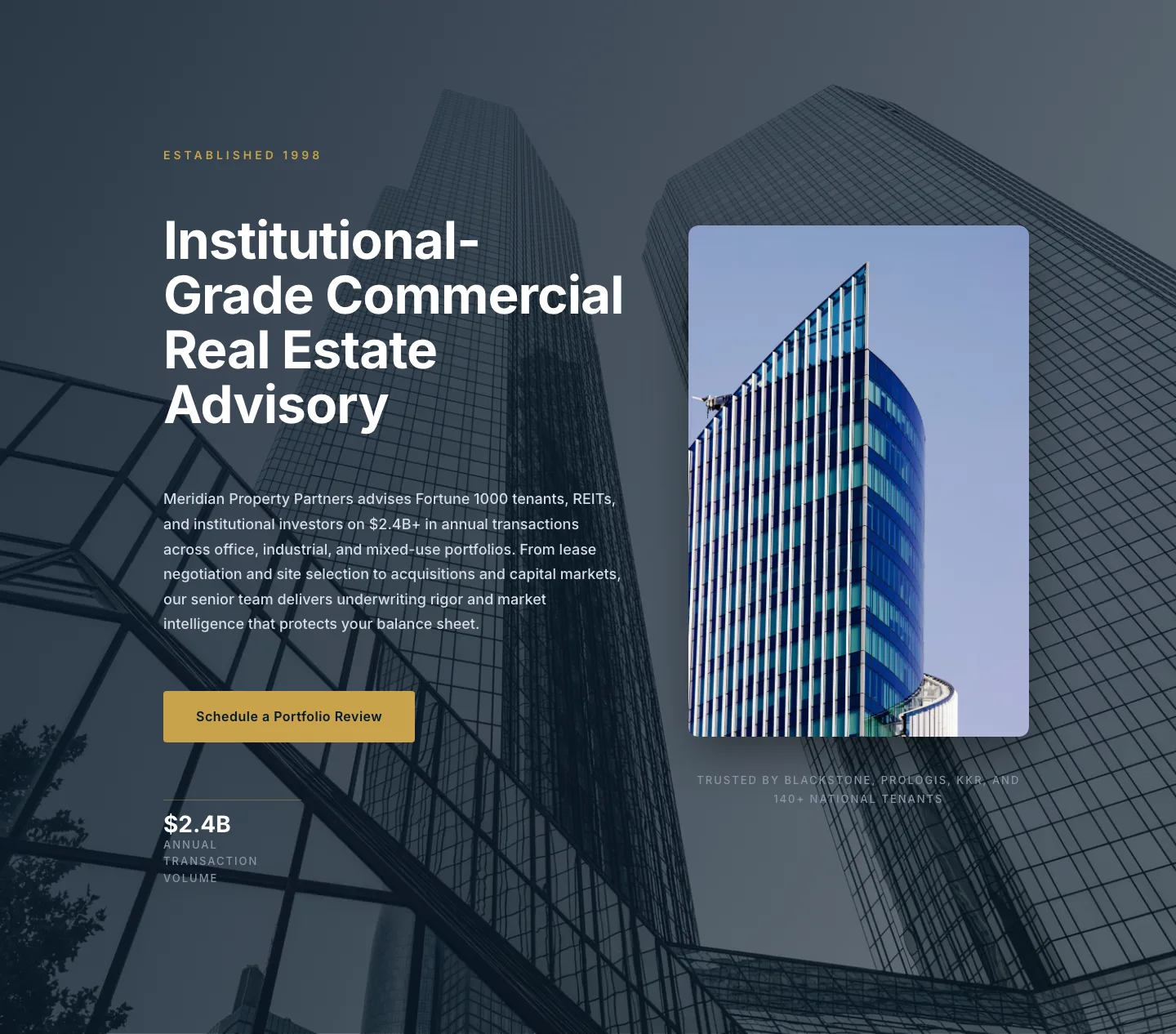
Corporate Real Estate Hero Layout for Divi 5: Meridian Property Partners
hero · real_estate · corporate
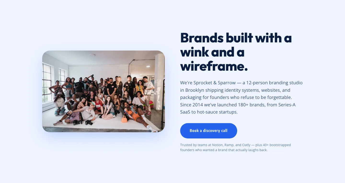
Playful Agency Hero Layout for Divi 5: Brooklyn Branding Studio Style
hero · agency · playful
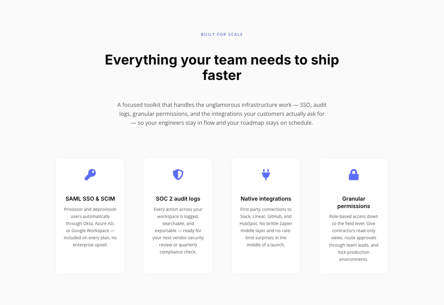
Minimal SaaS Features Section: 4-Column Icon Grid for Divi 5
features · saas · minimal
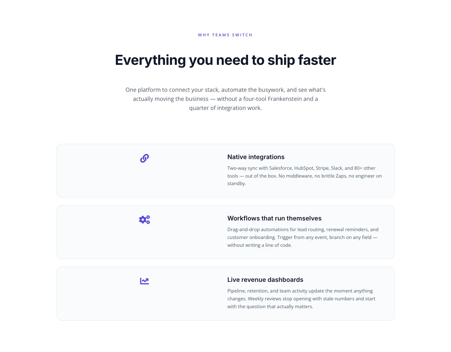
SaaS Features Section: Integrations, Automation & Live Dashboards
features · saas · minimal
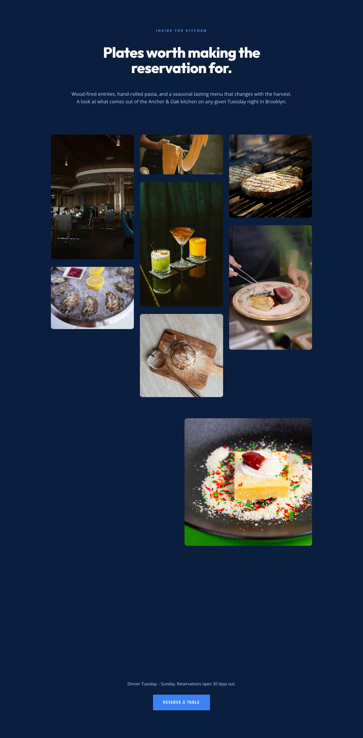
Restaurant Gallery: Bold Blue (Anchor & Oak) | Divi 5 Layout
gallery · restaurant · bold
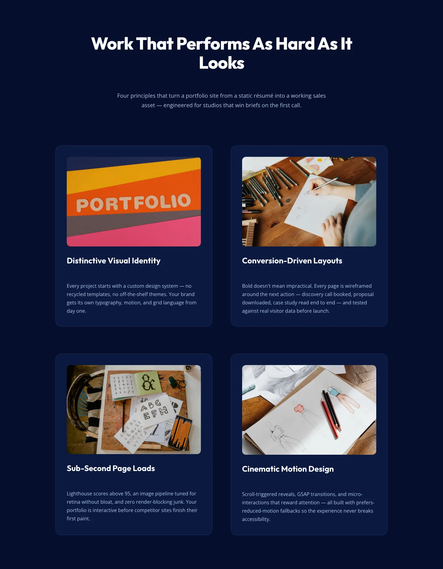
Bold Portfolio Features Section: 2×2 Grid for Divi 5
features · portfolio · bold
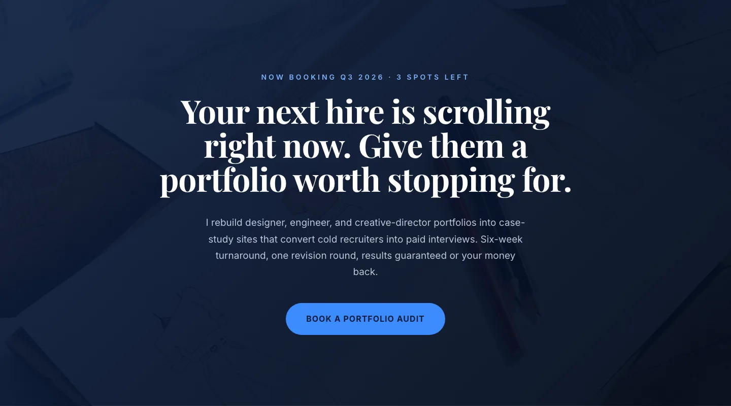
CTA: Portfolio Bold Blue
cta · portfolio · bold
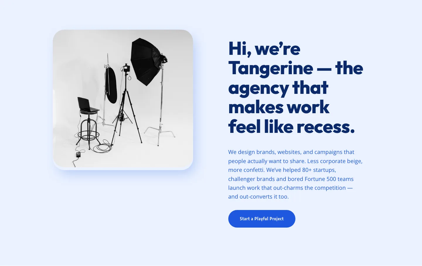
Playful Agency Hero Section for Divi 5: Image Left Layout
hero · agency · playful
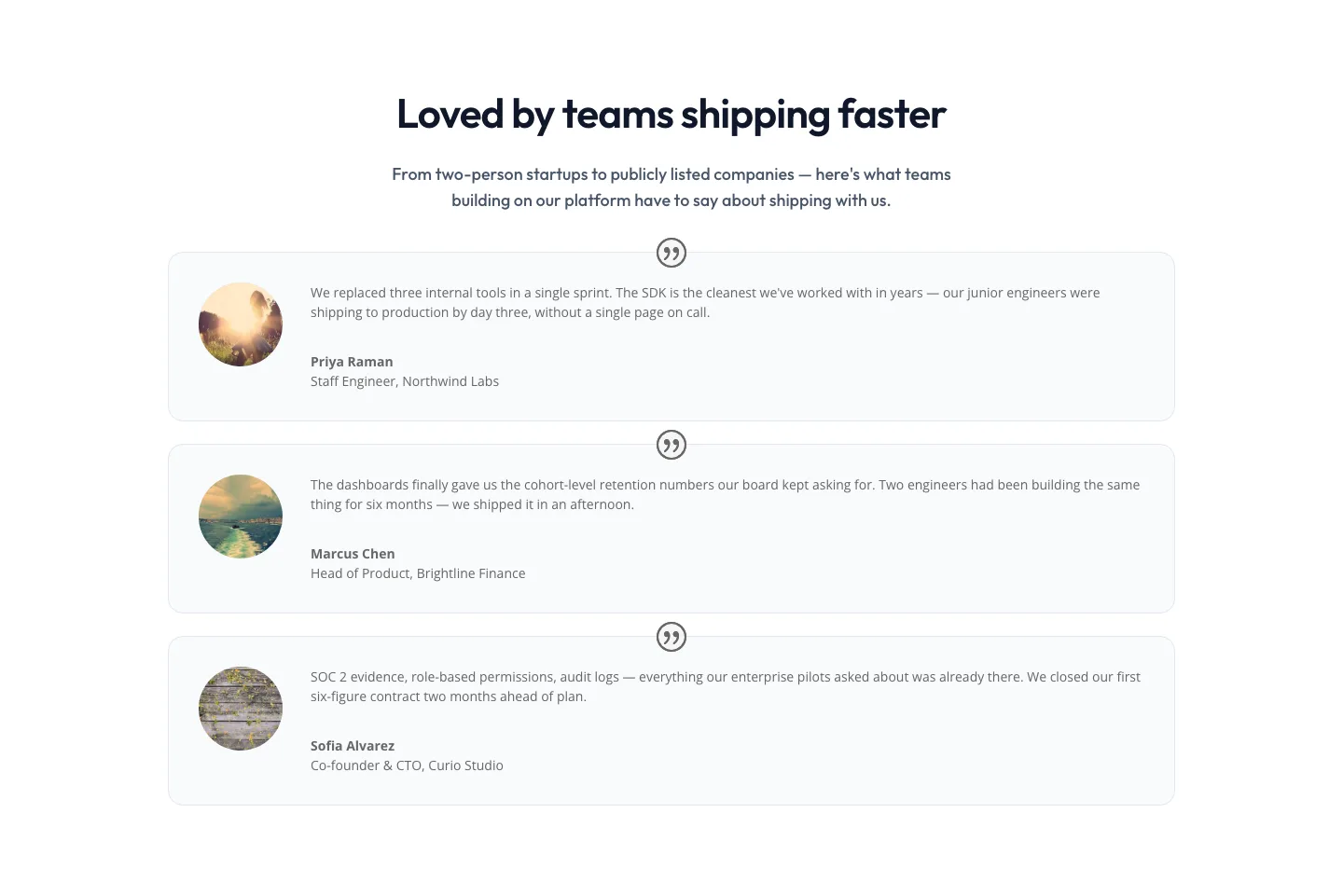
Minimal SaaS Testimonials Section: Three-Column Customer Quotes
testimonials · saas · minimal
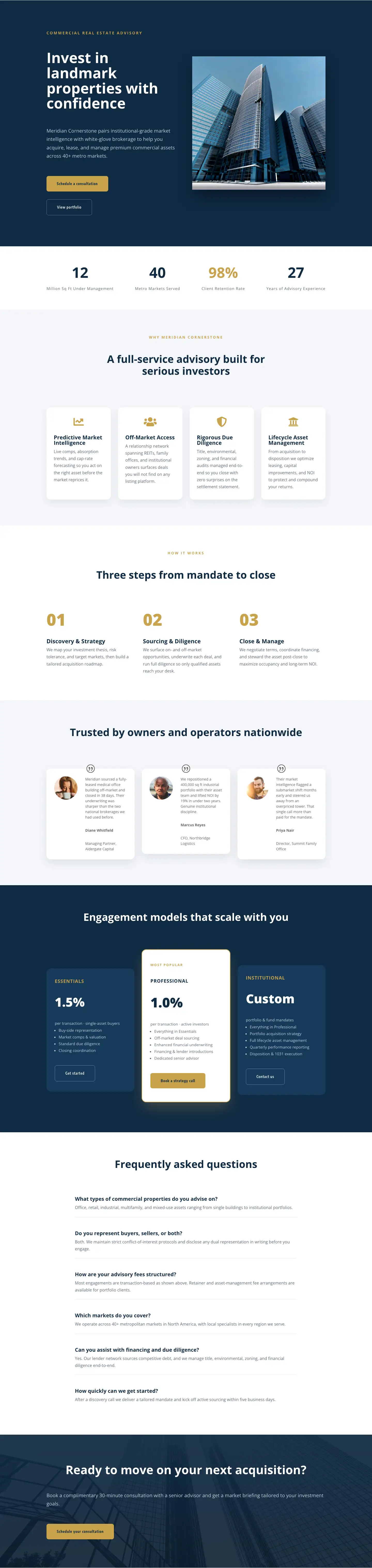
Commercial Real Estate Advisory Landing Page: Divi 5 Layout
full_landing · real_estate · corporate
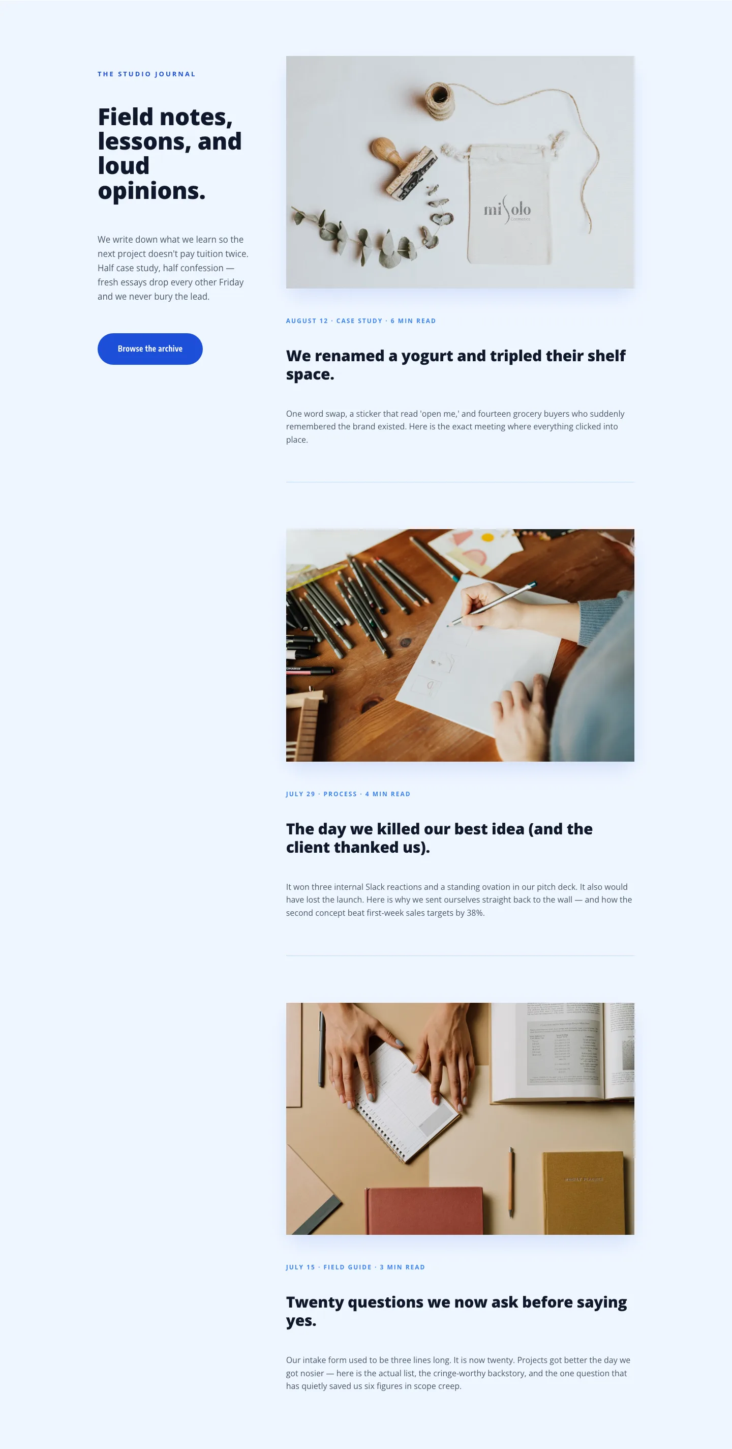
Playful Agency Blog Layout for Divi 5: Studio Journal
blog · agency · playful

Minimal SaaS 3-Up Feature Cards Layout for Divi 5
cards · saas · minimal

Minimal SaaS Feature Cards Layout: 4-Column Divi 5 Section
cards · saas · minimal
What makes a blue layout actually work
Blue is easy to reach for and easy to get wrong. The good layouts in this category aren't just "tinted blue", they treat the hue as a system. A single anchor blue (usually the CTA and primary headline accent), one supporting shade for surfaces or dividers, and a neutral spine of off-white, slate, or near-black to keep contrast honest. When those three roles are clear, the page feels considered instead of loud.
The other move that separates a strong blue layout from a stock one is restraint on the gradient. A subtle indigo-to-cobalt wash behind a hero can add depth; the same gradient repeated in five sections turns a page into wallpaper. The layouts here lean on solid blocks with one or two accent moments, which is why they read well on both a 27-inch monitor and a phone.
Who reaches for blue
Fintech, B2B SaaS, healthcare, legal, consulting, education, and civic organizations dominate this category: anyone whose brand promise includes "you can rely on us." But blue also shows up in wellness, travel, and editorial work when the goal is calm rather than authority. If your audience needs to slow down and read, blue tends to earn the attention.
Customizing a blue layout in Divi 5
Start in the Divi 5 Style Guide and set your brand blue as the primary color token before touching a single module. Every button, link, and accent in the layout is bound to that token, so one change re-skins the page consistently. Adjust the secondary color to a warmer neutral if the layout feels cold, a soft sand or off-white surface color reads better than pure gray for most brands.
Next, apply your preset overrides. Divi 5 presets let you shift the default heading font, button radius, and section padding globally. If your brand blue skews darker than the layout's default, bump body text one step lighter and increase line-height slightly. Dense text on a dark-blue background needs more air.
For copy, replace the placeholder headlines with a single benefit-led statement, keep subheads under fifteen words, and rewrite CTAs to describe the outcome ("Start a free trial," not "Learn more"). Swap the hero image last: a blue palette forgives most photography, but a photo with a warm accent (a person's jacket, a sunset, a wooden desk) will make the whole page feel less monochrome.
Every layout in this collection is a free download with a commercial license, gated only by your email. Import the JSON, retune the tokens, and the page is yours.