
Agency Divi 5 Layouts
Agency layouts have to sell taste before they sell services, the site itself is the portfolio. These Divi 5 sections give creative studios, brand consultancies, and dev shops a fast way to ship pages that look considered, not templated.
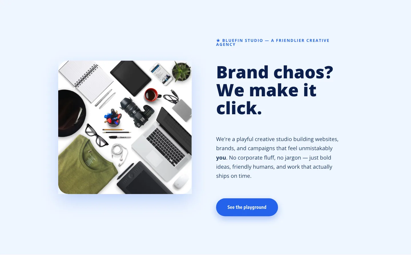
Bluefin Studio: Playful Creative Agency Hero Section for Divi 5
hero · agency · playful
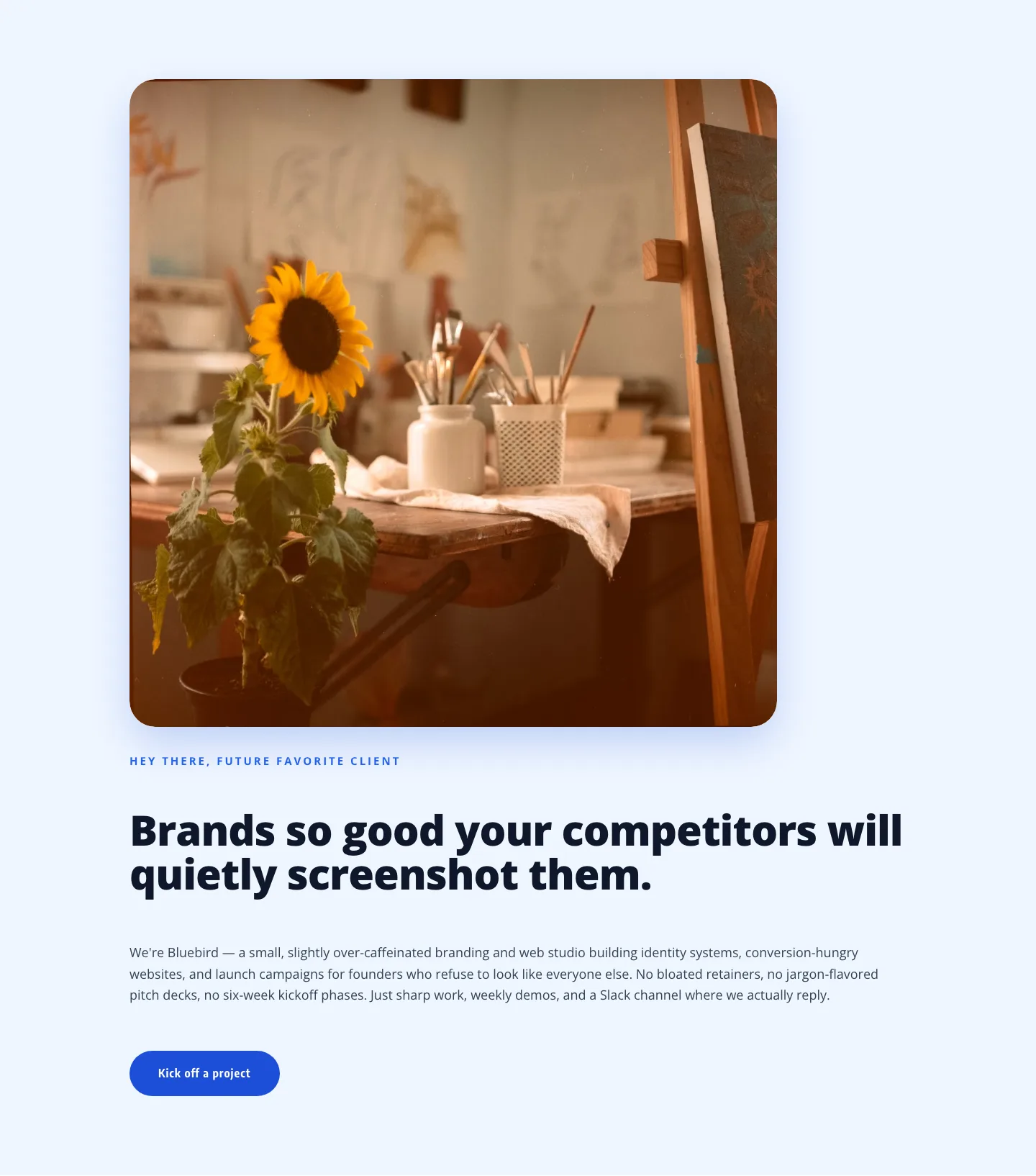
Playful Agency Hero: Friendly Branding Studio Divi 5 Layout
hero · agency · playful
What makes an agency layout work
Agency prospects skim. They land on your site already comparing you against three other studios, and they're deciding within a few seconds whether your work looks like it belongs next to theirs. Good agency layouts respect that. They lean on generous whitespace, confident typography, and a rhythm that alternates dense proof (case studies, logos, capabilities) with quiet breathing room.
The strongest agency sections tend to share a few traits: a hero that states positioning without hedging, a case-study grid that treats each project like editorial content instead of a thumbnail dump, a services block that reads as a point of view rather than a checklist, and a team or process section that makes the studio feel like specific people, not a stock render. Motion should be restrained, one deliberate transition beats five janky ones.
Who these are for
Branding studios, digital agencies, product design shops, freelance collectives, and creative consultancies who need a marketing site that reads as considered as the work they deliver to clients. They're equally useful as a starting point when you're pitching a new agency site to your client and don't want to burn a week on scaffolding.
Customizing in Divi 5
Every section here is validated against Divi 5's structure before it hits the marketplace, so you can drop it into the Visual Builder and start editing without wrestling module errors. A few adjustments unlock most of the flexibility:
- Presets. Apply your brand's button, heading, and body presets globally before touching anything else. One pass through Divi 5 presets restyles the whole layout in a coherent direction: accent color, radius, type scale, spacing rhythm.
- Palette. Swap the two or three color roles (background, foreground, accent) via the palette rather than editing modules one by one. Agency work usually reads best with a restrained palette: one dominant neutral, one supporting neutral, one confident accent.
- Copy. Rewrite headlines with the client's actual positioning language. Placeholder copy on an agency site is the fastest way to look like every other agency site. Case-study captions should name the outcome, not describe the deliverable.
- Imagery. Replace stock imagery with real work, even rough mockups outperform polished stock. If you don't have client-approved shots yet, use tonal photography over subject-heavy compositions.
Each layout ships as a free download (email-gated) under a commercial license, with real desktop and mobile screenshots so you know exactly what you're importing before you commit to it.