
Red Divi 5 Layouts
Red is confidence turned up loud. In a Divi 5 layout, it's the color you reach for when a page needs to convert, energize, or announce something. But it only works when the rest of the design gets out of its way. This collection gathers layouts where red carries real weight without shouting over the content.
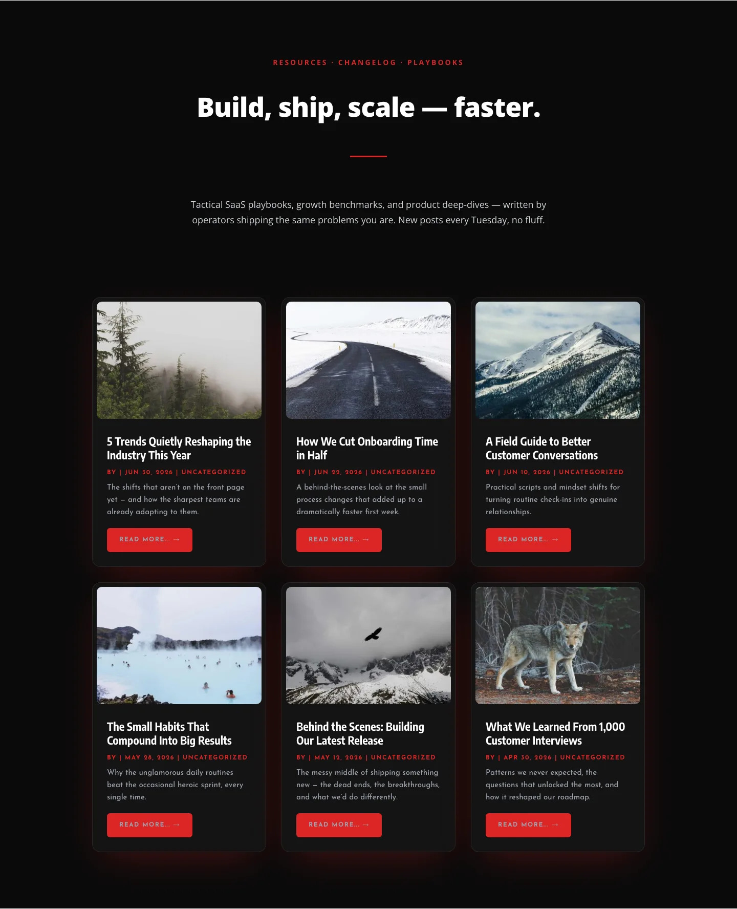
Bold SaaS Blog Layout: Resources & Insights Grid for Divi 5
blog · saas · bold
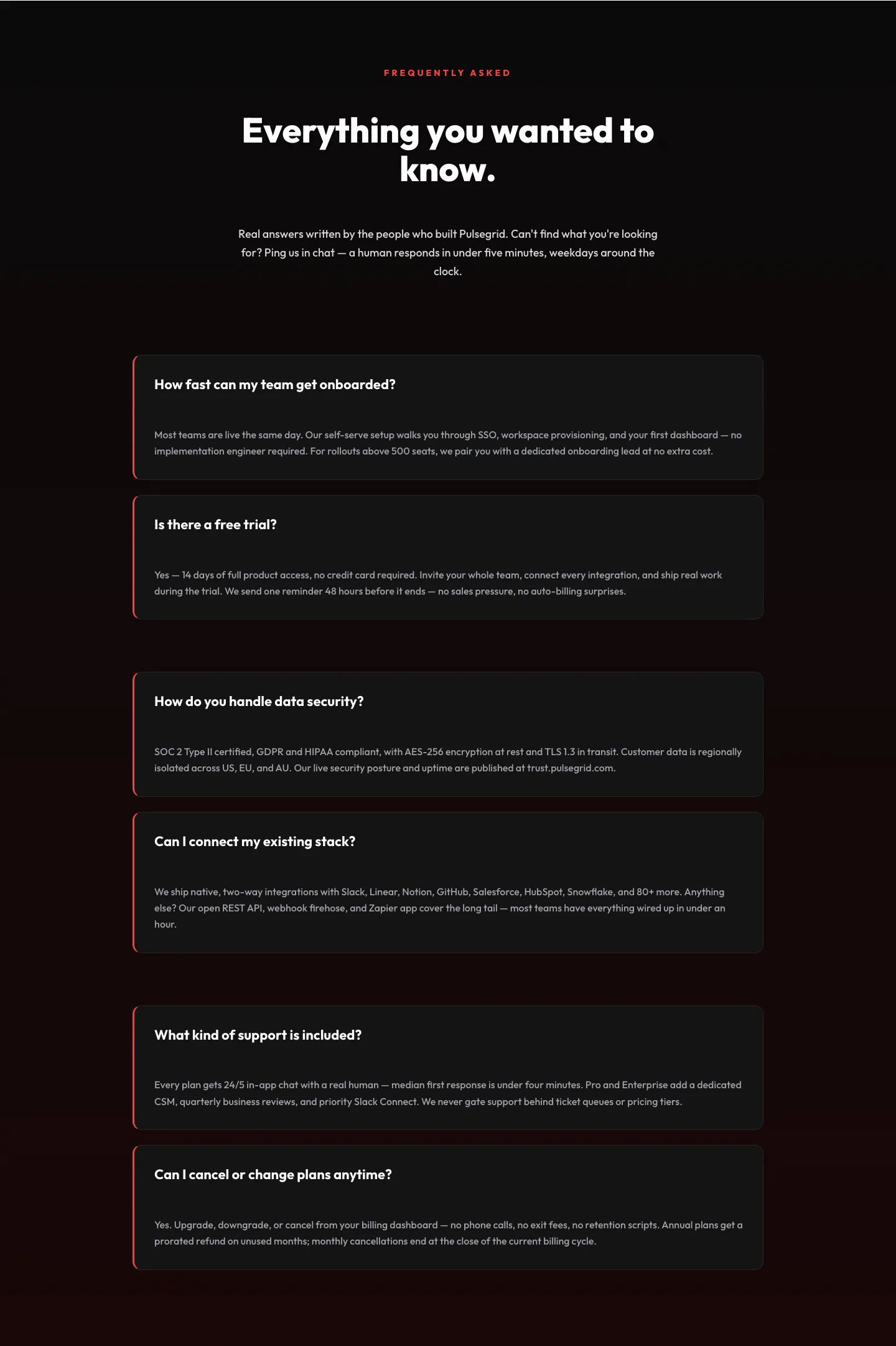
Bold SaaS FAQ Section: Two-Column Accordion Divi 5 Layout
faq · saas · bold
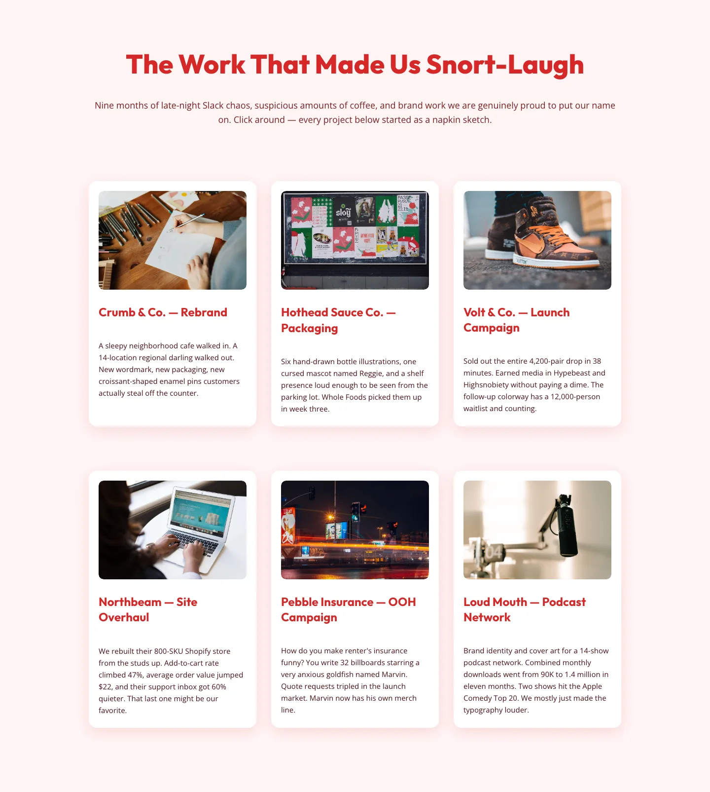
Playful Agency Portfolio Gallery: Free Divi 5 Layout
gallery · agency · playful
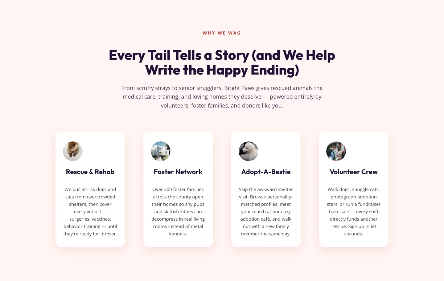
Playful Nonprofit Features Section for Divi 5: Animal Rescue Layout
features · nonprofit · playful

Pulsegrid SaaS Hero: Bold Dark Product Analytics Landing Section | Divi 5
hero · saas · bold
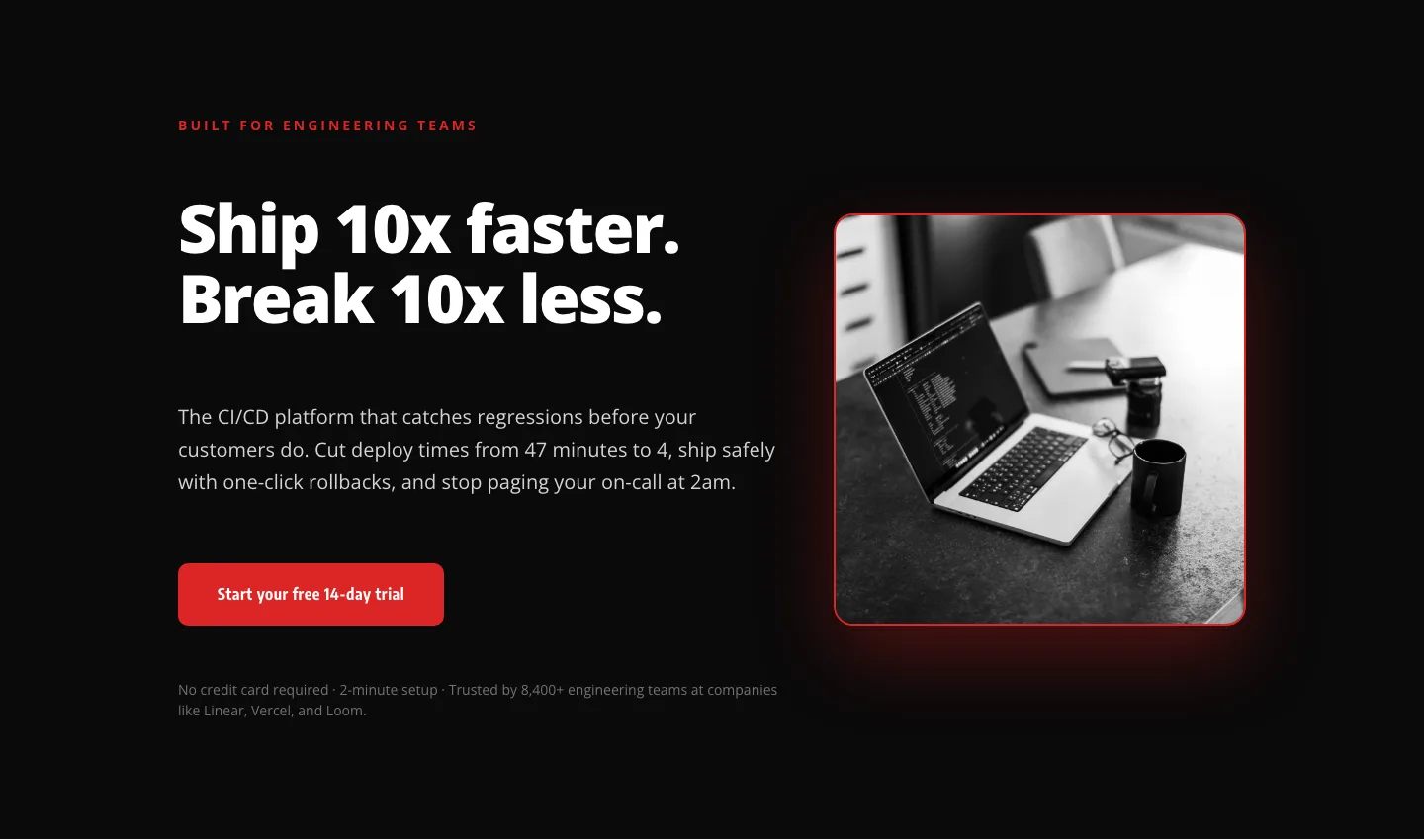
Bold SaaS Hero Layout for CI/CD & Engineering Tools: Divi 5
hero · saas · bold
What makes a red layout work
Red is the highest-stakes color in a designer's toolkit. Push it too far and a page feels aggressive; hold it back too much and you've wasted its momentum. The layouts in this category treat red as a lead accent rather than a background: reserved for headlines, buttons, badges, and the one photograph that anchors the composition. Everything else runs on off-white, deep charcoal, or a warm neutral so the eye knows exactly where to land.
Good red layouts also respect contrast. A crimson button on a cream section reads at a glance; the same button floating on a pink-tinted hero fights itself. Look for pages that pair a saturated primary red with a much cooler or much darker neighbor, that tension is where the color earns its intensity.
Who reaches for red
Fitness studios, food and beverage brands, sports gear, sale-driven e-commerce, bold agencies, and any founder who wants their landing page to feel urgent. Red also plays well in editorial and news-style sites where a strong visual identity matters more than a soft-sell mood. If you're launching a product, running a promotion, or building a personal brand that leans confident, this palette pulls its weight.
Customizing in Divi 5
Every layout in the library is validated against the Divi 5 structure before publication, so you can drop these into the builder and start editing immediately.
- Global palette. Open the Divi 5 style panel and reassign the primary red to your brand's exact swatch: the layout uses semantic color roles, so a single change updates buttons, headlines, dividers, and hover states together.
- Presets. Each section ships with reusable module presets for buttons, headings, and cards. Duplicate one, tweak radius or weight, and reapply across the page rather than hand-editing individual modules.
- Copy. Swap placeholder text for punchy verbs. Red rewards short, direct sentences. Long paragraphs against a bright accent tire the reader fast.
- Photography. If the layout uses a hero image, choose a photo with cool shadows or muted background tones. Cool-warm contrast is what keeps the red feeling deliberate rather than loud.
Every section here is a free download behind a quick email capture, ships under a straightforward commercial license, and includes real desktop and mobile screenshots so you can judge the composition before you commit.