
Elegant Divi 5 Layouts
Elegant layouts trade in restraint: generous white space, a considered type hierarchy, and a palette that lets one accent do the heavy lifting. They're the choice for brands that want to feel expensive without shouting: think heritage studios, private practices, and quiet luxury.
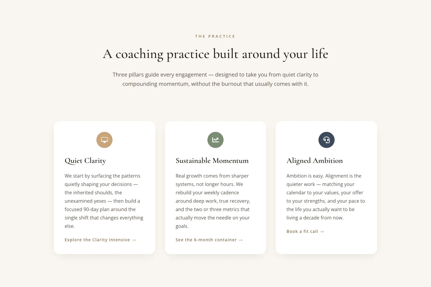
Elegant Coaching Cards: Three Pillars Section
cards · coaching · elegant
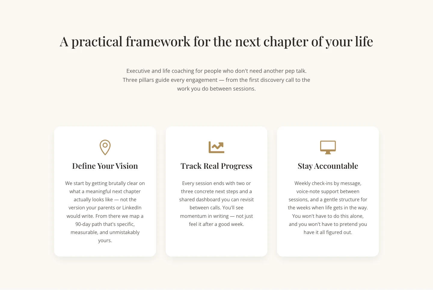
Three Pillars Coaching Cards: Elegant Divi 5 Layout
cards · coaching · elegant
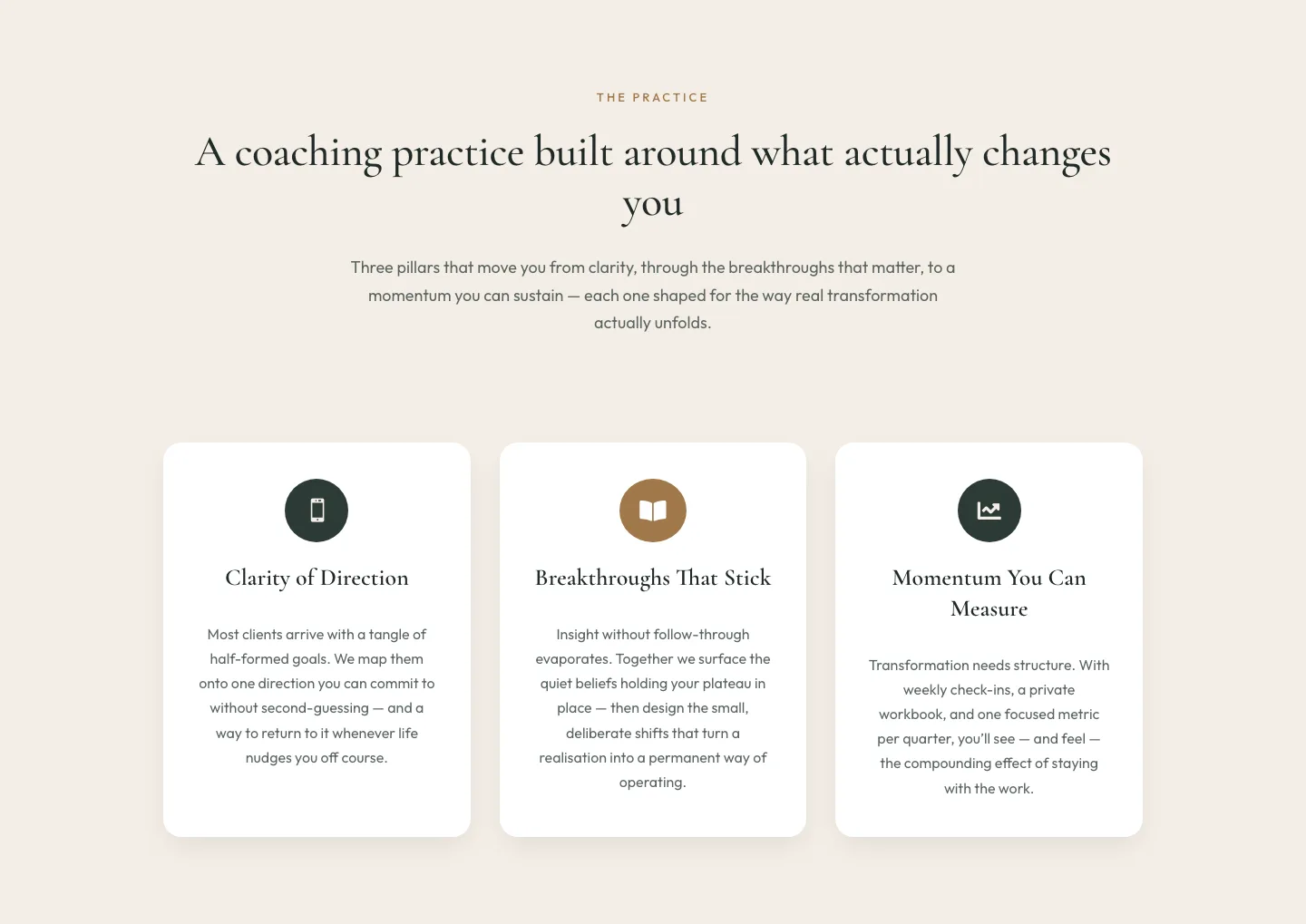
Elegant Coaching Three-Pillar Cards Layout for Divi 5
cards · coaching · elegant
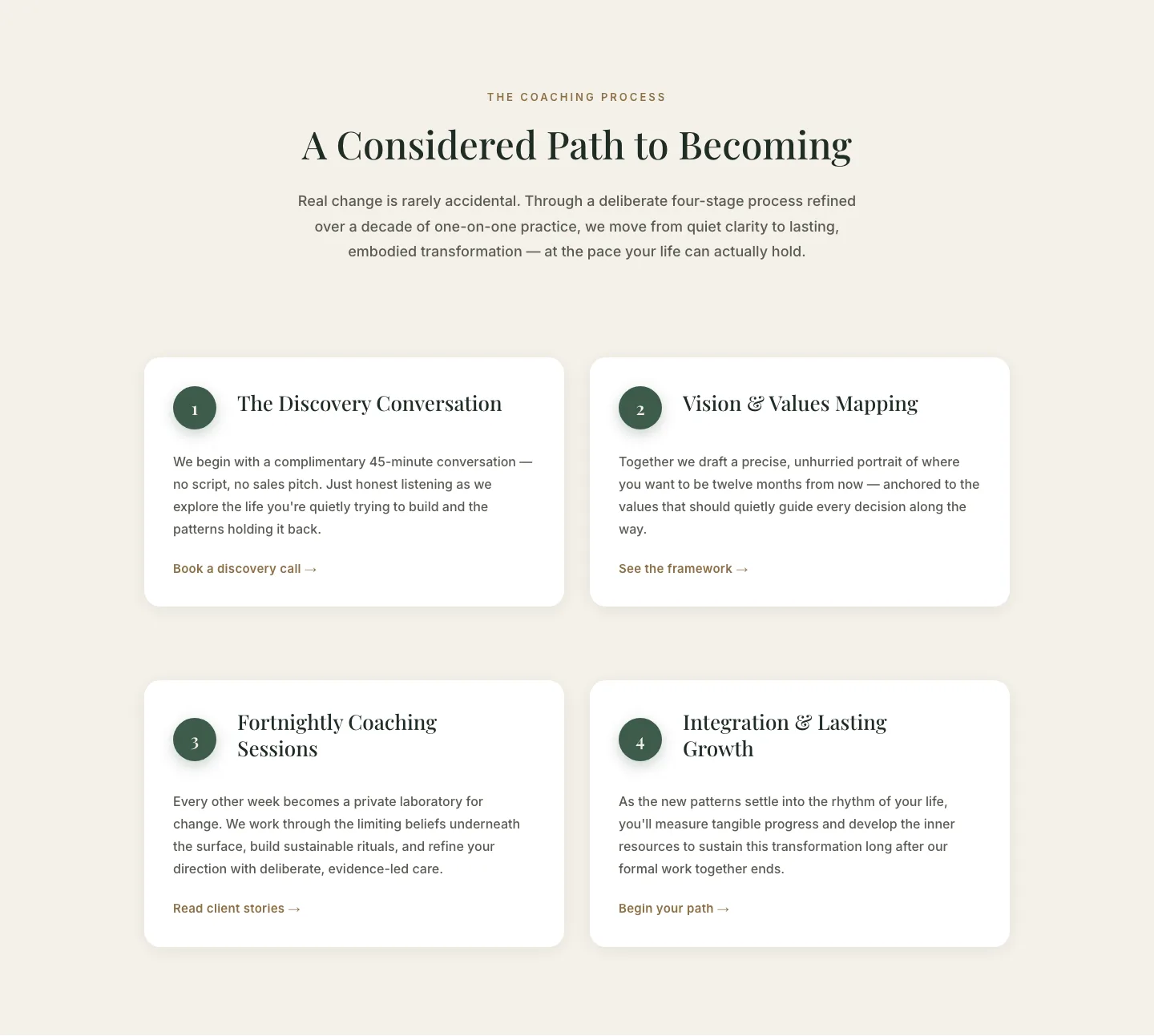
Elegant 4-Step Coaching Process Cards: Divi 5 Layout
cards · coaching · elegant
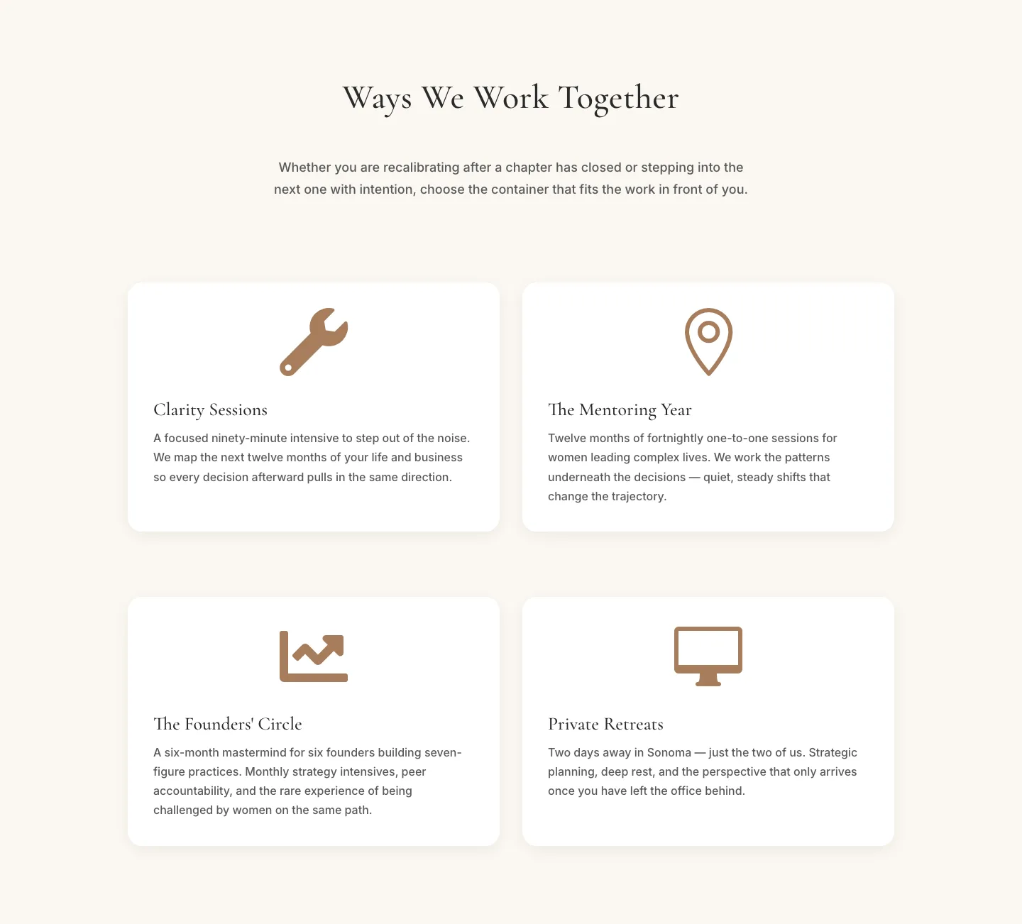
Elegant Coaching Programs Cards Section for Divi 5
cards · coaching · elegant
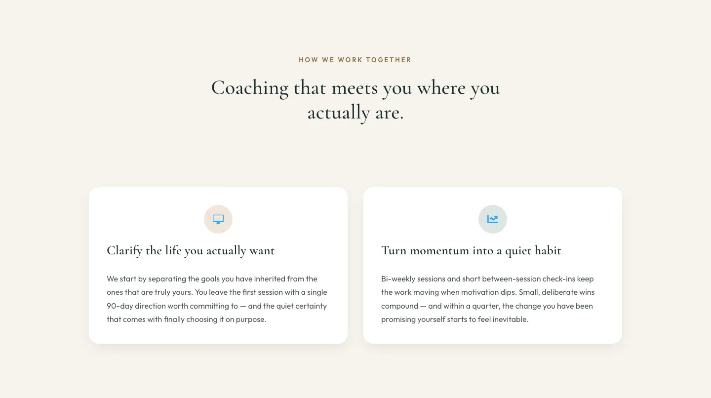
Elegant Coaching Cards Layout for Divi 5
cards · coaching · elegant
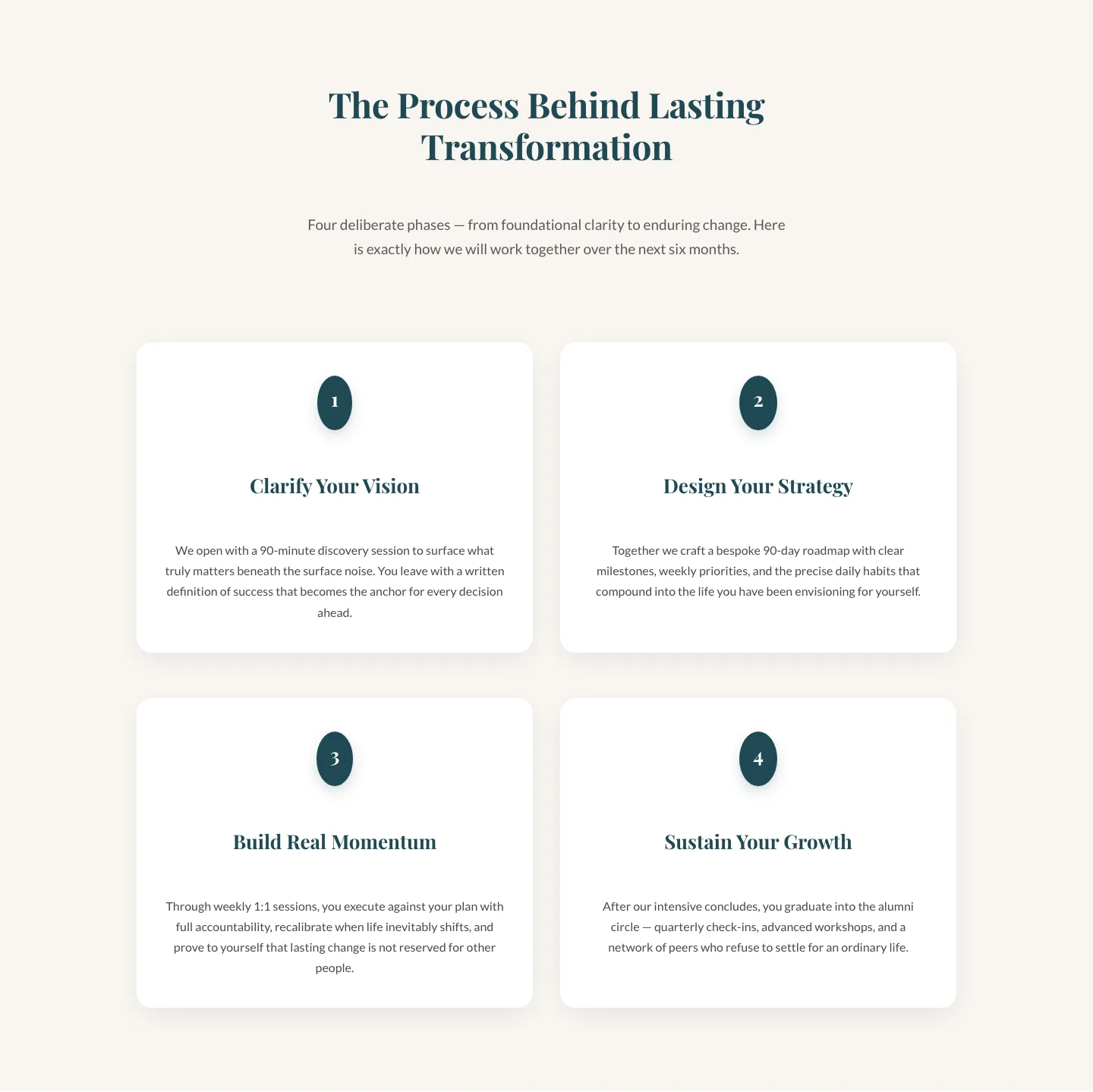
Four-Phase Coaching Process Cards: Elegant Divi 5 Layout
cards · coaching · elegant
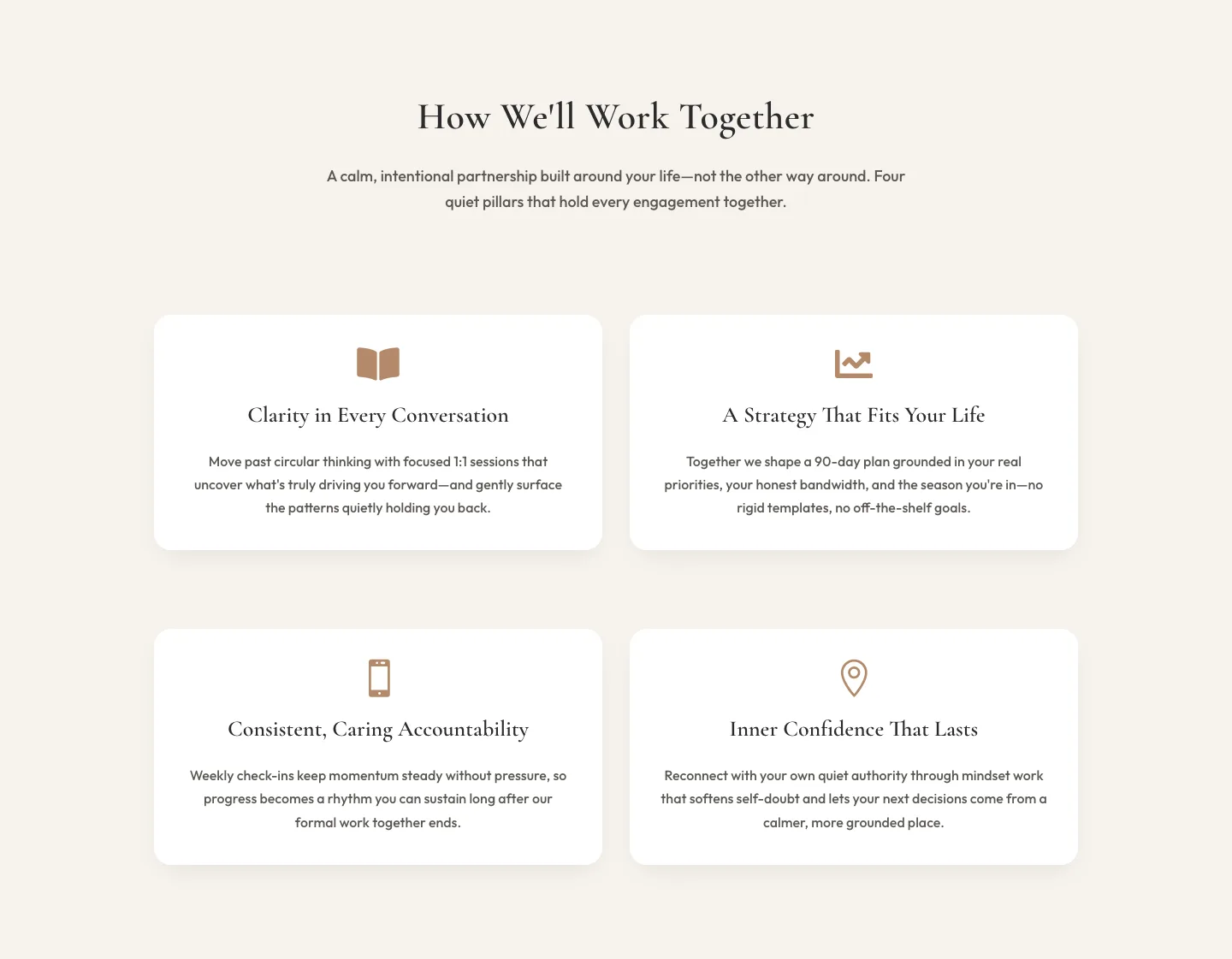
Elegant Coaching Cards Section for Divi 5: How We Work Together
cards · coaching · elegant
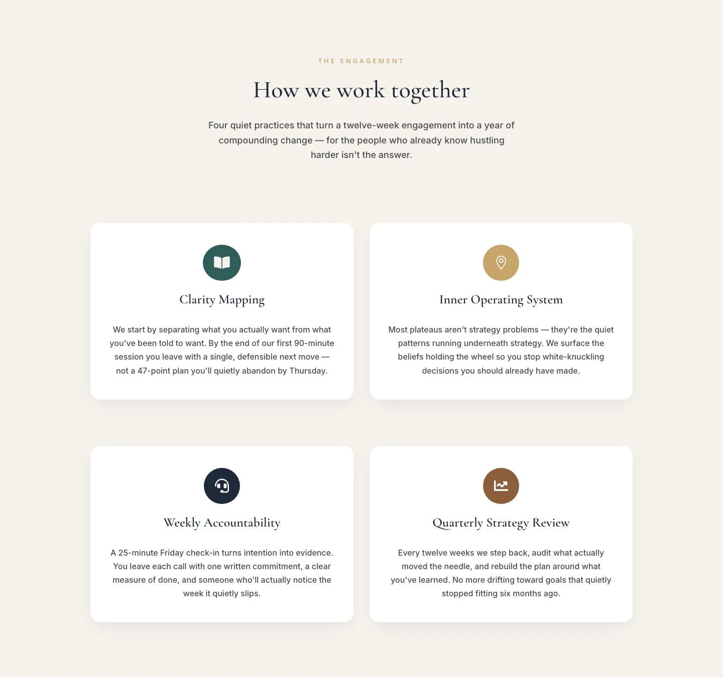
Elegant Coaching Cards Layout: How We Work Together
cards · coaching · elegant
What makes a layout feel elegant
Elegance in a Divi 5 layout is a discipline. It shows up in the ratios first: wide margins, tall sections, one column doing the work of two. A serif display face paired with a clean humanist sans, tracked out just enough to breathe. Muted neutrals (bone, taupe, charcoal) with a single restrained accent: a deep bordeaux, a forest, a brushed brass. Photography that's crisp and slightly desaturated. Buttons that don't beg. Every element earns its place, and nothing competes for the eye.
What you won't see in an elegant layout: gradients doing the heavy lifting, drop shadows on drop shadows, five CTAs above the fold, or copy written to fill a box. Restraint is the whole product.
Who uses these layouts
Boutique studios, private-client services, heritage brands, wellness practices, fine jewelry, hospitality, editorial portfolios, and any founder-led business where the price point rewards a slower, more considered read. If your buyer is comparing you to a peer with a Wirth-typography site and a Michelin-adjacent narrative, this is the vocabulary you need.
They also work for professional service firms (architecture, private wealth, family offices) where trust is the conversion, not urgency.
Customizing an elegant layout in Divi 5
Every layout in this category is validated against real Divi 5 structure before it's published, so you can drop it into your site knowing the modules, presets, and section wrappers are clean. Here's where to focus your edits:
- Presets. Divi 5's global presets are where elegant lives or dies. Set your Text preset once (line-height 1.6+, tracked headings), your Button preset (thin border, no shadow, generous padding), and your Section preset (top/bottom padding at 120–160px on desktop). Every module inherits the discipline.
- Palette. Reduce, don't add. Take the shipped palette and pick one color to remove, usually a mid-tone. Then push your accent one shade darker than feels comfortable. Elegance reads as confidence.
- Copy. Rewrite headlines to be shorter than the layout suggests. Elegant sections are designed to hold two sentences where a bold layout would hold five. If your copy fills the block, trim it.
- Imagery. Swap stock for original or licensed editorial. If you must use stock, filter it: a slight desaturation and a consistent warmth tie disparate shots into one visual voice.
Every download includes real desktop and mobile screenshots so you can see how the layout breathes at every breakpoint, and the commercial license covers unlimited client sites.