
Orange Divi 5 Layouts
Orange is the color of momentum: it pulls the eye without shouting, and it flatters brands that want warmth without going twee. This collection gathers Divi 5 layouts built around confident orange palettes: burnt terracotta, saturated tangerine, soft peach, and the rare well-tuned neon. Every layout is validated against Divi 5 structure before publication, so what you download drops in cleanly and behaves.
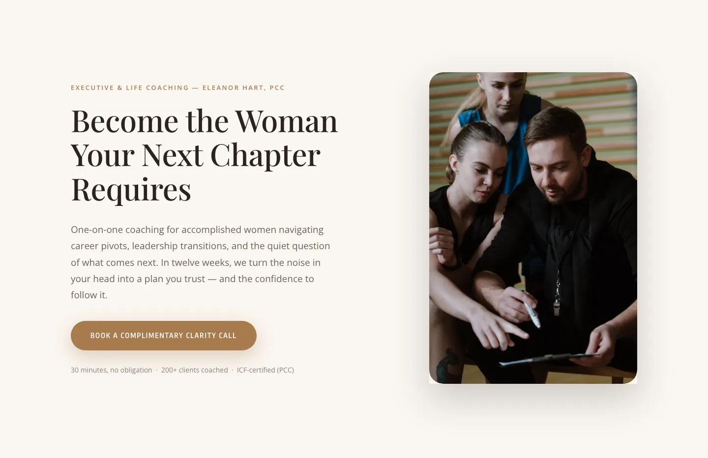
Elegant Coaching Hero Section: Divi 5 Layout with Clarity Call CTA
hero · coaching · elegant
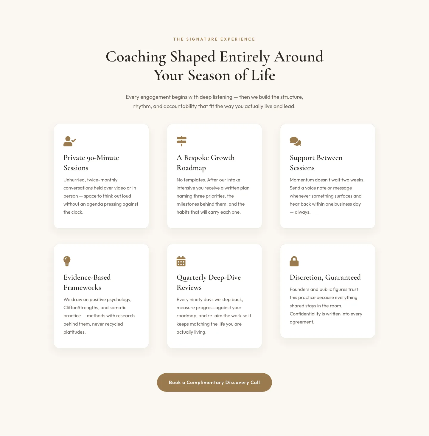
Elegant Coaching Features Section: Signature Experience Cards for Divi 5
features · coaching · elegant
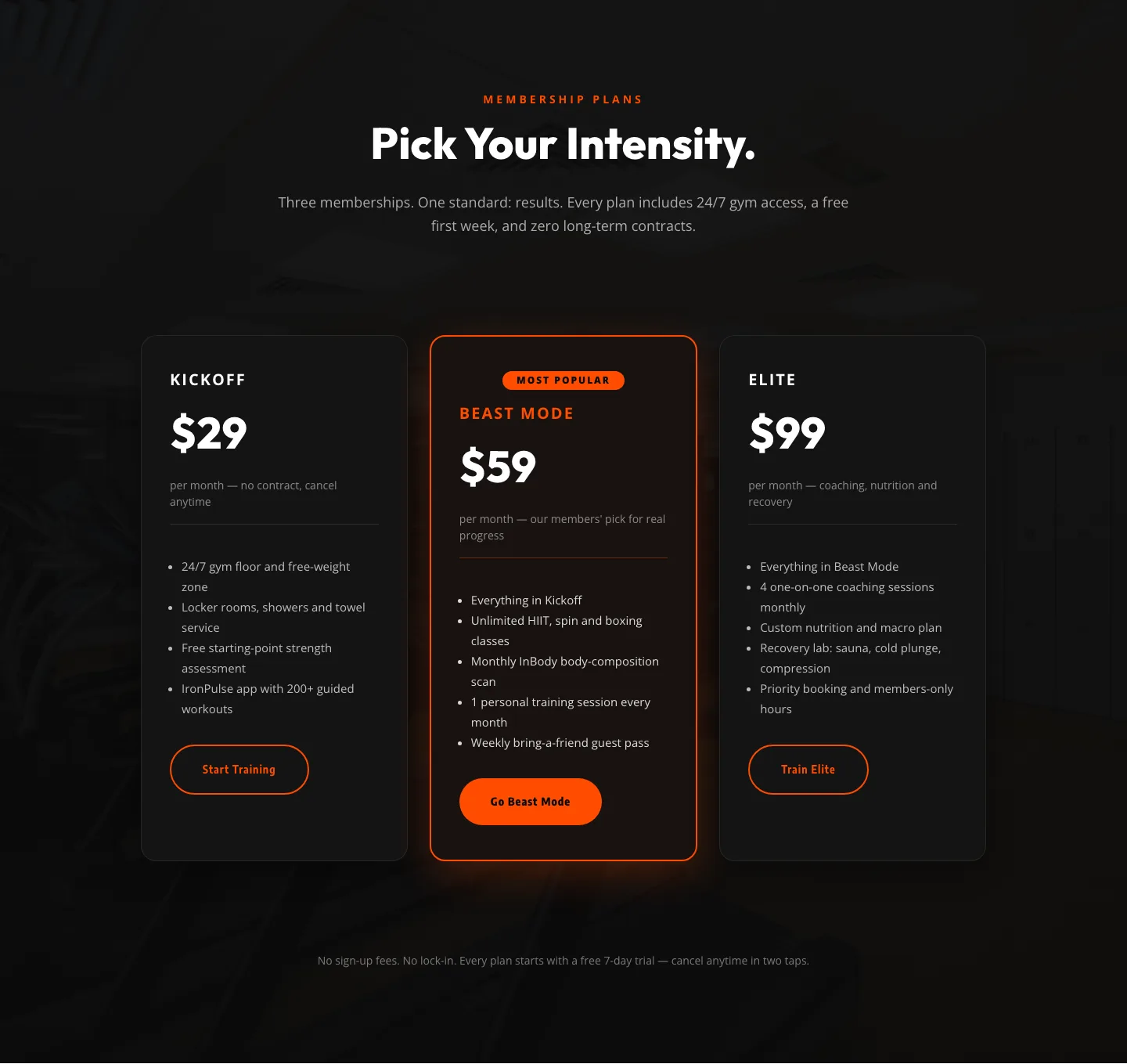
Bold Fitness Pricing Table: Dark Gym Membership Plans Divi 5 Layout
pricing · fitness · bold
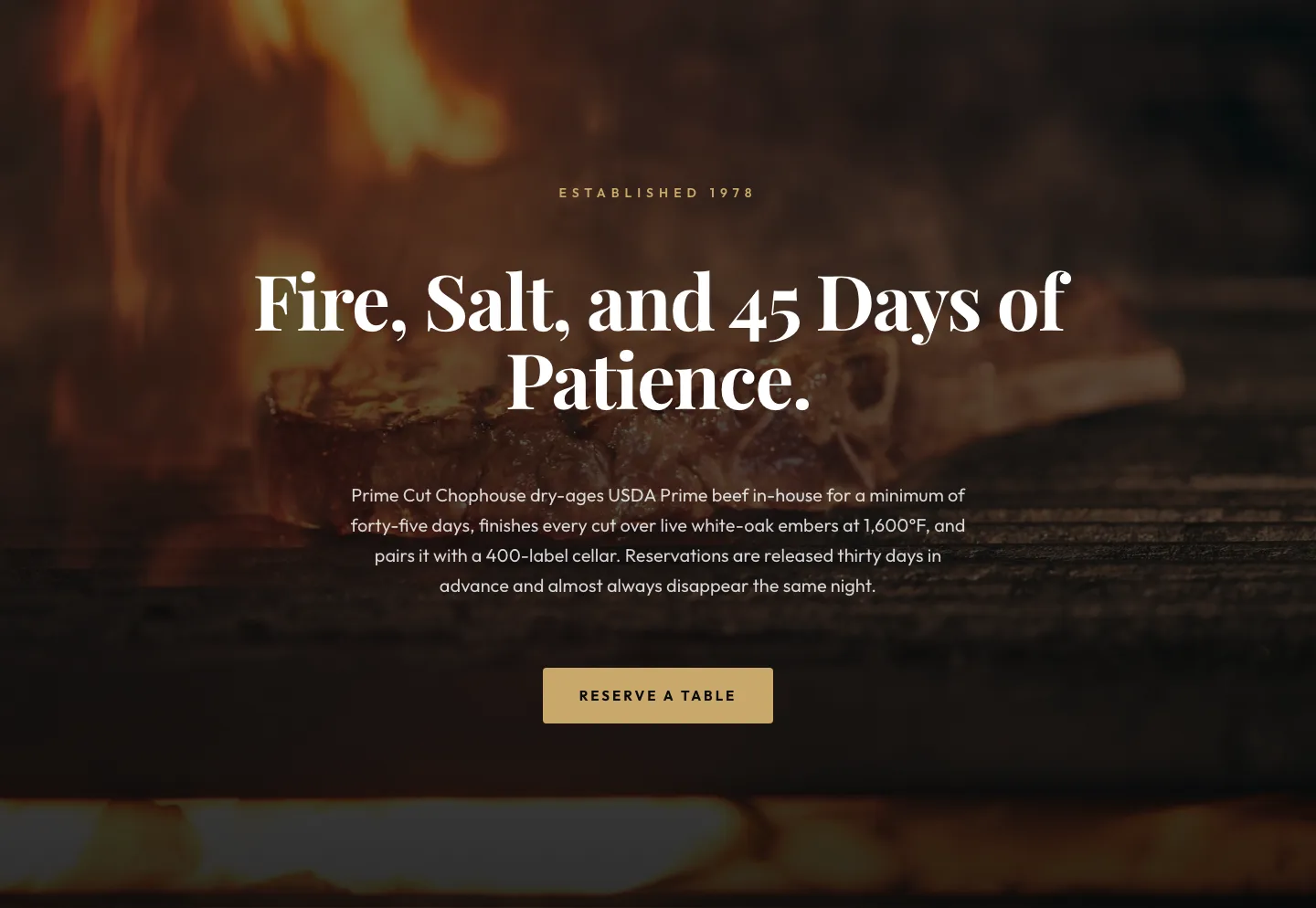
Prime Cut Chophouse Hero: Dry-Aged Steakhouse Divi 5 Layout
hero · restaurant · bold
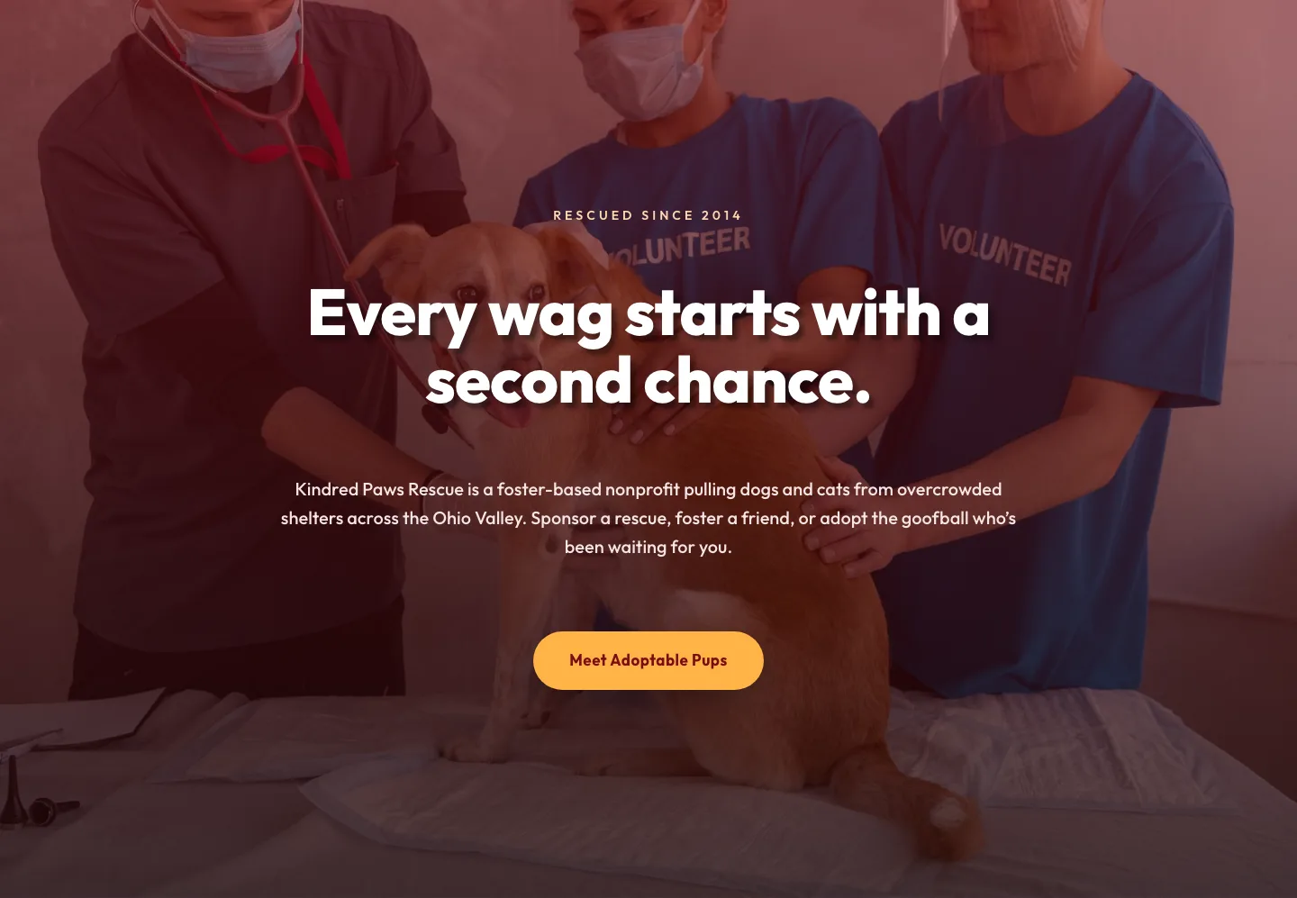
Playful Nonprofit Hero Layout: Kindred Paws Rescue | Divi 5
hero · nonprofit · playful
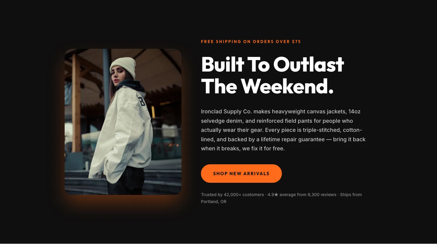
Bold Ecommerce Hero Layout for Divi 5: Product Launch Section
hero · ecommerce · bold
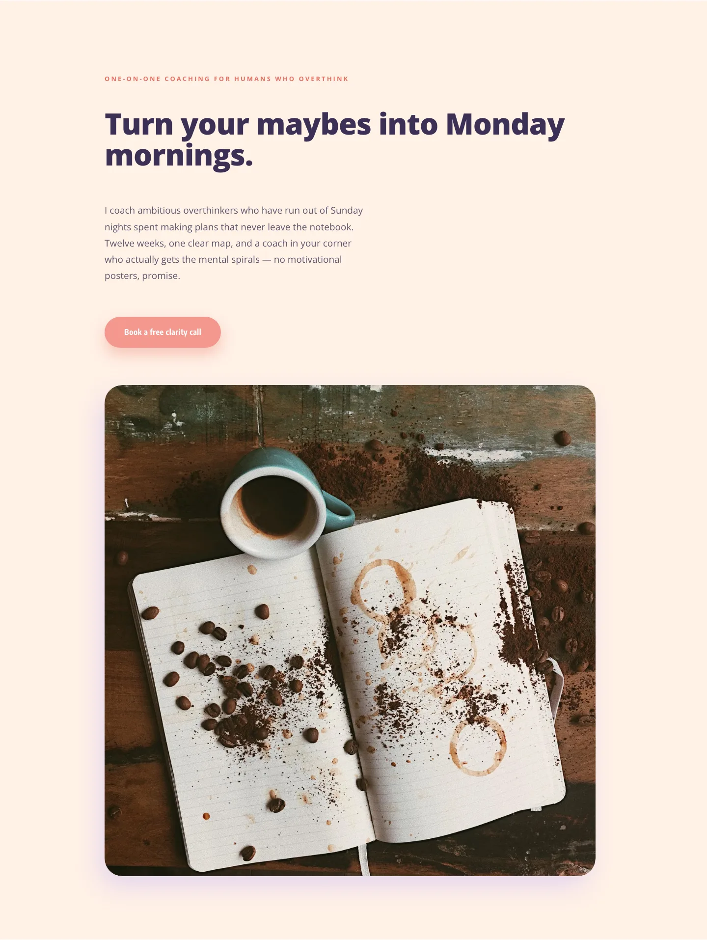
Playful Coaching Hero for Overthinkers: Divi 5 Layout
hero · coaching · playful

Ironhaus Strength Club: Bold Fitness Landing Page | Divi 5 Layout
full_landing · fitness · bold
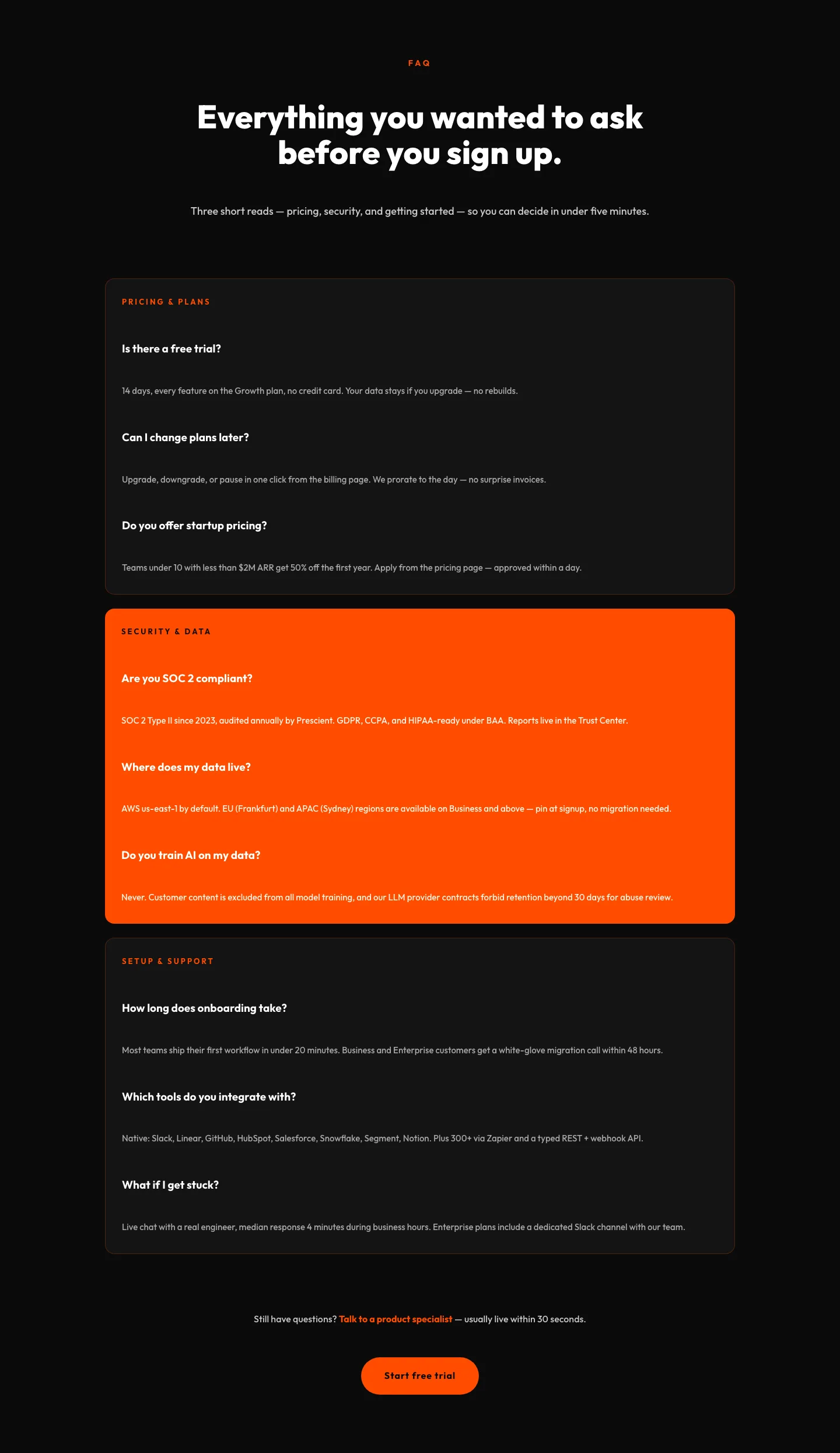
Bold SaaS FAQ Section: Divi 5 Layout
faq · saas · bold
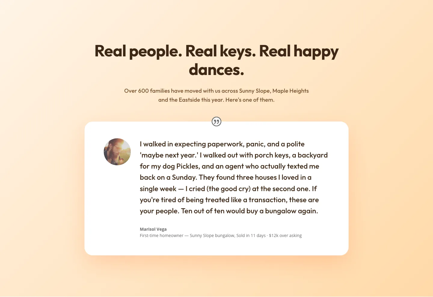
Playful Real Estate Testimonials Section: Warm Client Story Block | Divi 5 Layout
testimonials · real_estate · playful
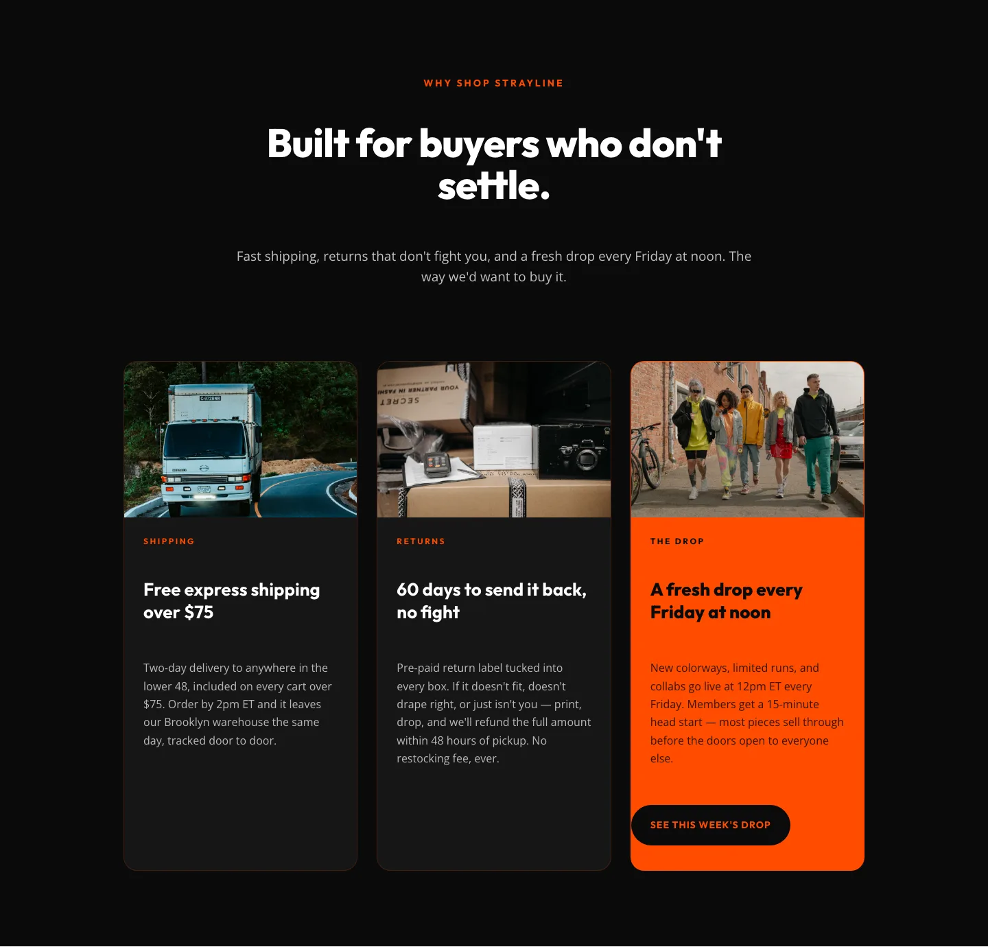
Bold Ecommerce Features Section: Free Shipping, Returns & Weekly Drops
features · ecommerce · bold

Wood-Fired Steakhouse Hero Layout for Divi 5: Bold Restaurant Template
hero · restaurant · bold
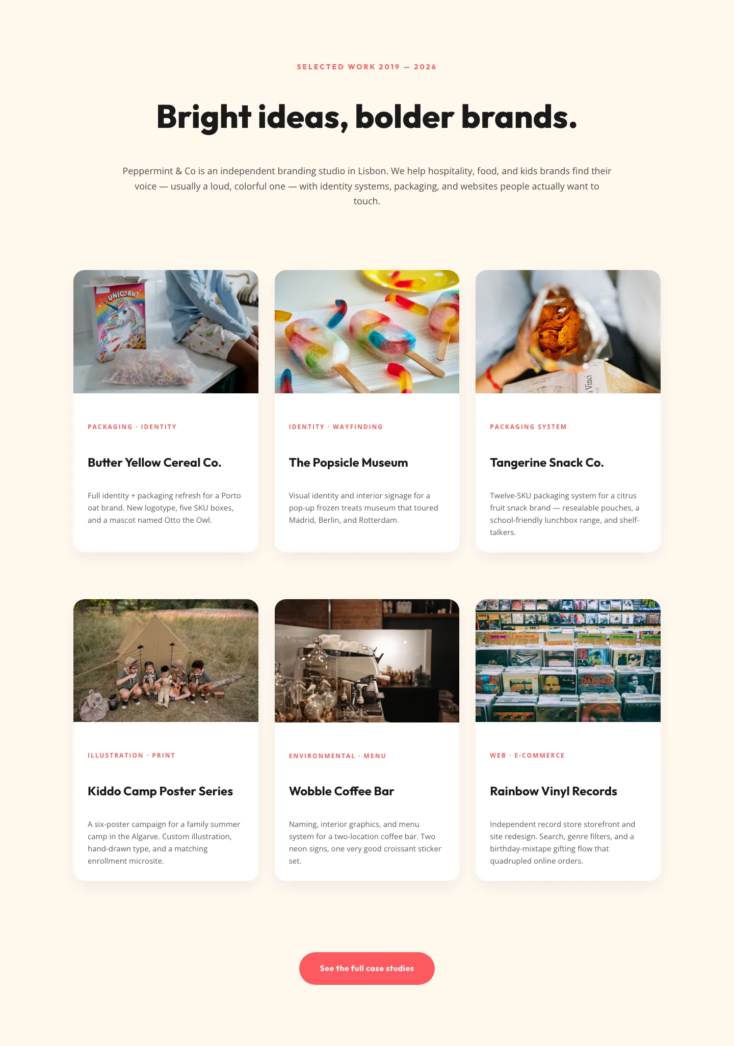
Playful Agency Portfolio Gallery: Divi 5 Case Study Grid
gallery · agency · playful
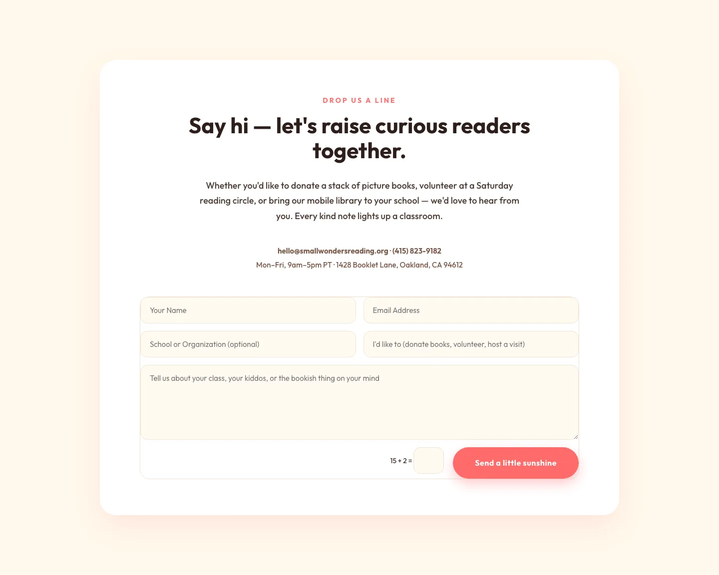
Playful Nonprofit Contact Page Layout for Divi 5: Small Wonders
contact · nonprofit · playful
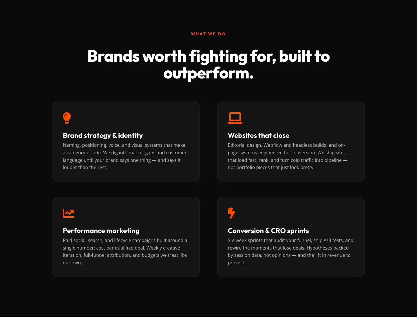
Bold Agency Features Section: Divi 5 Services Grid Layout
features · agency · bold
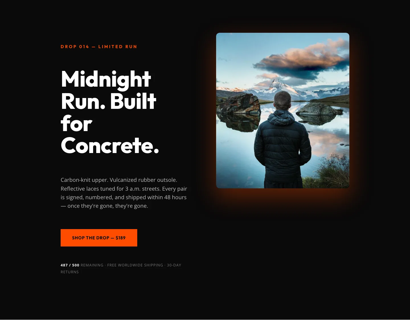
Midnight Run Drop 014: Bold Ecommerce Product Hero
hero · ecommerce · bold
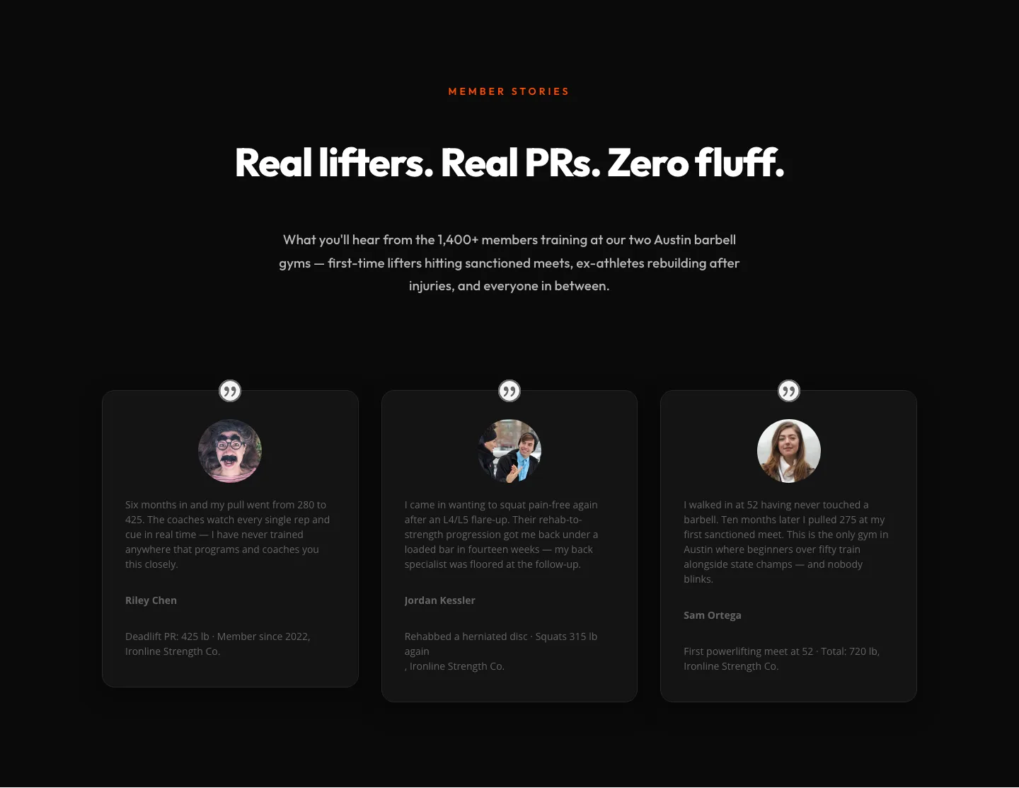
Bold Fitness Testimonials Section for Divi 5: Gym & Barbell Club
testimonials · fitness · bold

Ember & Steel: Bold Steakhouse Landing Page for Divi 5
full_landing · steakhouse · bold
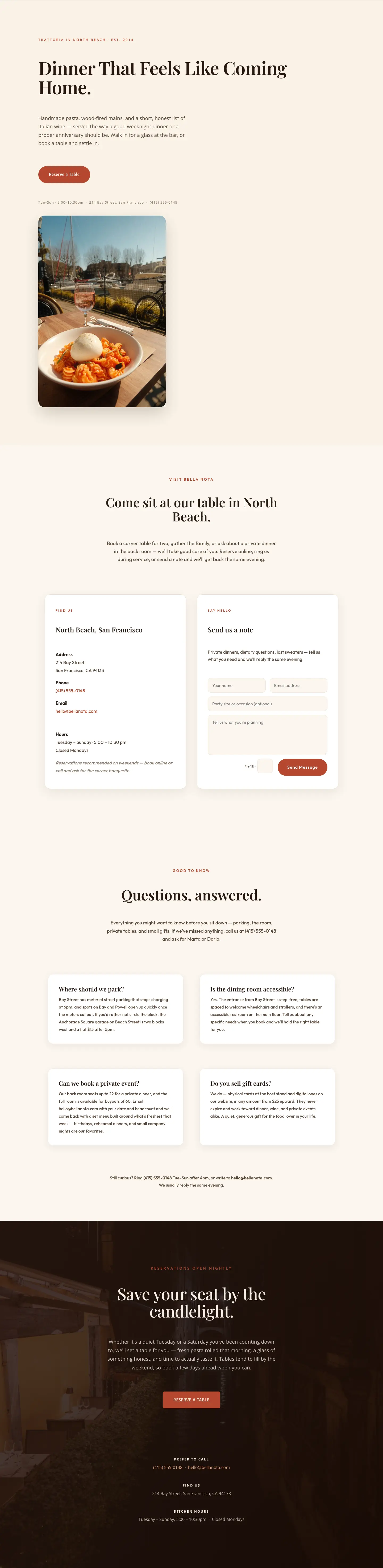
Bella Nota: Elegant Restaurant Contact Page for Divi 5
full_landing · restaurant · elegant
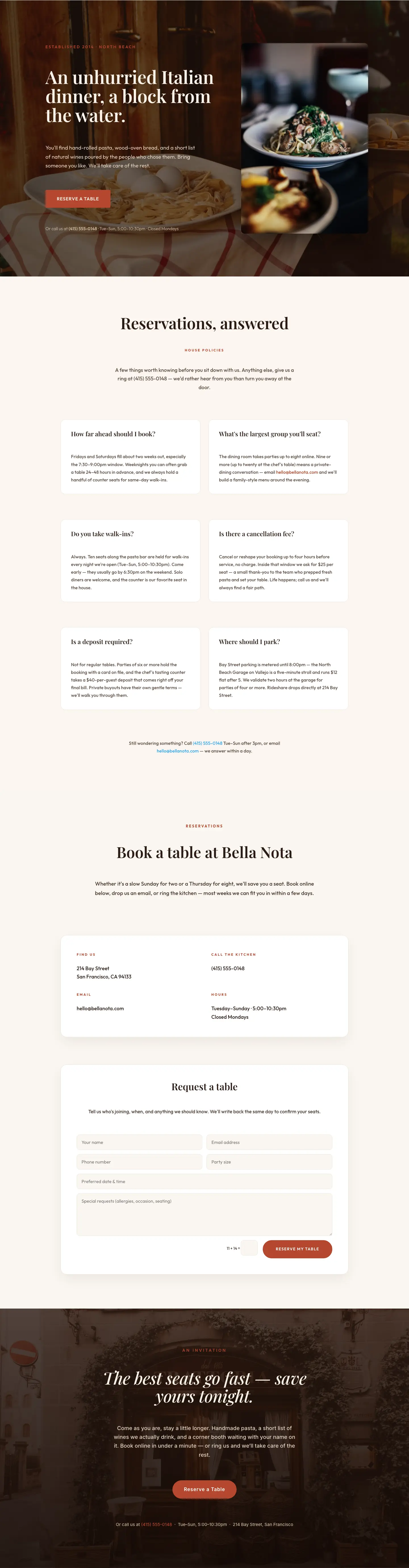
Bella Nota: Elegant Restaurant Reservations Page for Divi 5
full_landing · restaurant · elegant
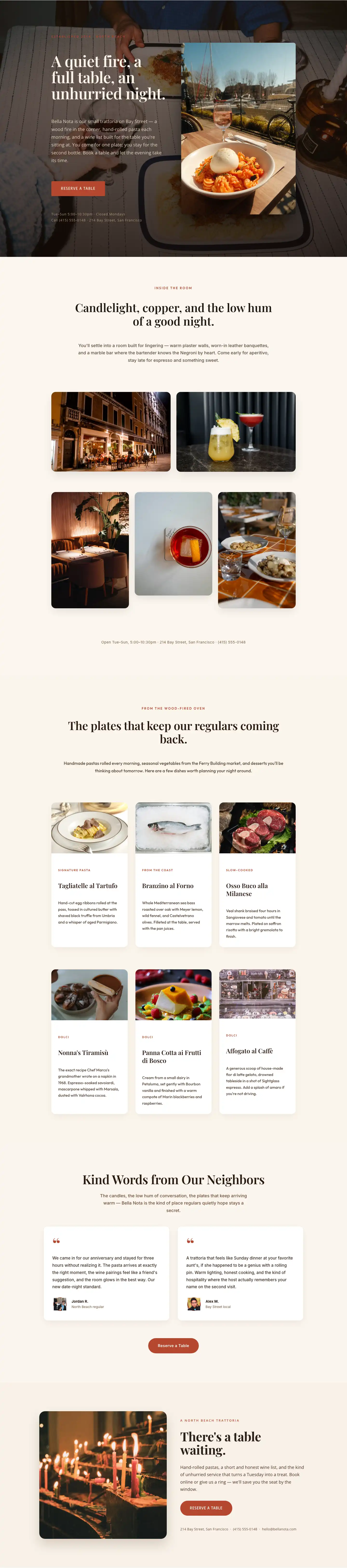
Bella Nota: Elegant Restaurant Gallery Page for Divi 5
full_landing · restaurant · elegant
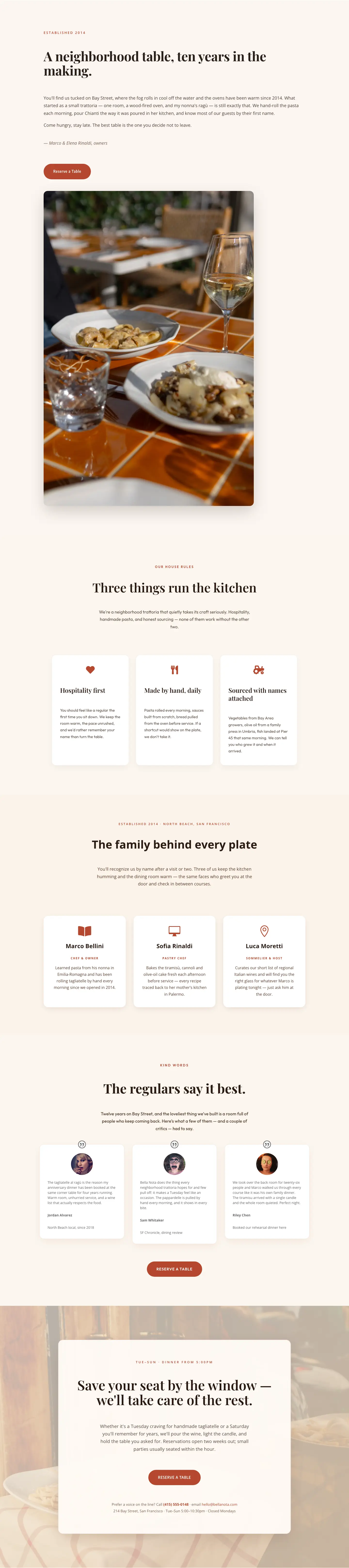
Bella Nota: Elegant Restaurant About Page for Divi 5
full_landing · restaurant · elegant

Bella Nota: Elegant Restaurant Menu Page for Divi 5
full_landing · restaurant · elegant

Bella Nota: Elegant Restaurant Home Page for Divi 5
full_landing · restaurant · elegant
Why a good orange layout is harder than it looks
Orange is unforgiving. Push the saturation too far and the page reads like a discount banner; pull it back too much and it drifts into brown or salmon. The layouts here work because the orange is doing a specific job (signaling a primary CTA, warming a hero photograph, or grounding a section divider) rather than being sprinkled across every heading. When you're browsing, notice how each design pairs its orange with a quiet neutral (bone, charcoal, near-black) and reserves the accent for one or two decisive moments per fold.
Who these are for
Orange layouts tend to land well for DTC food and beverage, fitness and wellness studios, creative agencies with a warm personality, outdoor and adventure brands, and coaches or course creators who want energy without corporate stiffness. They also work beautifully as autumn campaign pages, product launches, and event landing pages where you want visitors to feel movement.
If your brand is more clinical or luxury-leaning, orange can still work: but usually as a 5–10% accent against a dominant neutral, not as the section background.
Customizing an orange layout in Divi 5
Every layout in this pack is a free download (email-gated) with a straightforward commercial license, and the screenshots you see are real desktop and mobile renders. No mockups.
Once imported into Divi 5:
- Swap the palette at the theme level. Open your Divi 5 global colors and replace the primary orange with your brand's exact hex. Because these layouts reference global color slots rather than hard-coded values, one swap propagates across every button, heading accent, and divider.
- Adjust presets, not modules. If you want every CTA to sit tighter or every headline to loosen its tracking, edit the corresponding preset. This keeps the design coherent as you extend the page.
- Rewrite copy in place. The placeholder copy is intentionally close to real length: headlines are the length they should stay, and body paragraphs won't collapse when you replace them. Keep your headlines to a similar word count and the vertical rhythm holds.
- Mind the imagery. Orange competes with warm-toned photography. If you're bringing your own product shots, either shoot against neutral backgrounds or lean into the warmth by pairing with terracotta, cream, and deep brown supporting tones.
Browse the grid above, grab the layout that matches your brief, and drop it into your Divi 5 site. The structural work is done, your job is the story on top of it.