
Pastel Divi 5 Layouts
Pastel layouts trade contrast for calm. Soft blush, mint, butter, and lavender tones make a page feel approachable before a visitor reads a single word: which is exactly why wellness brands, kids' products, boutique studios, and lifestyle e-commerce reach for them. Every pastel layout in this collection has been validated against Divi 5 structure so the palette is the only thing you need to think about.
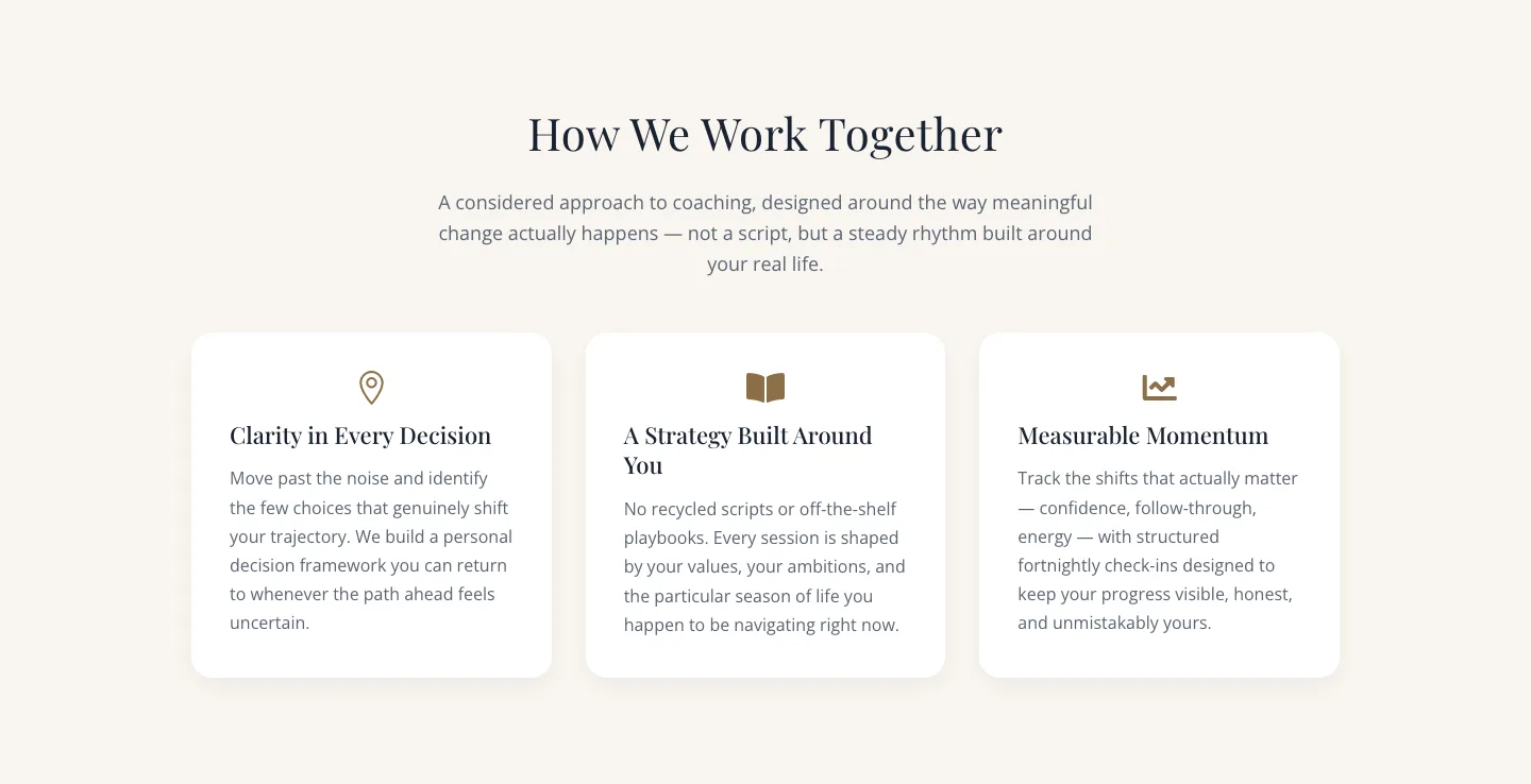
Elegant Coaching Approach Cards Section for Divi 5
cards · coaching · elegant
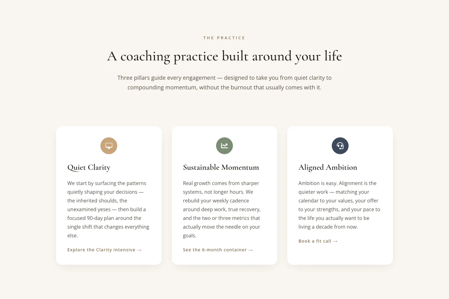
Elegant Coaching Cards: Three Pillars Section
cards · coaching · elegant
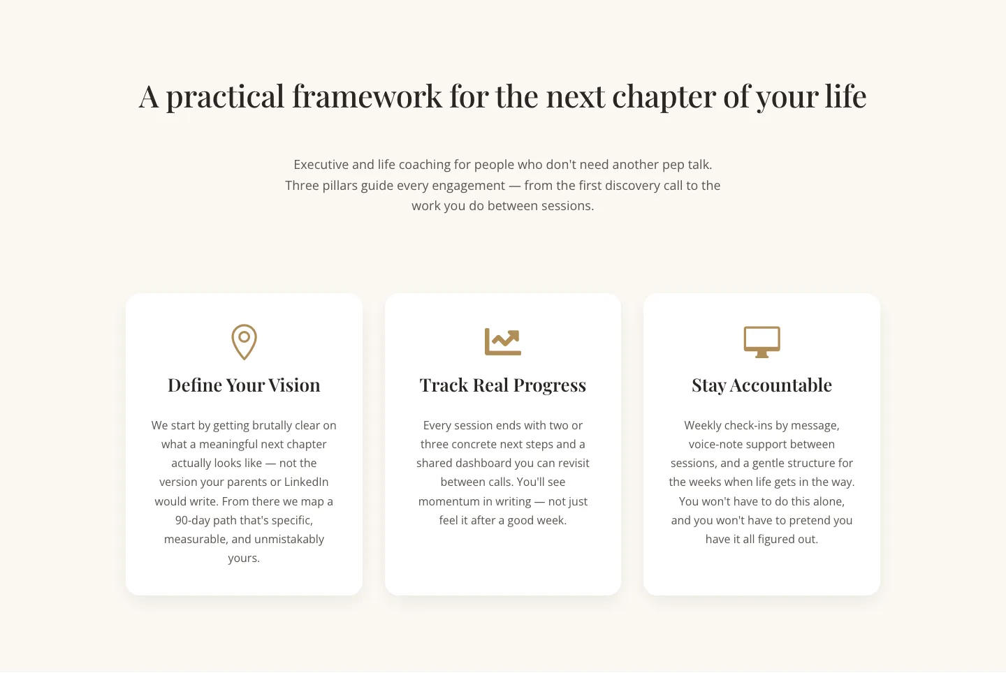
Three Pillars Coaching Cards: Elegant Divi 5 Layout
cards · coaching · elegant
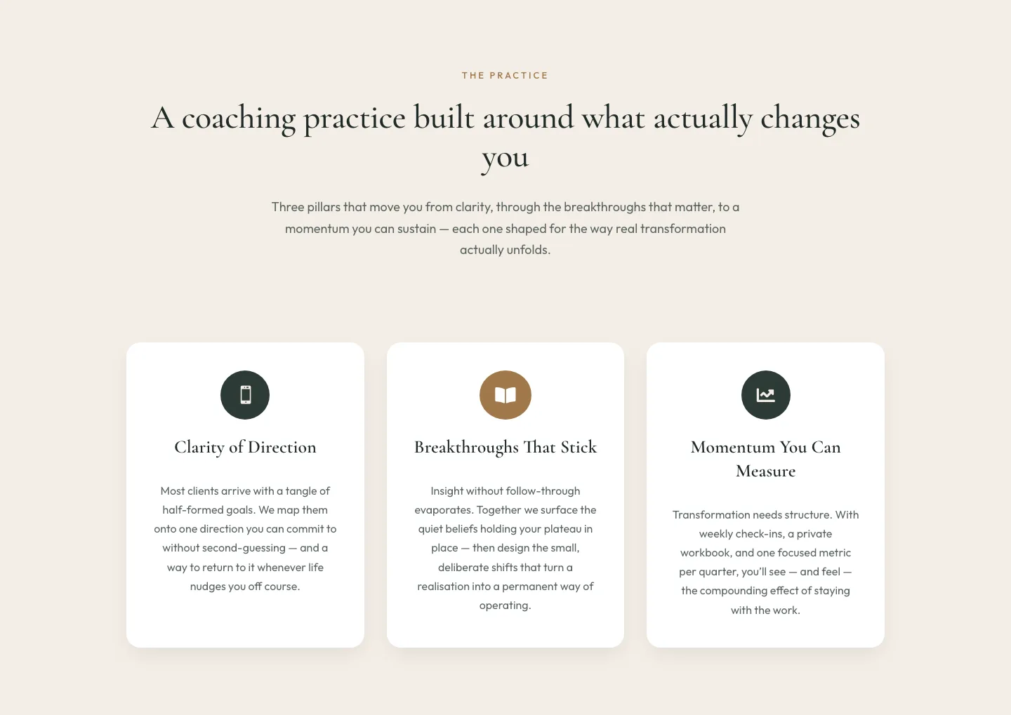
Elegant Coaching Three-Pillar Cards Layout for Divi 5
cards · coaching · elegant
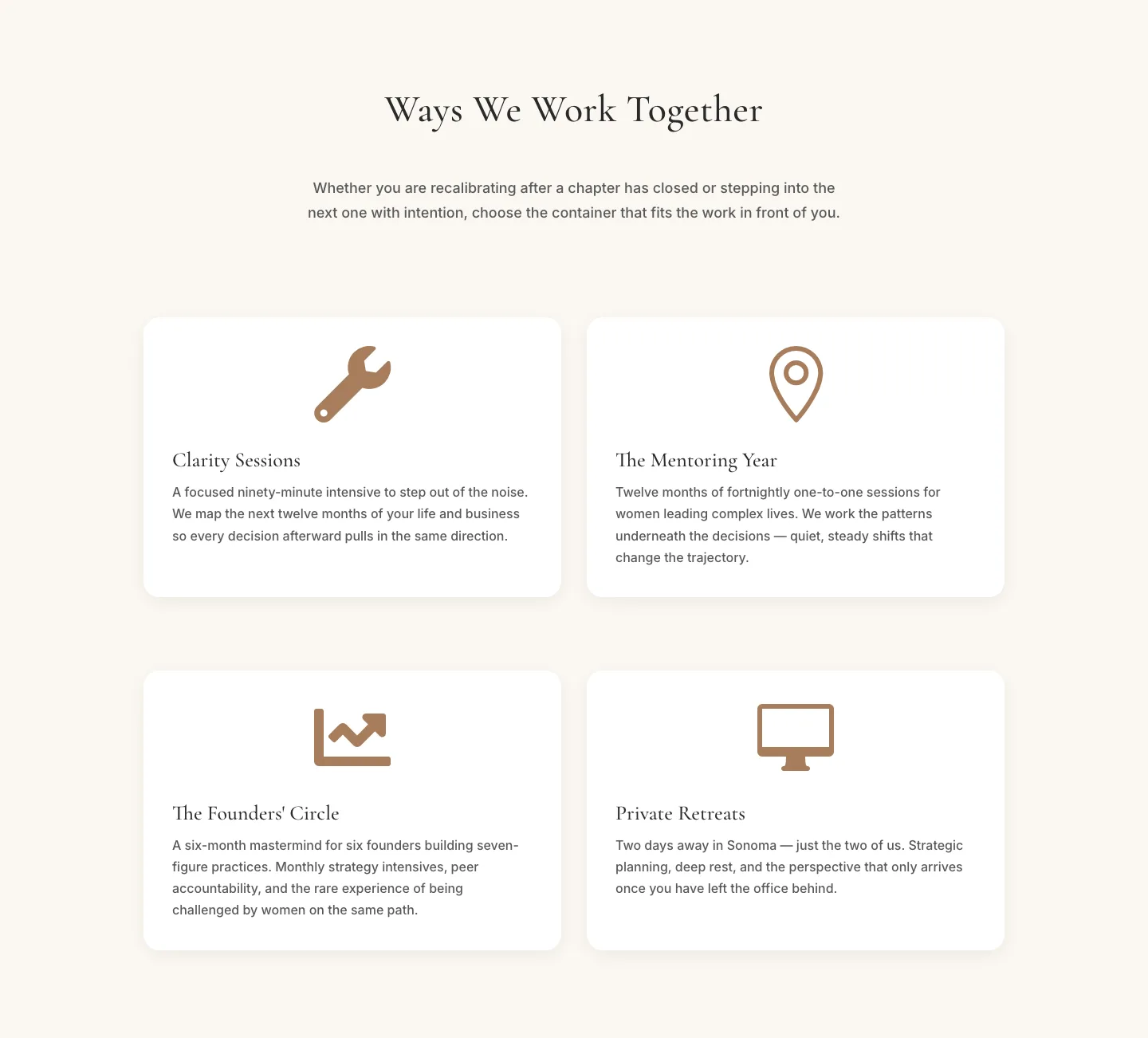
Elegant Coaching Programs Cards Section for Divi 5
cards · coaching · elegant
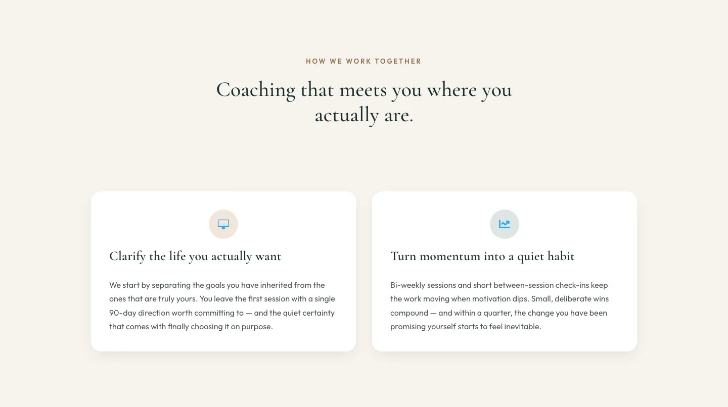
Elegant Coaching Cards Layout for Divi 5
cards · coaching · elegant
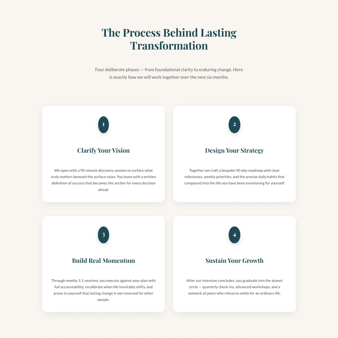
Four-Phase Coaching Process Cards: Elegant Divi 5 Layout
cards · coaching · elegant
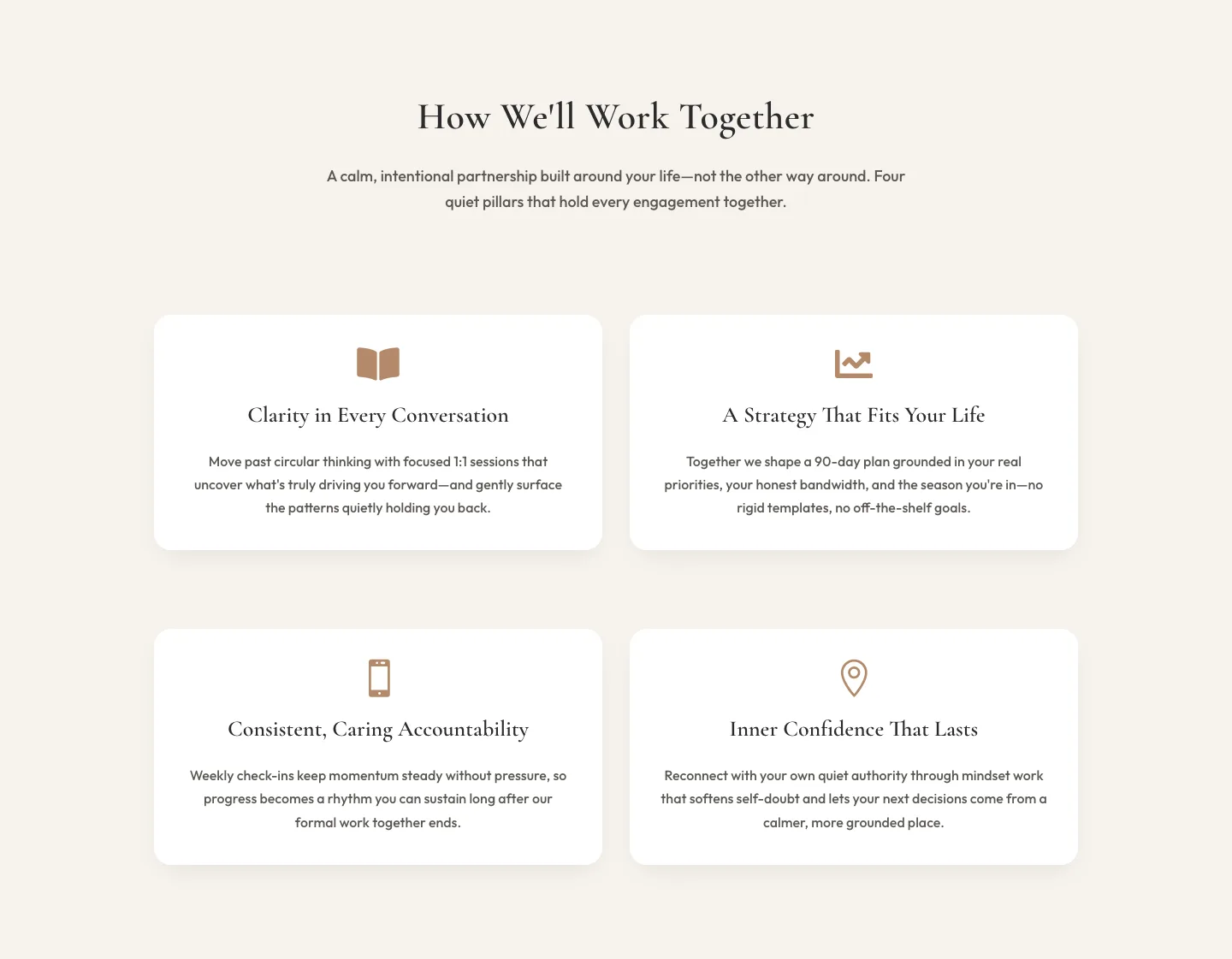
Elegant Coaching Cards Section for Divi 5: How We Work Together
cards · coaching · elegant
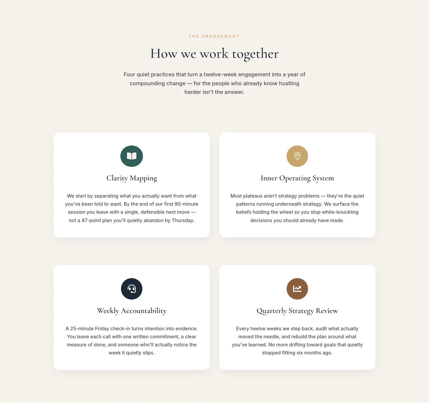
Elegant Coaching Cards Layout: How We Work Together
cards · coaching · elegant
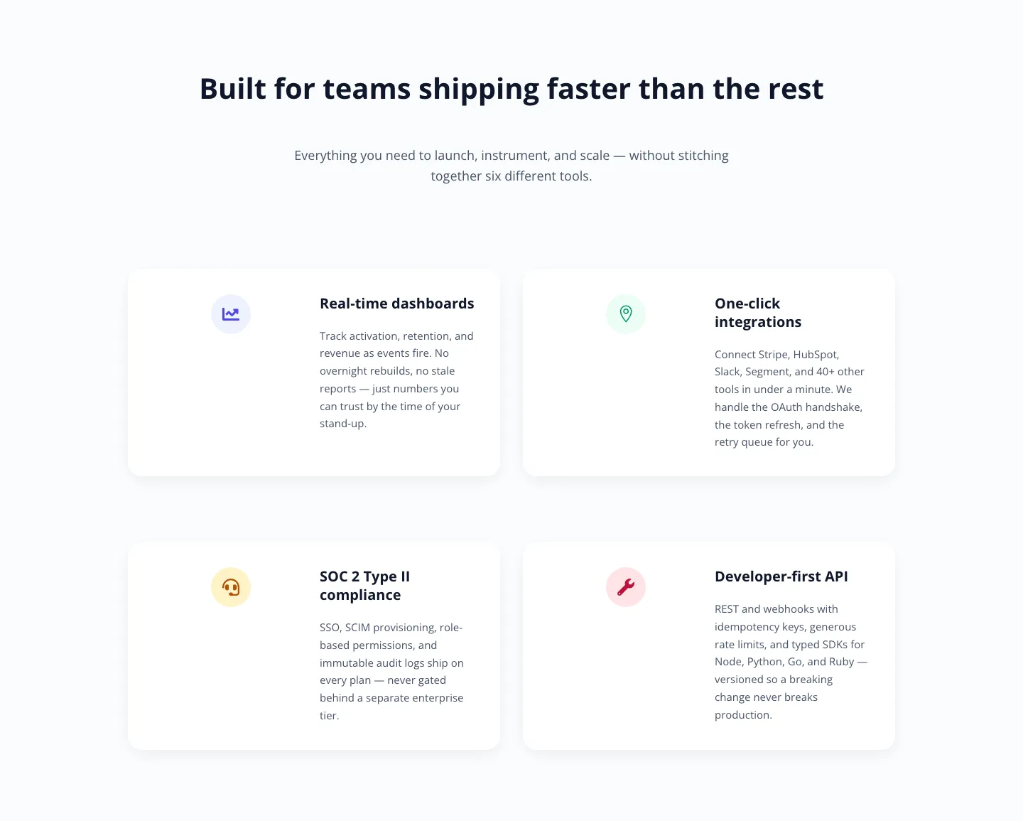
Minimal SaaS Feature Cards: Divi 5 Layout
cards · saas · minimal
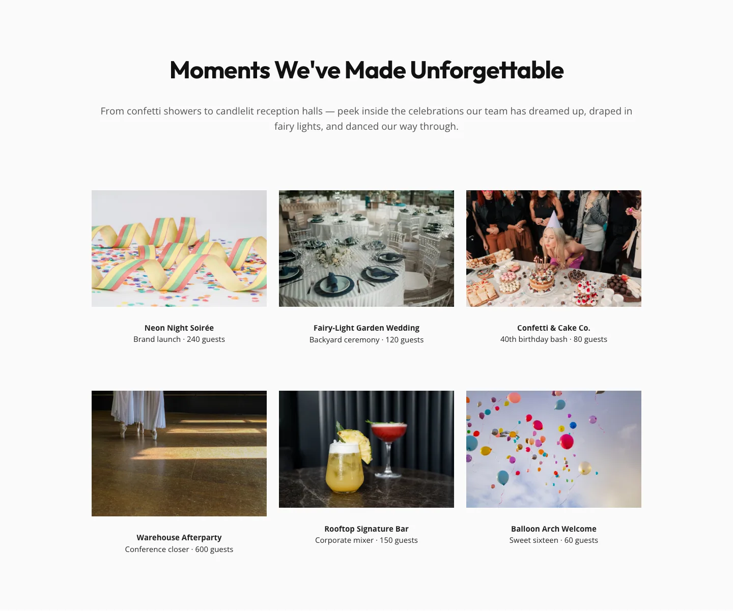
Playful Events Gallery Layout for Divi 5: Free Download
gallery · events · playful
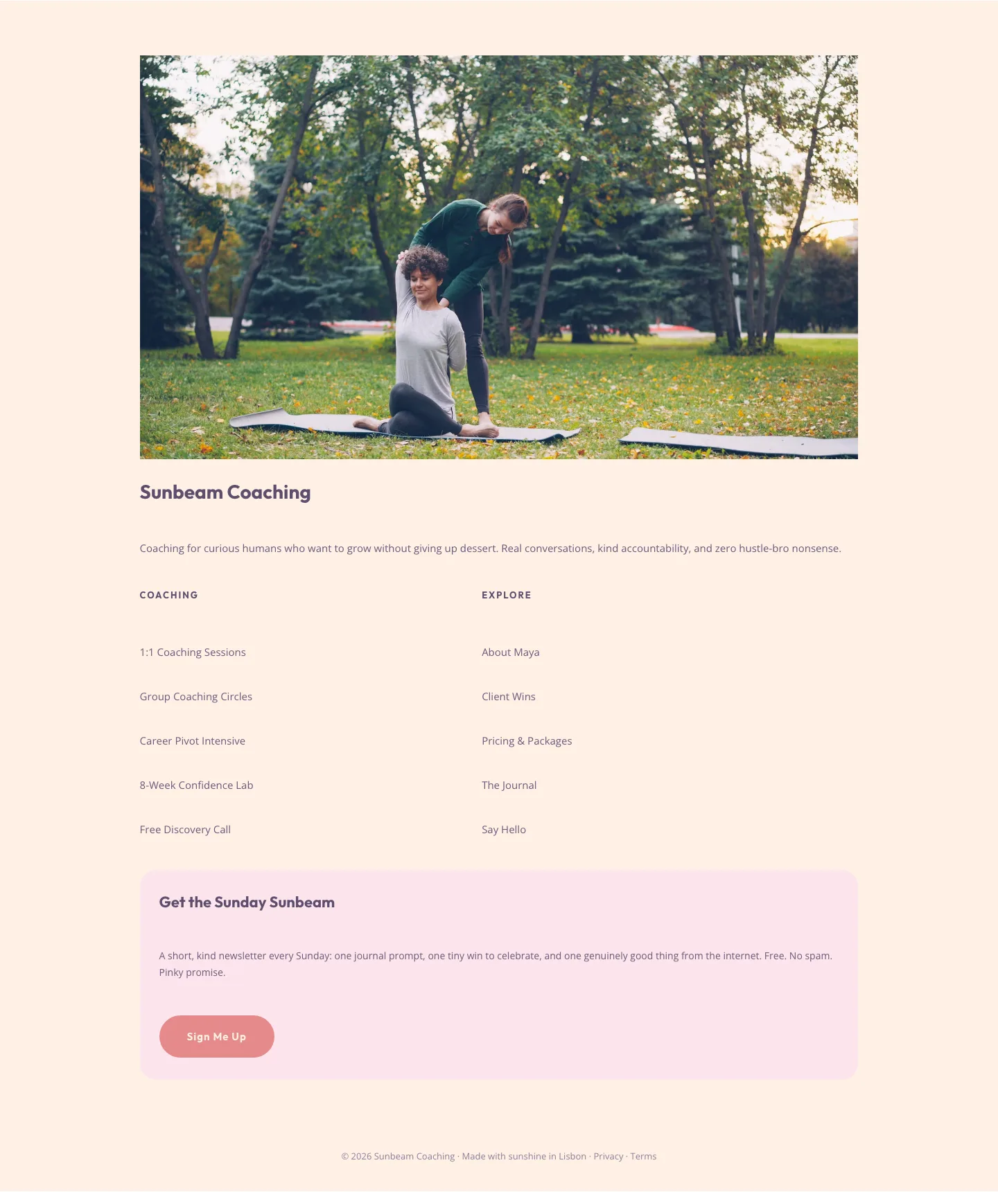
Playful Pastel Coaching Footer: Free Divi 5 Layout
footer · coaching · playful
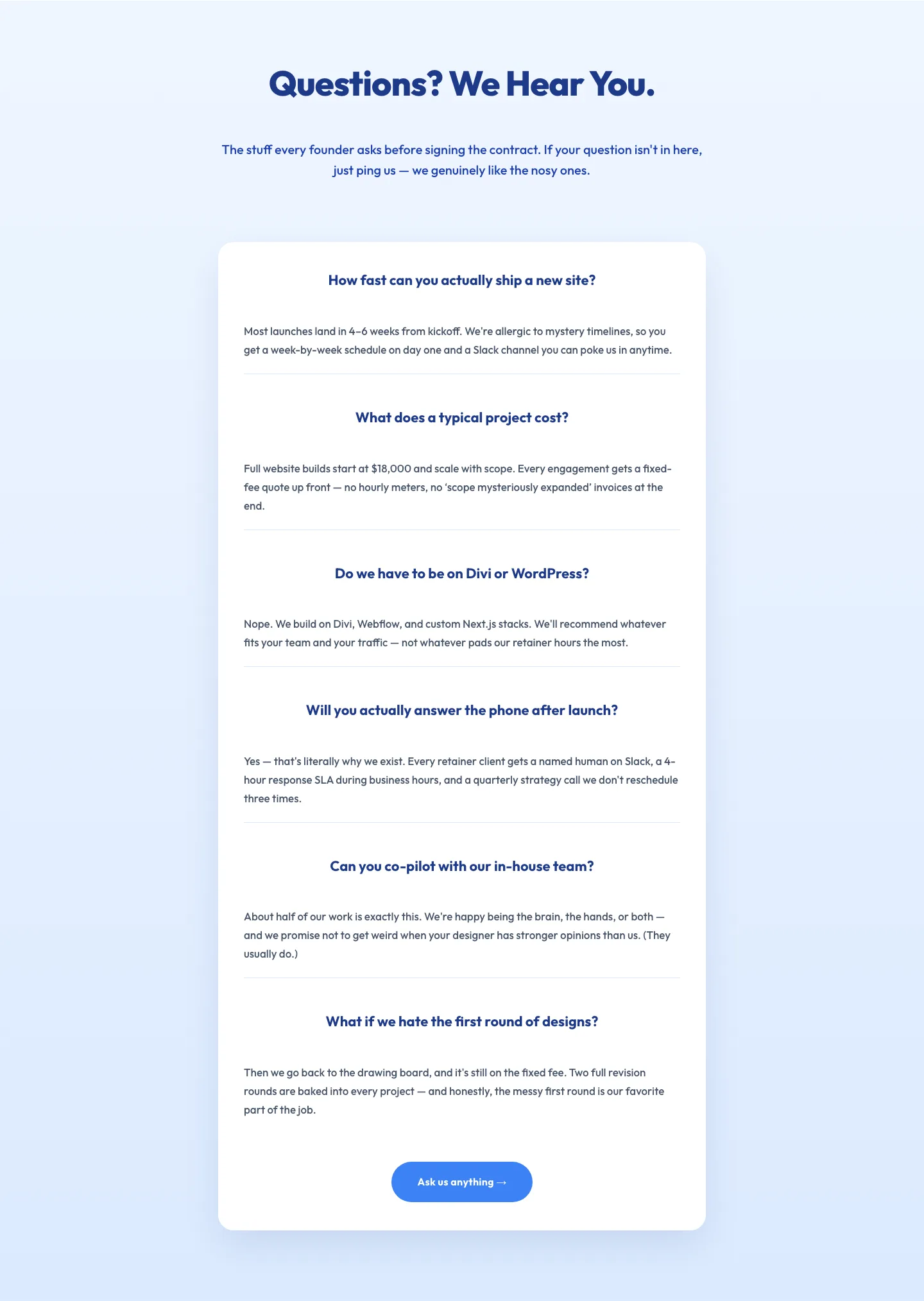
Playful Agency FAQ Section: Free Divi 5 Layout
faq · agency · playful
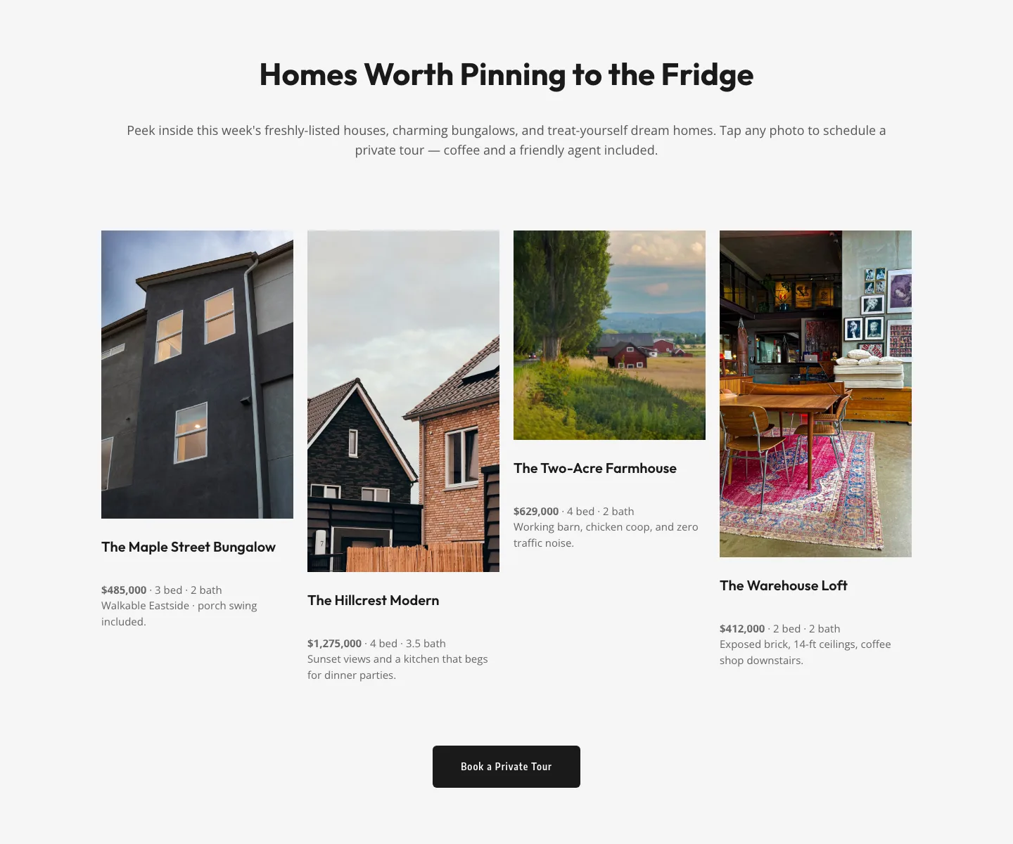
Playful Real Estate Listings Gallery: Free Divi 5 Layout
gallery · real_estate · playful
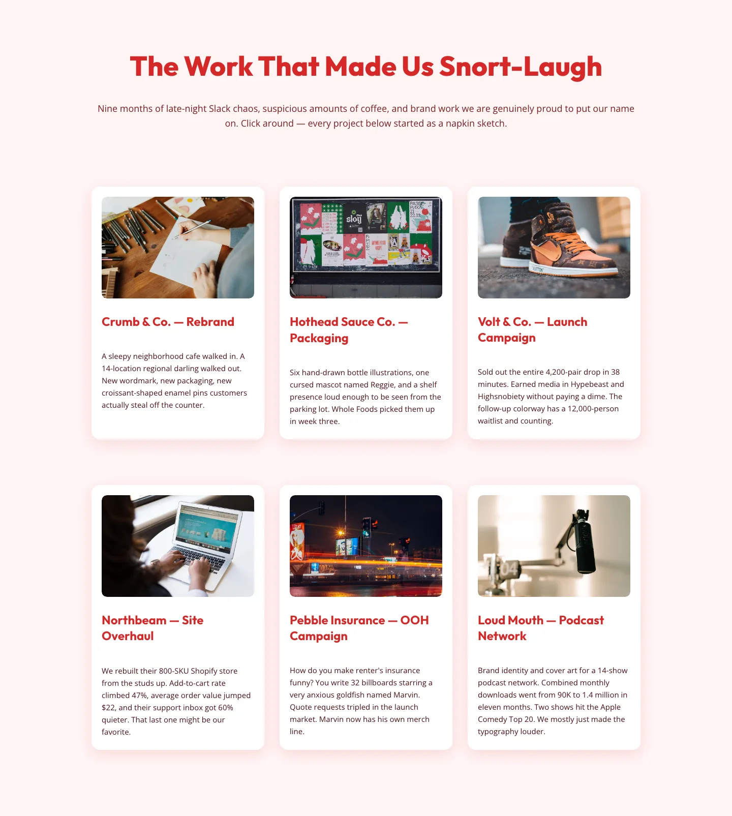
Playful Agency Portfolio Gallery: Free Divi 5 Layout
gallery · agency · playful
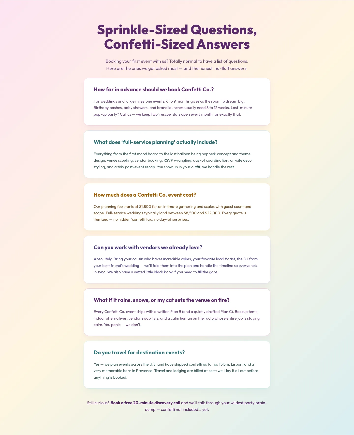
Playful Events FAQ Divi 5 Layout: Free Download
faq · events · playful
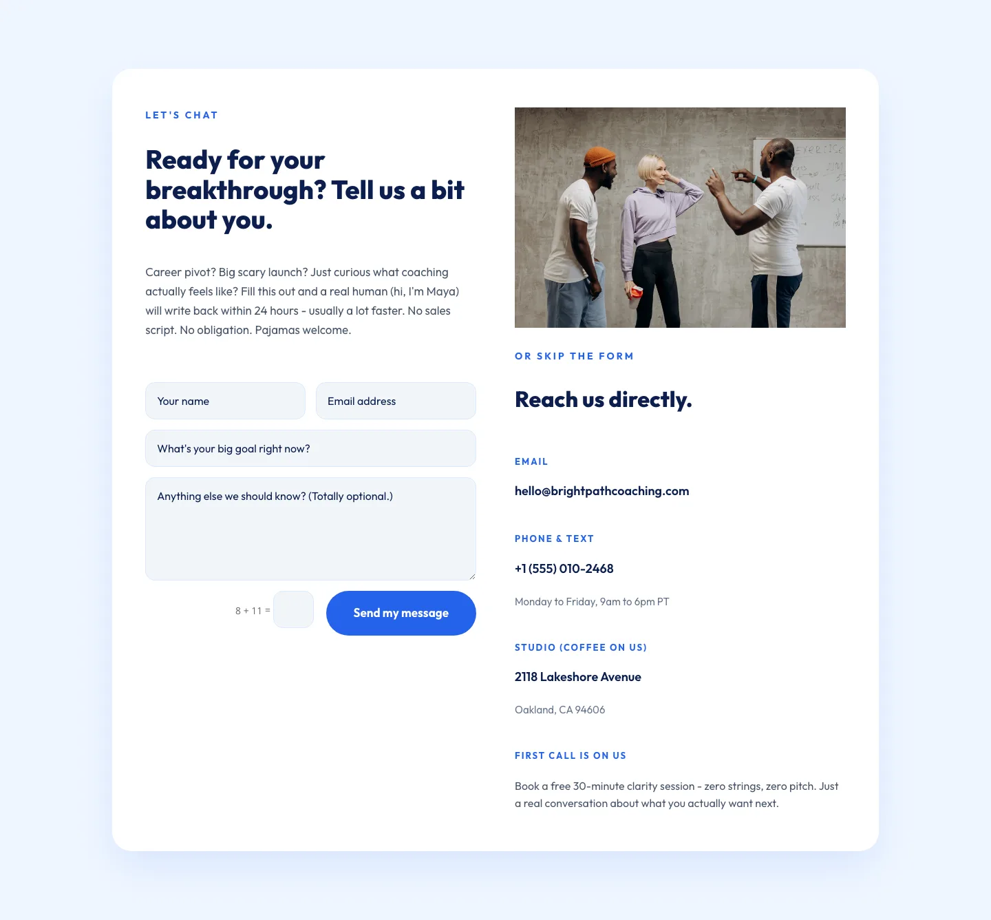
Playful Coaching Contact Page Layout for Divi 5 - Free Download
contact · coaching · playful
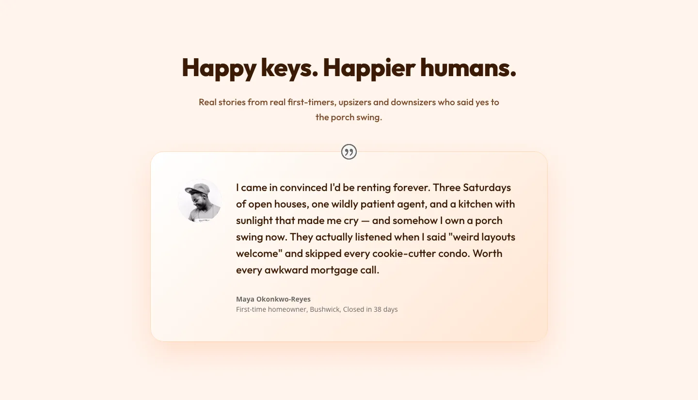
Playful Real Estate Testimonial Section for Divi 5
testimonials · real_estate · playful
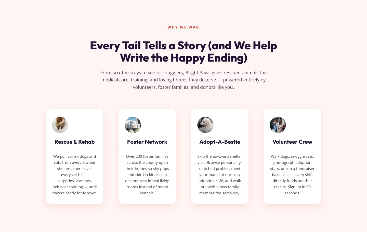
Playful Nonprofit Features Section for Divi 5: Animal Rescue Layout
features · nonprofit · playful
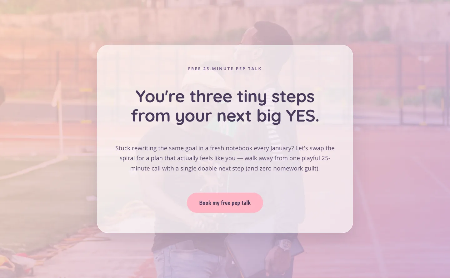
Playful Coaching CTA: Free Pep Talk Booking Block
cta · coaching · playful
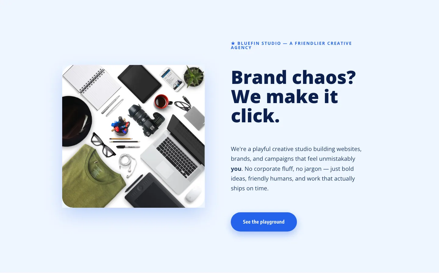
Bluefin Studio: Playful Creative Agency Hero Section for Divi 5
hero · agency · playful
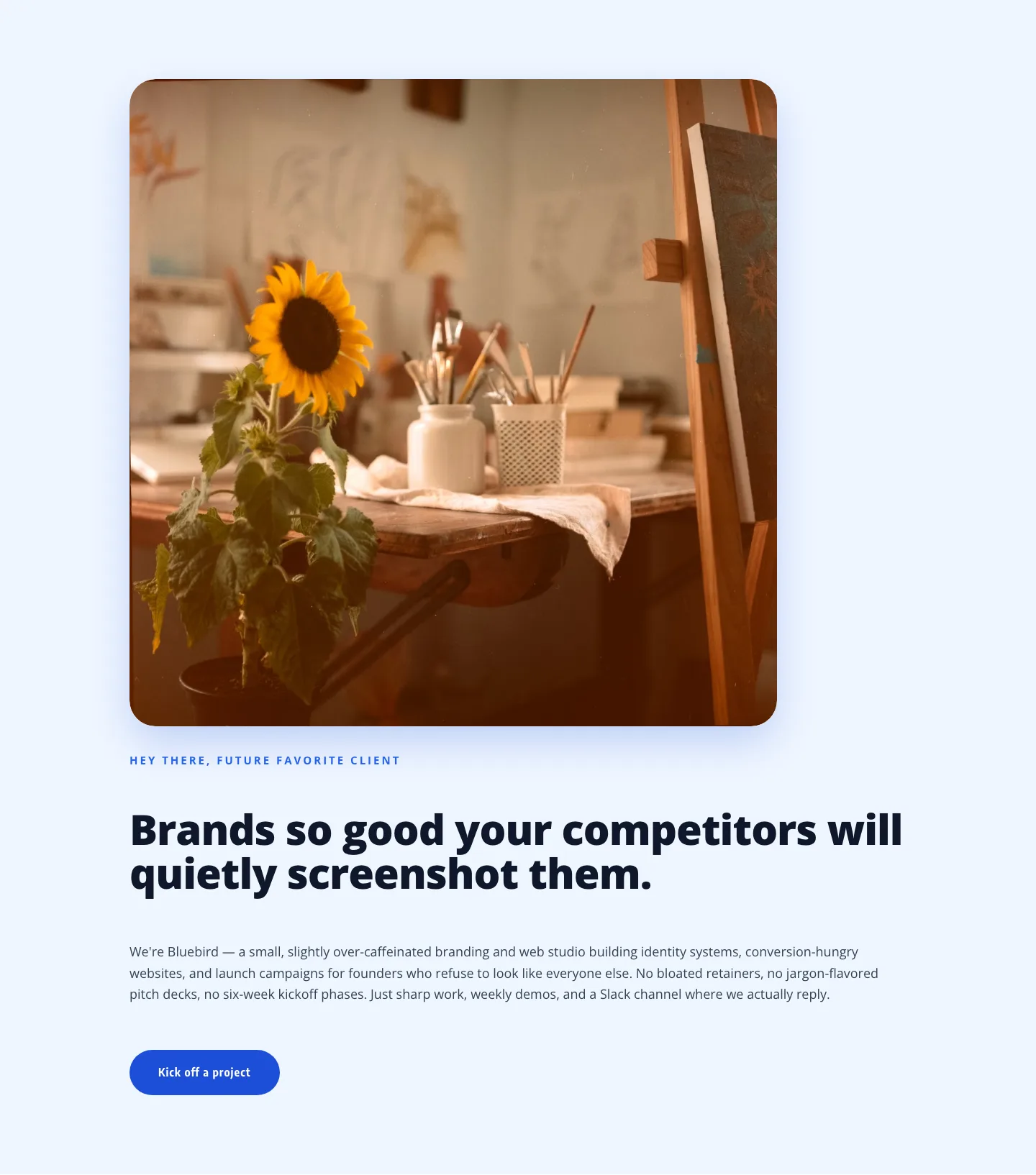
Playful Agency Hero: Friendly Branding Studio Divi 5 Layout
hero · agency · playful
What makes a pastel layout actually work
Pastels are forgiving to look at and unforgiving to design with. The palette flattens quickly, so a good pastel layout leans on generous whitespace, a single accent tone doing the heavy lifting, and typography with real weight contrast to keep the page from feeling washed out. You'll see that pattern repeated across the grid above: a dominant off-white or cream ground, one saturated pastel for buttons and highlights, and a deep neutral (charcoal, ink, warm brown) reserved for headings and body copy so nothing important disappears.
The layouts that convert best in this category also treat imagery as part of the palette. Product shots on tinted backgrounds, illustrated iconography instead of hard photography, and soft-edged shapes behind key modules all reinforce the tone without shouting.
Who these layouts are built for
- Wellness, skincare, and beauty brands where the palette signals gentleness and craft
- Baby, kids, and parenting products that need warmth without feeling saccharine
- Boutique service businesses: florists, stationers, event planners, doulas, therapists
- Lifestyle DTC and Etsy-graduating stores looking to move beyond a template feel
- Coaches and creators whose personal brand is built on approachability
If your brand voice is calm, thoughtful, and human, a pastel layout gives you a visual foundation that matches before you write a word.
Customizing a pastel layout in Divi 5
- Start with the Divi 5 palette. Open the layout's global colors and swap the accent for your brand's pastel. Keep the deep neutral for text, do not tint your body copy or headlines will lose contrast fast.
- Use presets, not per-module edits. Every section here ships with Divi 5 module presets. Change the button preset once and every CTA on the page updates. Same for headings and cards.
- Rewrite copy in short, warm sentences. Pastel visuals invite short lines. Long paragraphs feel heavy against soft backgrounds: break them, use pull quotes, add breathing room.
- Replace stock imagery early. The included screenshots show real desktop and mobile renders, but your own product or lifestyle photography is what makes the palette land. Aim for images already close to the palette's warmth so nothing clashes.
- Check mobile. Pastel type on light backgrounds can drop below WCAG contrast at smaller sizes, bump body size to 17-18px and verify headings hold up.
Every section here is a free download behind an email, licensed for commercial use on client and personal sites alike.