
Cards Divi 5 Layouts
Cards give a page rhythm, repeatable units that let visitors scan a lot of information without feeling overwhelmed. A well-built card grid balances hierarchy, whitespace, and visual weight so each tile earns its click. Every layout in this category is validated against Divi 5 structure and delivered as a free, email-gated download with a commercial license.
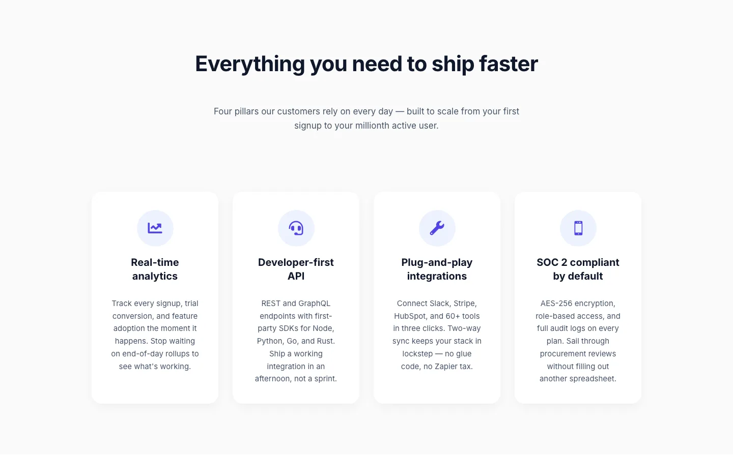
SaaS Feature Highlights: 4-Card Grid Layout for Divi 5
cards · saas · minimal

Three-Step How It Works Cards for SaaS Onboarding
cards · saas · minimal

SaaS Feature Cards: Minimal 3-Column Divi 5 Layout
cards · saas · minimal
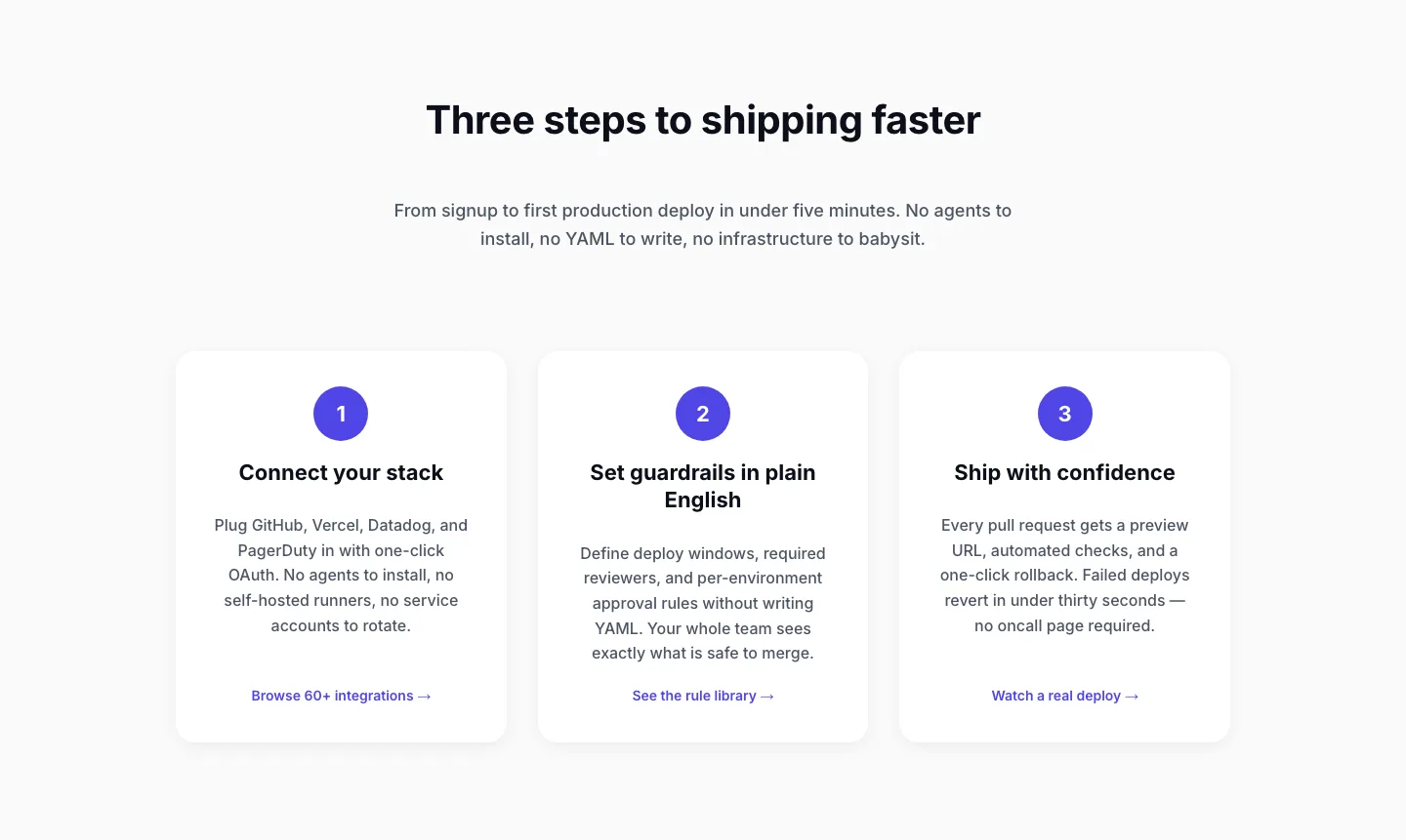
Three-Step SaaS Onboarding Cards: Minimal Divi 5 Layout
cards · saas · minimal

3-Column SaaS Feature Cards: Minimal Divi 5 Layout
cards · saas · minimal
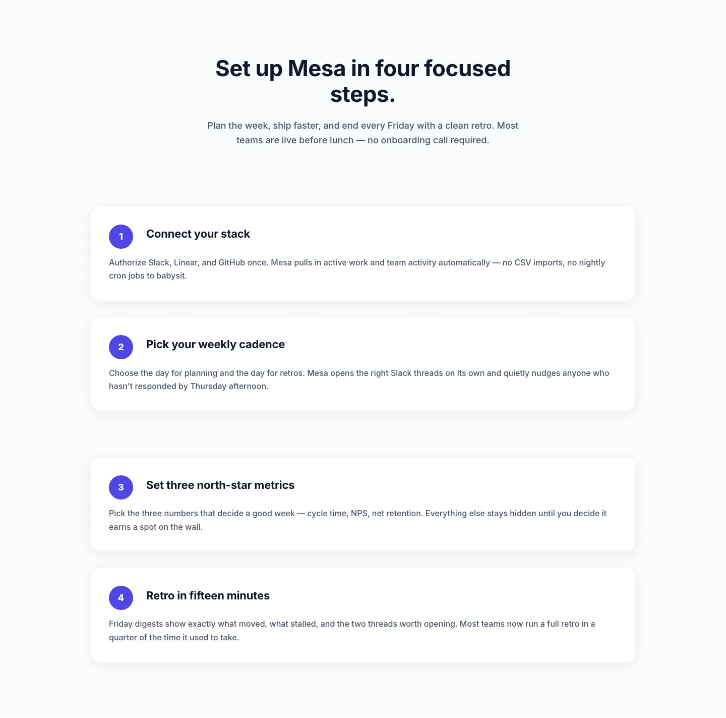
Minimal SaaS Four-Step Setup Cards Layout for Divi 5
cards · saas · minimal
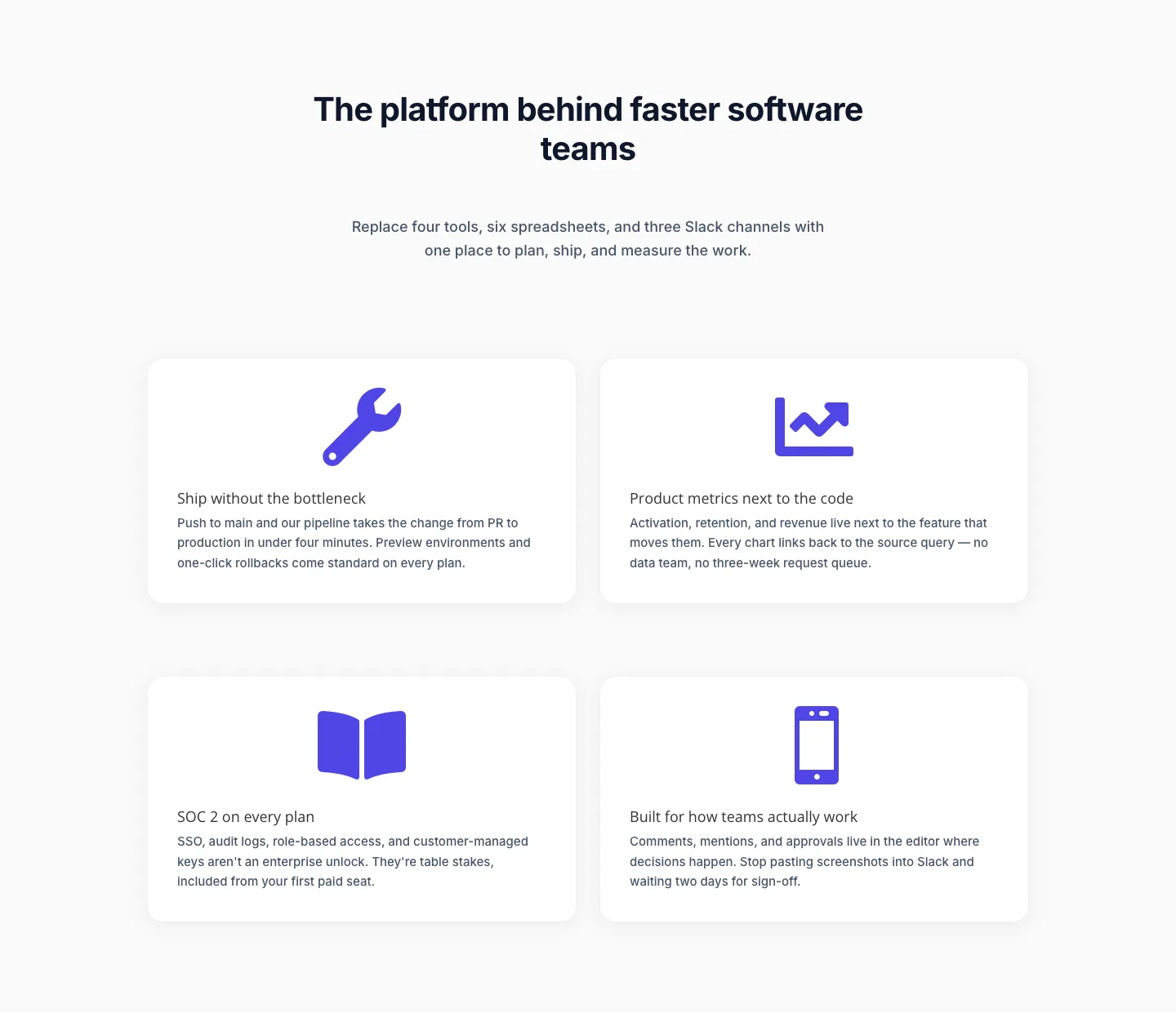
Minimal SaaS Feature Cards Layout for Divi 5
cards · saas · minimal

Minimal SaaS Feature Cards: Divi 5 Layout
cards · saas · minimal
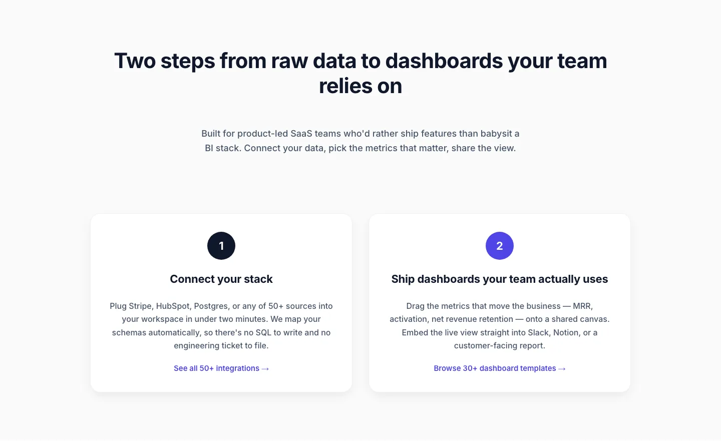
Minimal SaaS Two-Step Onboarding Cards for Divi 5
cards · saas · minimal

Minimal SaaS Two-Column Feature Cards
cards · saas · minimal
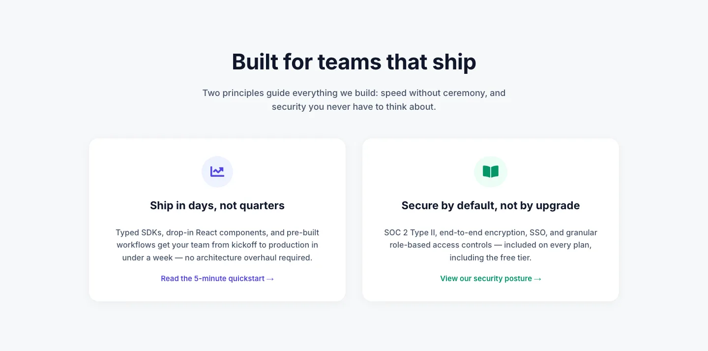
Minimal SaaS 2-Up Cards with Circular Icon Badges: Divi 5 Layout
cards · saas · minimal
What makes a good card layout
Cards succeed when they behave as a system, not a collection of loose boxes. The strongest layouts share a consistent aspect ratio, a predictable content order (media → title → supporting line → action), and enough padding to let each tile breathe. Hierarchy comes from restraint: one bold element per card, not three competing ones. Hover states, subtle shadows, or a thin border can add depth without turning the grid into visual noise.
Good card grids also handle imperfect content gracefully. Titles run long, descriptions vary, images arrive in odd crops. The layout should absorb that without breaking alignment. Fixed heights with clamped text, aspect-locked media, and a shared baseline for CTAs keep the rhythm intact.
Who uses them
Cards are the workhorse of modern marketing pages. Product teams use them for feature grids and pricing tiers. Agencies rely on them for case-study indexes and team bios. SaaS sites lean on them for integration directories and template galleries. Restaurants, real estate brands, and course creators use cards to present menus, listings, and lessons in a scannable format. If the underlying content is a list of comparable items, a card grid is almost always the right instinct.
Customizing a card layout in Divi 5
Start with the preset library. Divi 5's global presets are the fastest way to keep every card visually aligned: set your card padding, border-radius, and image ratio once at the preset level, and every tile inherits it. Editing a preset later reflows the whole grid in one move.
Next, tune the palette. Card layouts are palette-sensitive: too many accent colors and the grid fragments. Pick one background tone for the card surface, one for the page behind it, and reserve your accent color for the CTA or a single tag. Divi 5's global color slots make this a two-minute change site-wide.
Then rework the copy. Card titles should be short and parallel, same grammatical shape across every tile. Descriptions belong under 20 words. If a card needs more than that, it probably wants its own page. Keep CTAs identical in wording when the action is identical; vary them only when the destination genuinely differs.
Finally, check the responsive behavior. Divi 5 handles column collapse cleanly, but card content often needs a second pass on tablet: usually shrinking image height, tightening padding, and letting the CTA sit closer to the description. Every screenshot on this site shows the real desktop and mobile render, so you can preview the responsive story before you download.