
Purple Divi 5 Layouts
Purple is the palette you reach for when you want a page to feel considered: a little regal, a little creative, never loud for its own sake. These Divi 5 layouts use purple as a signal of taste and confidence, not a novelty accent, so the color earns its place in the hierarchy instead of fighting the copy for attention. Every layout here renders cleanly on desktop and mobile, ships as a free download, and passes our Divi 5 structural validator before it ever hits the grid.
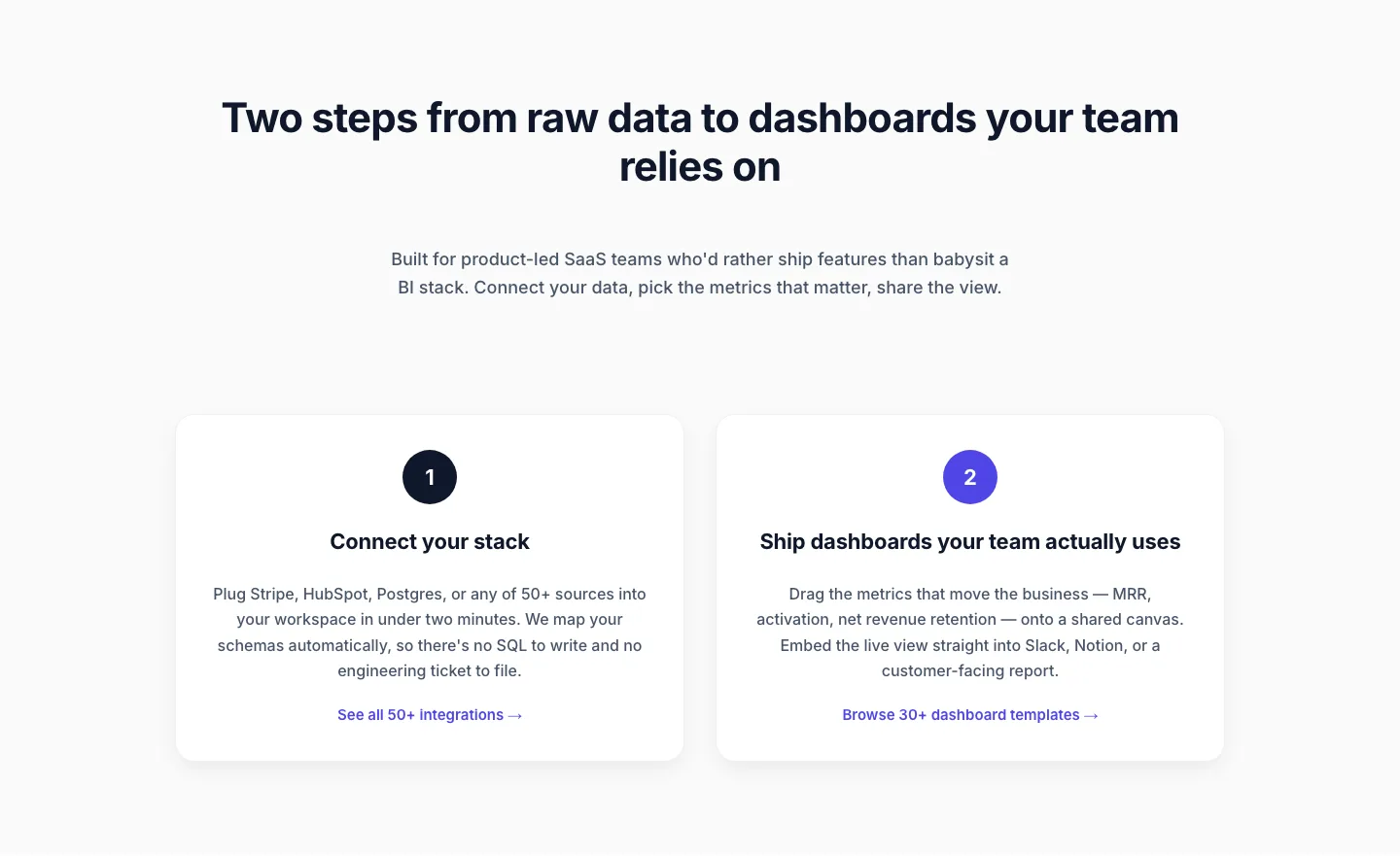
Minimal SaaS Two-Step Onboarding Cards for Divi 5
cards · saas · minimal
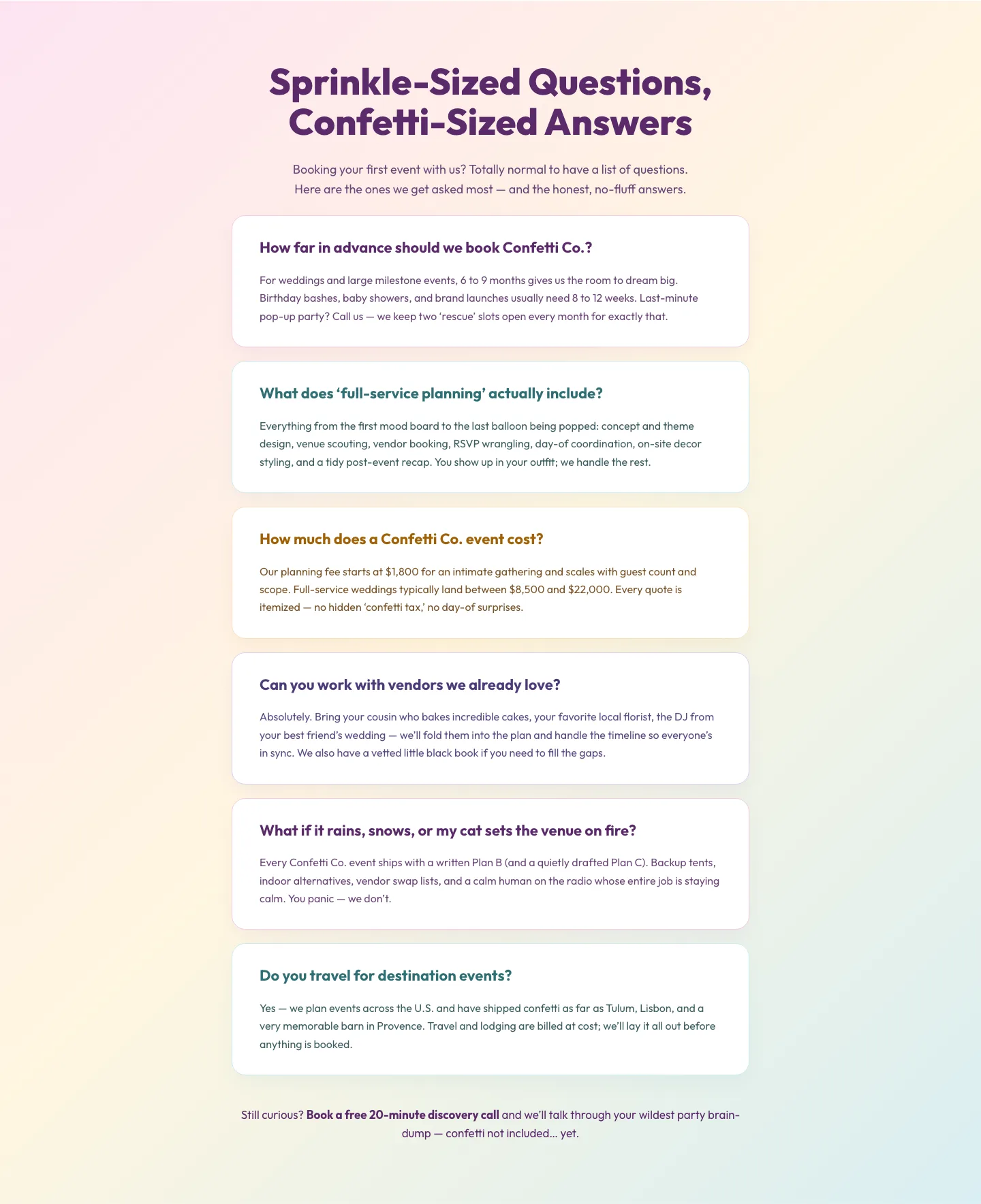
Playful Events FAQ Divi 5 Layout: Free Download
faq · events · playful
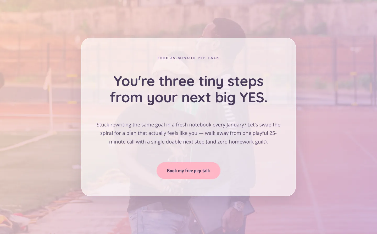
Playful Coaching CTA: Free Pep Talk Booking Block
cta · coaching · playful

Playful Real Estate CTA Section for Divi 5: Happy-Dance Home
cta · real_estate · playful
What makes a purple layout actually work
Purple is a range, not a shade. The good layouts in this category treat that as a feature: a deep aubergine anchoring the hero, a softer lilac carrying the mid-page, a near-black plum for typography, and a single saturated accent reserved for the primary CTA. When purple is used as a system (three or four tones with clear jobs) the page reads calm and intentional. When it's used as a single hex code sprayed across every button and heading, it reads like a template.
The layouts here lean into contrast. Purple sits against off-white, warm cream, or true black. Not against competing hues that muddy the palette. Typography stays neutral (a clean sans or a restrained serif) so the color, not the font, does the emotional work.
Who these layouts are for
Brands that want to feel premium without going full monochrome black: beauty and wellness studios, boutique agencies, coaches and creators, SaaS products aimed at design-forward buyers, wine and hospitality, and anything in the wedding, events, or luxury real estate space. Purple also does quiet work for tech and fintech brands that want to signal creativity without abandoning trust.
Customizing a purple layout in Divi 5
Start with the palette. In the Divi 5 site-wide color settings, replace the layout's default swatches with your own primary purple, a secondary tone one or two steps lighter, a neutral (cream, bone, or off-white), and a single accent for CTAs: a warm gold, a soft coral, or a crisp white all work. Let the layout's presets propagate the change; that's what they're built for.
Next, revisit the type. Divi 5 presets make it a single edit to swap headings globally: pair a modern serif with a neutral sans if you want editorial weight, or stay all-sans for something more contemporary. Keep body copy in a near-black plum rather than pure black; it softens the page without losing legibility.
Then the copy. Purple layouts reward restraint: shorter headlines, more whitespace, one clear promise per section. Rewrite the placeholder copy to match your voice before you touch anything structural: most of what feels "off" about a fresh layout is the words, not the design.
Every layout on this page is a free download (email-gated) and ships with a commercial license, so you can use it on client sites without a second thought.